Kitchen Practice/challenge
-
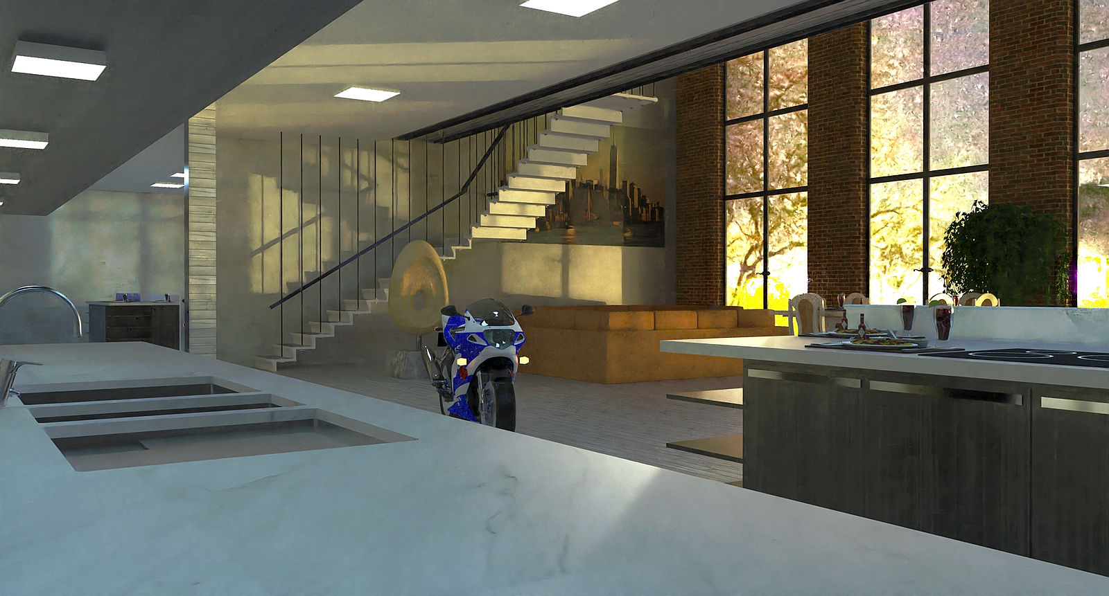
Find this latest test to be somewhat interesting..... raises a few questions.... Curious why you chose the viewpoint for this shot ? Personally I have never been able to pull off a good image with one of these "centered and lined up straight" with a long narrow space. Not a complaint really it's just this type of view never seems to "look quite right " to me.
Know it's a test but I wonder why you ended up with the brighter "white line" that runs around the space at the height of the doorway ?
Also wondering what render engine your using ? Are you using a Biased setting or an Unbiased setting for the
renders ?Have another render running now of my model. Hope to post something later today. Will try and give more info of how I set the render up then I did on first post.
-
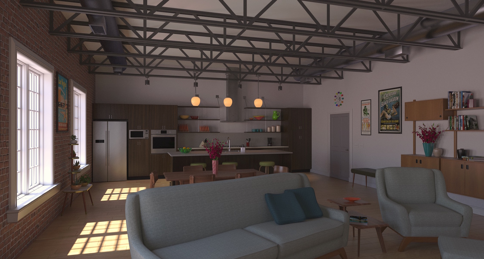
Messed about with material and light set up some. Ran a new render. Still not quite where I'd like it......
A little more info.... I use TwilightV2 for rendering. Set this up with Sky Portals over the windows and lights in the fixtures over the island and four track lights between the island and cabinets. Ran the render on Twilights Easy 9 setting
( an unbiased render setting ). Let it go 150 passes. I took a little over 20 hours. Image was rendered at 2250 px wide.Tried a different texture on the appliances and not real happy with the result there. Also need to try a different material set up on the A/C ductwork.....
Might try a different camera view on the next one..... Cheers


-
Hi Tuna, it was a test I was not worried about the the aesthetics or quality of the image at all it was just a test using the HDRI. The line running aroubd the room was addressed in the text with the image it is an "artifact" of the lamps I used.
-
No Worries L i am . Totally missed you mentioning the artifact band in the test render. Brain fade on my part I'm sure. I've had pretty good luck using HDRI's for these sun and interior light type renders. Don't have one that worked very well with this particular scene. Using Twilights Physical Sky settings with a handful of interior lights. Haven't done a lot of this type of render so figured the practice can't hurt.
Have a different view cooking now. Look forward to seeing more of your experiments and your particular set ups. It's always helpful to see how others approach similar models.
-
@tuna1957 said:
Find this latest test to be somewhat interesting..... raises a few questions.... Curious why you chose the viewpoint for this shot ? Personally I have never been able to pull off a good image with one of these "centered and lined up straight" with a long narrow space. Not a complaint really it's just this type of view never seems to "look quite right " to me.
Know it's a test but I wonder why you ended up with the brighter "white line" that runs around the space at the height of the doorway ?
Also wondering what render engine your using ? Are you using a Biased setting or an Unbiased setting for the
renders ?Have another render running now of my model. Hope to post something later today. Will try and give more info of how I set the render up then I did on first post.
I am using raylectron renderer. I do not even know it it is a biased or unbiased render but have asked support will let you know. oh one thing I found is I have a setting within the renderer allowing me to ajust the brightness of the HDRI I set it to about x7 to get the lighting around where I wat it.
-
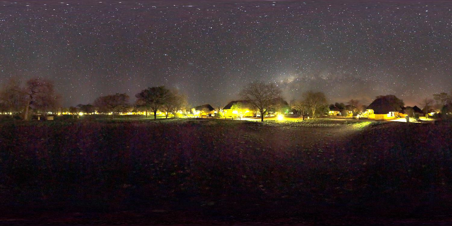
I was out and about for a few hours today and decided to try an evening/night render. The hdri (And portal) are 12k so definition is sharper.
Twilight render.

-
Is there a bush fire?
-
No, it is just a night image with a lot of light blooms.

-
Light portals have a resolution? This is Twilight, right? I didn't know.
-
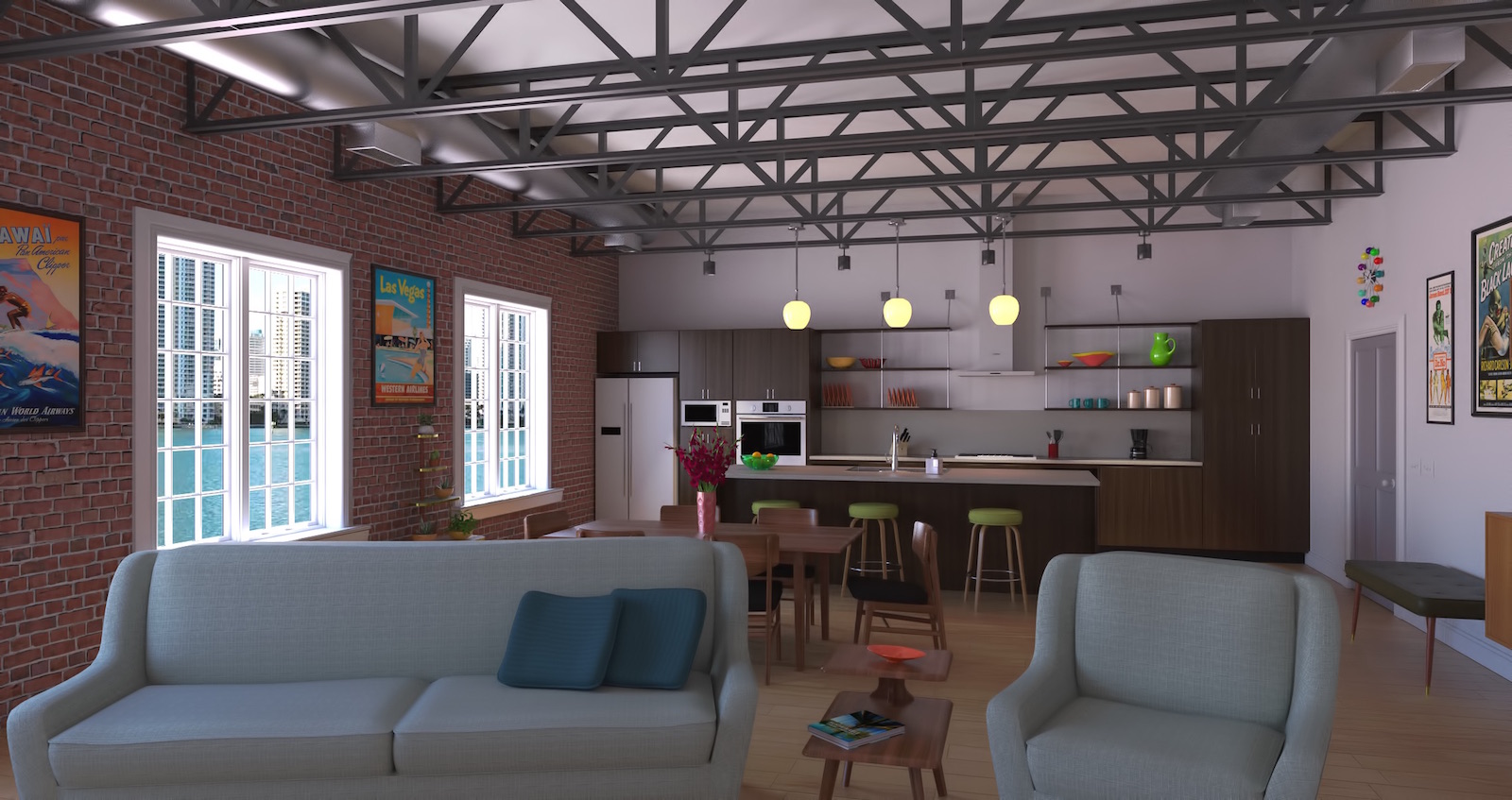
Tried a different view for this one. Surprised it rendered a fair bit faster than the first view I posted. Find these type of spaces ( narrow and long ) are a challenge for me to get a nice viewpoint.
"Outside View" was put in post pro. A lot of dancing about in post pro trying to get outside and inside to look right.These type of experiments give me great respect for others post pro abilities. Had issues with trying not to "blow out"the window trim while still brightening up the interior the desired amount....... Still not happy with the material on the appliances, tried a new texture and it didn't really work out as expected.....

Advertisement


