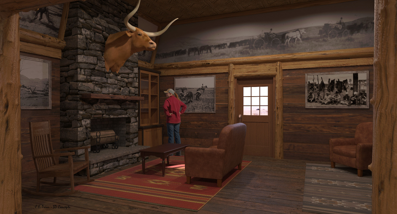
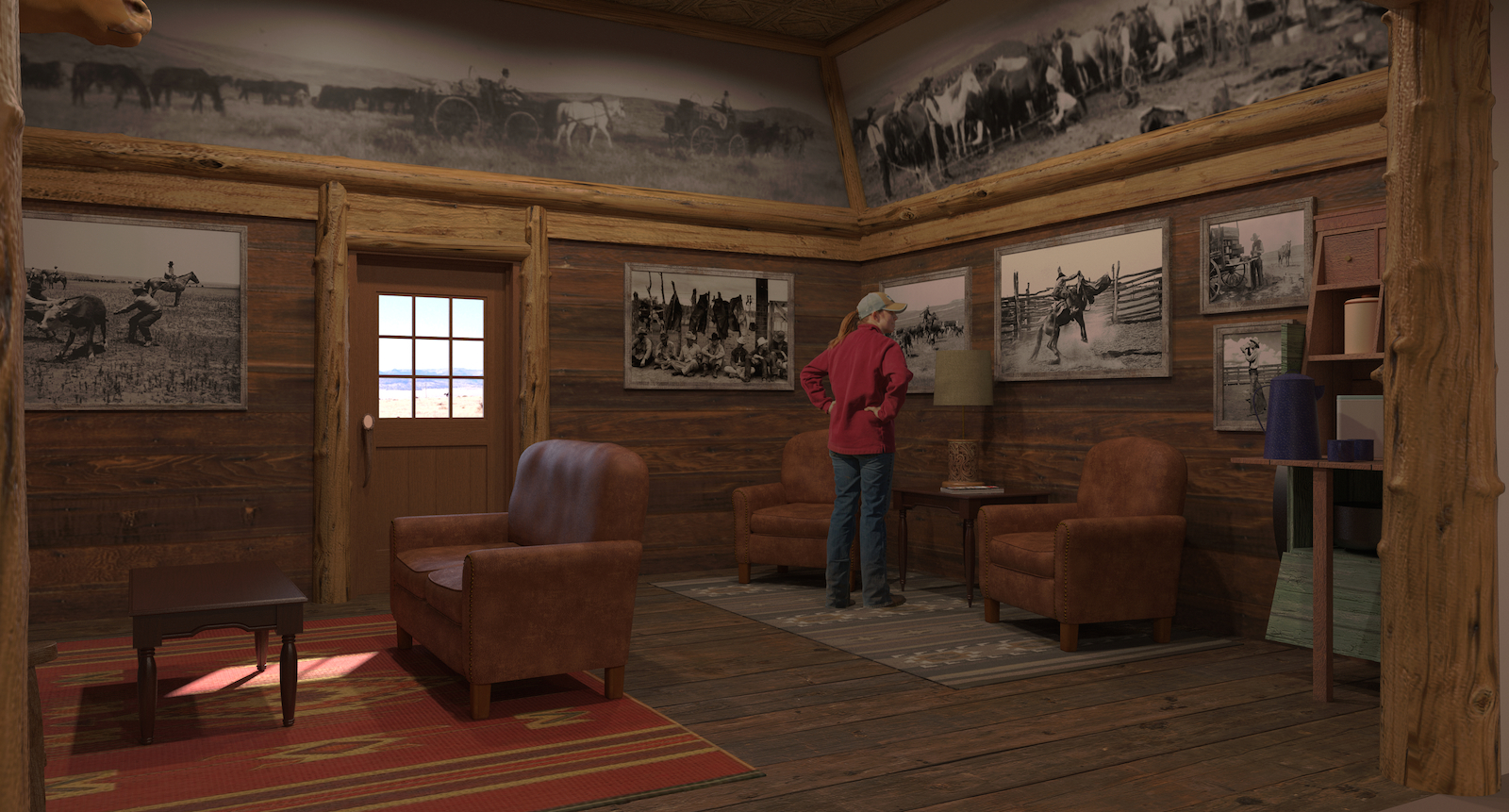
Store Lobby
-
Recent project. Produced some images for a consultant I do work for from time to time. "Entry Lobby" for a specialty retail store.


-
Very nice - well done!

-
That works for me, the stone element could do with a bit more random depth/bump but that would mean modeling in 3d. Not something I would relish doing so, nice one dood.
-
Excellent model and render!
-
Cool photographers' gallery!

-
Thanks everyone. Rendered nine different views, client picked four that I printed and mounted on presentation boards. Client happy.... me be happy when I get the $$.....
-
It may be less a storefront and more a lodge but it has a great ambience, nice dood. Hope the bucks arrive soon. Sorry about the pun, I could not resist it.
-
tuna1957 :
Nice. (no offense)Re-arrange the furniture, and it'd be a pretty nice living room ! I like it. garystan -
Beautiful images, but I'd put some stuff in that cupboard (what the hell is she looking at?) in the first image, as well as few do-dads on the mantle, to give it added realism. I don't know why, but everyone seems compelled to put things on a fireplace mantel.
-
 a really great thing - I am so impressed about the quality of the wood-logs(?) or tree trunk(?) (I don´t know the English word
  )
) -
Daniel, Thanks for your comments. Funny thing is the client had me remove a lot of small decor before cooking the renders. Go figure.....
HornOxx, Thanks and logs would be a correct term. In this case meant to represent peeled cedar logs ( it's a Texas thing )
 .
. -
Tuna, I have a client (cell phone retailer) who is the same way when I do a model of one of their new stores - no cars, people, landscaping, or other entourage of any kind.
Hello! It looks like you're interested in this conversation, but you don't have an account yet.
Getting fed up of having to scroll through the same posts each visit? When you register for an account, you'll always come back to exactly where you were before, and choose to be notified of new replies (either via email, or push notification). You'll also be able to save bookmarks and upvote posts to show your appreciation to other community members.
With your input, this post could be even better 💗
Register LoginAdvertisement


