Medeek Wall Plugin
-
Looks Great!
-
Preview of the Opening Edit and Delete Functions:
View model here:
3D Warehouse
3D Warehouse is a website of searchable, pre-made 3D models that works seamlessly with SketchUp.
(3dwarehouse.sketchup.com)
I am now working on the opening move function or tool.
The creation of the html menus for the window and door edit functions took a couple days due to the shear volume of the number of parameters involved. I have been very busy working on the plugin the last four days especially with debugging and testing.
As I actually test the features out sometimes new ideas come to me or even a better way of doing something so I also get dragged down into some rabbit holes as I am debugging and correcting the code.
I am wondering if it would be helpful with the wall, window and door creation tools to show a grid (every foot or six inches on center) that can function as an aid that the use can snap to?
-
This is an update on the previous "todo" list and the current status of various high priority items:
1.) Wall and Window edit, move and delete functions/Tools.
Edit and delete is complete, currently working on the move function.
2.) Global Setting tabs for Window and Door settings.
Parameters have multiplied five fold, will need to spend more time adding in all of these new parameters.
3.) Rudimentary Door and Window plugin that integrates with this plugin tightly.
This is complete, three door types, three window types, more variants to be added after initial release.
4.) Wall Move and Split Tool.
Wall move tool is planned prior to release, split tool will probably be after.
5.) Add air gap parameter for the cladding (ie. brick fascia).
Done.
6.) Auto corner configuration
Approximately, 50% complete, more debugging and testing required.
7.) Polyline Wall Tool and Face Wall Tool (right now all you can do is create a single segment at a time).
Polyline tool is now planned prior to release, face tool is on backburner until requests drive it to top of list.
8.) Final clean and addition of any additional parameters to the Global Settings.
This is part of item #2.
9.) Further refinements to the Add Window and Add Door Tools.
Complete for now, some additional error checking could be added to check for impossible geometry situations.
10.) Gable/Shed Wall Tool.
This is planned after initial release, for now.
11.) Add glulam beams to Window and Door header options.
This will be added when the garage door module is added, which will probably be post release.
12.) Update Wall Plugin web page.
Will attack this just prior to release of plugin.
13.) Additional logic for interior walls
This needs attention before release of plugin.
14.) Mitered corners for cladding.
Code is in place however further testing and debugging required.
-
Okay that was easy:
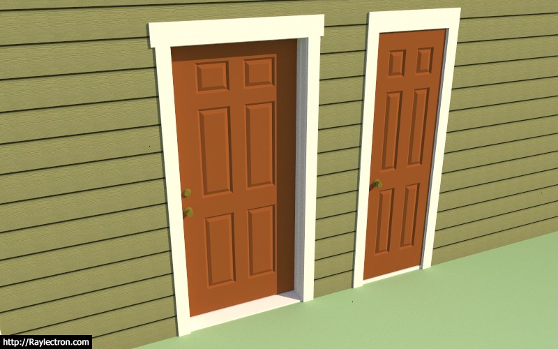
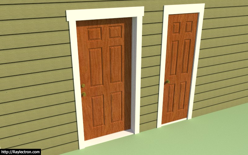
Six panel doors are now part of the plugin.
View model here:
3D Warehouse
3D Warehouse is a website of searchable, pre-made 3D models that works seamlessly with SketchUp.
(3dwarehouse.sketchup.com)
-
Still mucking around with the Wall and Door Move Function:
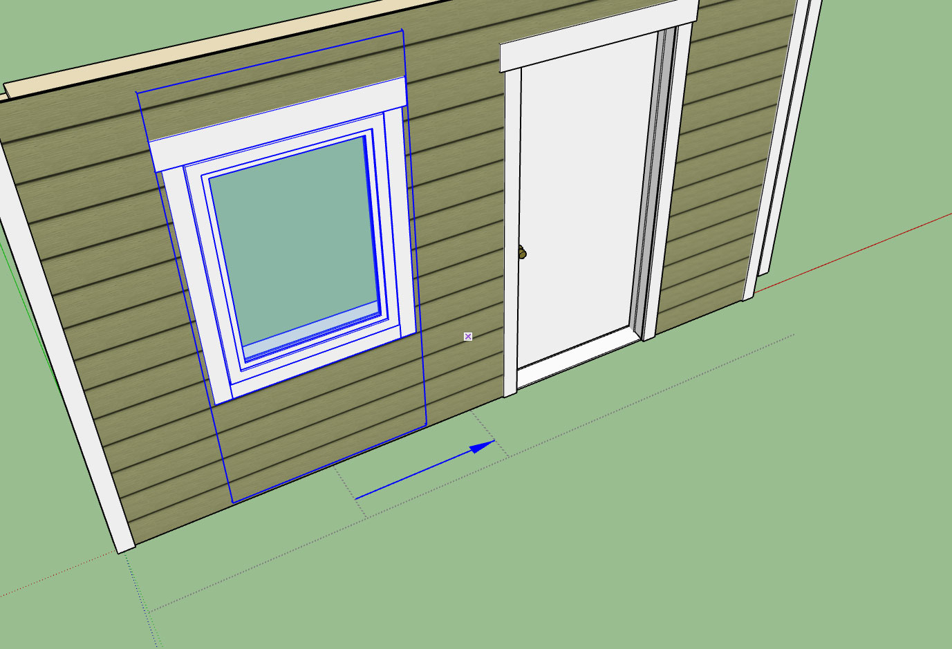
It's actually working quite well however I am trying to figure out how to add a grid next to the wall that the cursor can inference from and snap to regular intervals.
Any suggestions would be helpful.
I will say the move tool is quite handy and a bit faster than using the edit function.
-
The opening move tool is giving me some headaches:
-
What if you "auto-hide" the trim when the move command is selected, then you would have the wall edges to inference to. Is that even possible? I'm not a coder.
-
@mpacey said:
What if you "auto-hide" the trim when the move command is selected, then you would have the wall edges to inference to. Is that even possible? I'm not a coder.
The point is that I want to not have to inference against anything to have the move arrow smoothly extend either side of the opening.
-
The opening move tool is now complete and I am now working on the wall move tool along with the wall polyline creation tool and the auto-config for wall corners. This is the last major item(s) on the todo list prior to release. All other items are fairly minor in comparison and constitute mere housekeeping rather than actual significant development.
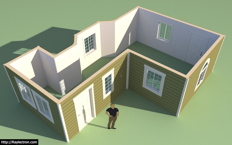
View model here:
3D Warehouse
3D Warehouse is a website of searchable, pre-made 3D models that works seamlessly with SketchUp.
(3dwarehouse.sketchup.com)
-
Every stud, plate and header is there, if you want it.
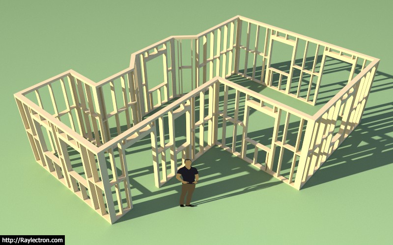
-
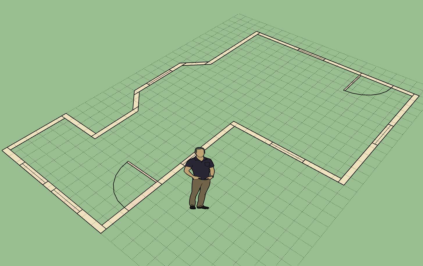
I've added a callout option so that when the designer is in the 2D mode the window and door sizes and types are called out:
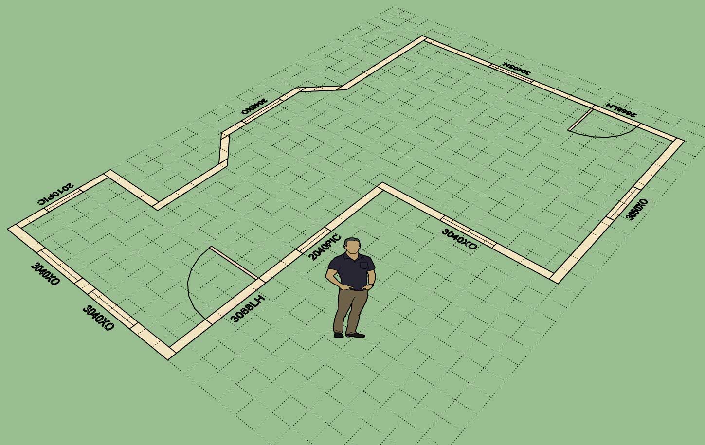
This particular option can only be set in the global settings.
One thing to note is that the door handedness and the window type are only in the callout if the user has specified a particular door or window type to install. If the advanced options are not enabled then only the opening size will be displayed (ie. 3068 vs. 3068LH or 3040 vs. 3040SH).
-
That's nice! I've had a CAD program for decades that has never added this simple feature. Often we go to schedules with a symbol or more detailed info on the plan but during design this would be great so anyone (including yourself) can look at the drawing or model and know what size is drawn. As for handedness, I don't like to put it on the plans. I am convinced that people just don't agree what it means. I can quickly find a diagram online that shows it opposite from what you show. Great additions though! Thanks!
I know the lines dividing the different wall lines relate to framing or modeling in your case but traditionally there are no lines drawn at the wall intersections in plan.
-
@pbacot said:
That's nice! I've had a CAD program for decades that has never added this simple feature. Often we go to schedules with a symbol or more detailed info on the plan but during design this would be great so anyone (including yourself) can look at the drawing or model and know what size is drawn. As for handedness, I don't like to put it on the plans. I am convinced that people just don't agree what it means. I can quickly find a diagram online that shows it opposite from what you show. Great additions though! Thanks!
I know the lines dividing the different wall lines relate to framing or modeling in your case but traditionally there are no lines drawn at the wall intersections in plan.
The 2D mode is really designed as lightweight schematic of the model layout rather than a final floor plan for construction documents.
Walls are divided up by segments and hence they are represented as separate structures even in 2D. At some point I will probably provide a feature which will allow the user to generate a full on floor plan that will be setup for bringing all of the data into layout or some other CAD engine for final construction document creation.
When it comes to generating 2D documents I still go to AutoCAD even though Layout does exist and continues to get stronger. For that reason I think it may be useful to have an automated DXF export function builtin at some point, that cleans up the drawing nicely and gives the user exactly what they need to prepare the floor plan.
I haven't shown any interior walls yet in any of these examples, but the idea there is they will be shaded a different color than the exterior walls so that the user can quickly differentiate between the two in the 2D mode.
I agree the handedness is a bit of a pain in the butt, and you are correct that there seems to be varying definitions of which is the correct way of designating this. I may eliminate the handedness altogether, besides the graphic clearly shows the swing of the door.
-
Medeek,
In response to your statement:
I may eliminate the handedness altogether, besides the graphic clearly shows the swing of the door.I can confirm that naming the handing or "handedness" over several years of door scheduling for architectural firms supports your view.
However
 when dealing with computer designed buildings
naming the handing allows for computer checking of the door hardware, building code requirements,
and building standards. This is applicable to medium to large scale buildings presently, but as
computers evolve on their merry exponential curve of application it could be applied to smaller projects in the near future. (3-6 years is my guess)I suggest completing your first version of the software allowing for future updates when and if there is a demand for a handing function for the particular market that will be using SketchUp for documentation in the near future.
-
A preview of the Polyline Wall Creation Tool and Auto-Corner Configuration:
-
Another test of the wall plugin combined with the foundation and truss plugin.
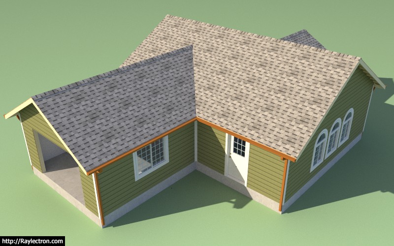
The wall plugin is now in better shape than the truss plugin since no manual edits are required and all the windows and doors are fully parametric.
However note that the interior walls and garage doors are still missing, more work yet to be done.
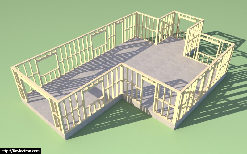
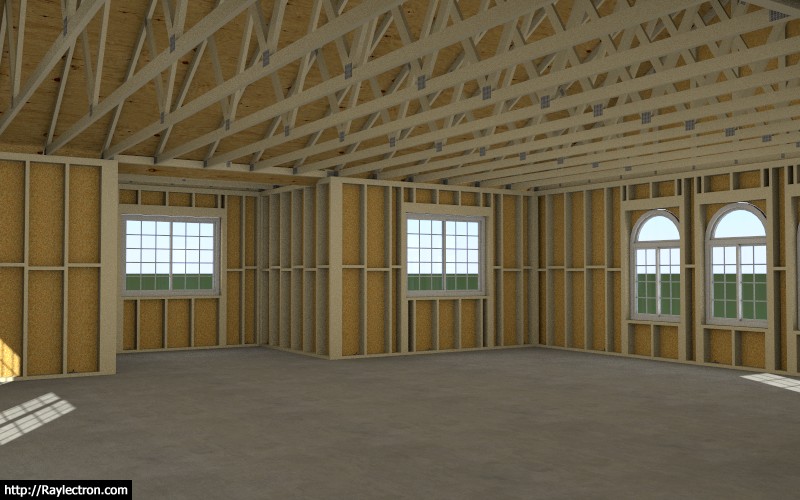
View model here:
3D Warehouse
3D Warehouse is a website of searchable, pre-made 3D models that works seamlessly with SketchUp.
(3dwarehouse.sketchup.com)
After spending the last month on this new plugin I can see where the other two plugins have room for some serious improvement, I've really got my work cut out for me.
-
A true house turnkey solution!

-
Getting REALLY anxious to give it a try.

-
My biggest concern right now is that it is stable and runs rock solid. I have a fair bit more testing and I'm sure debugging and optimization ahead of me in the next few days.
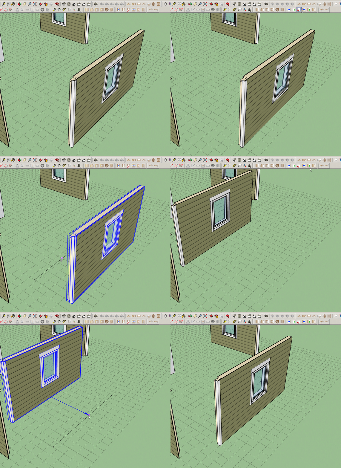
The wall move tool is working quite well, I just need to make sure the corners stay "glued" now. Click on image to view GIF animation.
-
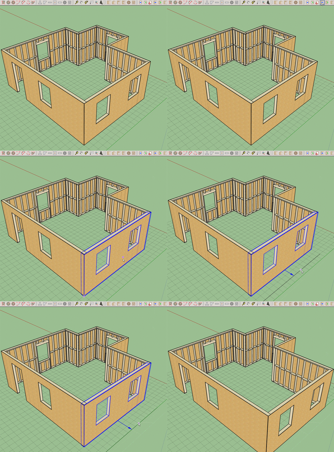
Progress has been made but I'm still working out a few kinks.
Hello! It looks like you're interested in this conversation, but you don't have an account yet.
Getting fed up of having to scroll through the same posts each visit? When you register for an account, you'll always come back to exactly where you were before, and choose to be notified of new replies (either via email, or push notification). You'll also be able to save bookmarks and upvote posts to show your appreciation to other community members.
With your input, this post could be even better 💗
Register LoginAdvertisement


