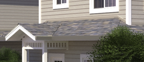
My Gazebo Model
-
That new texture is much better. Well done.
-
Ken, I'd like to see underneath the roof, to se kore of those angled pieces sitting under the rafters! Some sort of bracing??
-
@rich o brien said:
That new texture is much better. Well done.
Thank you, yes it looks better now..
-
@joe wood said:
Ken, I'd like to see underneath the roof, to se kore of those angled pieces sitting under the rafters! Some sort of bracing??
You can download it from the warehouse link in the first message.. I am not a producer, ı draw just what i saw while sitting in it..
-
OK I did look at it, I see now those diagonals aren't up under the roof but are forming a sort of truss under the top plate, instead of using beams. That's different, and interesting!
-
Looks very nice Box..
-
Sometimes you can get a nice image just using the edges.
-
kenancakir, nice model, and the second pass at texturing looks better (IMHO). Good touch on adding the shingle caps on the hips - a lot of people overlook that.
-

 & Thanks !
 -
Very nice!
-
Looking good!
You might look at other textures for the roof, for a composition shingle look and rough not shiny. Unless you are going for tile or slate, which could use different texture or modeling too)

-
Thanks to you all..
Here they use shingles for camelias usually, and yes it looks too shiny i will change its reflection values and bump value..
Hello! It looks like you're interested in this conversation, but you don't have an account yet.
Getting fed up of having to scroll through the same posts each visit? When you register for an account, you'll always come back to exactly where you were before, and choose to be notified of new replies (either via email, or push notification). You'll also be able to save bookmarks and upvote posts to show your appreciation to other community members.
With your input, this post could be even better 💗
Register LoginAdvertisement


