Help Improve My Images
-
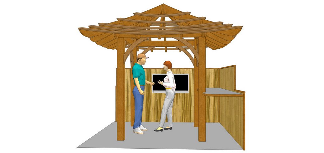
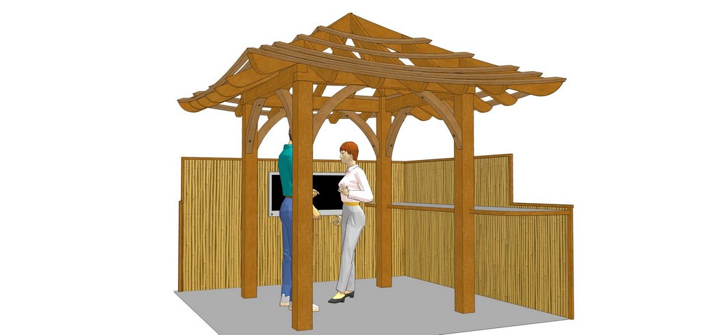
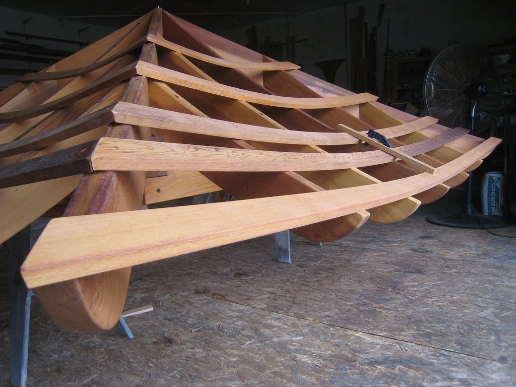
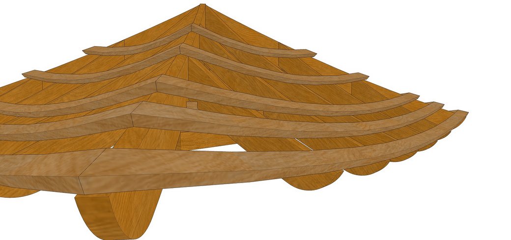
Folks, it seems to me that my images, well, they loose their clarity and I can't really see all the detail like I think I should.
Is it the textures I'm using? Sun setting? Do I need to render the images??
what can I do? Look at image 4, I can't really see what's going on in the drawing and I'm the one who drew it!

I export jpg at 6000 pix wide then resize.
-
Joe, if you want more photo-realistic, you could start by using better materials. There are sources for high resolution wood, stone, and other materials. Then use a rendering application. For that type of imagery you'll likely need to add some background instead of using just white.
Alternatively, you could go for non-photo-realistic and create perhaps a watercolor effect using Photoshop or Fotosketcher. Use a sketchy line style for edges and make the whole thing look more like hand work. For these you generally don't need high res textures.
It depends upon the sort of feel you want to create and how much time you want to invest in that end of the presentation. Since it's your business, you kind of need to consider the return on that investment. Is it likely to increase what you can charge the client for the job? Or are you more likely to get the job because of it? You know your clients and what they want.
-
I'm trying for non-photo-realistic Dave, don't even want to try to make it to look real. I was thinking of just using colors instead of wood grain, might be alot easier to see all the pieces!
would running that image thru a free renderer help at all?
what I need is some better wood textures, not the high rez realisitc ones, just ones that might make it a little easier to see? I mostly use stained western red cedar but the exact cedar look wouldn't be important.
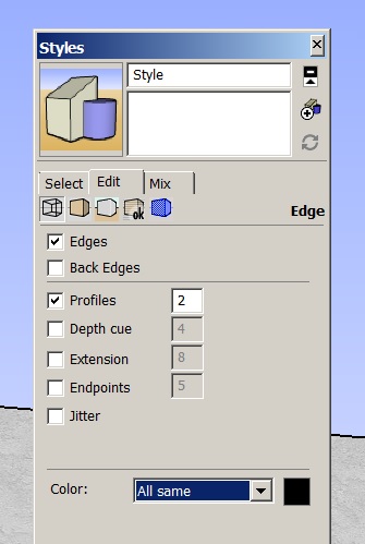
How about in Styles, the Profiles being set at 2?
I have shadows set at 70 for both light and dark?
is there any other setting / whatever I could check? Appreciate the help again Dave

-
OK, so for NPR, you could certainly do something with flat colors instead of using wood grain materials. You could also be selective about what gets materials/colors and what doesn't. When I include people for scale in my drawings, I often remove all color and even the faces to leave wireframe people. (example here.)
You don't have to run the model through a rendering application but you could to create some soft shadows. The rendering doesn't need to be fancy or time consuming. Sometimes I don't even bother with color. I just render everything in white to get the shadows thusly. I use Kerkythea for these renders.
Even when I do use materials, I don't bother with high res images. I don't need them to be high res. Instead I use images of full lengths of wood. Typically 8 to 14 feet long depending on the species. You can make your own from boards you have on hand if you want. Just look for even lighting and set up the camera perfectly square to the face.
@unknownuser said:
How about in Styles, the Profiles being set at 2?
For my taste, I don't usually like having profiles heavier than 1 but it is a taste thing.
I have shadows set at 70 for both light and dark?
That makes your images look very flat. Maybe you should change that. Set the Dark slider a bit darker than the Light slider.
You might play with sketchy line styles to get a more hand drawn look. You can have a great deal of control over the way the edges look and it isn't difficult to manage. I make Hidden Line exports with a sketchy line style and combine it with either a render as in the images I linked to or sometimes another image from SketchUp that has been manipulated in Photoshop or Fotosketcher (or both).
You should have my e-mail address. Send me the SKP file for the image you posted at the top and I'll give it a little play.
-
Hi Joe Wood
I have a feeling your problem might be this.
When you have set the image size to 6000 pixels wide, you are also reducing the appearance of edges to less than what you see on a Full HD Monitor (which is only 1920 pixels wide) That may be the reason the images are looking with lesser punch because you are getting very, very thin lines as edges so the image looks less sharp.
Why not try increasing the profile line thickness to 6 or keep it to 2 but switch on Depth Cue and increase to 6 and then export the image. You would get an image with more punch and also appear sharper. Play around with both the profile thickness and the Depth Cue thickness. You would get varying results.
Best regards
PRSS -
Pres, I always resize them, usually to 2000 pix wide, I do this to get rid of the jaggies.
But I'll play around with your suggestions about the line weight! I've never messed around with the depth cue before so I'll give that a try too. Thanks for that advice!
Hello! It looks like you're interested in this conversation, but you don't have an account yet.
Getting fed up of having to scroll through the same posts each visit? When you register for an account, you'll always come back to exactly where you were before, and choose to be notified of new replies (either via email, or push notification). You'll also be able to save bookmarks and upvote posts to show your appreciation to other community members.
With your input, this post could be even better 💗
Register LoginAdvertisement


