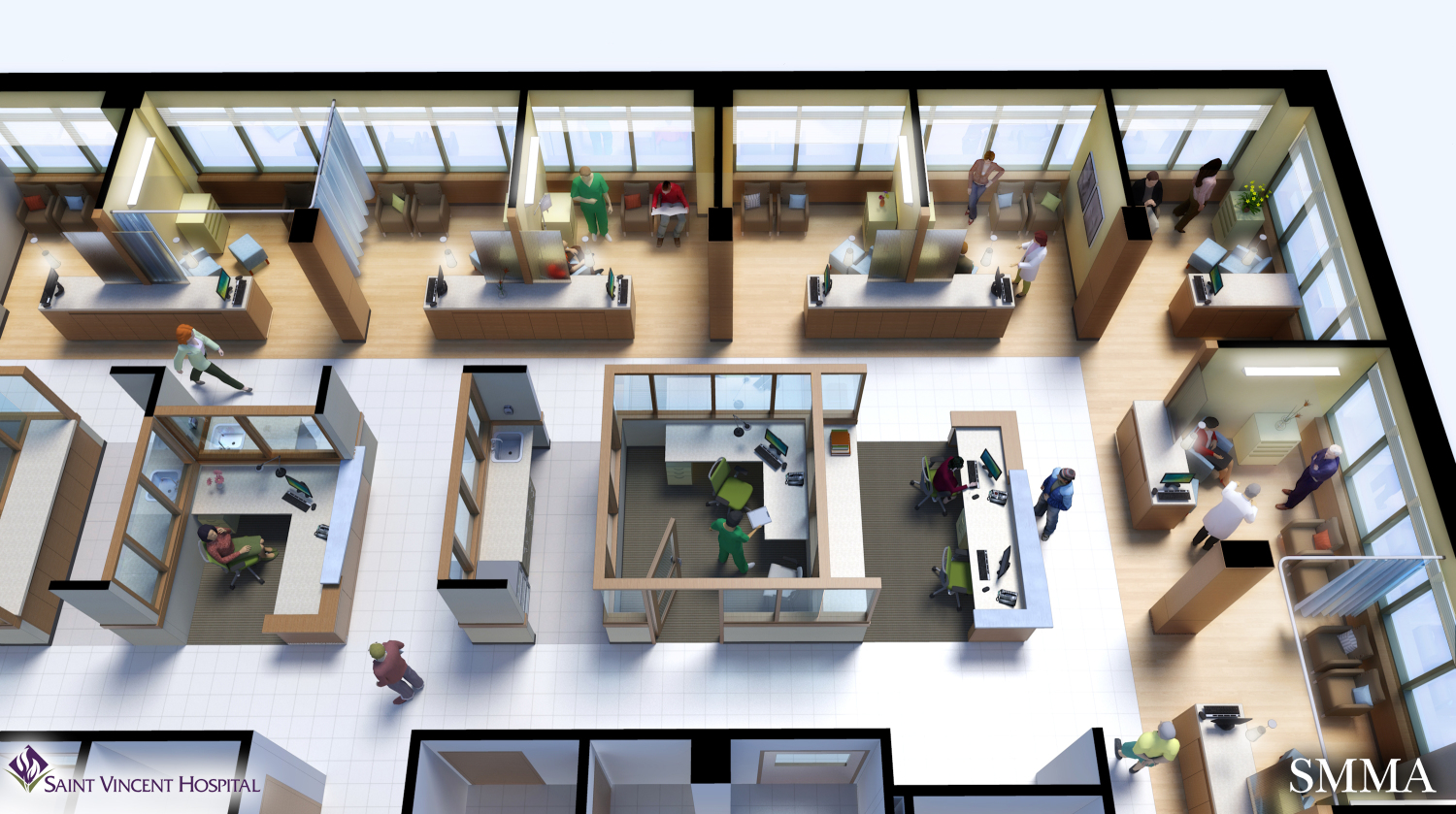
Cancer and Wellness Center
-
This is a rendering where I tried to capture the warmth and energy of the place. I paid special attention to how the patients, families, and doctors are interacting with each other. I usually don't use 3d modeled people but for scenes where the camera is above the action its hard to find photos of people from above. These people models are from FormFonts. I think they work from this distance and angle.
The focus of the scene is really on the outer perimeter of infusion rooms. I tried to coax some sense of atmosphere with the glow of the lighting and softened shadows.
SketchUp/Kerkythea/Photoshop

-
Michael, looks great. The FormFonts people look good, too. Effective way to convey the plan to clients, who so often cannot understand the typical 2d plans.
-
Excellent design, style and render.
-
Wish some of mine would come out this clean and nice.

-
Excellent and effective presentation. Sometimes too much realism kills it. And I agree the 3d people livened it up! Great work!
-
With what extension/program did you render it?
-
Nice, if a little formal. An organic model would do better with the type of patients you are talking about, fewer boxes and more curves with attention to colour and lighting the result improves the outcome for the patient.
-
@jakob_2704 said:
With what extension/program did you render it?
This scene is rendered in Kerkythea. The raw rendering was then taken into Photoshop for post production.
Hello! It looks like you're interested in this conversation, but you don't have an account yet.
Getting fed up of having to scroll through the same posts each visit? When you register for an account, you'll always come back to exactly where you were before, and choose to be notified of new replies (either via email, or push notification). You'll also be able to save bookmarks and upvote posts to show your appreciation to other community members.
With your input, this post could be even better 💗
Register LoginAdvertisement


