When someone destroys your stuff! GRRR!
-
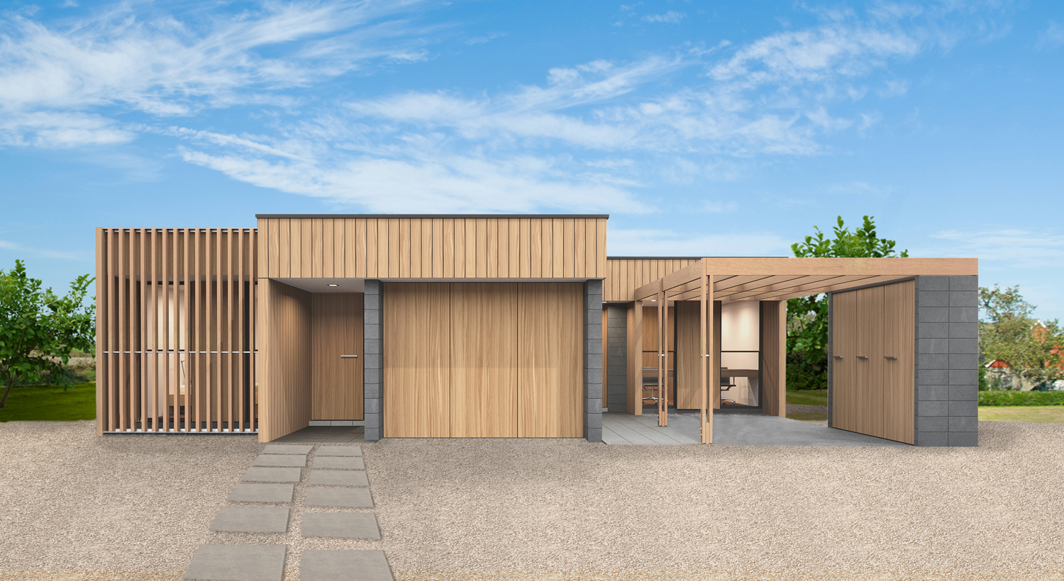
So a client has employed a local marketing company to help them. The marketing gurus suggested that rather than the range of B&W background images I've been producing, that all works should be in full colour for maximum impact. So this is then what they are running with!
Talk about people settling for crap!

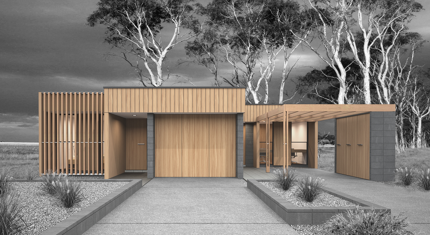
Original Render

-
Richard your original is Great! Did you make composite color/grey in PhotoShop?
-
Your original render is much better.

I can imagine that they thought the trees didn't match the surroundings where the house were to be built, but WHY did they change the foreground?
-
Changing the background was bad enough, but why remove the hard landscaping as well? Now there's nothing to place the building in its environment!
-
LOL Richard, I understand why they did that and I can totally relate to your feeling! People are basically scared of ideas and deep emotions. Been there too and hate it.
-
Hi Richard,
I find myself in situations like this too.
Marketing managers are usually numbers people. They will have some website heat map study or something like that, and will know that colourful ( more saturated, and with higher contrast) images will get more attention and presumably sell better.
I hate it and I cant do nothing about it. I view it as an architect as a problem, that needs solving. And communicate to the marketing people, that I need my work to by represented well. I cant risk my client to connect me with bad marketing or my project selling poorly, because its shown in a bad way.
For me the best argument how to get out of this situation is to prove that your solution is better than competition. -
The fact is that marketing solutions aim at markets and architectural solutions aim at people.
Architecture tries creating uniqueness, marketing is about massification.
You're on opposite sides!
-
Such a poor PS job too. Even I could've done that.
-
-

I feel for you, Richard.
-
Oh yes...
-
Are those marketing "gurus" college freshman? Their so-called improved rendering makes it appear lifeless. I'm surprised they didn't contact you and ask if you have a color version of your rendering.
There is one consolation: at least they only changed the setting, and not the design of the building.
-
Depressing Richard, happens to me a bit too. Just had a website destroyed by the company's accountant!
-
@bob james said:
Richard your original is Great! Did you make composite color/grey in PhotoShop?
Yes mate! The background was added as BW, all the foreground elements were masked and desaturated.
-
@pixero said:
Your original render is much better.

I can imagine that they thought the trees didn't match the surroundings where the house were to be built, but WHY did they change the foreground?
Mate the background was selected to maintain a theme of non urban environments. Yeah why they dropped out the foreground of driveways and bedding I truly don't understand.
-
@hieru said:
Changing the background was bad enough, but why remove the hard landscaping as well? Now there's nothing to place the building in its environment!
I agree mate, it has lost EVERYTHING!
-
@jql said:
LOL Richard, I understand why they did that and I can totally relate to your feeling! People are basically scared of ideas and deep emotions. Been there too and hate it.
Thanks mate, want to join me and cry in the corner?
-
While in general, your model looks far superior, I think what they were doing from a marketing viewpoint was adding the color. Having worked with some home builders in the past, they like the color. Especially if they are posting pictures in their sales office or marketing materials.
Even given that, why the heck the removed some of your landscaping details is beyond my understanding. I can certainly understand your dismay.
As for your work - WELL DONE.........
-
@jql said:
The fact is that marketing solutions aim at markets and architectural solutions aim at people.
Architecture tries creating uniqueness, marketing is about massification.
You're on opposite sides!
Weird though that then you get the other clients! I put this render done to support a planning application on the front page of a brochure and website. Told the client and marketing guys that as soon as I could I'd flip it out with a full colour version. And they wanted this one to stay!
They felt it was EDGY!

-
@dod3r said:
Hi Richard,
I find myself in situations like this too.
Marketing managers are usually numbers people. They will have some website heat map study or something like that, and will know that colourful ( more saturated, and with higher contrast) images will get more attention and presumably sell better.
I hate it and I cant do nothing about it. I view it as an architect as a problem, that needs solving. And communicate to the marketing people, that I need my work to by represented well. I cant risk my client to connect me with bad marketing or my project selling poorly, because its shown in a bad way.
For me the best argument how to get out of this situation is to prove that your solution is better than competition.This is exactly what is driving me crazy in this situation (actually pissing me off)! I did the design and render at a VERY low licensing fee with a royalty agreement on every one sold. Now I seriously don't see them selling any!
I guess we learn from our mistakes, I should have put a lot more conditions upon the agreement.
Hello! It looks like you're interested in this conversation, but you don't have an account yet.
Getting fed up of having to scroll through the same posts each visit? When you register for an account, you'll always come back to exactly where you were before, and choose to be notified of new replies (either via email, or push notification). You'll also be able to save bookmarks and upvote posts to show your appreciation to other community members.
With your input, this post could be even better 💗
Register LoginAdvertisement


