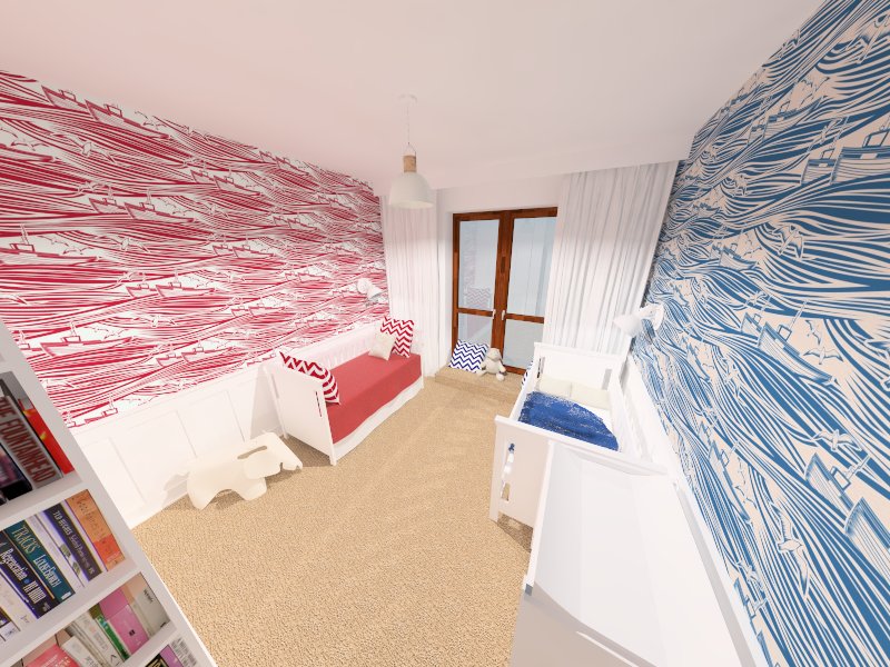
How to make my render more realistic with vray?
-
I have problems with my renders. All of them they don't look like photo at all. Does anyone know what is wrong with my settings?
There are 3 spot lights. On the ceiling:
intensity 25
Units : defaults
Spot Angle: 1,9
Penumbra angle 0,4
Decay Linear
Penumbra LinearAnd 2 sconces:
intensity 10
Units : defaults
Spot Angle: 1,8
Penumbra angle 0,3
Decay Linear
Penumbra LinearI tried so many different V-ray settings confused The ones on the photo attached are:
Camera:
Type - Default
Physical Camera On
Type - still camera
Shutter speed -100
F-number 11
Film speed - 100
Distortion - 0
Zoom Factor - 1,0
Lens -0Indirect Ilumination:
On
Refractive
Post- procesing:
Saturation - 1,0
Contrast base 0,5
Contrast 1,0
Multiplier 1,0 Irradiance Map
Sec Bounces
Multiplier 1,0 Light CacheIrradiance map
Min rate -3
max rate -2
HSph 50
Interp samples 20Clr 0,4
Nrm 0,3
Dist 0,1
iterp 2Light cache
Subdiv 800
Sample size 0,02
Scale Screen
Number of passes 0
Depth 100
Store direct light on
show calc phase on
min paths 16How to make the render look more realistic?

-
Just a couple of quick notes.
-
Your white is too white. There is no such thing as pure white material in the real world. Try making it slightly grey (RGB 210,210,210) or something like that.
-
The lighting is unnatural. If you want a realistic image use realistic lighting. Try finding an IES file that matches your fixture. That fixture would not produce an even bright light like that.
-
Good textures are -very- important. Try finding real world examples of the models you have in your scene and notice that even the white seat for example, would be probably constructed from wood and therefore even if it were painted it would have some little bumps and dents.
-
My last suggestion would be the camera angle. When I look at this image I feel as if I am viewing it through a security camera up in the corner of the room. Perhaps try lowering the camera a little to be more from a person's eye level.
Take these as constructive criticism only. You definitely have a good start here and the books in the book case look great to me.
Rob
-
-
There is no short answer to this. Most of us have worked hard at learning how to make the software do what we as artists need it to do to tell the story.
A realistic render will be the product of:
1 - a detailed accurate model
2- realistic lighting setup
3 - realistic materials
4- good camera and composition settingsA good start might be
http://sketchucation.com/shop/books/intermediate/1285-v-ray-for-sketchup -
Turning on Ambient Occlusion will help also! (in the indirect illumination settings)
I typically use .8 amount, 16 subdivs, and 8 radius.
-
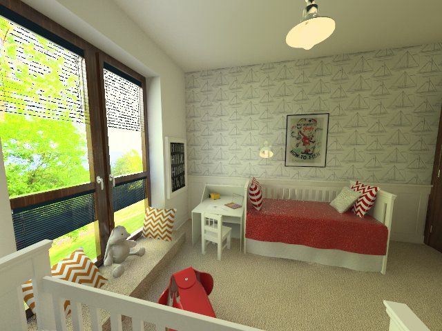
Thanks for all your advises.
I decided to add photo outside the window, but it made my render look really dark, so I've changed the setting of the camera to:
F-numer 8
Film speed 320
Shutter speed 30There are some new stuff on the model, but in general it is the same model as in the first post.
@rspierenburg:
Firstly I don't take your advises personally, they were really helpful
- I've change all the whites and used different shades for wall panels, furniture and paint. You were right, it looks so much better
- Downloaded and used in the model, although I don't see much difference. Maybe my settings are incorrect?
- I've added some bumps etc.
- Changed to 65
@tparks
It is on. Amount 0.6 Subdivs 12 Radius 30 - although I'm not sure if is it optimal.Render looks so much better now, but the shutters are overexposed. Environment is 1,0 for GI. Or maybe the fault is somewhere else?

Hello! It looks like you're interested in this conversation, but you don't have an account yet.
Getting fed up of having to scroll through the same posts each visit? When you register for an account, you'll always come back to exactly where you were before, and choose to be notified of new replies (either via email, or push notification). You'll also be able to save bookmarks and upvote posts to show your appreciation to other community members.
With your input, this post could be even better 💗
Register LoginAdvertisement


