Classroom
-
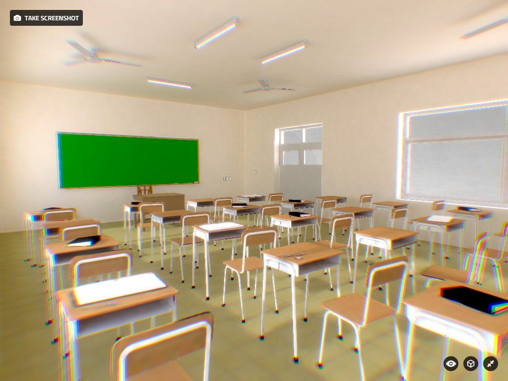
I made this college classroom uploaded to Sketchfab. I render texture maps in Blender for a touch of life and realism with lighting https://skfb.ly/DqYo

-
Pretty cool. Can you make it more detailed? Maybe you could add some students in there.
-
Maybe it's just my tired eyes, but it looks way out of focus to me. Almost like it's trying to be a 3D image or something (especially with the red and blue colors in lower right corner)
I even put on a pair of 3D glasses just in case, but nope, that's not it
-
@hellnbak said:
Maybe it's just my tired eyes, but it looks way out of focus to me. Almost like it's trying to be a 3D image or something (especially with the red and blue colors in lower right corner)
I even put on a pair of 3D glasses just in case, but nope, that's not it
I'm seeing the same thing.
-
Good start, but a few things to consider.
- As already mentioned, it's out of focus.
- To make it look more natural, move the chairs slightly, so they aren't all perfectly lined up.
- The separations between your doors and the transom above have disappeared. Probably because they were touching or separated just by a line, which would disappear in a rendering program. You have to either model these elements with a gap (and it helps to make the edges a darker color), or use textures that emphasize the edges.
-
Also you can add a map on a wall, a board with cosmic bodies or a board with human components to make it more like a class room. That depends on what kind of class room is it. P.S: Try to reduce the focus. The corners of the image are way too blurry. Reduce the number of the lights on the ceiling and the focus and you will have a perfect image! Cheers!
-
thanks for the advice, always good to try to see the details. The question of 3D blur is an effect of chromatic aberration enabled in Sketchfab I like XD. Again, thanks for the tips

Hello! It looks like you're interested in this conversation, but you don't have an account yet.
Getting fed up of having to scroll through the same posts each visit? When you register for an account, you'll always come back to exactly where you were before, and choose to be notified of new replies (either via email, or push notification). You'll also be able to save bookmarks and upvote posts to show your appreciation to other community members.
With your input, this post could be even better 💗
Register LoginAdvertisement


