Monochrome Floor Plans
-
Ok that didn't work.
-
Wow, you're going to town with all the framing and so forth. Nice little video.
-
@unknownuser said:
Personally I'm not a lover of plans attempting to gain that 3rd dimension. After all that is what they are, a PLAN!
Totally agree with Richard.
The same for 2d sections of a 3d model. Why obtaining plans and sections from a 3d model? Shouldn't be the opposite? Both plans and sections are "symbolic"and "conventional" representations and not "real". They have representation rules that are not close to reality and should give much information as possible in a clear way. An example: plans and sections must always show at least a door and a window for every room even if there is no window or door in the point of the cut. -
@massimo said:
@unknownuser said:
Personally I'm not a lover of plans attempting to gain that 3rd dimension. After all that is what they are, a PLAN!
Totally agree with Richard.
The same for 2d sections of a 3d model. Why obtaining plans and sections from a 3d model? Shouldn't be the opposite? Both plans and sections are "symbolic"and "conventional" representations and not "real". They have representation rules that are not close to reality and should give much information as possible in a clear way. An example: plans and sections must always show at least a door and a window for every room even if there is no window or door in the point of the cut.Hope this isn't to abrupt but I say nonsense. It's time to let go of those old ways of thinking and working and the tools available demand it of us.
-
@ccaponigro said:
@massimo said:
@unknownuser said:
Personally I'm not a lover of plans attempting to gain that 3rd dimension. After all that is what they are, a PLAN!
Totally agree with Richard.
The same for 2d sections of a 3d model. Why obtaining plans and sections from a 3d model? Shouldn't be the opposite? Both plans and sections are "symbolic"and "conventional" representations and not "real". They have representation rules that are not close to reality and should give much information as possible in a clear way. An example: plans and sections must always show at least a door and a window for every room even if there is no window or door in the point of the cut.Hope this isn't to abrupt but I say nonsense. It's time to let go of those old ways of thinking and working and the tools available demand it of us.
Call it nonsense if you like. I don't mind. The concept is that a plan or a section done with whatever you like and in whatever way you like, should be clear and respect some rules. If not, you'll have some useless graphic more or less pleasant depending on your ability.
-
"plans and sections must always show at least a door and a window for every room even if there is no window or door in the point of the cut."
That's news to me. In all my years (decades, now) of architectural drawing, I've never heard that rule. I've never drawn a section through something that the section line didn't pass through; Doing otherwise would be confusing. I have, however, jogged the section line. Unless unavoidable, I tend to miss on purpose interior doors - I'll have separate door type and door detail drawings anyway. At the right scale and the right amount of detail, sections can be very real (well, as real as a drawing can be). If a person models something complete enough to derive their section from it, more power to 'em; why recreate something twice? Any way someone can save time and effort by incorporating SU into their work flow is a plus.
-
@unknownuser said:
I have, however, jogged the section line.
Yes that is what I meant. Most of the time you can not work with straight section planes since you have to place the cuts on openings.
@unknownuser said:
At the right scale and the right amount of detail... If a person models something complete enough to derive their section from it, more power to 'em; why recreate something twice?
This is indeed the problem. Look at ccaponigro's plans for example. He probably modeled the windows very well and quite detailed. The result is that they seem walls at that scale. Also, for example, indicating the axes of openings/glass panels really would help to understand.
I still think that 2d drawings (plans & sections basically) and 3d representations should tell different stories and require different approaches. An example: as you surely know there are several "conventions" to represent the stairs in plans. Just to name one: the steps can not end against a wall. That's mainly because you have to tell to the viewer how he will move into the building. Another one: often is useful in plans to indicate with dashed lines what is above the section cut or under the floor. I could go on forever.
You simply can't do those things just by cutting a 3d model.Maybe I indeed have an "old way of thinking" like ccaponigro said, but after all I grew up with a pencil and not a mouse in my hand.
-
First things first. I am enjoying this thread and the friendly and constructive discourse. The first plans where more for presentation and are in their infancy. Trust me the construction document version would be much cleaner with no shadows etc. And I'm working on things like line weight. I am also working on the sections. My only goal here is to dismiss the idea that you can't have offset sections.
As a matter of fact plan views are in fact horizontal sections and have always been. I too held a pencil and am a classically trained draftsman.
Anyway it's quite simple you create two sections in SU import to layout, clip and align and bingo. If you look at the second floor plan I used a similar technic to keep the lower roofs from being cut. I simply used a section cut higher hide what I didn't want and placed it over the second floor plan (horizontal section).
PS add to wish list backside clipping.
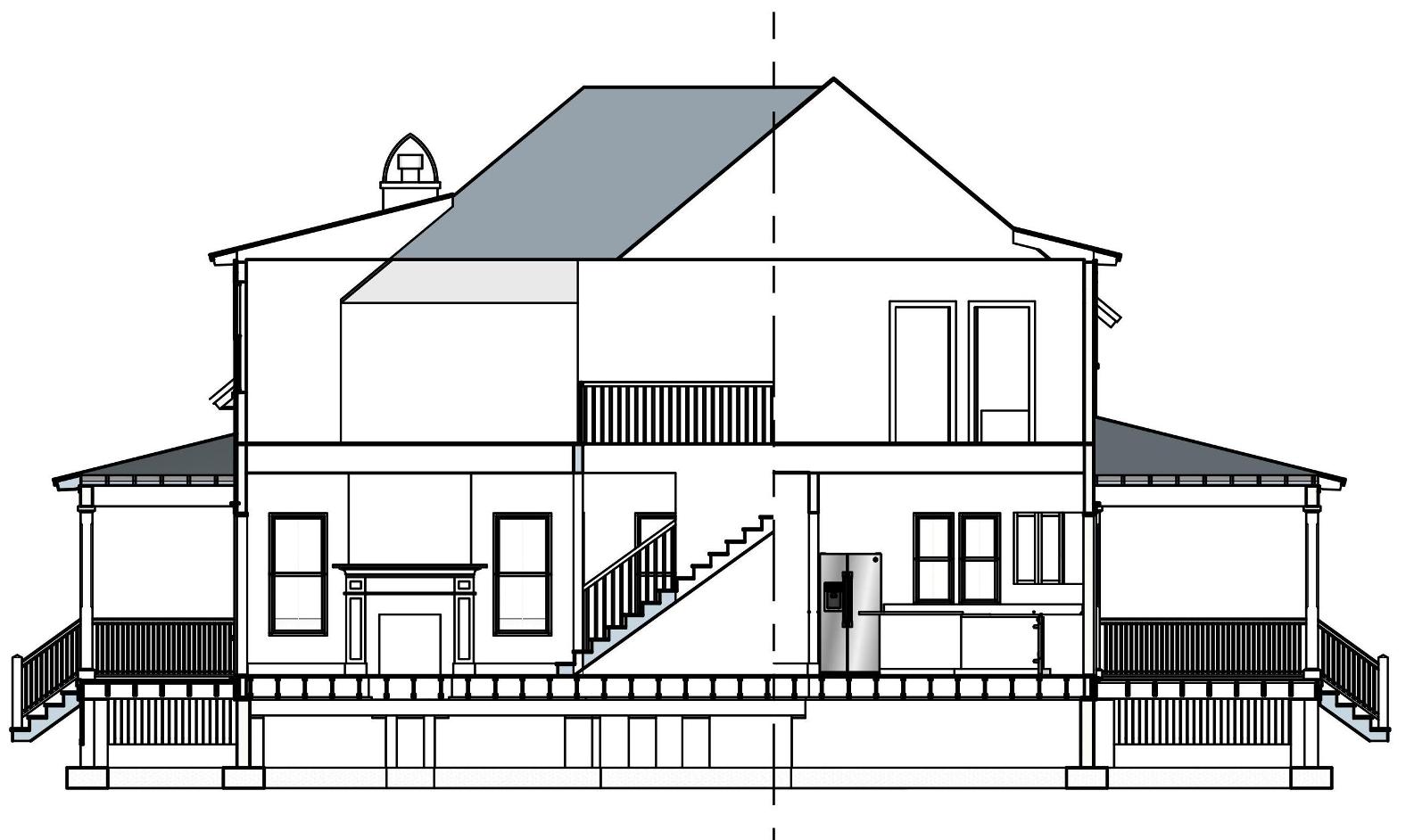
-
Yes with enough information the 3d model can generate orthograhic images as needed. Rendered sections and elevations actually can be quite informative for the feel of a space, if not the details for construction. I find that plans are more symbolic than representational and still find 2d approach is the straighter path to a finished product. Sections are similar for me, but mostly because I don't usually complete the model to show enough detail. I sometimes use the model cut image (dwg) to begin drawing the section.
-
@ccaponigro said:
Trust me the construction document version would be much cleaner with no shadows etc.
I think you hit it on the head!!!! "construction document version would be much cleaner with no shadows". So let me get this right? For the construction guys (who read plans every day) you will make the plans clearer. But for the buyer (who rarely reads a plan) you are going to make the plan less legible? Hmmm!
@ccaponigro said:
Hope this isn't to abrupt but I say nonsense. It's time to let go of those old ways of thinking and working and the tools available demand it of us.
I said this before, it is only those new too these tools adapting their use to this style of presentation. If you ever correspond with a high end architectural publisher their guidelines will clearly state that all plans must be clear B&W linework with no shadows - why? For clear legibility.
Do some searching around the internet, you will find 3D or shadowed plans used "only" by the very low end of the market, with the exception of where in print material the plan might occur on the same page as full colour renders or photographs, and even in this instance it will be for sales, not in the demonstration of the design. AND even if presented this way they the shadows will be added via illustrator so as to have far better softness control. Big Heavy shadows and colour visually reduce room size, this is the VERY last thing a marketeer wants!
Also shadows (not so much colour) tend to reduce the viewers ability to recognise rationalisation of the planning (alignment and justification of doors, windows and walls) that the architect has achieved to create harmony and calm rather than chaos and discourse. The reader will unconsciously pick this up in the simplicity or READ! Without it the reader is left hunting. The result is that the reader is less appreciative of these attributes.
-
Advertisement