Monochrome Floor Plans
-
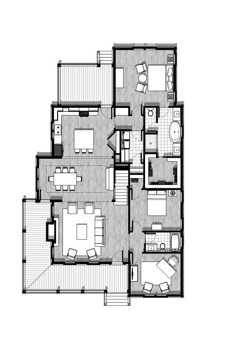
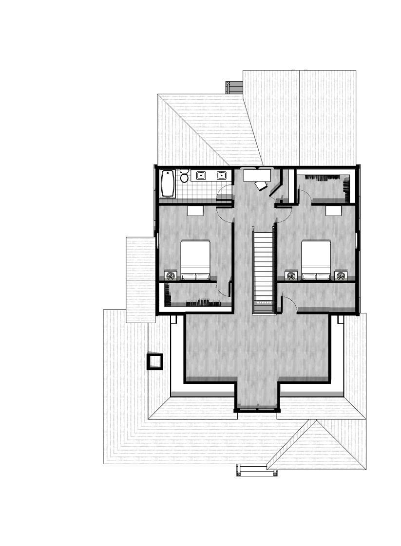
I know there is a lot of emphasis on rendering but I ultimately want to produce some very professional looking plans with sketchup and layout alone. So I thought I would share what I have so far. What do you think?


-
i think its great...
just a personal preference, i like it better in color thoughevery oportunity i get with a more relaxed client, i present the plans in Sketchup + Illustrator, but layout works just as well
im always trying to run away from AutoCAD, lol -
Very nice. A touch of color is nice but too much takes more time to manage and make presentable / coordinate with format and printing etc.
I like this. It looks a tiny bit blurry. That could be the reproduction here or the floor material. I think a flat gray would work just as well. Have you looked at Sonder's an Bmikes work?
-
Thanks for the feedback! Sonder inspired me to believe I could break the Autodesk chains. I really like what BMike is doing too. I know I have a lot to learn before I can produce the type of models Sonder is creating. if I could produce smart door,window,area, and room finish schedules I'd be home free. Getting ready to take a hard look at Pluspec. There are numerous people I need to thank for helping me get this far but that's for another post.
-
Very nice... ccaponigro
-
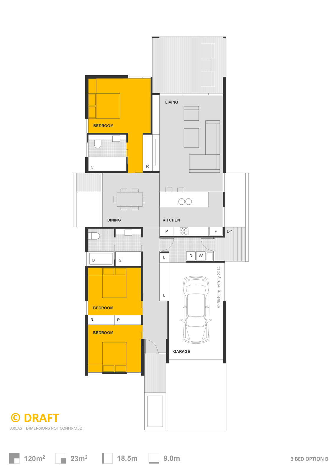
Here's one great color example from Richard: http://sketchucation.com/forums/viewtopic.php?f=81%26amp;t=46974%26amp;p=421541#p419882
-
Another comment if you find it helpful: the windows don't stand out very well. Somehow they look thick and dark. It would be nice if they looked more "open" in conrast with the walls.
Cotty, Richard's example is done totally in LayOut. No SketchUp. They're nice too.
-
@pbacot said:
Cotty, Richard's example is done totally in LayOut. No SketchUp. They're nice too.
Yes, but since ccaponigro has the PRO version too, it might be an option...
-
I think it is very good. I don't like too saturated color plans for they distracting ones attention on what is important. This is plain and simple. If adding color, just subtle water color (transparent and pastel colors) touches would be enough.
-
Thanks to all of you for taking time to comment.
@ cotty monochrome is the point. I started with color and clients take it to literally and my builder clients prefer monochrome as well. I also think each of us is trying to portray the information in our own unique way which becomes a kind of signature style. Thanks for the input!
@ pbacot I get what your saying about the windows they are very detailed models coming out of Anderson Window Studio plugin and the combination of that and Skalp fills is giving me to much black line weight. I'm going to work on that. I am striving for output with very little work in layout and no post processing at all. And I think your right the floor texture is to much and gets distorted easily.
@ srx Thanks I think you get what I'm going for.
-
@ccaponigro said:
.... What do you think?
What do I think? I think they look great. If you angled the shadows, say at 45 degress, and lightened them some, I might even say they look fantastic.

-
Mate I think everyone covered the points I'd raise. But I'll throw them up again, shadows are a bit dark and the windows are, as Peter suggests, too detailed to break from the walls.
Personally I'm not a lover of plans attempting to gain that 3rd dimension. After all that is what they are, a PLAN! One of the things I find when shadows are cast is the closure of the space. I think it is essential to furnish a plan to allow the reader to recognise function quickly, and to see how spaces and circulation have been addressed. However casting shadow from furniture makes it difficult for the reader to differentiate built in from furnished.
One other thing about shadows is when it comes to printing, nice clean linework from vector is lost and all becomes hazy!
Peter is right that the floor plan Cotty linked to is done direct in Layout. Again I don't like this style of representation AT ALL! It was a clients demand and for a sign! Plus the shadows are added via Indesign so to keep the file as a vector for clean reproduction.
I think in the end we have to balance our desire of want to showcase our skill v's that of what is most legible for the reader!
As far as colour goes or even that of greyscale. I do like the use of colour to allow quick recognition of room function. Though again would reiterate that solid furnishing will visually diminish the size of spaces.
This style of plan is probably my preference for ease of reading. Remember that although many of us can read your great work, we've all had YEARS of experience at reading plans! The random viewer may not! BTW this is developed directly in Layout, actually I use layout for all design planning not just the presentation. I know many would find the double dealing of doing up a separate works in layout just for the presentation as time wasted, but to trace your plan in LayOut might take 30 min.

-
I'm obsessed with this program. I would almost do it for free. Let's keep that just between us.
-
Ok that didn't work.
-
Wow, you're going to town with all the framing and so forth. Nice little video.
-
@unknownuser said:
Personally I'm not a lover of plans attempting to gain that 3rd dimension. After all that is what they are, a PLAN!
Totally agree with Richard.
The same for 2d sections of a 3d model. Why obtaining plans and sections from a 3d model? Shouldn't be the opposite? Both plans and sections are "symbolic"and "conventional" representations and not "real". They have representation rules that are not close to reality and should give much information as possible in a clear way. An example: plans and sections must always show at least a door and a window for every room even if there is no window or door in the point of the cut. -
@massimo said:
@unknownuser said:
Personally I'm not a lover of plans attempting to gain that 3rd dimension. After all that is what they are, a PLAN!
Totally agree with Richard.
The same for 2d sections of a 3d model. Why obtaining plans and sections from a 3d model? Shouldn't be the opposite? Both plans and sections are "symbolic"and "conventional" representations and not "real". They have representation rules that are not close to reality and should give much information as possible in a clear way. An example: plans and sections must always show at least a door and a window for every room even if there is no window or door in the point of the cut.Hope this isn't to abrupt but I say nonsense. It's time to let go of those old ways of thinking and working and the tools available demand it of us.
-
@ccaponigro said:
@massimo said:
@unknownuser said:
Personally I'm not a lover of plans attempting to gain that 3rd dimension. After all that is what they are, a PLAN!
Totally agree with Richard.
The same for 2d sections of a 3d model. Why obtaining plans and sections from a 3d model? Shouldn't be the opposite? Both plans and sections are "symbolic"and "conventional" representations and not "real". They have representation rules that are not close to reality and should give much information as possible in a clear way. An example: plans and sections must always show at least a door and a window for every room even if there is no window or door in the point of the cut.Hope this isn't to abrupt but I say nonsense. It's time to let go of those old ways of thinking and working and the tools available demand it of us.
Call it nonsense if you like. I don't mind. The concept is that a plan or a section done with whatever you like and in whatever way you like, should be clear and respect some rules. If not, you'll have some useless graphic more or less pleasant depending on your ability.
-
"plans and sections must always show at least a door and a window for every room even if there is no window or door in the point of the cut."
That's news to me. In all my years (decades, now) of architectural drawing, I've never heard that rule. I've never drawn a section through something that the section line didn't pass through; Doing otherwise would be confusing. I have, however, jogged the section line. Unless unavoidable, I tend to miss on purpose interior doors - I'll have separate door type and door detail drawings anyway. At the right scale and the right amount of detail, sections can be very real (well, as real as a drawing can be). If a person models something complete enough to derive their section from it, more power to 'em; why recreate something twice? Any way someone can save time and effort by incorporating SU into their work flow is a plus.
-
@unknownuser said:
I have, however, jogged the section line.
Yes that is what I meant. Most of the time you can not work with straight section planes since you have to place the cuts on openings.
@unknownuser said:
At the right scale and the right amount of detail... If a person models something complete enough to derive their section from it, more power to 'em; why recreate something twice?
This is indeed the problem. Look at ccaponigro's plans for example. He probably modeled the windows very well and quite detailed. The result is that they seem walls at that scale. Also, for example, indicating the axes of openings/glass panels really would help to understand.
I still think that 2d drawings (plans & sections basically) and 3d representations should tell different stories and require different approaches. An example: as you surely know there are several "conventions" to represent the stairs in plans. Just to name one: the steps can not end against a wall. That's mainly because you have to tell to the viewer how he will move into the building. Another one: often is useful in plans to indicate with dashed lines what is above the section cut or under the floor. I could go on forever.
You simply can't do those things just by cutting a 3d model.Maybe I indeed have an "old way of thinking" like ccaponigro said, but after all I grew up with a pencil and not a mouse in my hand.

Hello! It looks like you're interested in this conversation, but you don't have an account yet.
Getting fed up of having to scroll through the same posts each visit? When you register for an account, you'll always come back to exactly where you were before, and choose to be notified of new replies (either via email, or push notification). You'll also be able to save bookmarks and upvote posts to show your appreciation to other community members.
With your input, this post could be even better 💗
Register LoginAdvertisement


