Hoverbike test
-
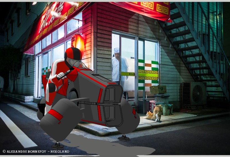
Just goofing around here using the watermark background effect.
 (found the background on-line. Credit on bottom left.)

-

-
Looking great Bryan, a little reflection on the Bike/Biker and you've cracked it. The proportions look spot on.
John
-
@tadema said:
Looking great Bryan, a little reflection on the Bike/Biker and you've cracked it. The proportions look spot on.
John
Thanks John. I'm testing backgrounds for the final render.
Thanks Carsten!
I wasn't going to post this, but it looked so much like anime' without doing anything other than positioning and proportioning, I just couldn't resist.
Could have used a headlight beam, though. Too bad I don't know where I'm going to put the headlight yet.

-
Looks great. Why bother with a full render? Just add some reflections in PS.
-
@pbacot said:
Looks great. Why bother with a full render? Just add some reflections in PS.
Thanks. That's a good idea. I do like the anime' style.
I'll probably do both.
-
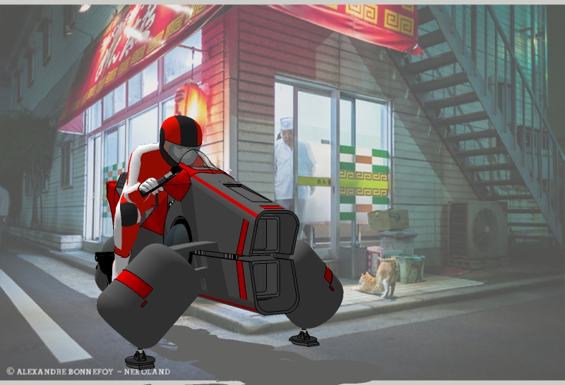
Background adjustment of fog as suggested by Raylectron from Google SketchUp groups.
Made by adjusting watermark to "Blend" and slightly lowering the setting. Actual "Fog" does not work with watermarks.

-
maybe rethink the landing gear(?) prior to rendering?
they seem sort of generic when compared to the styling of the bike.. (fragile looking too) -
@jeff hammond said:
maybe rethink the landing gear(?) prior to rendering?
they seem sort of generic when compared to the styling of the bike.. (fragile looking too)I'll will be changing the landing pads, adding headlights and rear view mirrors.

-
cool. curious to see what you come up with.
-
Thanks Jeff. Still WIP.

-
Cool, I'll take two please.
-
-
Great job !

-
-
Tron revival!

-
Thanks pilou!
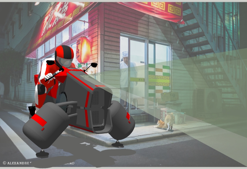
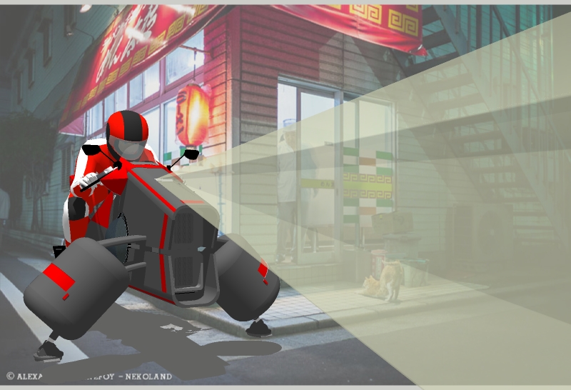
This is the final update with the reworked landing gear. I am also going to try an animation of this scene and then a studio render.
I will send the model to anyone who would like to render it. Just PM me.

-
Very cool, Brian.


One order of General Tso's Chicken, to go, please.


A couple of suggestions if I may:
1- The fog/atmospheric perspective: the effect of the fog is stronger in the distance/background and less as you get closer to the foreground. The corner of the building and the ground right under the Hoverbike as well as the shadow of the hoverbike should be darker.
2- The beam light: if this is the style of render you want, then disregard my comment. But if you are interested in rendering a more realistic effect, I would suggest the edges to be softer and the light should fade as it gets farther away.
Photoshop tips:
-
Use a mask layer to make fog/light beam fade. Click on the "Add layer mask" next to fx in the Layers window. Use Gradient Tool or Brush to add black and dark grey in the areas where you want the fade effect.
-
To make edges of light beam softer, create the shape of your beam with the Polygonal Lasso Tool and go to Select -> Modify -> Feather. Play around with the numbers to see what works best. Use the technique above to make it fade.
Google "beam light" and "fog" or "atmospheric perspective" to see examples, and there are tons of them online.
Hope this helps. Keep it up!
Have a great weekend!
_KN
-
-
Thanks Ken. All great suggestions and you are exactly right about the lighting and atmospherics.

What you see right now was all done in SketchUp. I was testing the limits of SU. Here's what I did:
- The background is a watermark. WM is set as "background" and not "overlay"
- the fog isn't really fog, it's just the blend slider on the WM setting. Fog doesn't work with watermarks.
- The WM is what makes the bike shadow "off"
- the light beam is a rather dodgy square cone with transparent material

- the shadows really don't match quite right with the background due to SU's lighting limitations (I tried to pick a picture that was somewhat ambiguous for this reason)
So yes, it definitely needs more work and I will eventually make the changes.
 This is my first experiment with backgrounds in SU. My first tries always look a little wonky.
Again, thanks Ken. That is a very clear step by step process and I will have to try it. I have some other ideas as well that fit with the animation.
Hello! It looks like you're interested in this conversation, but you don't have an account yet.
Getting fed up of having to scroll through the same posts each visit? When you register for an account, you'll always come back to exactly where you were before, and choose to be notified of new replies (either via email, or push notification). You'll also be able to save bookmarks and upvote posts to show your appreciation to other community members.
With your input, this post could be even better 💗
Register LoginAdvertisement


