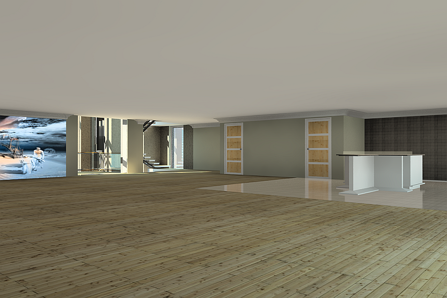
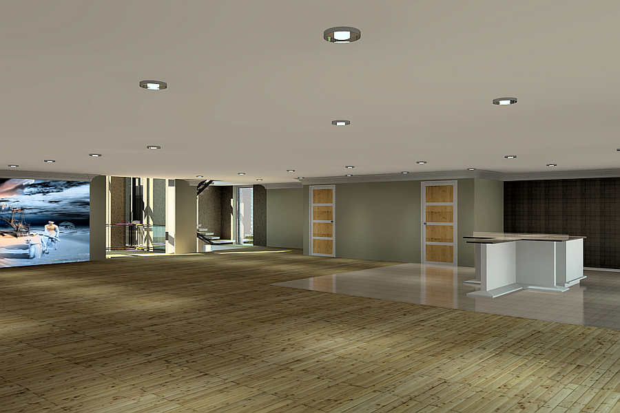
Open plan residence, first floor.
-
A modern home on three or more levels. Ground level has an entry area and garage, second level is the kitchen/dining/living area and the third level is bedrooms and bathrooms.
The view below is from a corner looking towards the entry lift and stairs, the kitchen on the right and toilet, larder behind the two bi/textured doors. I have the coving in place but not the skirting boards and the lift shaft doors are also absent, the lift itself is an open lift while the shaft itself has inset windows for light.
The idea is to have a moderately sized home that would suit someone in a professional job who does a moderate amount of entertaining. No kitchen equipment yet, I have not made it so far. everything bar the textures is a home build.

-
Lights initial plus adjustment in Irfanview for saturation and sharpness.

-
Looking good!
-
Ta mate, I know I am missing things like dirt maps etc as well as sub surface scattering but Renditioner cannot do those as yet.
-
Mate it's looking like a VERY big open plan area, in fact so big I'd worry about a lack of intimacy.
For one I'd probably consider a drop ceiling in the kitchen area, kitchen that are too integrated into a living space, for me, become just part of the furniture, and an unwelcomed part. You need some physical feature to break up and define uses. I'd maybe even consider this is other sections of the space, ie: the ceiling reflecting the definition of the spaces.
-
The whole thing is ongoing and very much a wip but thanks very much for those crits, very helpful. My thoughts on the kitchen included that drop down ceiling to include a screen that would be linked to the smoke alarm and would drop down in the event of a fire. I had thought of various different heights to the ceiling but am tied down at the moment and do not have much time. Very much a thought on what I would like tbh.
-
What about a half wall with a breakfast bar to separate the kitchen from the living space? still keeps the open feel, while giving separation from the two spaces.
-
Nice rendering. The ceiling height looks low for such a large space.
-
I think its just how we perceive the picture with no reference objects to go off of. If you try and imagine a person standing next to the counter it seems to help. I think because it is a WIP that without anything in the space it seems to feel cramped in there surprisingly.
-
I'd agree on the ceiling height (low) if that is a counter height over on the right. But until the design is filled out more, who's to say for sure?
Good work! Looking forward to seeing more WIP!
-
Thanks for the replies, the breakfast bar is taken car of and the ceiling height is 8' so not low at all. I think the large open space gives an illusion of a low ceiling. There will be a lower ceiling for the kitchen breakfast bar area which will have a fireproof screen. I am looking into the idea of a glass display case of some kind to break up the rest of the area so far undesignated.
-
Mike, that is what I meant by the ceiling too low. Although 8' sounds like a decent ceiling height, and may work functionally, in such a large space it will FEEL lower.
-
In the US, 9-10ft ceilings are now considered the norm because of the prevalence of open floor plan designs, with 8ft heights being used for 2nd (and sometimes even 1st floor) floor bedroom areas.
-
Thanks guys, I missed the point you made earlier but thanks for the heads up. Being used to 7' or lower ceilings in the UK I sometimes miss things like that. I suppose the increase in general population height means I have to catch up a bit. A bit confusing to have to think of closing a single space down but open it up at the same time. I will get it in the end.
-
7' in the UK really? Holy Crap, that would feel like living in a shoe box on side of road and eating cold gravel for breakfast! WOW!!!!
8' (2.4m) is minimum required here in Australia. There is a tendency toward 9' (2.7m) where costs permit. One trick I use a lot, as plasterboard sheets come as 1.2m (2.4m / 2) or 1.35m (2.7m / 2) I use a 1.2m plus a 1.35m sheet giving 2.55m. As the two standard heights are 2.4/2.7 the viewer / buyer assumes the ceiling is 2.7m yet the total cost saving over the building footprint is significant eg 2 brick courses across all walls.
One has to imagine when standing, the height of a room is perceived as that which is above eye height. Thus even a 6" increase is judged as visually significant.
For me anything beyond 9' (2.7m) is actually starting to lose intimacy and human scale (in a home). Easily felt when standing on a balcony. If the balcony is not covered it feels somewhat alien and uncomfortable. Once it has some sort of enclosure above, even if just false work (pergola) we feel more relaxed, secure, less intimidated.
-
For me, it's about the proportions of the space and how it feels. My house is small, so the 8' ceilings seem normal, comfortable. But I have been in some large spaces with 8' ceilings, and it felt like the ceiling was pressing down on me.
-
well SOMETIMES the gravel is warmed over, a bit.......
-
Hello Mike, looking good
 your modelling/renderings coming on in leaps and bounds.
John
-
Cheers John, getting some good textures helps a lot, limited otherwise.
Hello! It looks like you're interested in this conversation, but you don't have an account yet.
Getting fed up of having to scroll through the same posts each visit? When you register for an account, you'll always come back to exactly where you were before, and choose to be notified of new replies (either via email, or push notification). You'll also be able to save bookmarks and upvote posts to show your appreciation to other community members.
With your input, this post could be even better 💗
Register LoginAdvertisement


