Nursing home renovation and expansion
-
Some might already have seen this at the Thea forum but I figured I'd post it here as well.
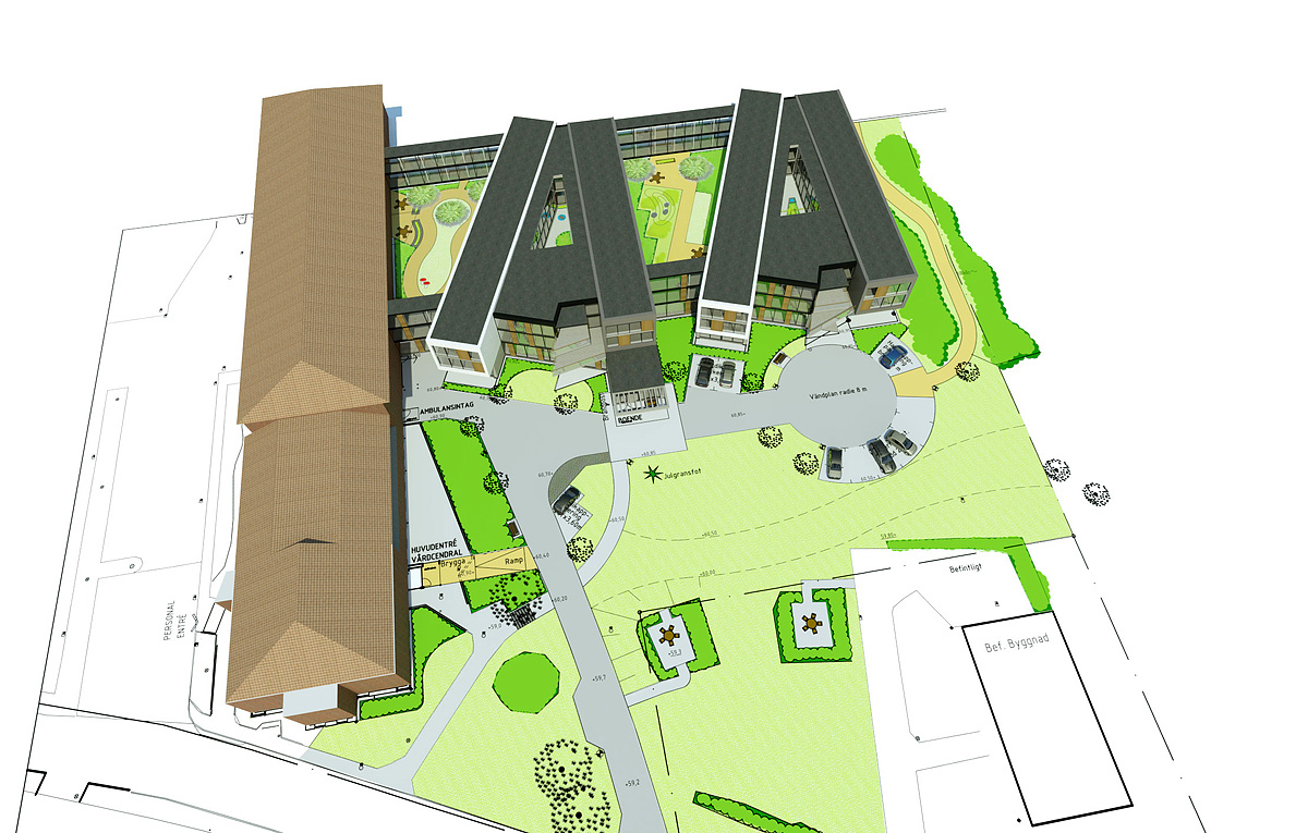
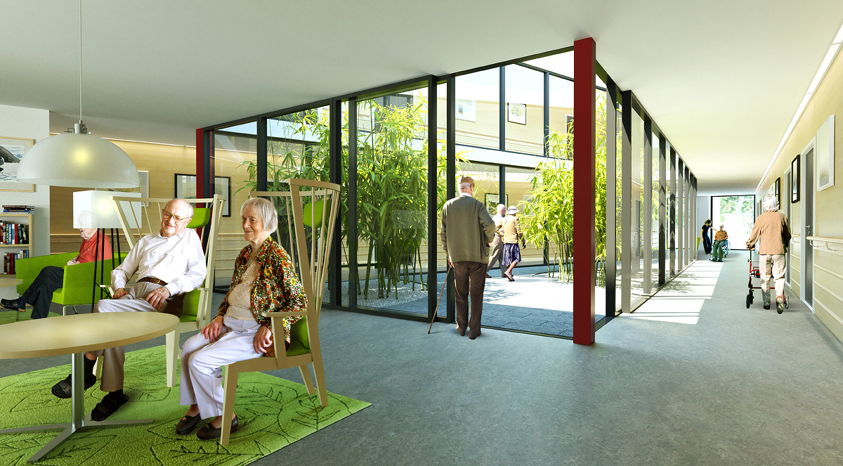
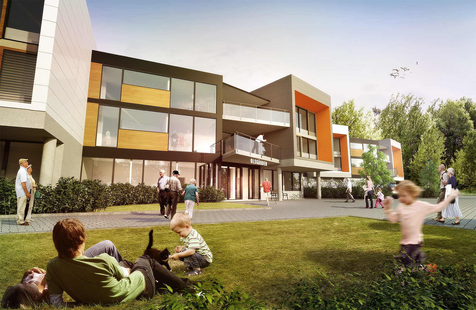
These are some images I made recently of a renovation/expansion project for a nursing home.
The posted images are down sized. Original images are 5000 pixels wide.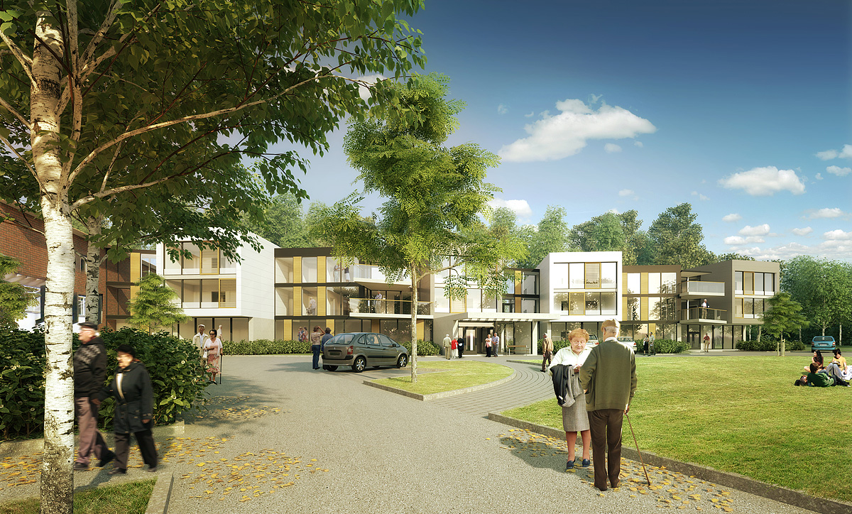
-
snygga bilder! very nice images pixero... is that a 3D tree on foreground on first image???
great job!!!best
V -
Tack!
Thanks!
Yes that is a 3d tree Birch model downloadable to registred users of Thea render. -
Very nice!
Two little hints:- your pensioners are very fast when they cause motion blur at sunlight

- The sitting man got to much light (image 3)
- your pensioners are very fast when they cause motion blur at sunlight
-
@cotty said:
- your pensioners are very fast when they cause motion blur at sunlight

Yeah, they are out training for the olympics...

@cotty said:
- The sitting man got to much light (image 3)
Hard to find images of people that exactly match the lighting, or maybe it's the woman next to him that really shines in his company.

- your pensioners are very fast when they cause motion blur at sunlight
-
Excellent stuff, your client must be thrilled.
-
Hi Jan,
Can we add this to the Gallery?
Great post processing on the grass
-
@rich o brien said:
Hi Jan,
Can we add this to the Gallery?
Great post processing on the grass
Absolutely!
Thanks, at the Thea forum I got the response:
"This is some of the most realistic grass I've seen."
Given it's postwork in Photoshop I find it funny that so much interest is put on how to do everything in 3d when a quick Photoshop job does it as good or maybe even better.
-
Good job Pixero I like the 1st 2 images. Thea looks like a force to be reckoned with !
-
Wow! That's VERY good.

I too hope your client is very happy. They should be.
-
Does the "Double A" on top view a formalism alphabetic concept or pure random form / function ?
-
Very nice, Jan.
If they are anything like the retirees in the retirement home in my neighborhood, half of them will be in power scooters, terrorizing pedestrians. -
Looking fantastic.
I see from the aerial view the buildings look like two "A's", what does that mean? Advanced Aged?
-
@solo said:
Looking fantastic.
I see from the aerial view the buildings look like two "A's", what does that mean? Advanced Aged?
Thanks!
The "A" shape doesn't mean anything. It's just that the long buildings are the residents rooms and the "horizontal" part is the social areas with TV-room and kitchen.
As seen in the interior image they can walk around the inner garden through the corridors. -
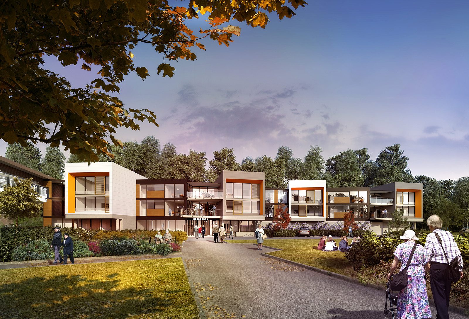
A few new renders after some redesign. Original render was 6440x4200 pixels.
Hello! It looks like you're interested in this conversation, but you don't have an account yet.
Getting fed up of having to scroll through the same posts each visit? When you register for an account, you'll always come back to exactly where you were before, and choose to be notified of new replies (either via email, or push notification). You'll also be able to save bookmarks and upvote posts to show your appreciation to other community members.
With your input, this post could be even better 💗
Register LoginAdvertisement


