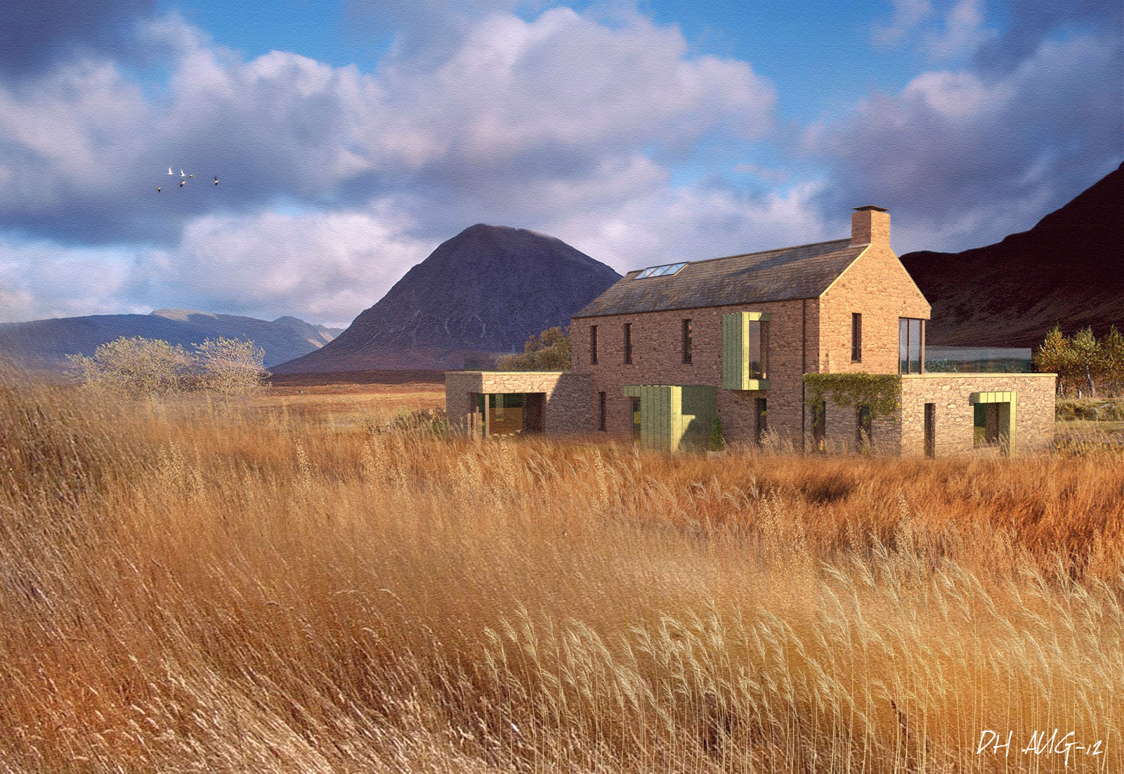
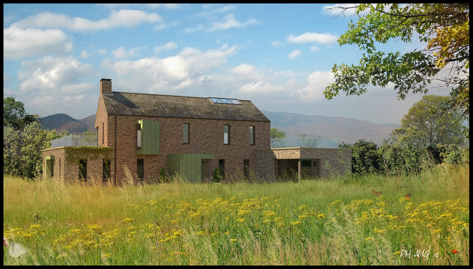
2 Fields,2 different moods
-
2 different images with hugely contrasting colour tones.The first is predominantly gold,red and purple,the second greens and blues.
The first image has a lot of layers for the grass to try and build up a sense of density and heavyness of windblown grass.
The second has less layering and a lot more transparency between the layers to get a more lighter feel to the vegetation.I also added some sublte red tones to the sky in the first image to reflect the colours of the golden grass below.
-
my heart always makes a jump when i see that there's a new thread by you!

they're both fantastic in their own way. if i had to buy just one of them i would go for the first, as the perspective shows more the wideness of the countryside. -
You are my grass teacher. Very nice.
-
Beautiful job, can almost see that grass swaying.
-
Wow. Love the first image. (The second one is really good too.)
-
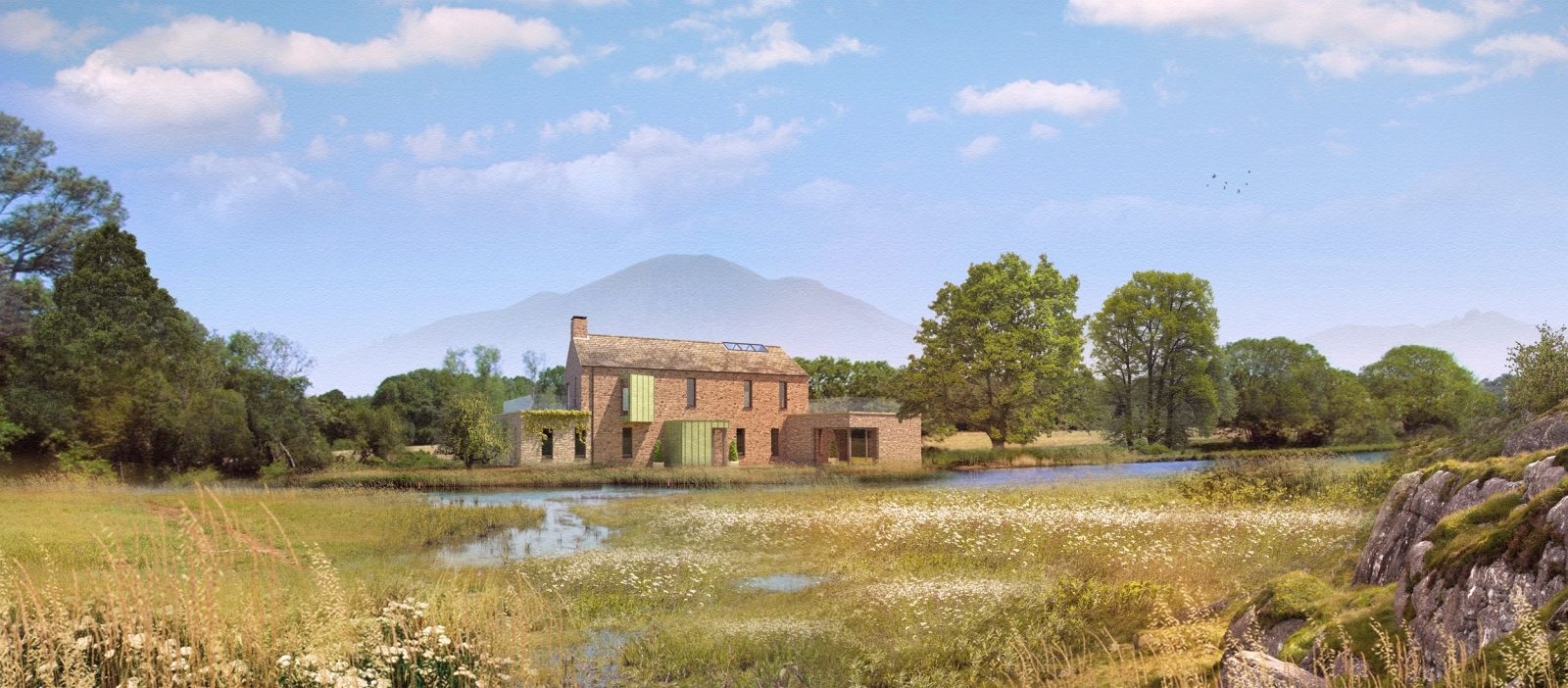
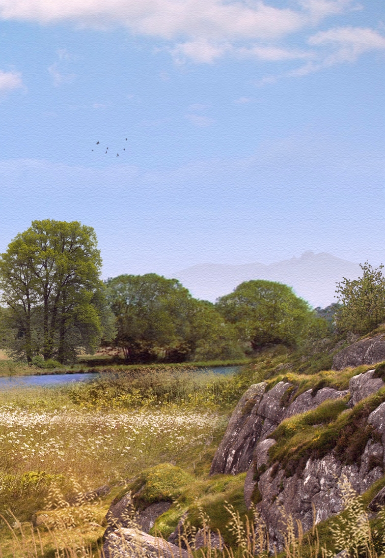
One more with a larger expanse of landscape.I have also attached a cropped part to show the detail as this was reduced in size for the forum.
-
Looks great. You can almost feel the atmosphere.
-
These are fantastic! I wish I could understand how somebody does this kind of work in SU. Architecture doesn't really interest me but nature does, and if I could create something even remotely close to your work I would be happily busy for the rest of my life.

-
stunning!
Hello! It looks like you're interested in this conversation, but you don't have an account yet.
Getting fed up of having to scroll through the same posts each visit? When you register for an account, you'll always come back to exactly where you were before, and choose to be notified of new replies (either via email, or push notification). You'll also be able to save bookmarks and upvote posts to show your appreciation to other community members.
With your input, this post could be even better 💗
Register Login


Advertisement