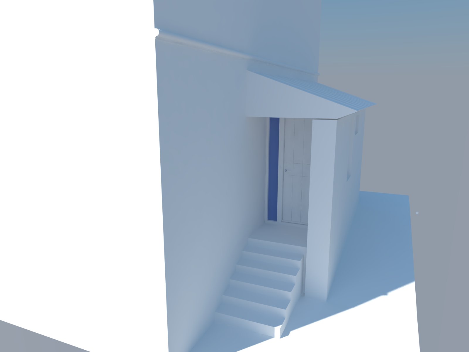
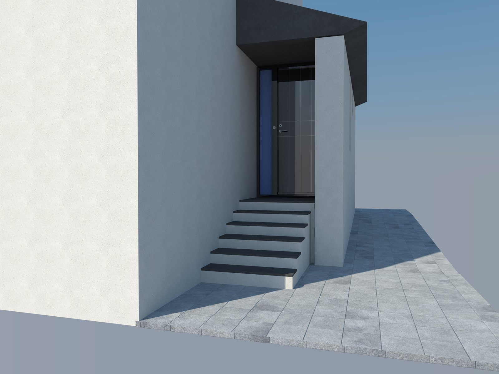
House Entrance Images
-
Hi guys
I am new here at SketchUcation and I am also realatively new at using SketchUp and Vray..
I think the colours of my rendering is quite off and I can't seem to get it right, it is too shiny and doesn't look real at all.
Btw the gap between the roof and the big wall is on purpose.Anyway here is some examples of my latest work.


-
Anyone?
-
@amalskaer said:
Anyone?
Well, at this stage (and seeing your question/problem), you probably did not post it to show off in the Gallery.
I don't know if you discovered but we have a V-ray subforum under the Extensions forum...
If you wish, I can move the topic there. -
@gaieus said:
@amalskaer said:
Anyone?
Well, at this stage (and seeing your question/problem), you probably did not post it to show off in the Gallery.
I don't know if you discovered but we have a V-ray subforum under the Extensions forum...
If you wish, I can move the topic there.Oh, sorry I didn't knew there was a subforum about this.
Yes I would appreciate if you'd move this topic.Thank you sir.
Cheers
-
amalskaer,
seeing as you haven't gotten any responses, I'll try to jump in even though I'm not an expert. First, just some clarification: are you talking about the generally blue hue of everything? That is caused by using the physical sky. If you don't already have it bookmarked, search for Vray for Sketchup manual. There is a very informative section about the physical sky and the settings. Another option would be to use an HDRI for lighting and reflections. Then you can choose a sky with a little more color in it.
The other question I have for you: what "color" is your walls? That is, are you using a true white (255)? If so, I'd recommend something more like 217 (85% gray) as your base color. Anything brighter than that and you risk getting strange effects. Between the physical sky and the white, that might give you a start. -
Hi amalskaer,
- are you using any bump maps? it seems not... they may help make your render look more realistic.
- also, a bit of dirt on the lower part of walls and that stairway would greatly improve realism.
- furthermore, walls aren't generally stuccoed all the way to the ground... check out some options for plinths
- on the stairs, the black part looks like paint...is that the intention?
- the front and top of the tiles don't match. this kind of thing will cancel out any level of realism a render may have.
Hello! It looks like you're interested in this conversation, but you don't have an account yet.
Getting fed up of having to scroll through the same posts each visit? When you register for an account, you'll always come back to exactly where you were before, and choose to be notified of new replies (either via email, or push notification). You'll also be able to save bookmarks and upvote posts to show your appreciation to other community members.
With your input, this post could be even better 💗
Register LoginAdvertisement


