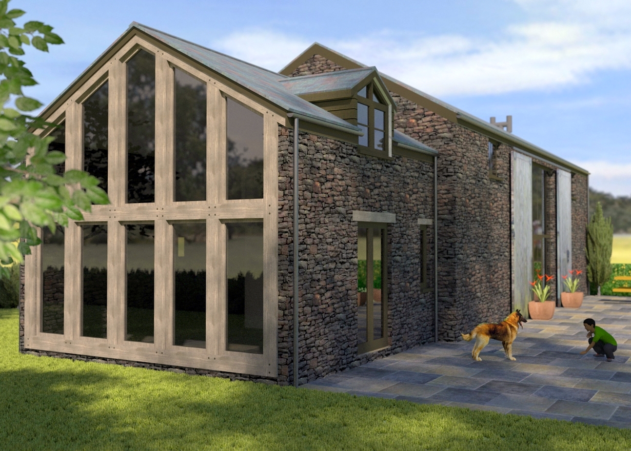
Welsh Barn Extension
-
Thought I'd start posting some of my renders here
This is my first Arch Viz from a year ago
Rendered in Kerkythea, post-pro in gimp

-
wow nice render
and a nice design too! -
Thanks

-
Very nice, Andrew. Like the weathered wood. I'm expecting that dog to pounce on the boy.
-
Looks good. Maybe show some of the concrete foundation wall - so the stone veneer doesn't go all the way to the ground. Also another plant in the foreground on the right might balance it out.
-
Love the design. Especially the large hanging double doors feature!! Well done

-
Many thanks for the comments guys
This is an existing building which I designed the extension for a couple of years ago, thought you might appreciate a photo of the complete extension for comparison. Unfortunately, planners demanded the dormer was removed and the whole extension downsized. If you look closely you'll see the stone does actually go to the ground as the original part of the building is actually about 200 years old.
I'm thinking of redoing this image for my portfolio as I have learnt quite a lot since, and it definitely needs more interest. so more foreground plants are a must!
the weathered wood came from cgtextures.com. the dog, kid and various plants came from 3d warehouse, trees are KT models.
-
is it 2 storey extension? could be a cracking space in there.....
nice to see 'as built' shots - it's not all spaceships and laser guns here! -
Yes its 2 storey, with a bedroom and on-suite on the first floor, kitchen on ground floor.
I'm afraid my next upload will be contributing to the guns thing, I did a steampunk raygun last year that I was going to post!
-
That extension brought some memories of a college I once visited. It had a reading room almost exactly like that attached to the main library. Very cozy, relaxing and inviting.
Good job.
-
@bryan k said:
That extension brought some memories of a college I once visited. It had a reading room almost exactly like that attached to the main library. Very cozy, relaxing and inviting.
Good job.
Thanks, the location adds to the feel of the place... very peaceful
-
Congrats on the design and the render. I think the planners were right - it looks better without the dormer that would have distracted from the delightful simplicity of it all. Nice to see as-built photos here.
Anssi
Hello! It looks like you're interested in this conversation, but you don't have an account yet.
Getting fed up of having to scroll through the same posts each visit? When you register for an account, you'll always come back to exactly where you were before, and choose to be notified of new replies (either via email, or push notification). You'll also be able to save bookmarks and upvote posts to show your appreciation to other community members.
With your input, this post could be even better 💗
Register LoginAdvertisement


