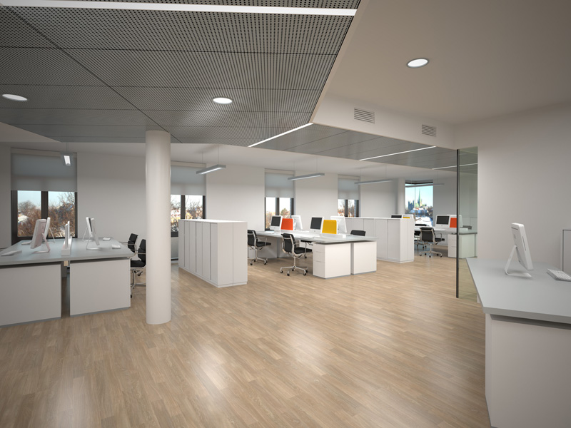
Office Interior "Building B" - SU + VfSU
-
This is an interior illustration I'm rather pleased with. I'm quite happy with the materials and lighting. There is a version with people - but they annoyed me.

Full size (3000px) can be seen over at devinatArt: http://fav.me/d31kjbu
-
Yummy

what are the yellow and red things?
-
Something the interior designer put there... I don't ask too many questions.

-
Think it might be something to stick notes to...? At least it adds a bit of colour.
-
'Bang head here' device maybe? every office needs one

-
@unknownuser said:
'Bang head here' device maybe
...thought that was the monitor...
-
Those are the latest Piet Mondrian Monitors.
-
sir can yu post your settings thank you
-
Fantastic render Thomas!
-
@ian02 said:
sir can yu post your settings thank you
I made the model originally with VfSU 1.05.30 - but now I use 1.48. Not sure if I would have needed tweaking, but here it is. (Require 1.48)
-
can you please post your setting sir i reaaly like the output very nice
-
I already did - after asked the first time.

-
Nice work Thomas. Everything is so clean and wireless.
-
@thomthom said:
.......I'm quite happy with the materials and lighting. There is a version with people - but they annoyed me.........
One of the walls could use a clock.
I felt the same in my "youth". Sigh!!!!!now I can't even recall when the sentiment changed. >_<
-
VERY nice work mate!!! As always it must be said!
The flooring looks just a little flat though!
-
can you post it in image form sir i only using vray for sketch up 6.. if you have time thank you.
-
-
Thomas,
Nice clean look, everything is so crisp and coordinated. Nice work!
One comment: I was looking more closely at your lighting and have a question about how you did your fluorescent fixtures. It looks like they are supposed to be direct-indirect, but there's a shadow on the ceiling above each one. Do you have a rectangle light under each fixture? You may want to disable shadows in the material you use for the interior of the lights to get rid if the dark areas.Andy
-
Nice and clean

-
@andybot said:
Thomas,
Nice clean look, everything is so crisp and coordinated. Nice work!
One comment: I was looking more closely at your lighting and have a question about how you did your fluorescent fixtures. It looks like they are supposed to be direct-indirect, but there's a shadow on the ceiling above each one. Do you have a rectangle light under each fixture? You may want to disable shadows in the material you use for the interior of the lights to get rid if the dark areas.Andy
I don't remember how the light was set up. Maybe my rectangular lights lit in both directions...
Hello! It looks like you're interested in this conversation, but you don't have an account yet.
Getting fed up of having to scroll through the same posts each visit? When you register for an account, you'll always come back to exactly where you were before, and choose to be notified of new replies (either via email, or push notification). You'll also be able to save bookmarks and upvote posts to show your appreciation to other community members.
With your input, this post could be even better 💗
Register LoginAdvertisement


