Shrine WIP updated
-
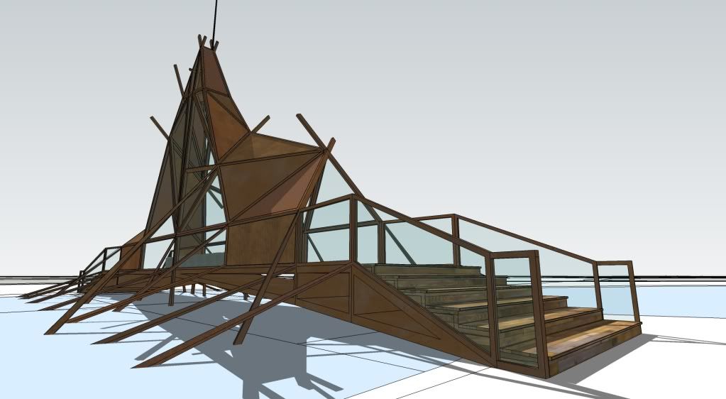
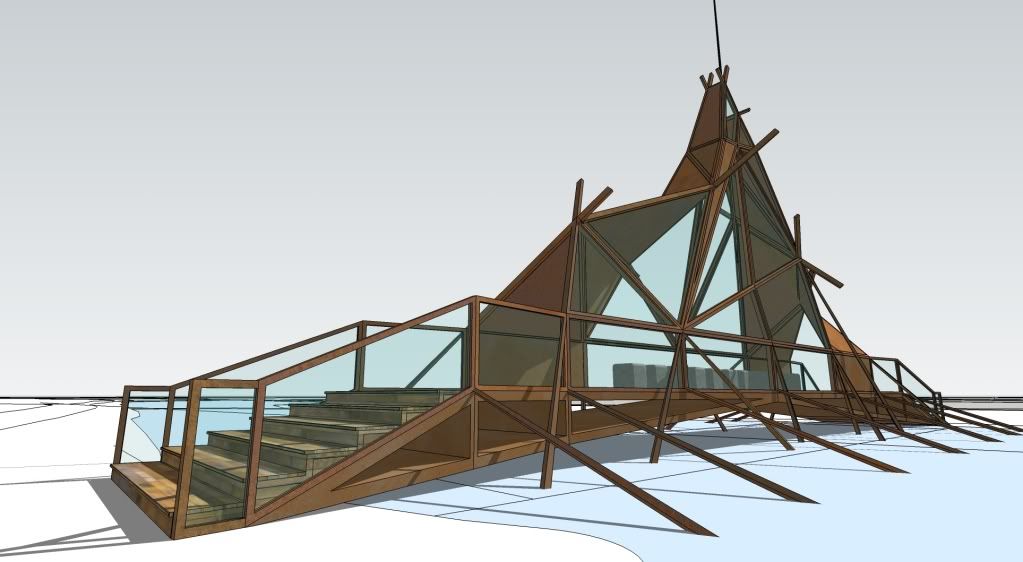
For a university project on a site in Portmeirion, Wales. Really need to hurry up on this, deadline tomorrow!!

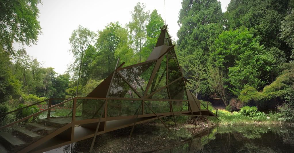
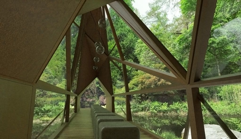
Corten steel, reclaimed timber and concrete seating. Simple shinto concept for the design with a contemporary assault!!
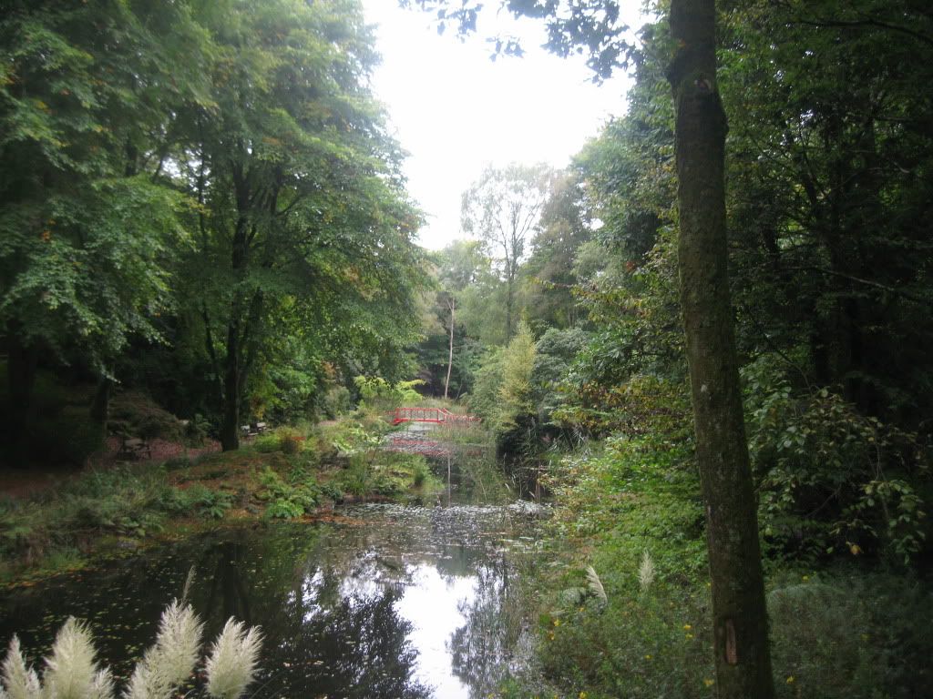
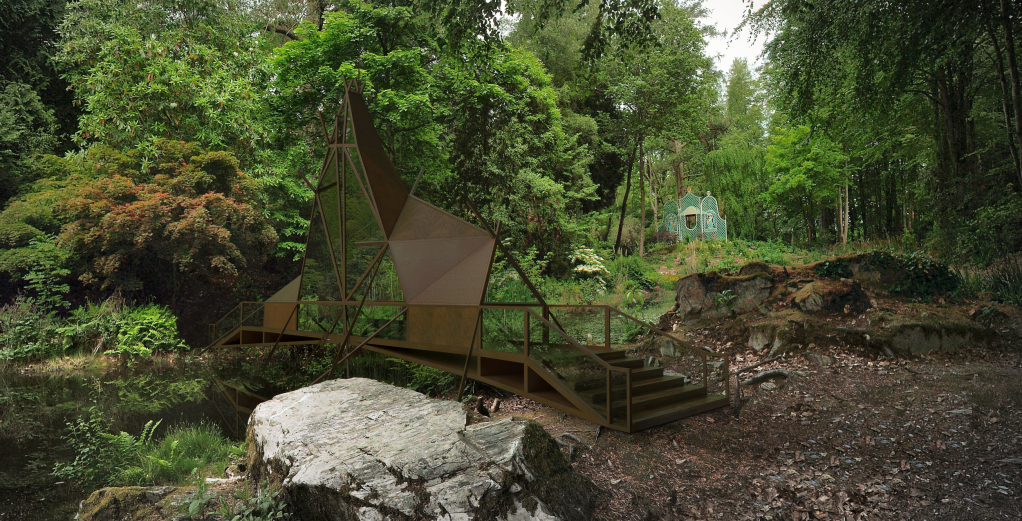
Will post some renders soon....you really have to see it in context. It spans the pond in the photograph.
[edit] i removed the "paddles" for the final design, started to get a longship appearance!
[update] twilight renders added. nearly raw, just faked reflections in the water...90 minute renders at 2500 pixels wide! IBL is very quick!! should have left interior to cook a bit longer but it was fine for presentation. I think I changed a few people's opinions of "shitty" sketchup!
-
Looking forward to the renders

Nice looking project, Indian feel to it
-
Looks great Oli, and fun project.
Try Thea's shadow catcher here, it should integrate well.
-
Good looking form Oli. Very much like boat with sails and paddles.
I would worry about (cortain) steel going into the water as such. -
Very Cool!
-
Thanks guys, been dying to work on my own project for quite a while! I really struggled with the form Sid, trying to give it a lightweight appearance influenced by Shinmei Zukuri shrine design. Its a shrine to commemorate the lives of Susan William Ellis and her architect father Clough.
I managed to acquire a proper spherical panorama I'm gonna use for the lighting. I had to buy it from the photographer, its really good quality. and in the exact spot of the intervention. I haven't had time to learn Thea yet, I need a free weekend so its gonna be twilight for these images (stick to what I know for time being)
@unknownuser said:
I would worry about (cortain) steel going into the water as such
sssshhhh! don't tell anyone! lol apparently its stable and doesn't run off but I've seen different!!
 maybe there's a way to seal it properly with a resin...
 -
Dear Oliver,
So nice to see you doing your own stuff.
This might be useful. Note the references to proper welding and drainage (see Disadvantages).
also:
http://www.uss.com/corp/construction/cor-ten-azp.asp
You could experiment with a clear resin, but I suspect that the surface oxide layer would make adhesion suspect.
Kind regards,
Bob -
@unknownuser said:
sssshhhh! don't tell anyone! lol apparently its stable and doesn't run off but I've seen different!!
 maybe there's a way to seal it properly with a resin...
lol....I would like to see it without run off as well. Hmmm that may be the way forward but I do not know if r resin would stick to rust.
BTW you will love Thea ...the quality and speed is just amazing. I have no doubt you will master it quickly. -
Like it Oli BUT WHERES THE EWOK'S

Sorry I just couldnt help myself.
-
cool design, I look forward to the renders. I just made the jump from Twilight to Thea and it's been going well, I love Twilight but I'm starting to see the power of Thea, can't wait to master it someday...hopefully. (plus someone posted a good corten metal material on the forums!)
-
Nice work OLi.
Mate I like the structure, though the lower level outriggers I'm finding are taking something away from the overall! I'd also love to see a finer edge detail where the sheets and posts meet, maybe even the sheeted sections being dual skinned to incorporate the posts and not separate so to speak.
Remember all said we see things how they effect us, so the above is not a crit!
-
its for a mini competition, i've only had a couple of days so i'm really not gonna slave on too many details. its more of an exercise this project, to get us all back into design again (most of us have just spent a year in practice being monkeys)
yeah i know what you mean about the "oars"! may review that...
-
OLI


Tuned! -
Indian cathedral over the river

-
Very cool design, Oli. I like it a lot.

Looking forward to seeing the final renders.
Good luck!
_KN
-
added three renders to original post, may do a few more.
-
Those renders are excellent, Oli

-
Oli
They are amazing renders - will this be built if you win? Good Luck!!
-
I think that your renders are excellent.

Your design is more 'Native-American_meets_Constructivist' than the locale's 'Italianate' theme... but then it is 'stand-alone' AND Portmerion is big enough to take it anyway [after all their own newly refurbished 30's restaurant, their [in]famous concrete-boat moored in the harbor and other whimsical touches here and there are not exactly 'in keeping' either]...
I was in Portmerion last year, and walked around the very spots you show in your photos.
It really is a 'magical place'. I really recommend everyone to go there. I stayed for a few days, in 'Fountain' - the quiet little flat overlooking the bay - where Noel Coward stayed in 1941 to escape the London Blitz, and to write Blithe Spirit [in just five days] - they had changed the sheets!

-
cheers guys! was a nightmare getting the hdri to be the right scale. In twilight you can only rotate it, so i had to do lots of Photoshop back and forth. basically if you place a large black border round a spherical image it will shrink it in your render (make the hdri look further away)....although this was actually a 14000 pixel wide jpeg.
TIG, its funny you should say that...
I had to deeply justify why exactly it was in this style. I took immediate inspiration from the oriental aspect of this "temple pond", the red pavilion, the bridge. It was about reinforcing those connections Ellis has made throughout Portmeirion....obstructions, framing, seduction, scale, illusion....i felt they became lost at this point. People talk about Portmeiron as a journey, not really a destination so thats kind how I justified using this particular site. I place to stop, contemplate and reflect (perhaps) on the artistic lives of the Ellis family. Ellis seemed to borrow architectural features from a variety of sources; Georgian, Italian renaissance, oriental (the big Buddha LOL), he gave this site an oriental style and I didn't want to break too far from that. I could, of course, have placed a replica Shinto temple spanning the pond....but it wasn't about copying. I took inspiration from Shinmei Zukuri shrines, but added a lightweight and asymmetric style. Maybe its self-important, I dunno, but it was quite fun to make! I kinda need to take the concept further though. A shrine isn't just about its destination, its the journey, so i need to make some cues and connections along the way somehow.Dermot I won't win they are looking for a pastiche mockery i think! but no i don't think the winner will get anything built, its more like an experiment.
Hello! It looks like you're interested in this conversation, but you don't have an account yet.
Getting fed up of having to scroll through the same posts each visit? When you register for an account, you'll always come back to exactly where you were before, and choose to be notified of new replies (either via email, or push notification). You'll also be able to save bookmarks and upvote posts to show your appreciation to other community members.
With your input, this post could be even better 💗
Register LoginAdvertisement


