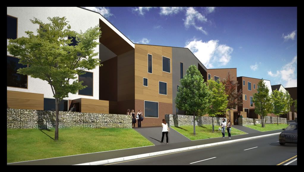
Final streetscape - sketchup, twilight, photoshop
-
So I've been up all night on a caffeine fueled rendering spree.

This is the first image of many! I'm still working on the others at the moment

Hope you enjoy.
-
Looking good Oli...but do the cars have to jump the curb to get up the driveway?
 ...looking forward to the rest...
 -
@d12dozr said:
Looking good Oli...but do the cars have to jump the curb to get up the driveway?
 ...looking forward to the rest...
I hope you don't drive a car if you can't tell the difference between a driveway and a pedestrian path.

-
@johnsenior1973 said:
@d12dozr said:
Looking good Oli...but do the cars have to jump the curb to get up the driveway?
 ...looking forward to the rest...
I hope you don't drive a car if you can't tell the difference between a driveway and a pedestrian path.

That pedestrian path is NOT ADA compliant! The slope is what, 8:1?
 I can see the wheelchairs ripping down the hill and getting nailed by oncoming traffic!
Oh, it not personal, but I absolutely abhor gabion baskets in any way, shape or form.
Rick
-
wow they are not even drive ways. footpaths. parking is at the rear

. I couldn't fudge the terrain any more to accomodate wheelchair users so unlucky! but thanks for useful comments.
-
@olishea said:
wow they are not even drive ways. footpaths. parking is at the rear

. I couldn't fudge the terrain any more to accomodate wheelchair users so unlucky! but thanks for useful comments.
Actually, you could get a ramp up there - you would just lose some green. It could start on the corner, have a flat landing zone at the far end, and then go on the other side of the trees up to it destination.
The problem with it, ADA stuff is so darned ugly with all the railing that has to go up too!

Rick
-
oops

-
in reality the gradient isn't so steep. so no need for a landing or anything in the real proposal. the topo survey wasn't very good so my model terrain isn't amazing. this was an absolute biatch of a model to make-and the texturing was just so intense. more images to come.....
i really wanna play with podium version 2....but i gotta get this out of the way

no worries d12dozr


-
We do not have ADA... In England access is controlled by Building Regulations and DDA. It is not necessery to have access at every point. I presume there is access to properties from the carpark and/or from the pavement higher up.
Renders are nice ...bit saturated for my taste and slightly dark ...but still nice. Gabions are cool btw.
-
thanks Sid!!
yeah there is level access to all houses. front and back. lots of provision for disabled access....but yeah like you say Sid, access is not required everywhere.
i think architect did a great job to be honest. remember these are council houses!!!
I agree about saturation sid....sometimes you need someone else to look at it, thank you. ive updated original.
still working away........

-
Nice work Oli

Are these houses or flats? Either way, it's a funky housing design that'll look great when developed.
-
council houses. or association housing....whatever you wanna call it. the form and materiality takes influence from the industrial context-saw tooth roof mills etc, north lights (oldham, greater manchester, uk).
i think it'll really improve the lives of the people who live there

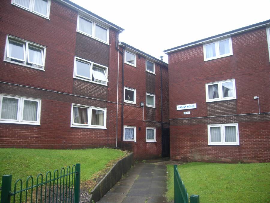
this is what St Mary's estate looks like at the moment (neighbouring estate).
-
and wtf man
@unknownuser said:"Oh, it not personal, but I absolutely abhor gabion baskets in any way, shape or form."
this isn't even constructive... personal taste means nothing in this game. what would you suggest?.....a big brick wall? gabions were chosen for visual lightness and the fact that plants can grow from them further softening their appearance. gabion material is reclaimed too so its a great choice IMO -
I love the architecture and I love the render.
The thing that really stands out to me and in a good way, is just how good the road looks!
Is that and image you have used Oli? -
im so glad somebody finally noticed!! I spent a lot of time getting the road right! I adapted a texture from cg textures.com. its as close to a typical british road as I could make! I made a bumpmap for it too and applied a rough stone template in twilight. I got the curb texture from this forum and projected it over the curb.
I made most of the textures so if you would like any (including bumps) let me know and I will post them. Got higher res version of road texture too if you want it.
-
I would love the road texture and bump Oli.
Also the kerb if possible too.Thanks
-
Road texture would be quite nice to have.
-
PM me your email guys and I'll send it to you. its too large and its not worth reducing.
i'll post a photobucket version in meantime here:
dylan you can use the kerb texture itself as a bump map in the twilight bump channel.


here is kerb texture:
http://forums.sketchucation.com/viewtopic.php?f=40&t=22057&p=194908&hilit=side+walk#p194908
-
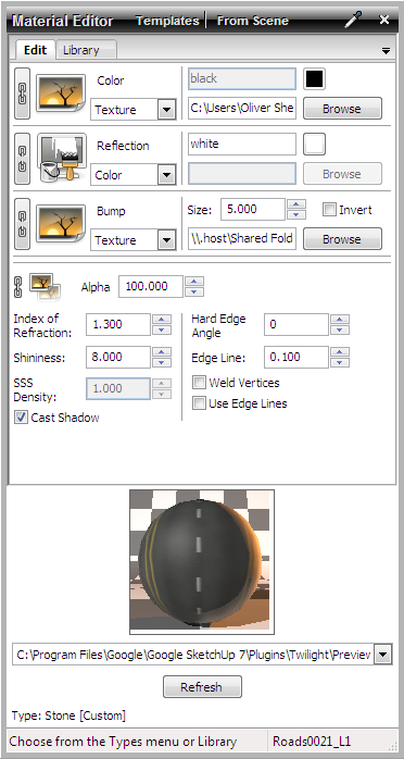
here are material settings (to rough stone template)
-
@olishea said:
and wtf man
@unknownuser said:"Oh, it not personal, but I absolutely abhor gabion baskets in any way, shape or form."
this isn't even constructive... personal taste means nothing in this game. what would you suggest?.....a big brick wall? gabions were chosen for visual lightness and the fact that plants can grow from them further softening their appearance. gabion material is reclaimed too so its a great choice IMOSorry, but it is from personal (mis) use here in the states. The wires in gabions have a tendency to break and then you have these nice pointy wires that can cause problems. Yours might be completely different gabions that what I am used to here in the states. We use them at stream edges. I am a proponent for natural scapes ( take a look at http://www.wildlandhydrology.com/). So if you are asking for an alternative within those parameters, a vertical green wall might work well.
Again, this was not meant as a personal attack - honest.
Rick
Hello! It looks like you're interested in this conversation, but you don't have an account yet.
Getting fed up of having to scroll through the same posts each visit? When you register for an account, you'll always come back to exactly where you were before, and choose to be notified of new replies (either via email, or push notification). You'll also be able to save bookmarks and upvote posts to show your appreciation to other community members.
With your input, this post could be even better 💗
Register LoginAdvertisement


