SU Toolbar issues
-
I dont know why im only asking these noob questions now ive been using SU since @last software owned it lol, anyway my second question this week is about the SU toolbar.
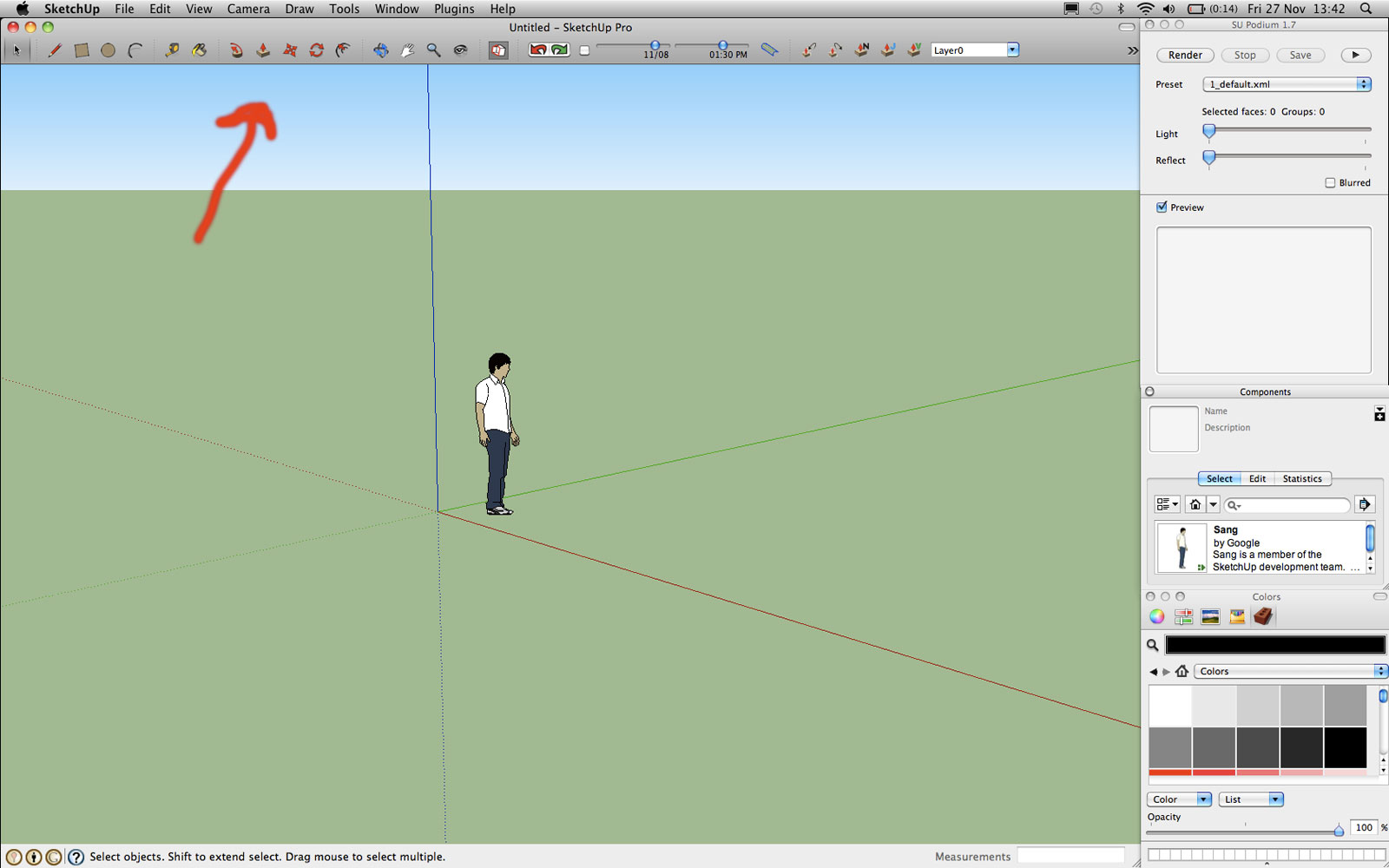
I like to have all my options in the toolbar and all of my plugins. Ive just upgraded my OS from 10.4.11 to 10.6 so haven't got round to installing all the plugins yet. Anyway the point is ive seen screenshots of others peoples SU interfaces and they have two or three rows of icons and sometimes along the top and left hand side. Ive looked and looked and im only able to but one row of icons along the top and all my options dont fit on even still.
Anyway here is a screen grab of my setup so far. Ive assumed this multi icon interface maybe windows only as im running it on mac, if so thats disappointing but if not I would be glad if somebody could give me the heads up.

-
i think having multiple rows in the top bar is a windows only thing unfortunately.
-
gutted ah well maybe somebody knows something i found this site http://sketchygraphics.wordpress.com/2008/08/01/plugin-sketchup-custom-toolbars/ but so far it looks like your right and it a windows only thing
I downloaded it and placed the toolbars plugin.rb in my plugins folder but its not showing up?!!?!?!?! so looks like you are right
-
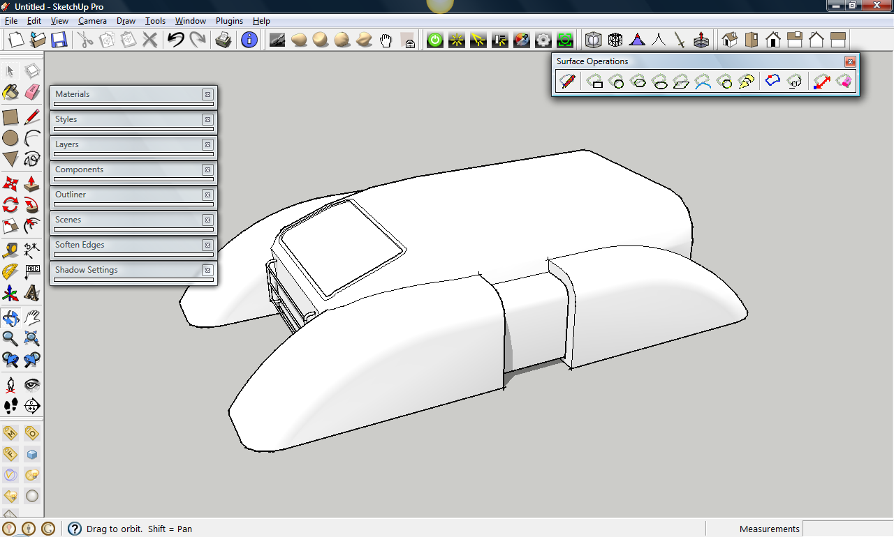
I have use a mac before, although I mostly use windows now. As far as I know, mac doesn't treat the tool bars as the rows, since they can only put one row. Instead, they have it as dialog boxes, such as the TOS toolbar in the att. (I know it's a windows screenshot but mac treats it that way though..
 )
)

-
I'm not a Mac user... but I find it hard to believe that you can't simply drag a floating toolbar [unlocked from where it is by grabbing its 'handle' on left-end or top] to somewhere else on any of the four sides of the screen and get it to snap and lock there - can on a PC !

-
Well looking at your screen grab thats what I want, all the built in fictions can be put in one bar but all my plugins float uselessly around in there own boxes its a terrible mess, when im at home I dual screen so everything is tidied up but when im working out and about its a mess.
Ultimatez 32 are you saying I can double up my toolbar like you have on the left in mac if so how?
-
Ahh yes I can already do that but I wanted some way of incorporating it into the toolbar itself, i also wanted to double up the bar like your on the left so i dont have to scroll on mine to get more options
 oh well ill just gave to make do, thanks for your help.
 -
no, but look closely to that ''surface operations'' toolbar. It's not part of the row, it's acting like a dialog box. I can move it around. That's how mac treats it. go to view -> toolbars and choose the toolbar you want to see. I'm pretty sure that sketchup will open a toolbar that's a dialog box. Try that.
edit: just read your post again, so ignore the post above. Then again, you can rearrange the toolbars so that it looks like the windows version, even though it doesn't stick. For that double-up thing, I'm sure mac has a large tool set. Go to view -> toolbars -> large tool set. I think the large toolset doubles up
Hello! It looks like you're interested in this conversation, but you don't have an account yet.
Getting fed up of having to scroll through the same posts each visit? When you register for an account, you'll always come back to exactly where you were before, and choose to be notified of new replies (either via email, or push notification). You'll also be able to save bookmarks and upvote posts to show your appreciation to other community members.
With your input, this post could be even better 💗
Register LoginAdvertisement


