Render this: L.E.D lighting
-
Okay, for the next challenge and by popular demand, we are doing LED lights.
Initially I could not figure out how best to do this as there are so many LED type lights these days from car head and tail lights, cabinet lighting, under cabinet lighting, on boats, flash lights, as spots, recessed, etc. With today's 'Green' revolution LED lighting is becoming the industry standard, so lets master how to use them.
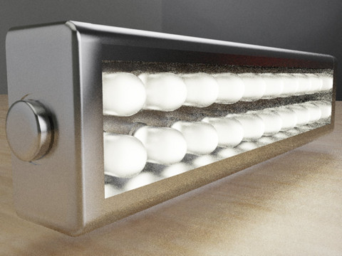
So I modeled a generic strip light that is commonly used for a range of applications, I have this type under my kitchen cabinets as well as above my bathroom mirror.
I have only modeled the fixture as well as Al Hart made a Dynamic component version so you can choose which to use depending on how you plan to render it.The emphasis is on how to create an LED light as close to real as possible, some may choose to light it with point lights while others may opt for emitting surfaces.
So without getting too technical, let's play and see how we can achieve this, try a close up if possible as the lighting is after all the aim here.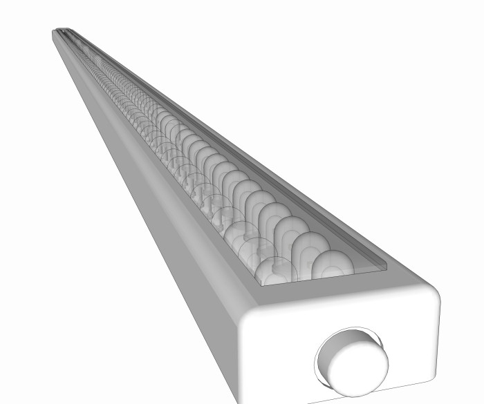
*** Most Important... HAVE FUN! ***
-
A slight issue. All LEDs I seen, do have a solid epoxy enclosure.
-
Or like a rope light enclosure.
-
Did mean how a single led is made...
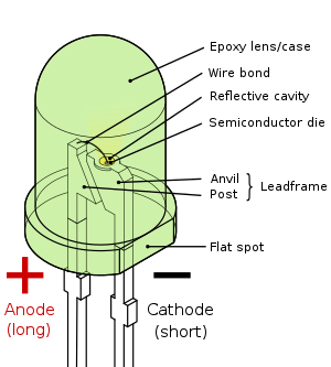
There are naturally plenty of different packages, but encapsulation is always solid.
-
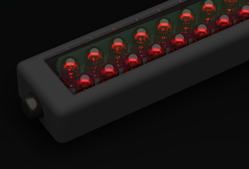
1st try Hypershot
emitter on the inside cube, colored tinted glass on the led and thin glass film on the outer glass.
-
I see what you are referring to, I assumed you meant the casing for the strip.
If you would like I can remove the inner part of the dome, or you can as they are componented if that will help with the render.
-
Here is another version without inner bits to the LED's.
And here is a shorter version with a center core, so there are many options, feel free to modify as you feel necessary as this is not an absolute model but just a guideline to start from.
-
I did, see LED4 above.
-
I have a bunch of LEDs in front of me from a Christmas toy I tore apart. It looks like the curve of the acrylic is positioned just right to focus on the emitter, just like a lens. I suspect that distance is important. (Anyone know the IOR of the acrylic? 1.49 is a common acrylic number)
-
There are so meny different materials used so it's safe to use IOR 1.40 to 1.60.
-
I'm using 1.45, the problem is the cover as having a plastic cover above an acrylic texture slows things down somewhat.
Not an easy challenge. -
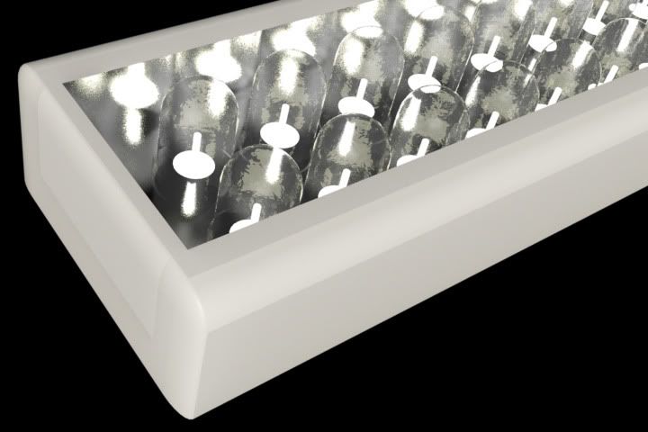
quick try
-
First attempt.
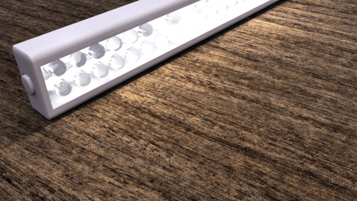
-
Excuse the dodgy kerning.

-
Cool reference photo. It would be even cooler to have a LED model like this one (wink, wink).
http://www.otherthings.com/blog/images/led_throwies_small.jpg -
@unknownuser said:
You could shorten it a bit...it's a bit awkward to throw around.

I took Solo's LED light strip and made a Dynamic component out of it.
If you stretch it the number of lights will change to match the new length.
Also, you can right click and change the light spacing or length if you have dynamic components enabled:
The DC is inside the .SKP file, so you could copy and paste the entire component if you wanted to use it in a different model.
-
Ok, here's my try with Twilight:
I used a very, very darkened HDR as background so the light coming from the LEDs would be the focus of the image. This caused the problem I had already foreseen because I've experienced it many times when taking real photos: If you lower the exposure until you see clearly the shape of the LEDs, the rest of the scene is too dark:
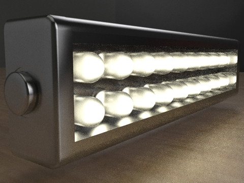
And if you rise the exposure until the rest of the scene looks better, the LEDs themselves become overexposed.
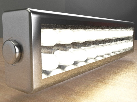
Of course, I could have used a brigther HDR background from the very start (Duh!), but I want to make a point here, so please bear with me.
I saved the render as an HDR and opened it in the free program Picturenaut, which is a very handy tonemapper, HDR creator, HDR<->EXR converter, etc. I used a "photoreceptor" type tonemapping with these settings:
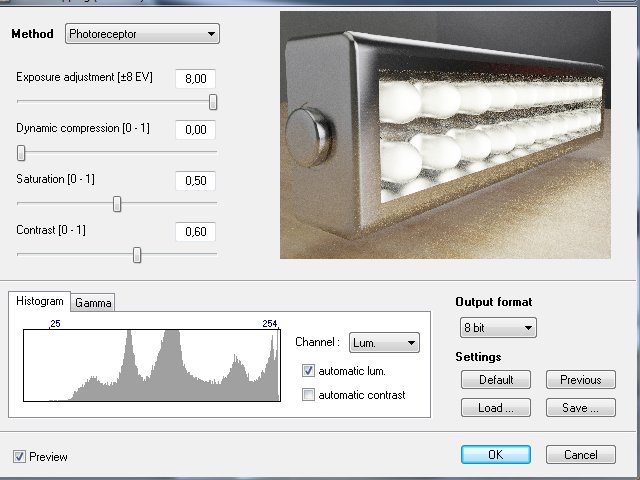
And here's the result:
I could have chosen a higher saturation level but I like how it looks.So, which one do you prefer?
-
Your second image looks most realistic to me... LEDs are often overexposed in photos.
By the way, what kind of material did you use? The LEDs themselves look really good. -
Well, in the reference picture I linked to I noticed that LED light comes from:
- A small disc inside the casing, which seems to be the source.
- Total internal reflection.
- Sub-Surface Scattering.
So I used the SSS Rubber Ball template (which by default has IOR = 1.4, which seemed adequate after reading the first posts here), made it completely clear with no color, and rendered it with simple MLT (aka "Easy 09"). Perhaps I could have gotten better results with Bi-directional MLT (Easy 10).
-
@ecuadorian said:
Cool reference photo. It would be even cooler to have a LED model like this one (wink, wink).
http://www.otherthings.com/blog/images/led_throwies_small.jpgNice reference photo.
I had a bunch of LED's next to me when I was trying this out earlier. Kept hot-wiring them to a battery until they got hot.
Hello! It looks like you're interested in this conversation, but you don't have an account yet.
Getting fed up of having to scroll through the same posts each visit? When you register for an account, you'll always come back to exactly where you were before, and choose to be notified of new replies (either via email, or push notification). You'll also be able to save bookmarks and upvote posts to show your appreciation to other community members.
With your input, this post could be even better 💗
Register LoginAdvertisement


