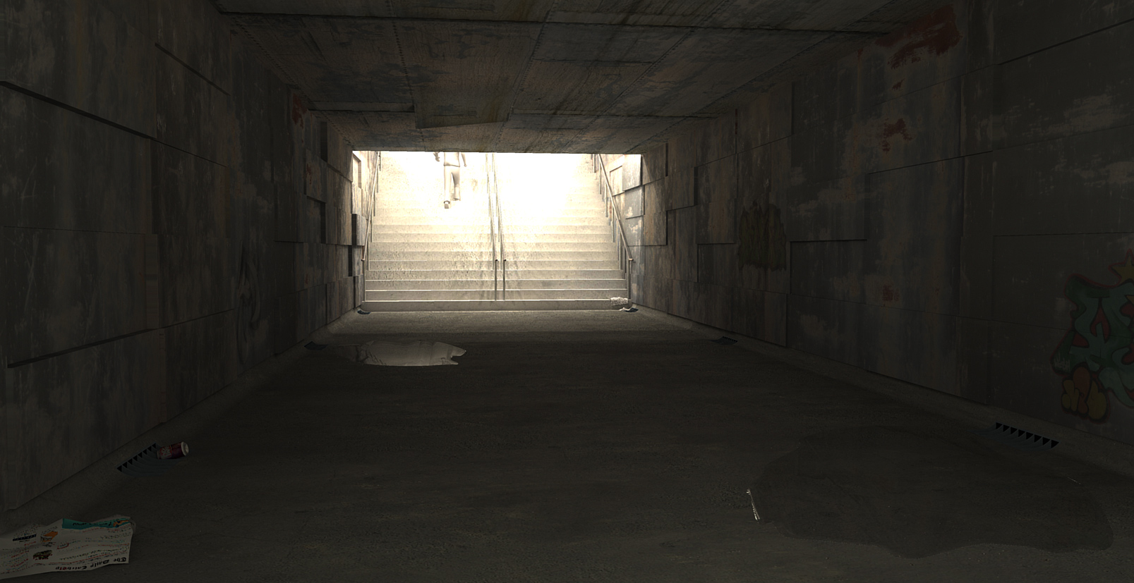
What's Up?
-
Eric
Looks good -
I really like it. Great work Eric. Is that guy going up the stairs 2d or 3d.
-
Thanks.
Just one of the standard 3d people that come with SU. -
Here is an updated image.

-
Nice job! where are the puddles coming from though? I'd put some wet spots on the stairs, or on the ceiling above to puddles, just so they don't look like they appeared out of nowheres

-
this is very cool.... i want to think the puddles should maybe be darker? like the concrete is soaked with water?
-
@unknownuser said:
Nice job! where are the puddles coming from though? I'd put some wet spots on the stairs, or on the ceiling above to puddles, just so they don't look like they appeared out of nowheres

Thanks.
Well there is a peeled back panel above the far puddle.@marked001 said:
this is very cool.... i want to think the puddles should maybe be darker? like the concrete is soaked with water?
Good tip. I would not have thought of that.
-
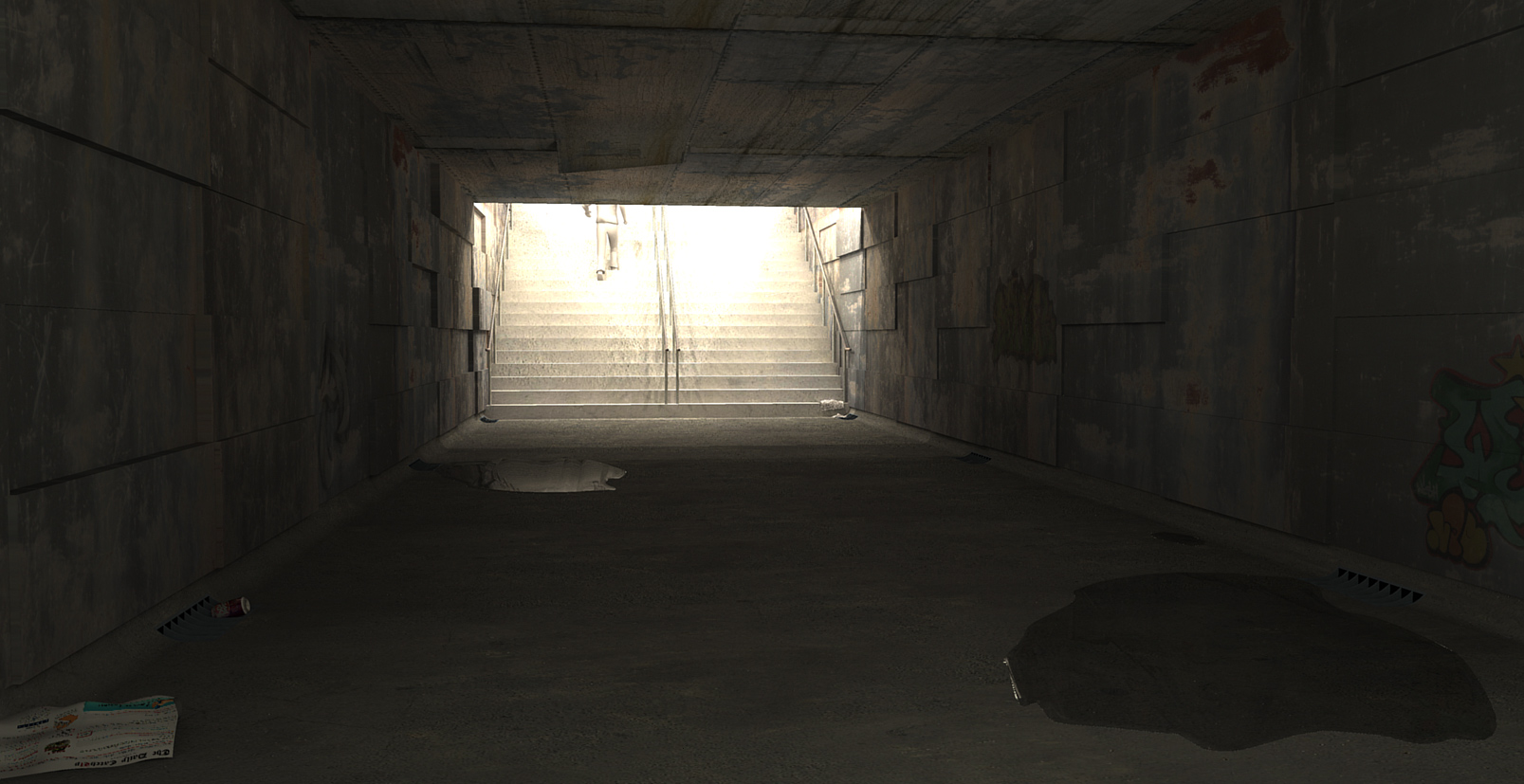
Update.

-
good stuff boo
the puddles seem a little too unnatural, I cant put my finger on it. They seem viscous somehow. whats this image for btw?
-
Looks great, Eric.
-
@olishea said:
good stuff boo
the puddles seem a little too unnatural, I cant put my finger on it. They seem viscous somehow. whats this image for btw?
maybe if the actual texture is painted to be a little darker..then extend the darkness/wetness a bit beyond the puddle? might help 'ground' it.
-
Thanks again guys. Daniel, it is hard to see but the graffiti in the middle right says Daniel

Also, I made The Daily CatchUp as the "tossed" newsprint to the lower left. I think leaving it out would help the image however.Again, great tip about the wet Jason. I might try it soon.
Oli, this is just for practice. I wanted to see if I could create this type of mood purely with Podium and no post processing. I got the idea from a piece of artwork I saw recently. I might try it with Vray next.
-
These look great I have 0 rendering experience, yet, so my comment comes with no expertise.
It seems the nearest puddle is sitting above the level of the concrete as opposed to having the liquid flow into the depression it would find on an unlevelled surface. I think the added 'viscosity' is related to the reflected light coming from the closest puddles near left edge, as opposed to it sitting level with the concrete. Maybe the water that would flow through this space would have some added grit and be 'less clear' after seeping through the ground or running off down the stairs... not sure if that would effect how natural the water looks to the eye...
These are mere observations as I have no clue how you can change it

Maybe I should start reading a rendering manual...
-
Great suggestions once again.
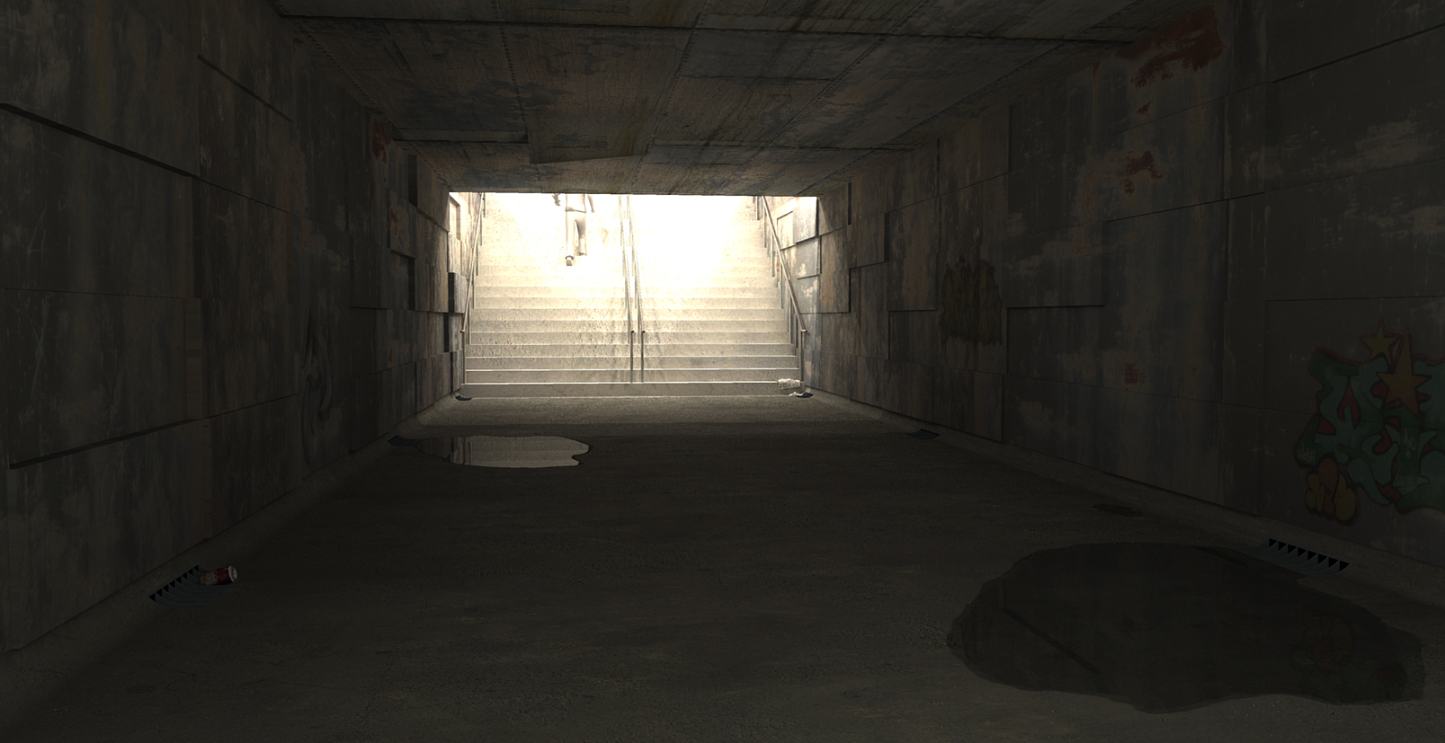
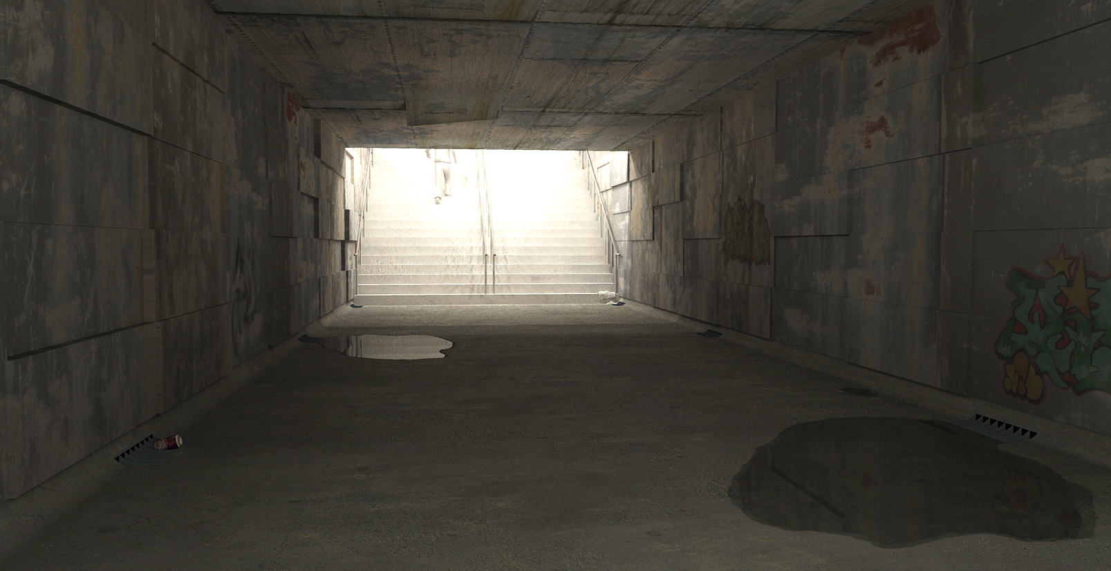
Here are a couple more. I made a depression in the pavement rather than have the water on top. Much better, thanks. And I got rid of that CatchUp Newsprint lower left
Also, I noticed on my work machine that the image was much darker than on my home machine and much of the detail was lost. So the second one is lighter, same image just lighter.
Let me know what you think.


-
I really think that near puddle looks great. Well done!

Actually I think the whole image looks great...
-
the lighter one is defo the better image, gives the impression theres some light from behind the observer and that they're close to the other side of the underpass too.
Hello! It looks like you're interested in this conversation, but you don't have an account yet.
Getting fed up of having to scroll through the same posts each visit? When you register for an account, you'll always come back to exactly where you were before, and choose to be notified of new replies (either via email, or push notification). You'll also be able to save bookmarks and upvote posts to show your appreciation to other community members.
With your input, this post could be even better 💗
Register LoginAdvertisement


