Which Web Site Look to you like?
-
When our new web site was designed on CrowdSpring, the designer included blue and black bars with extend to the edge of the screen.
Some people like this and some people think it looks like a mistake. (especially on wide screen monitors where the bars get longer)
Personally I suspect this may have to do with age - with younger people liking one look and older people liking the other look. So I have decided to put it to a vote and also to see if age makes a difference in peoples choices.
I am planning to go with the "peoples choice". However, if it is close, I am going to go with the "young peoples vote".
You can view the actual web site here:
Take a look at the images below, and vote with this survey:
Look A: This is the web site as designed on Crowd Spring.

Look B: This is the same web with the blue and black stopping at the edge of the page itself.

Al Hart

IRender nXt from Render Plus -
I like the second one, but would still have the black go all the way.
-
@unknownuser said:
I like the second one, but would still have the black go all the way.
I'll add a comment line to the survey so that when you vote you can add a comment.
(Otherwise I have to guess how old you are )
)Al
Al Hart
IRender nXt from Render Plus -
I like the second one.
-
the first one is better... especially on wide screen displays.. otherwise, you just have this random squarish thing sitting in the page..
-
I appreciate the comments here. But be sure to vote as well.
It is surprisingly close at this point.
I will announce the final results - with a breakdown by over 40 / under 40 and then change (or keep the web site)
Render Plus employees are allowed to vote as well.
 (Interestingly they do not all agree either.)
Al
Al Hart
IRender nXt from Render Plus -
Like the second one best- the first one looks "wrong".
-
Hi Al, hi folks.
I prefer the second one.
My age is 55.
Just ideas.
-
under.. voted second
Elisei
-
The second one - it looks tidier, and the wider bars don't add anything to the design.
The website currently looks a bit messy as the news column on the right hand side overlaps the 'background' border, I guess because the contest image slideshow is too wide.
-
It looks like Look B - (no wide blue bars) is the winner,
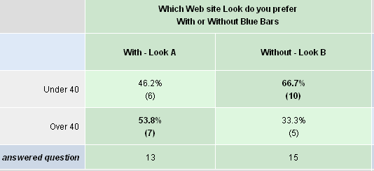
It is slightly preferred overall, and slightly preferred by the "younger crowd"
Al
Al Hart
IRender nXt from Render Plus -
You could still add something to the side area to take up some space, just not making it look like it's out of place, like the first design which seems like it's going over it's page.
Hello! It looks like you're interested in this conversation, but you don't have an account yet.
Getting fed up of having to scroll through the same posts each visit? When you register for an account, you'll always come back to exactly where you were before, and choose to be notified of new replies (either via email, or push notification). You'll also be able to save bookmarks and upvote posts to show your appreciation to other community members.
With your input, this post could be even better 💗
Register Login


Advertisement