Site Model
-
My first time posting to the gallery here, so take it easy on me.
 Actually I would really appreciate any constructive criticism.
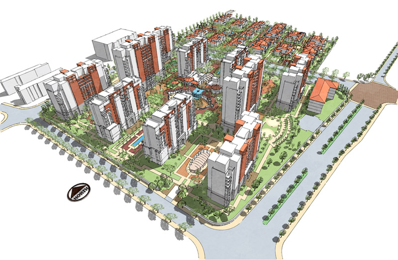
The model is a first pass at a site plan for a project in China. The image is straight out of Layout, which I found to be of much better quality than exporting right out of SU. The reason for that being that you can adjust the line weight in Layout.
I textured it with mostly plain colors, except for the trees for which I made a png material so they could have some transparency.
I used style builder to create the style with a hand drafted pen line. And I added a watermark mask that very subtly softens the image.Enjoy,
Mark

-
I don't have to take it easy on you at all. That is just gorgeous. Congratulations on a job well done.
-
Mark
Welcome to GSCF.
I love that image, fantastic work and very inspiring.
-
Welcome to the gallery, Mark. Very nice presentation. My one criticism would be the north arrow - the black color doesn't really go with the rest of the model, and it stands out too much. You might want to try a light or medium gray.
edit: Also, have you looked at adding some cars on those roads?
-
Great image...welcome to the forum.
I agree about the north arrow. tone it down or just have it be white and let the shadows define it.
I agree with the comment about the trees there is a ruby called randor.rb or something like that created by TBD you can select all the tree components and apply the ruby and it will randomize their scale.
There is a fine line between monochromatic and fully textures. Your image starts down the path of fully textures but stops short. In that regard I wonder if it might benefit by making the flat roofs a darker color like they would be in reality. similarly I wonder if having some extremely low poly cars might ad a sense of dynamics to the image.Just my 2 cents. But again it a great image and I look forward to seeing more of you efforts.
-
Great work and I second the comments above.
Welcome! -
Really nice indeed, Mark...thanks for sharing! (More please

-
Congratulations !
-
Welcome Mark
That is a great model.
Jon
-
I second everything said above.
Fantastic! Lets see more!
-
and i THIRD everything above! overall, its an awesome model + image.. welcome and keep em coming..
-
I'm going to be doing a model like this shortly... thanks for sharing and giving us some inspiration!
-
Well thanks for all the encouraging words, folks.
And thanks for the suggestions:
-North Arrow- needs to calm down.
-Trees - some scale variety would be nice. (I actually have that ‘randor.rb’ ruby already)
-Cars - yeah, would liven it up a bit, and I think give a better sense of scale.And Phil, I agree that is a fine line of how far to go with texturing…
I got a couple more shots of this model that I will throw up here soon.
-
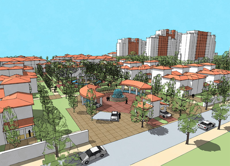
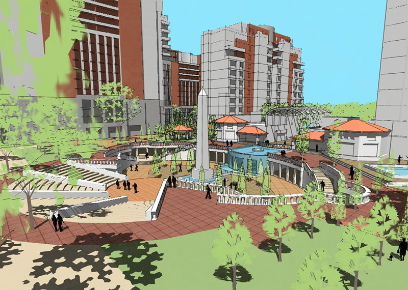
Here are a couple closer in views.
I adjusted the Style for these views to have longer extensions and a thicker line weight in Layout.The second one I had trouble getting all the sketchy lines to show up like I wanted. Layout seems to be real finicky sometimes about what it will show or not.
Enjoy.


-
They look great, Mark. Hope I'm not coming off too picky, but have a few comments:
-
Adjust the color of either the grass or the trees, as the two are blending together, especially in the second image.
-
That blue sky looks a bit cartoonish, IMHO. You might want to look at toning it down. Is that a backdrop? In perspective mode, SU should display the sky with gradation from top to bottom.
-
Add some more people to the first scene. I'm reading it as a public space, but it doesn't look too lively.
Keep 'em coming.
-
-
NO not too picky, Daniel. Those are good suggestions.
That is a backdrop in the sky. I knew something didn't quite feel right but it didn't occur to me that I was missing the gradient that SU automatically puts in there.
-
That would make a great model for rendering using Vue, keeping the buildings simple but adding a realistic terrain and solid growth trees. considering rendering at all?
-
Well, Solo, I would love to render it, but I have Zero rendering experience so I still need to take the time to learn how....
-
Pete, since most of the terrain is hardscape, why not just delete the SU trees and import it into Vue as is, and just add solid growth trees? I admit I haven't figured out how to model custom terrains in Vue yet.
-
Mark, I just love all these images. Really great! All the suggestions given are only going to make your images even better!
Hello! It looks like you're interested in this conversation, but you don't have an account yet.
Getting fed up of having to scroll through the same posts each visit? When you register for an account, you'll always come back to exactly where you were before, and choose to be notified of new replies (either via email, or push notification). You'll also be able to save bookmarks and upvote posts to show your appreciation to other community members.
With your input, this post could be even better 💗
Register LoginAdvertisement


