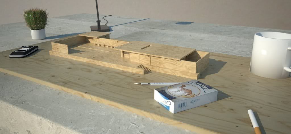
Barcelona Pavilion (Animation Added)
-
Really want to make this into an animation but at 30 mins per render I can't see that happening for the moment. For now I'm going to call it a work in progress. Any suggestions appreciated before I try to get this animated.
Most objects are from the warehouse by the way. Right click - 'view image' or 'save as' to view the entire imageUpdate - Animation Added
[flash=640,480:26m5ca3h]http://vimeo.com/moogaloop.swf?clip_id=1705244&server=vimeo.com&show_title=1&show_byline=1&show_portrait=0&color=&fullscreen=1[/flash:26m5ca3h]
Youtube: http://nl.youtube.com/watch?v=RPVoY8WwL7E
-
I like this. I prefer the cropped image as I think the cigarette and the mug let it down slightly but its a really good render.
Would you mind sharing your wood material?
-
-
I've already downloaded Majid's maquette materials but I don't have the particular wood material that you have used

Do you mind posting just that one in your model?
-
Here ya go: http://www.cgtextures.com/texview.php?id=4715&PHPSESSID=ed155963660e9c84e42204b0199a8376
What do you reckon would make the cigarette and mug better? I see there is slight discoloration at the bottom of the mug - dunno why that is though -
Update - Animation Added
-
Really cool animation. I think it's a really great idea to render a model as a...gasp...model! Very fun and still gets the point across, especially works well for a cubic building like the Pavillion.
Regarding the objects around the model, my only critique would be that they seem a bit random. Ideas running through my head would be to put the model on more of a polished desk in a nice office. Sort of as if it were an office piece for some CEO type. Or perhaps on a work table in a wood shop w/ a drill and nails around, maybe a table saw in the background. Or for those of us who built stuff like that in architecture studio, I'd like to see it on a drafting table w/ scattered debris, pencils, plans, rulers, and maybe a dude head down passed out on one end of the table w/ saliva dripping for the corner of his mouth onto a pile of old eraser shavings. I think many of us could relate to that scene!

-Brodie
-
Brilliant!
Great clarity, fantastic lighting, just overall sweet.
This is the future of rendering.
-
Thanks Brodie and Solo. Appreciate the advice too - especially the architecture studio scenario. With object animation I could even have a fly buzzing around and actual saliva dripping!
-
Nice job Prince.
The wood comes out nicely and indeed the light is fine.
I wonder: is this the same model you propose AdamB to try out using LightUp?
That would make a great comparison in terms of the speed/quality ratio.
Interesting! -
@kwistenbiebel said:
Nice job Prince.
The wood comes out nicely and indeed the light is fine.
I wonder: is this the same model you propose AdamB to try out using LightUp?
That would make a great comparison in terms of the speed/quality ratio.
Interesting!Thanks kwist, and yes this is the same model I propose Adam try out using LightUp. I know it will be fast, but i'm more interested in the quality LightUp will produce..
-
It is something beautiful!
-
@princedragoncok said:
Here ya go: http://www.cgtextures.com/texview.php?id=4715&PHPSESSID=ed155963660e9c84e42204b0199a8376
What do you reckon would make the cigarette and mug better? I see there is slight discoloration at the bottom of the mug - dunno why that is thoughThe discoloration is caused by 2 things.
-
The handle goes through the body of the cup and is causing some bad normals on the inner surface - you'll see SU shading anomolies. Just delete the part of the handle inside the cup body.
-
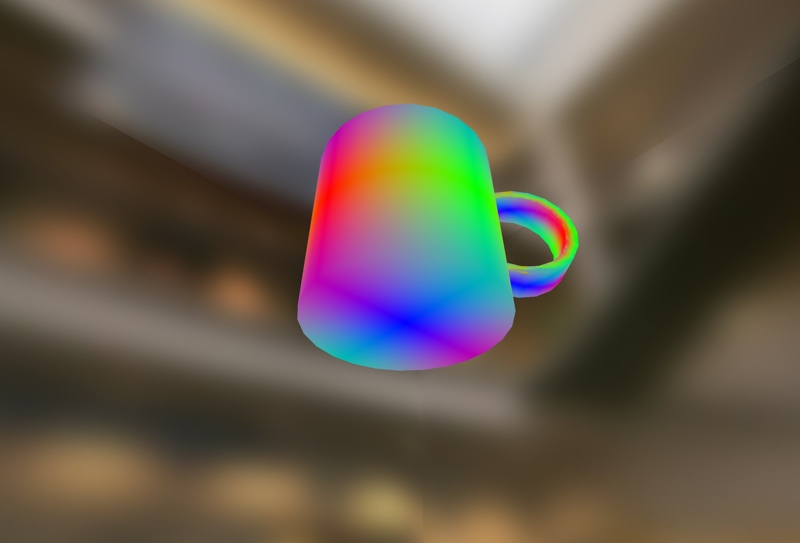
More importantly, the smoothing groups seem wrong. You want your surface normals on the outer side of the mug to be varying around the circumference of the mug but not vertically. This false color render of interpolated surface normal screenshot from LightUp shows the normals are being smooth around the bottom of the mug causing your odd shading. If the normals were 'right', the bottom of the mug would have a near constant normal facing down (as it does right in the center).

-
-
@adamb said:
The discoloration is caused by 2 things.
-
The handle goes through the body of the cup and is causing some bad normals on the inner surface - you'll see SU shading anomolies. Just delete the part of the handle inside the cup body.
-
More importantly, the smoothing groups seem wrong. You want your surface normals on the outer side of the mug to be varying around the circumference of the mug but not vertically. This false color render of interpolated surface normal screenshot from LightUp shows the normals are being smooth around the bottom of the mug causing your odd shading. If the normals were 'right', the bottom of the mug would have a near constant normal facing down (as it does right in the center).
Hmm this is interesting, but somewhat out of my realm of understanding. I should also say that I got the cup from the warehouse, so what you're saying might make more sense if i was the creator. But I do understand that you want a horizontal band, rather than vertical band of colour around the cup. So how badly is the render effected in Lightup in the end? Vray has discoloured it slightly but it's not detrimental to the final rendering. Is this the case in LightUp? Can LightUp adapt to cope with such 'bad normals' rather than the user having to make sure every component is composed of good normals?
-
-
prince-
great realistic feel to the atmosphere in that room! are you saying this is lightup?
-
@princedragoncok said:
@adamb said:
The discoloration is caused by 2 things.
-
The handle goes through the body of the cup and is causing some bad normals on the inner surface - you'll see SU shading anomolies. Just delete the part of the handle inside the cup body.
-
More importantly, the smoothing groups seem wrong. You want your surface normals on the outer side of the mug to be varying around the circumference of the mug but not vertically. This false color render of interpolated surface normal screenshot from LightUp shows the normals are being smooth around the bottom of the mug causing your odd shading. If the normals were 'right', the bottom of the mug would have a near constant normal facing down (as it does right in the center).
Hmm this is interesting, but somewhat out of my realm of understanding. I should also say that I got the cup from the warehouse, so what you're saying might make more sense if i was the creator. But I do understand that you want a horizontal band, rather than vertical band of colour around the cup. So how badly is the render effected in Lightup in the end? Vray has discoloured it slightly but it's not detrimental to the final rendering. Is this the case in LightUp? Can LightUp adapt to cope with such 'bad normals' rather than the user having to make sure every component is composed of good normals?
Hey its all just ones and zeros. Be that in LightUp, vray or anything else, the same applies - ie the renderer is going to take the input you give it and do its lighting thing. If that input is bad, you'll get a bad result. "Garbage in, garbage out" is the old adage with computers.
Over many years of writing software I've come to conclusion that rather than try and second guess the user - by for example, ignoring the normals that are given and recalculating new ones that the software thinks are 'better' - its better to simply reflect what you're given.
So, I would Explode the mug, and use the Smooth normals tool to reset the crease angle (say, 30 degrees), then regroup it and you should be good to go.
Adam
-
-
beautiful... how did you render the animation, better said, what is the other software u used to join the vray image rendered. i just know how to render the each frame but i don´t know how to make the video.

-
beautiful... how did you render the animation, better said, what is the other software u used to join the vray image rendered. i just know how to render the each frame but i don´t know how to make the video

-
@mirjman said:
prince-
great realistic feel to the atmosphere in that room! are you saying this is lightup?
No this is v-ray for sketchup.
@juanjo06 said:
beautiful... how did you render the animation, better said, what is the other software u used to join the vray image rendered. i just know how to render the each frame but i don´t know how to make the video.

Thanks, I used windows movie maker which comes with all vista machines
Hello! It looks like you're interested in this conversation, but you don't have an account yet.
Getting fed up of having to scroll through the same posts each visit? When you register for an account, you'll always come back to exactly where you were before, and choose to be notified of new replies (either via email, or push notification). You'll also be able to save bookmarks and upvote posts to show your appreciation to other community members.
With your input, this post could be even better 💗
Register LoginAdvertisement


