The verdict is in...
-
i m not an artist nor an arhitect but they looks a bit shiny IMO
edited :i m not an artist nor an arhitect but they looks a bit bright,IMO
-
the brush strokes are a bit unsettled in my opinion. thats why I would go for the more calm compromise.
-
It might just be me... but the floor on a couple of those images are burning my eyes when I look at them! I dunno... it might just be my monitor! Really nice images though...
-
but I warned you about it, Bubba, when you decided to buy this radioactive power screen!
now I could say "I told you so" - but today I don't want to
but I did bloody tell you!
-
They all look great, but I can see where your client would prefer the first two for their crispness and clarity of detail.
-
Ahhh next time I'll just throw my shades on!
-
Tom, I agree that the first 2 are clear and crisp.
The problem that I am having with all of the others is that, to me, it seems that you are getting caught up in making the images appear to be hand rendered in some pastel type style. By concentrating on the medium, you have lost the most important element of what makes a readable image: composition. For instance the one with the lady in purple. I just see her and nothing else. There isn't a visual path leading away and around the image. The one with the huge white space in the centre ends up being only about the white space. The values and colour use in the images have to be carefully thought out so that they play against one another. These seem to be all similar values but have a single area of such high contrast that you get stuck there. So the problem isn't really that the Pseudo-pastel medium isn't convincing, it is really the use of colour, value and positioning of objects.I do love that you are continuing to push the envelope on creaing these wonderful mock NPR media. Please don't take it amiss, but a crit is useless if it is just idle compliment.
-
WOW! Great and guiding comments! Already working on it...more later, thanks!
-
I have to agree with Susan's comments [although not as educated on the subject I have to say]. The second two in your first post are a bit in your face....
Susan, have you ever thought about collating a "do's and don't's list" for NPR imaging? I have searched for texts on the subject of composition, contrast, etc. but to no avail. I also am intrigued with your comment [The values and colour use in the images have to be carefully thought out so that they play against one another. ]...
Tom, i look forward to seeing your amended work...
-
Thanks Andrew.
Truthfully, composition with respect to placement of objects, colour values and a myriad of other things is something that is studied for years in art schools. Even the most proficient artist doesn't get it "right" everytime. Generally setting up a scene is done in a serious of scribbly thunbnails first just to test for best positioning and then colours are scribbled in to test for values. No good piece (well few) arrives into the world straight from one's stream of consciousness. Artists spend a lot of time preplanning before they approach the final view and start to paint ( render).
That being said, there are a lot of places where this stuff is condensed into lists of do's and dont's. All the good information is in the lists but I think for someone coming upon them for the first time, it may be difficult to assimilate it all. Three pages of do's and dont's represents countless generations of advancements on the subject and people tend to look at them and not really "see, hear, digest". In Bonnie Roskes' book "Mastering Piranesi" I contributed a chapter, the longest chapter in the book actually, on the principles of composition and a series of critiques with respect to those pricnciples. I have at one time suggested to Bonnie that it may be a good idea for her to publish just that chapter as a PDF for sale alone. I would do it but I believe I gave up the rights to Bonnie when I gave it to her for her book. I'll look into it though.
There is really a lot of very good stuff on the internet regarding compositon and colour theory. I'll see if I can dig some of it up for you guys in the meantime.
-
Okay, here are some really really good links. The first one is a goldmine of information, goes on for 23 pages and it is FREE!
I tried to diversify so that there is input from a traditional artist and from a photographer. The final one is from a photographer who does bird photographs. Don't assume that he has nothing of relevance to say to you because you are not rendering birds. What he says applies universally to all compositions.
Hope you guys find this helpful.
http://photoinf.com/General/Johannes_Vloothuis/landscape_composition_rules.html
http://photoinf.com/General/Lee_Frost/The_Art_of_Composition_-_Landscape.htm
-
Thank you so much Susan, your input to this subject is invaluable.

I bought one of Bonnies books from SU version 4 I think and recall it being a great source of info. If you do look into whether you can publish the extract from Bonnies book, please let us know here, I'm sure there are many [including myself] that would benifit!!!.
Many thanks,Now, back on topic. Tom how are you going with the updated images?
-
thanks for the tips, susan. they are really invaluable.
-
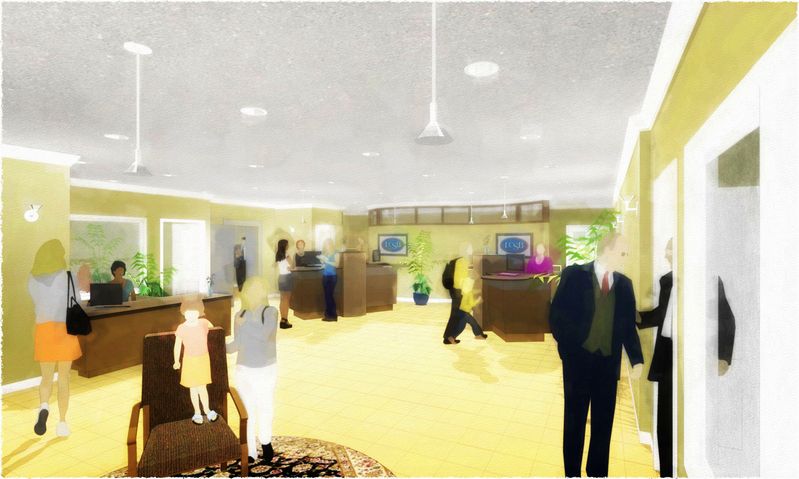
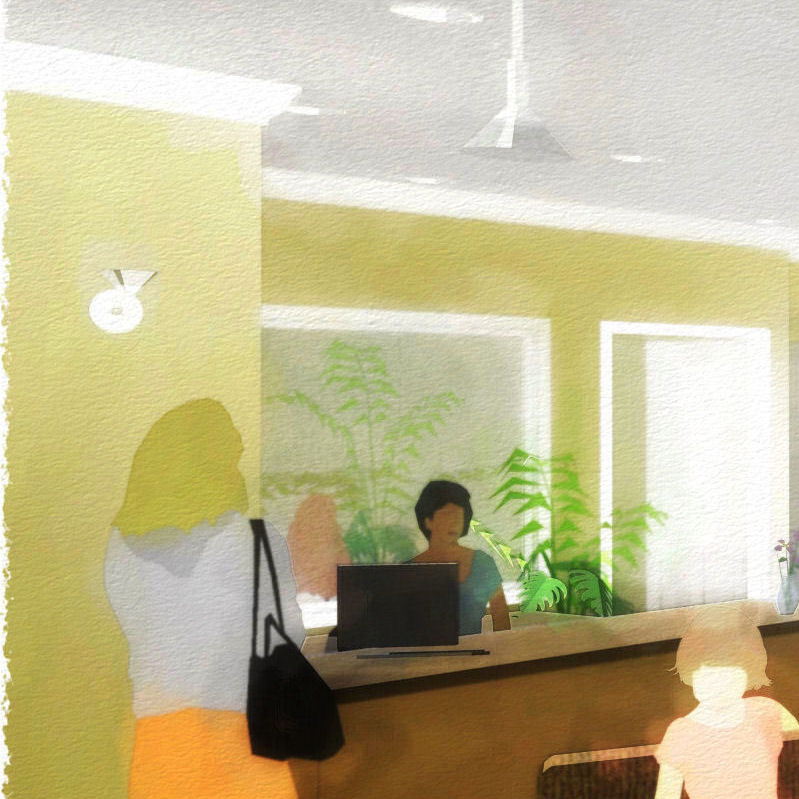
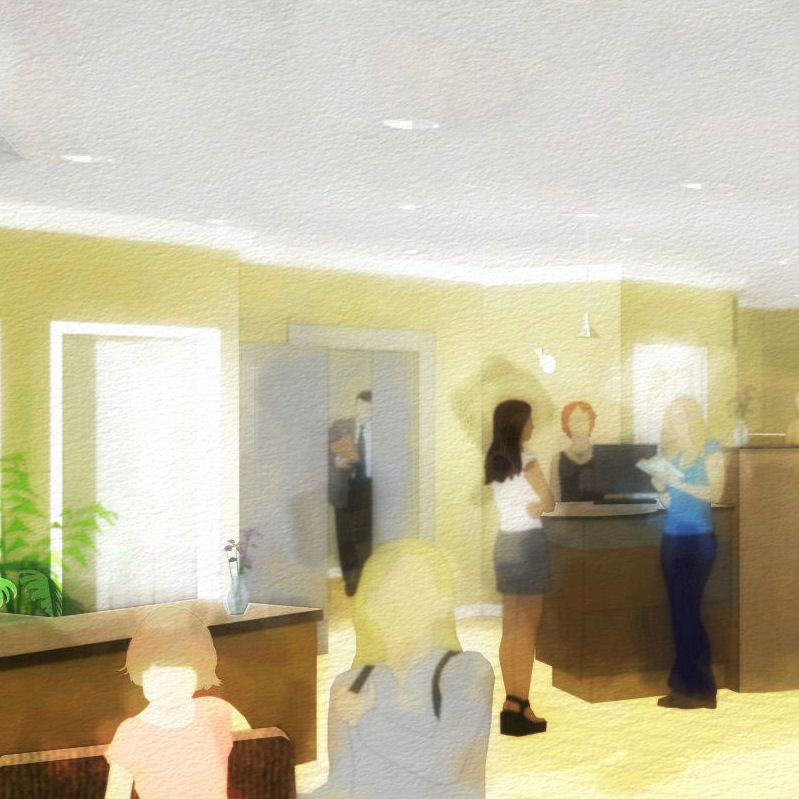
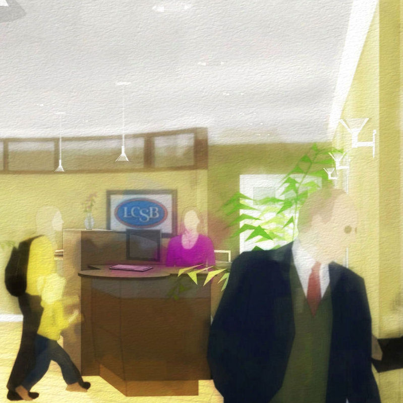
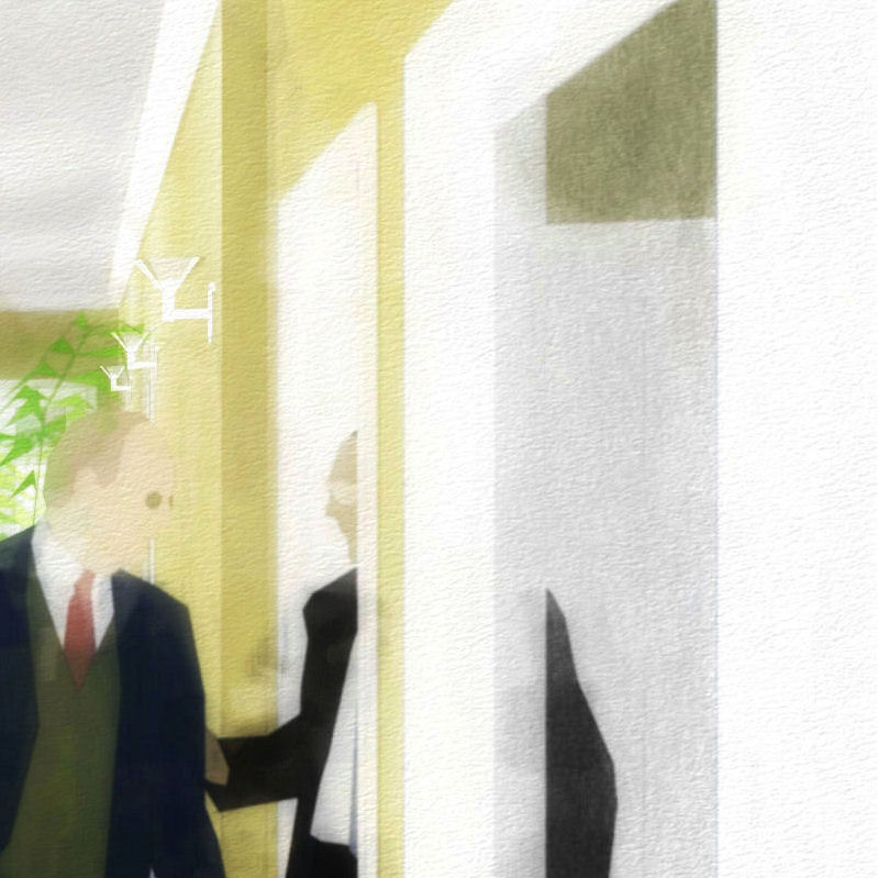
Okay, finally...first, thanks for your continued interest: I hope to receive same on this one, thanks! This shows more clearly where I'm heading with this style and keeps pleasing me more as I refine. I think I have near reached the limit (sans sparks of genius and moments of divine intervention :`) of what I can do with fade filters and the random seeds of preset effects: time now to court some brushes and learn to paint. What do you think?

-
I still think you need something in the big yellow expanse in the centre. There is too much of it for the eye to carry on and leap towards the next "thing".
At this size it looks a little "fuzzy/mushy" but maybe printed at full size it wouldn't be so. Also I only have one lens in my glasses so maybe that is affecting my vision.
-
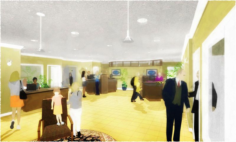
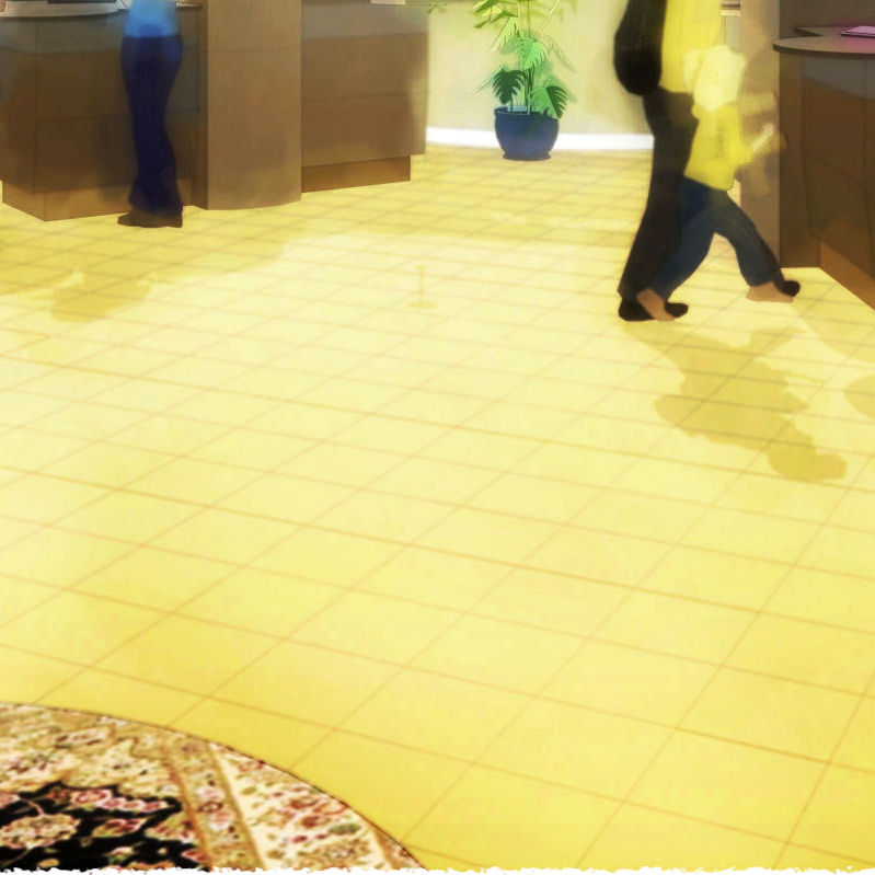
Susan...still may not carry for you, but I enhanced the image a bit to compensate for the small size (and left off the paper texture) then did some of the sheens and shadows brush work I was talking about to intensify the relationships between the hard points and lines around the open floor...which should (sometimes) lead your eye forground to background.
My lithos of so long ago (the inspiration for this style) were always more of a dance for the eye than a stroll...but obviously I haven't learned to make the CG instruments really sing...yet! :`)
-
I like them tom; although the mat on the floor is a little out of place in a NPR image I think....
I'd like to know how you are producing them.

-
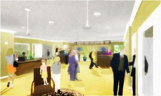
The Style is not the main issue for me. Tom. It is still the composition. I've attached a sample proposed adjustment. I'ms sure you can come up with something better and more in keeping with your style, but that huge space in the centre of the floor is killiing the composition. This might give you some food for thought.
But you may also want to give some thought as to what your subject is. Is it the space? If it is, then the space is not coming across as the most important item but the woman and child up front are. They are the centre of interest because they have the greatest degree of definition and contrast.
It may be more appropriate to make the desk area and person behind it more the centre of interest: After all that spells "BANK". You would need to change the sharpness and and increase the colour contrsst in that area then mute the people in the front. Put them in shadow, make the colours more muted and less differentiated. Certainly mute the carpet. On second thought get rid of the lady, armchair and kid altogether and use a rectangulr carpet pointing inward as a visual path ( on some nice diagonal)but make sure the pattern isn't too prominent,or maybe just use the shadows of some people we cannot see just outside the space, . You would need to juggle the midgroung people a little then perhaps. But still, I would make some "work area" within the space the centre of attention.
-
Of course you're right, Susan, the subject is the space...the use of it, that is, by the community with the new dialog banking towers (to be installed in front of the new curved wall in the back). With that in mind I switched the fuzzy from back to front, in to out, and think the sharpened focus on the other side of the expanse works much better on several levels. Thanks for that.
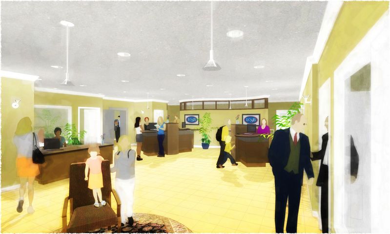
Also noticed finally there is a "circle the wagons" feel that needs to be relieved...I'll work on that (but now I just have to prove I can make that open area work: for me and you, wish me luck :`). And, thank God, I'll now let myself change that hideous existing yellow floor a bit, and loose the image textures altogether (the banker's wife isn't gonna see this anyway).Best, Tom.
-
This is becoming a great thread; I wish we could give it a star rating....[like PushPullBar]
Coen, is this possible? you know identify 5 Star threads....
Hello! It looks like you're interested in this conversation, but you don't have an account yet.
Getting fed up of having to scroll through the same posts each visit? When you register for an account, you'll always come back to exactly where you were before, and choose to be notified of new replies (either via email, or push notification). You'll also be able to save bookmarks and upvote posts to show your appreciation to other community members.
With your input, this post could be even better 💗
Register LoginAdvertisement


