New Building Style using Organic Tools
-
Just starting to feel my way with this. Perhaps some potential. This is just a first quick attempt.

-
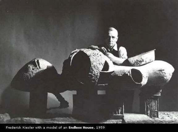
Fred, are you familiar with the work of architect Frederick John Kiesler? I think you would find his ideas interesting. There is an exhibit of some his work in NYC until the 24th:
http://www.drawingcenter.org/exh_current.cfm
I'm hoping to have a chance to see this myself, but time may not permit.
-
He he
 ....nice support structure.
It has some FLW 'Falling Water' to it. -
This one I really like...


I've been lurking in most of your threads, Fred, but although I found them being nice, I couldn't find a way of using them, unless it was as sculptures or alike, but this one I really like..!!

-
Thanks for the comments guys. Much appreciated.
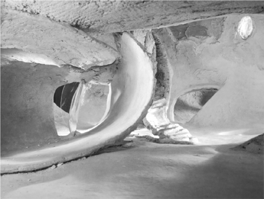
Lewis, I'm investigating Kiesler, thanks for the lead. Interesting stuff. He is perhaps, one of the first blobbists.

A couple of images of his Endless House.


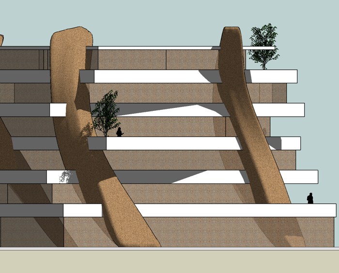
This reminded me of Kwist's interior made with SdS.Kwist, definitely the terraces are very similar to Wright's cantileavered terraces at Falling Water. Probably worth going back and taking another look at FW as Wright uses vertical support "towers" to support the terraces in a similar way to what I'm doing with the organic vertical shapes.
Frederick, I'm curious about your reaction. Any chance you could articulate what it is about this one that you found more "likeable"?
Fred
-
@fbartels said:
Frederick, I'm curious about your reaction. Any chance you could articulate what it is about this one that you found more "likeable"?
Well... Didn't mean to sound offensive or alike...

I like a lot of the work you've posted here, but found most of it being nice sculptures, which can't be used for other purposes...
Then I've seen you've made some - what I interpret as - "fantasy" buildings and although that they look nice, I found them being more like fantasy buildings (Salvador Dali) rather than anything else...

This one, however, looks much more like something that could be made in real life...

So - no offence... I just haven't posted any comments in your other threads, simply because I didn't know what exactly to write...

Hope this clarifies..!!

-
Frederik,
No offense taken at all. I was really just curious what you liked about this one. Thanks for elaborating.

Fred
-
Fred,
this one looks cool. I feel similar as Frederik described... particularly like the impression of being constructable the design has...
Cheers,
Franziska -
I like this one very much ...your kind of art applied to something "real".
but I see it really bigger ! the human should be at least half the side he is now .
really nice ! I would like to live in it

-
i agree with frederik, this one really looks like it could be actually build. and it would be a stunning building?
as orgelf said, maybe it should be bigger. i suggest that you add some more storeys.
-
Thanks all for the feedback. It is very helpful.
orgelf, the human is correctly sized, it is just a trick of perspective that he appears too big, there are 10 feet between each floor and ceiling... see image below, an elevation of the same model.

Julius, I'm sure I'll try a version with more floors in the near future.

Thanks again,
Fred
-
aahhh ok ... I understand the volume now

nice !
-
Fred
Like Frederick I have also been a lurker in most of your posts, for similar reason they appear to be an exploration of fantasy and as such more leaning towards the artistic side. However this one seems to have bridged the gap between art and architecture. The contrast of the more fluid structural elements with the rectilinear floor plates is pleasing. Almost like a tree house but on a much larger scale.
Sometimes you have to explore fantasy to push reality a little bit farther than where it currently is. It's visionaries like you that expand the perception of what is acceptable.
Thanks for sharing your thoughts with us.
Regards
Phil
-
fred, you've out done yourself again. this is awsome. i love how its slightly twisted and all the floors are at diferent angles. the twisty-nes reminds me of the TIN stuff i used to do.
283
-
Dear Fred,
I really like your design. Reminds me of the Robinson family treehouse!
Keep up the good work.Ward
Hello! It looks like you're interested in this conversation, but you don't have an account yet.
Getting fed up of having to scroll through the same posts each visit? When you register for an account, you'll always come back to exactly where you were before, and choose to be notified of new replies (either via email, or push notification). You'll also be able to save bookmarks and upvote posts to show your appreciation to other community members.
With your input, this post could be even better 💗
Register LoginAdvertisement


