Need help with this illustration
-
I'm working on a project that involves reconstruction of a room - and I'm trying to create a illustration of that room.
I have tried to combinate vray renders as a shadowlayer and on top normal SU export. But it is not good

Does anyone have some suggestions on how I could make it more 'nice' ?
Should it be more like a auqarel or ?
Thanks
Jorgensen
-
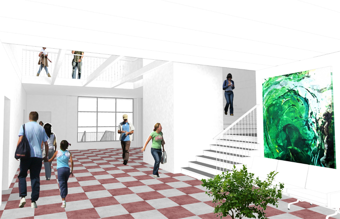
a too open room

yes i think aquarel willl fit best.
-
Hi
"a too open room" - you meen to few people ? -
First thing that pops out is the people look to be floating without shadows. Also maybe add a color to the walls to give them more definition.
Scott
-
I think the peeps are working good to help describe the flow of the space...open and comfortable when 'crowded', but the walls and clg aren't...not an image I'd let the paper color suffice (or maybe some hint of line work would work instead of subtle color?).
Also, I guess I'm a bit troubled by the headless folks on the upper floor...maybe a kid with them would help (or maybe this is just a personal thing?).
OM'sO
Anyway, hope to see the finished product!EDIT...agree with Scott about the shadows.
-
Hi
I'm workin on it - but I can't paint the walls - is a part of a competition and there is only calulated with white wallsYou are right about the shadows - Scott.
-
@jorgensen said:
Hi
"a too open room" - you meen to few people ?no
i meant the room itself it is too opened to be a room.
just semántica.
or my bad english

aquarel will bright the scene of that opened space-room?
-
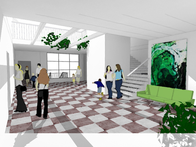
Do you mean more realistic by saying nice? The second version I think is a lot better without anything else. It is a good illustration except the tree on the right corner
For the realistic version I think just render it with Vray do not use regular SU export' then add people by using mask in Photoshop. After that, you should seperate the shadows in different layers. http://lucky13.deviantart.com/art/Drop-Shadows-and-More-A-Movie-16850075 This tutorial helps i guess. If the results for renders will not be satisfying, I recommend to use 3Ds Max with Vray which has more options to control the environment and UWV. -
Like the last render very much, nice going!
-
-
Tutorial is a flash movie. You dont have to download it. Check you flash plug-in of you browser. Also the other Photoshop tutorials of this guy are very handy for us.
-
Just wait for a while
 I can watch them. Just checked.
 -
I don't have much constructive advice on how to render it better, though you could look at kerkythea which I've been using to design my own house remodel for rendering and it works great.
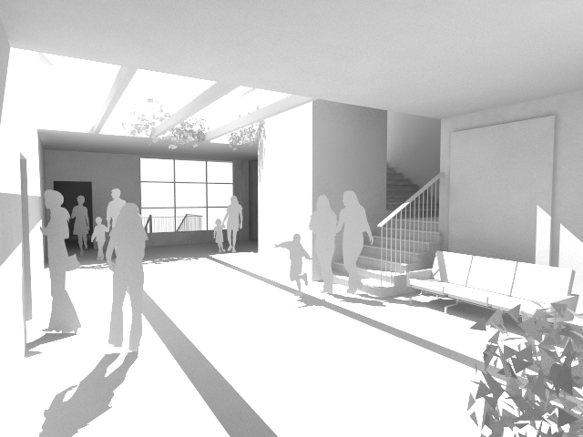
I will say, I understand Juan's comment about 'open room' -- Is their a utility reason for the room being so sparse? Without much context it's hard to say. But from a completely laymans point of view (I'm not a designer or architect) the room 'feels' like it's missing something from the middle of it. Those people that can look over the railing down into the room, if the room is empty they just see a checkered floor. You could add a raised planting space (not even sure what it's called) -- by the space it looks like it could fit a 4'x8' type area that even offers a small ledge to sit, even if it was only 18" or high or so it would help break up the room flow.
P-
-
Hi
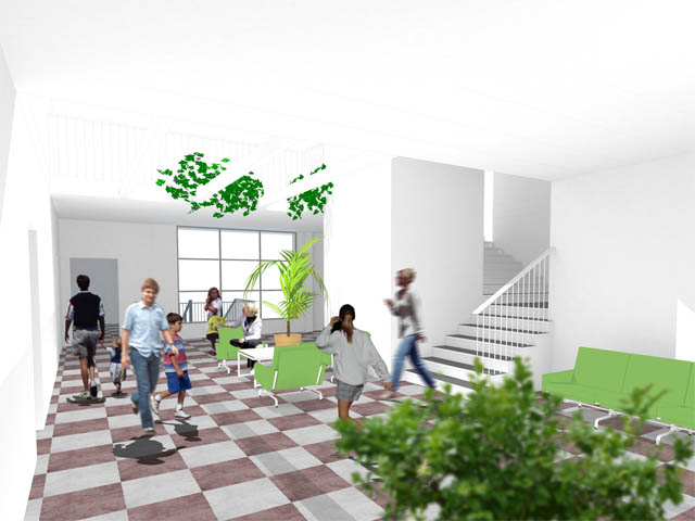
Next version
- tried to create more difference in the room by using more contrast on the shadows
(added a VRay spotlight, might be to bright still) - played around with the aquarel technique
- changed the people to the more simple ones
- lowered the red color on the floor.
Next
I consider removeing the pickture in the back of the sofa - it takes to much attensionOther tips ?
ps. the floor is existing.
- tried to create more difference in the room by using more contrast on the shadows
-
Render 03
Added a new version where I added som photo-people, and some furniture in the room.
But I think it's hard to make the photopeople to become a part of the room, they seem to crispActualy I like the aquarel look better.
-
Jorgensen, how bright is your wall colour? I asume it is a pure white (RGB colours at 255, 255, 255).
such a bright material does not exist in the real world. you should consider setting down the brightness of the colour a bit (for example: a white sheet of paper has RGB 220, 220, 220).
if you have a perfectly white wall, light rays will not loose any of their strength when reflected - and with the raytracing method the rays will bounce from surface to surface until they have lost all energy (that is how indirect lighting works). if they don't loose any energy, they will bounce forever.

I don't know how close Vray sticks to real light behaviour (for it is an biased render enigne). I recently started using Indigo (an unbiased renderer) and if you use a completely white colour it will look unrealistic.
- please correct me, if it is a different matter with Vray -
-
I agree if your using Vray try to stay away from using pure white (rgb 255,255,255). It bleed too much and does not show well. (rgb 240,240,240) works well for most things white. Also make sure you have "clamp output" checked in the color output rollout. This will help whites being too white or bleeding too much.
As far as the image I am not sure about the plant materials. They do not fit for me in this image. Especially the once hanging. Overall I think the image is getting better. If the space is the main focal point try to not over populate it with other content. It is a fine balance between "enough" additional content and "too much".
Scott
-
i love the look of the second one.
very nice
pav
Hello! It looks like you're interested in this conversation, but you don't have an account yet.
Getting fed up of having to scroll through the same posts each visit? When you register for an account, you'll always come back to exactly where you were before, and choose to be notified of new replies (either via email, or push notification). You'll also be able to save bookmarks and upvote posts to show your appreciation to other community members.
With your input, this post could be even better 💗
Register Login


Advertisement