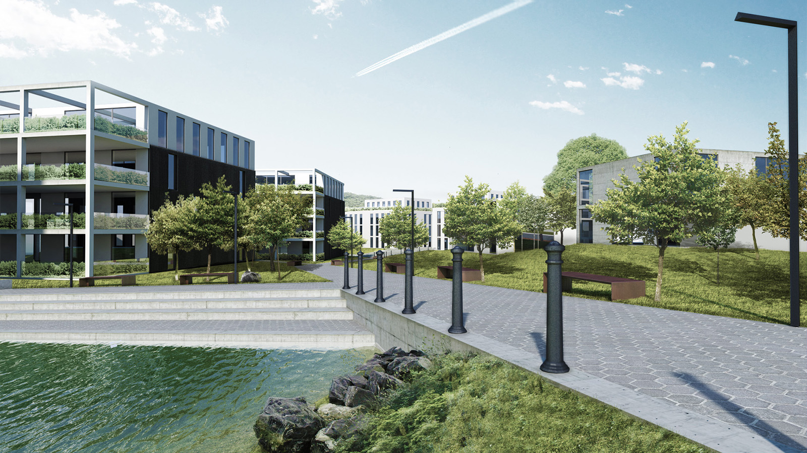
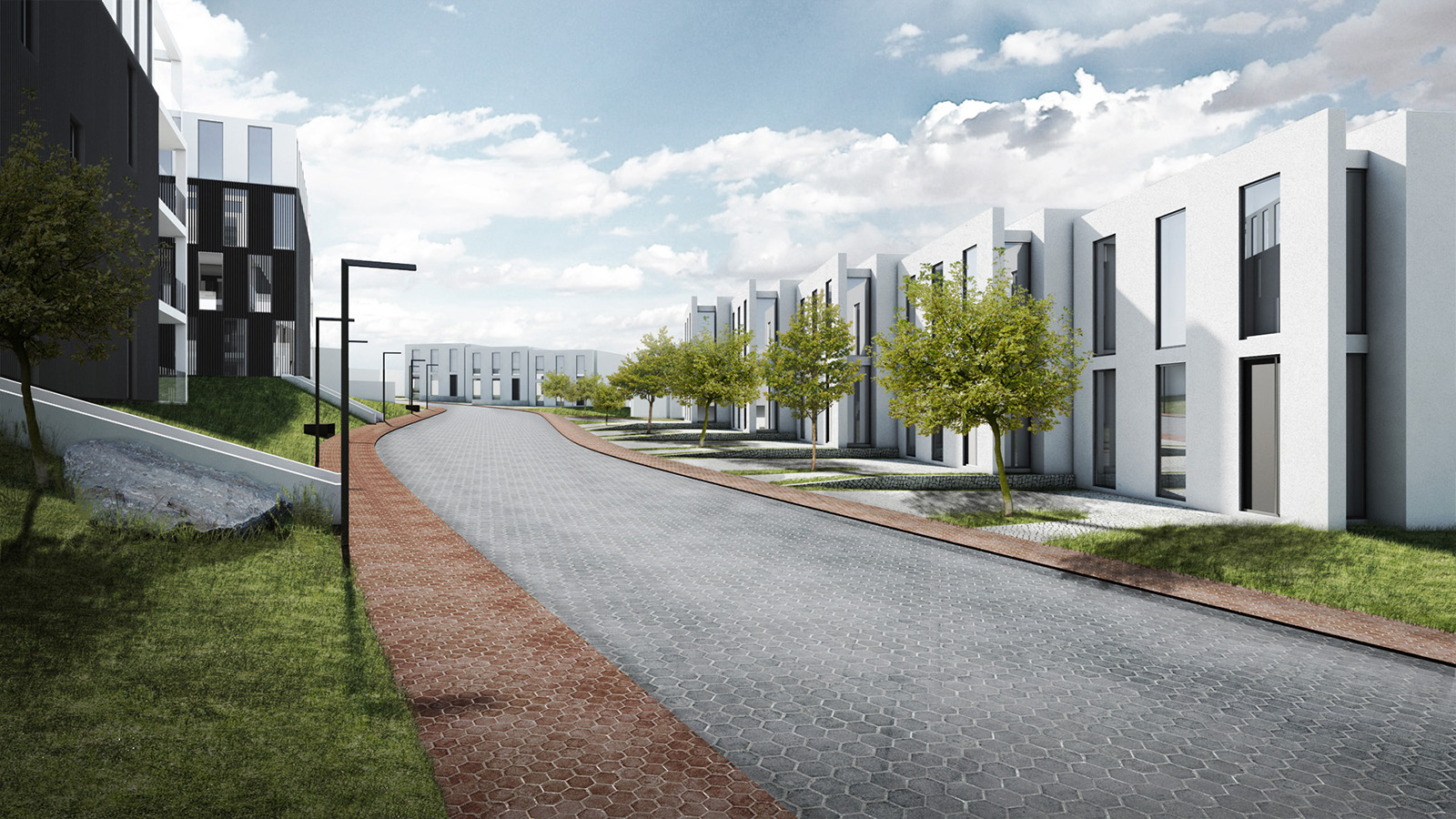
Hi RedFoxy, welcome to the gallery forum! I'm quite new here too. 
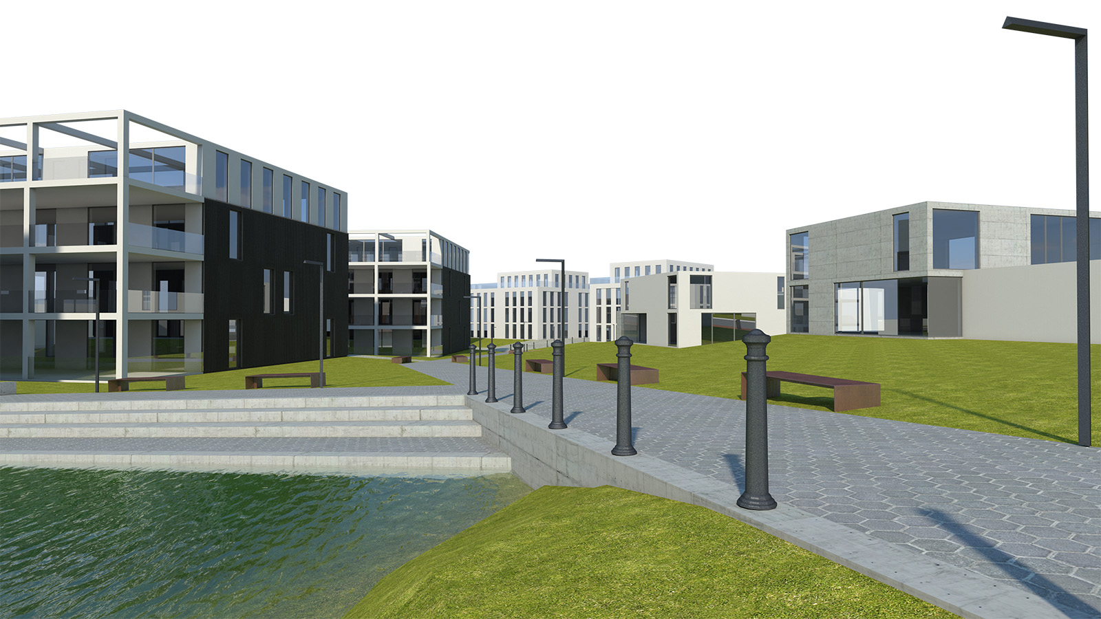
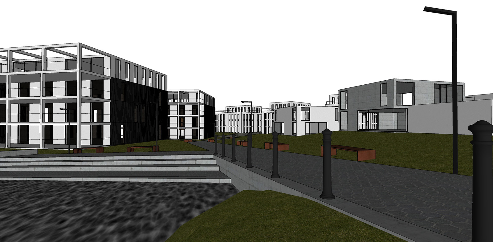
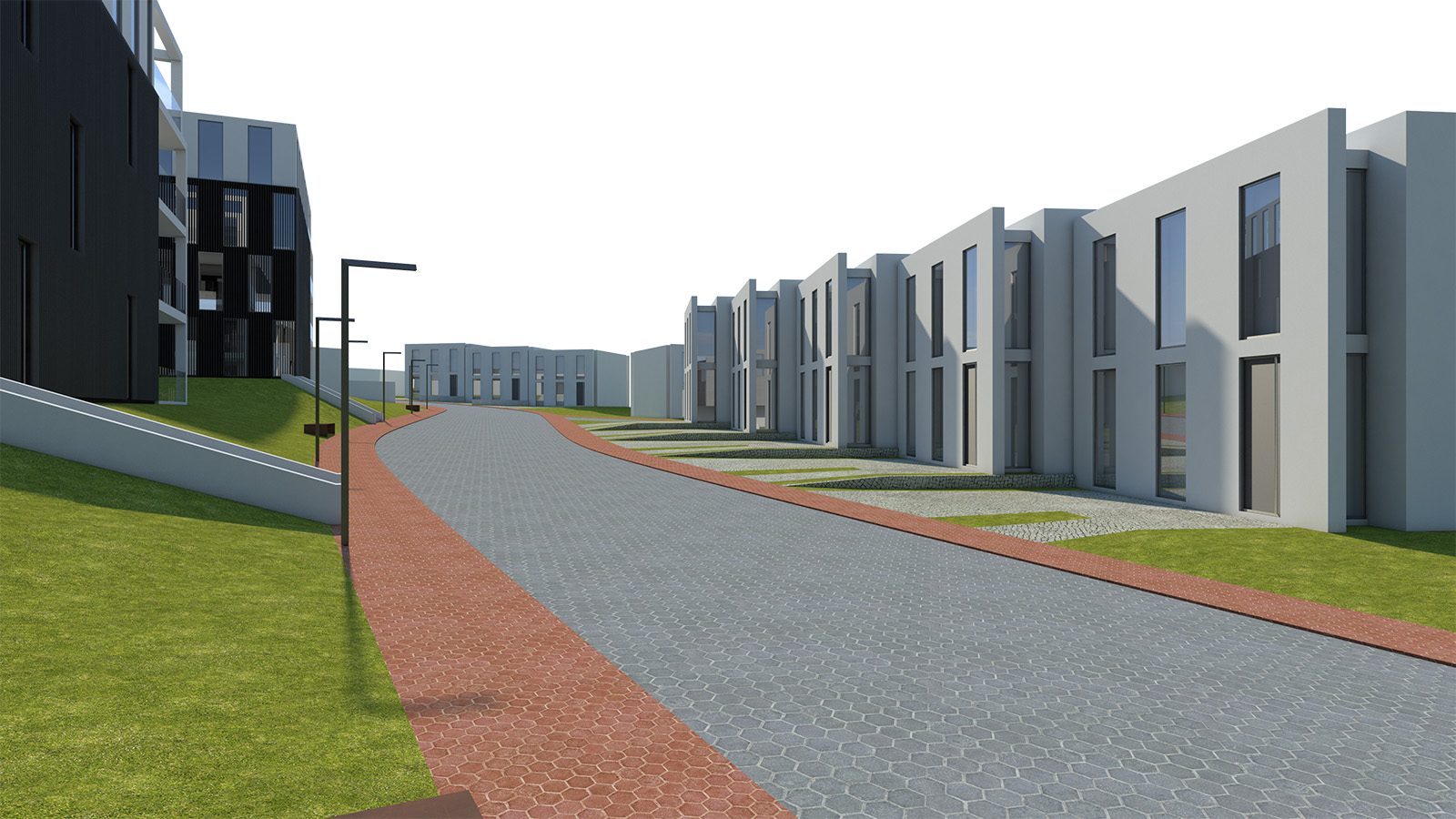
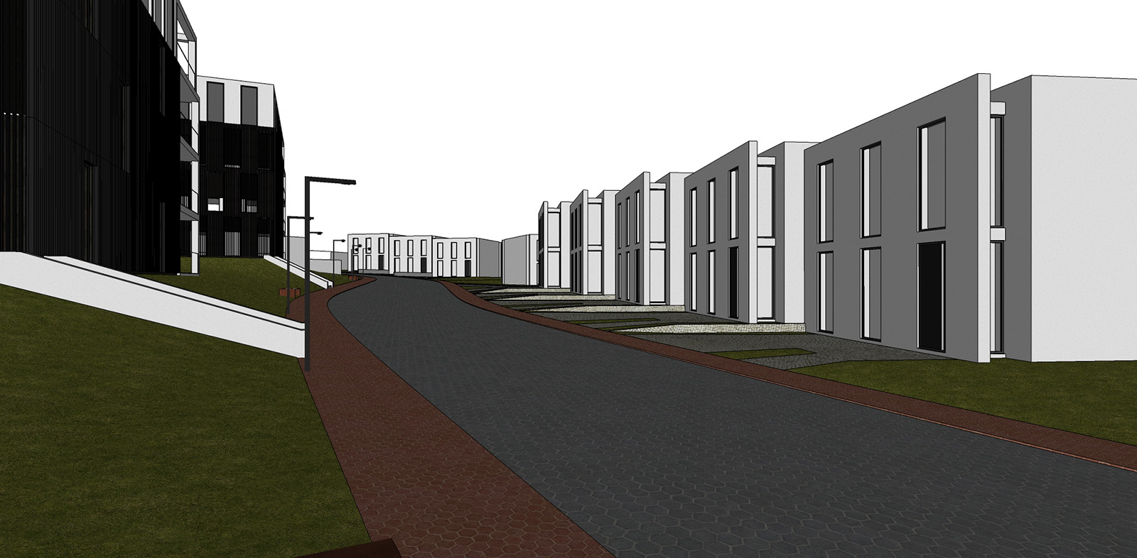
First off, these are great images for just being a second scene! I'm already eager to see what you'll be making after 10 scenes/projects.
Nevertheless, there's always room for improvement, some additional info would always be handy. (Render engine, material settings of the ones you don't like),..
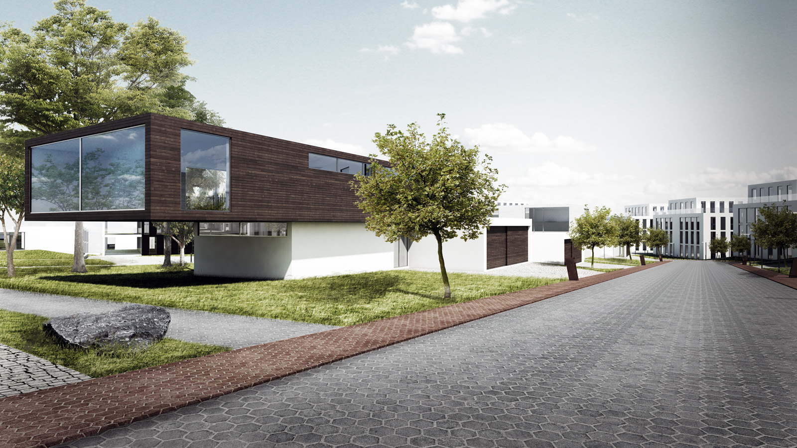
-The woodgrain on the window frame all run in one direction
-Windows are a bit simplistic looking
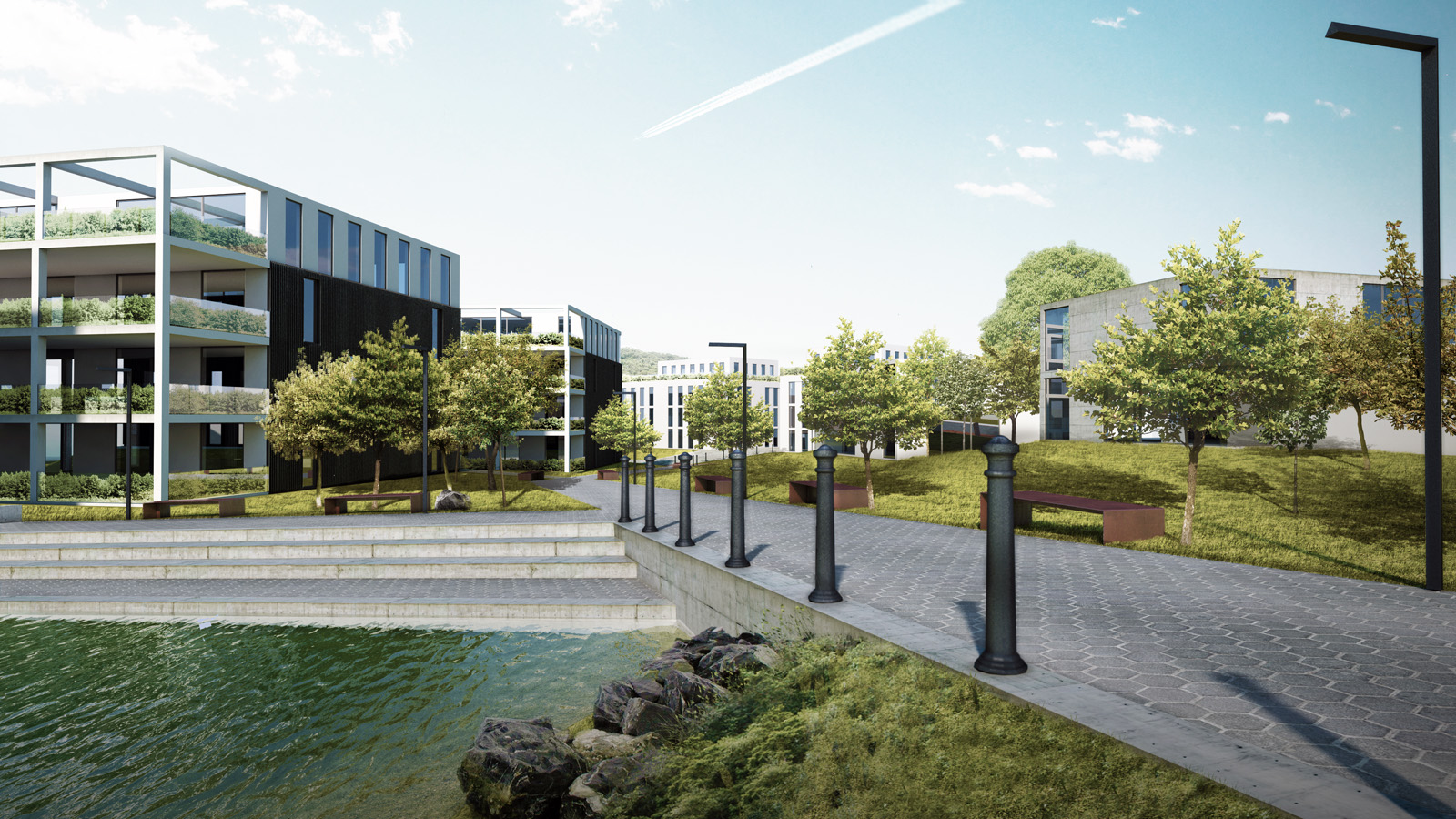
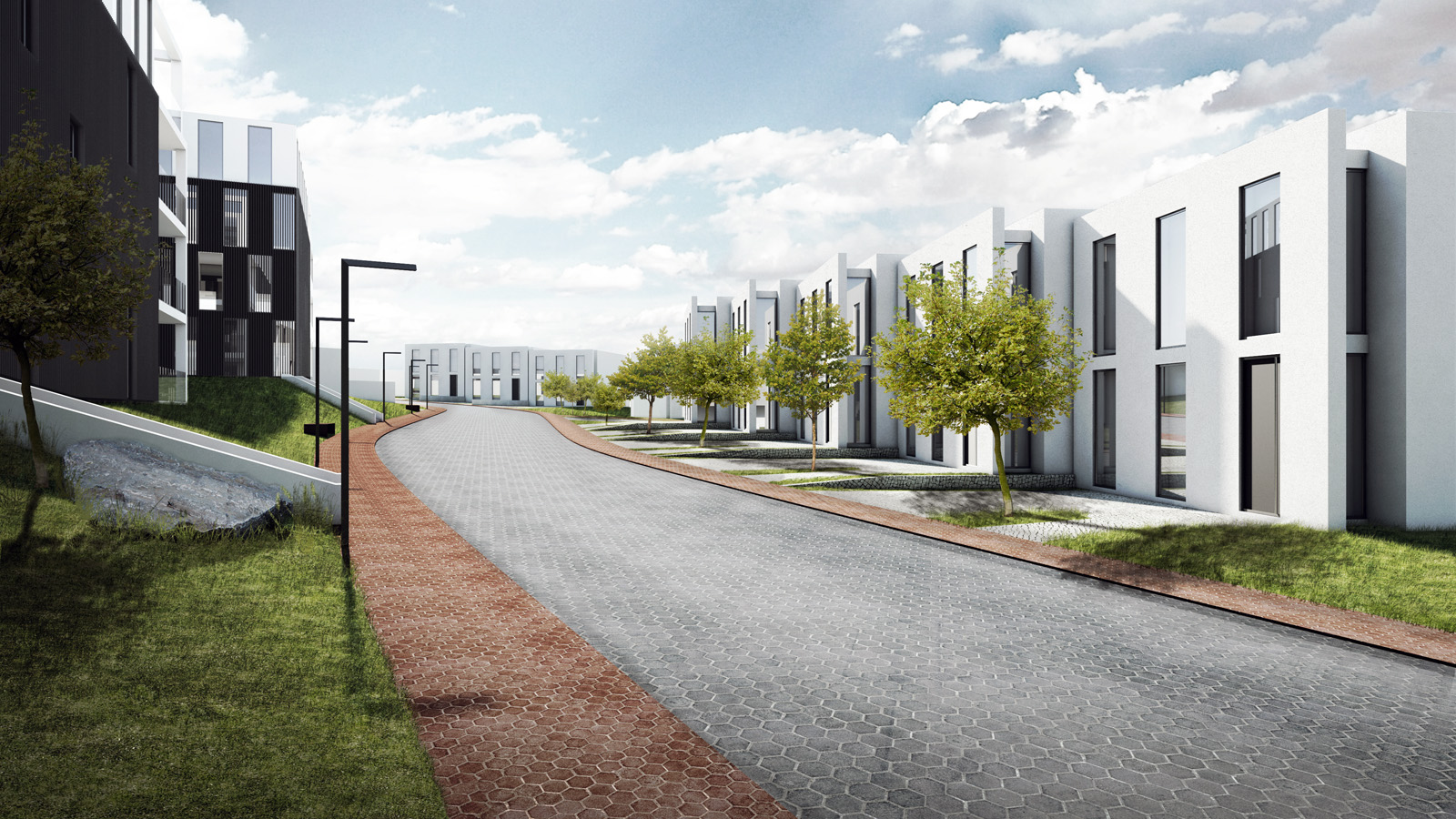
-Concrete texture doesn't tile perfectly and is a bit low-res/tiled too big
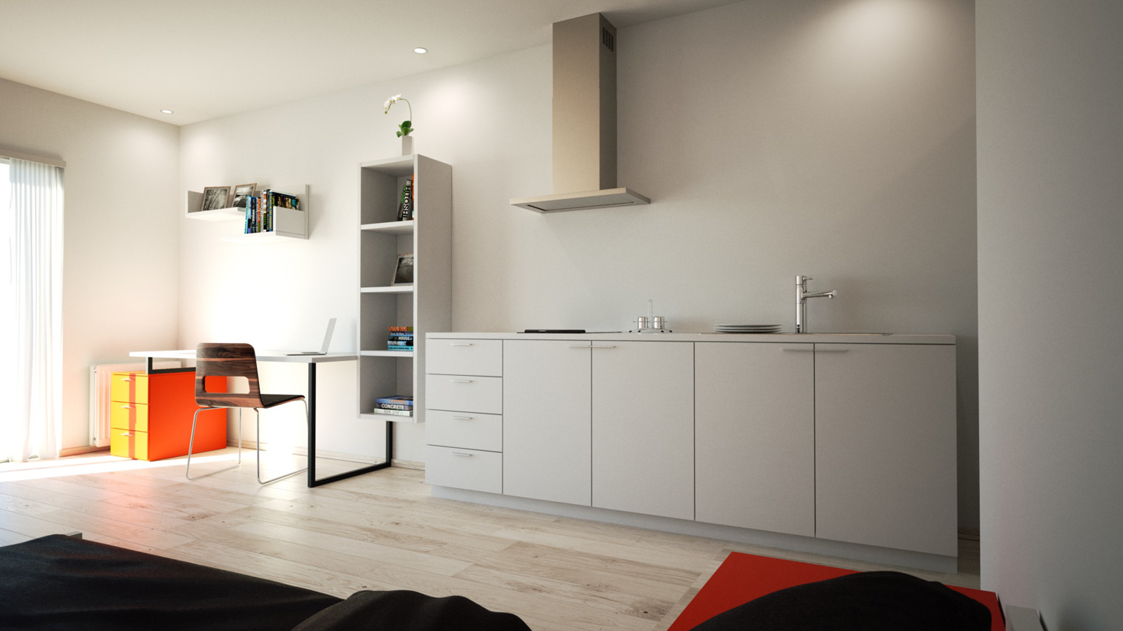
-Woodfloor doesn't tile perfectly
Maybe try to play a bit more with the camera (levelling it, focal field so the scene looks slightly bigger, etc)
Still, very neat work. Keep us updated!
Cheers,
Roo Evans


 Don't worry about the floor too much, that's the 'smallest improvement' I'd make. As Stefanq stated, also try to use AO. This might improve the scene dramatically!