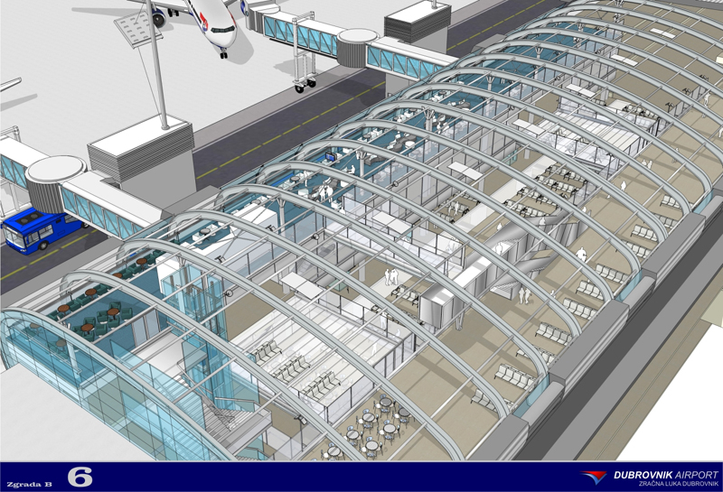
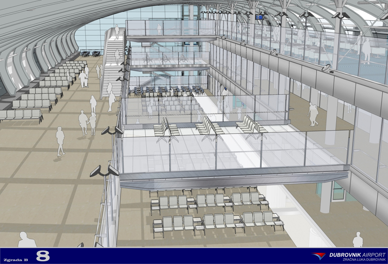
Great images Tom.
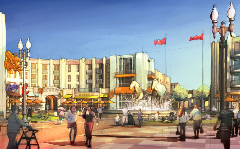
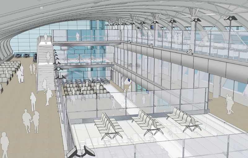
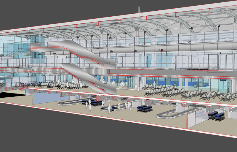
In my opinion Your images would benefit even more
and have a greater architectural feel if You added some
loose pencil sketch overlay and maybe extended edges.
I would also prefer to keep the sky simple.
I think have an image in my reference library that I think
shows what I mean. It was done by Dennis Allain,
illustrator . It was probably done in other techniques
but You will catch the drift.
You can see more of his work here:
http://www.dennisallain.com/
Dont get me wrong, once again You images are great
this Is just a matter of opinion and my personal
taste.
Cheers,
Mateo
