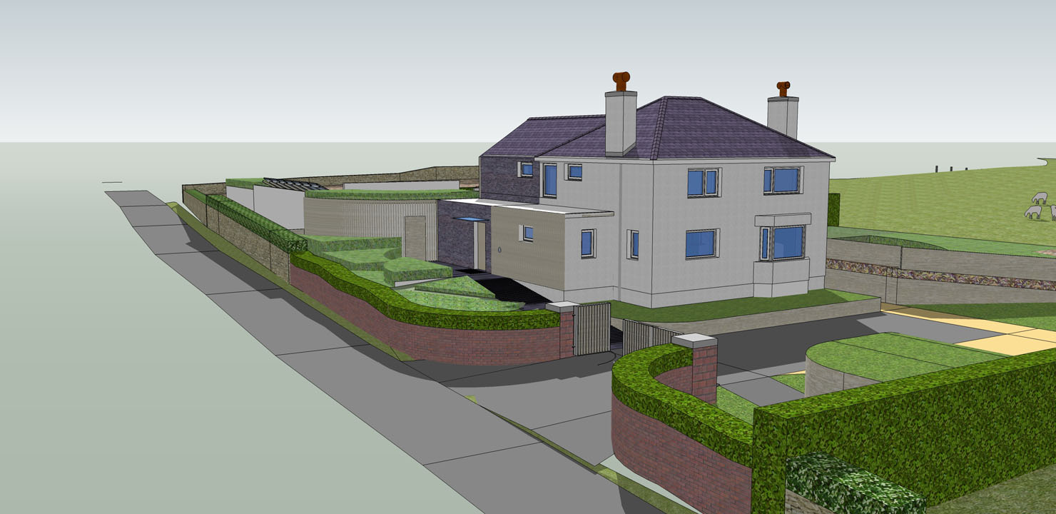
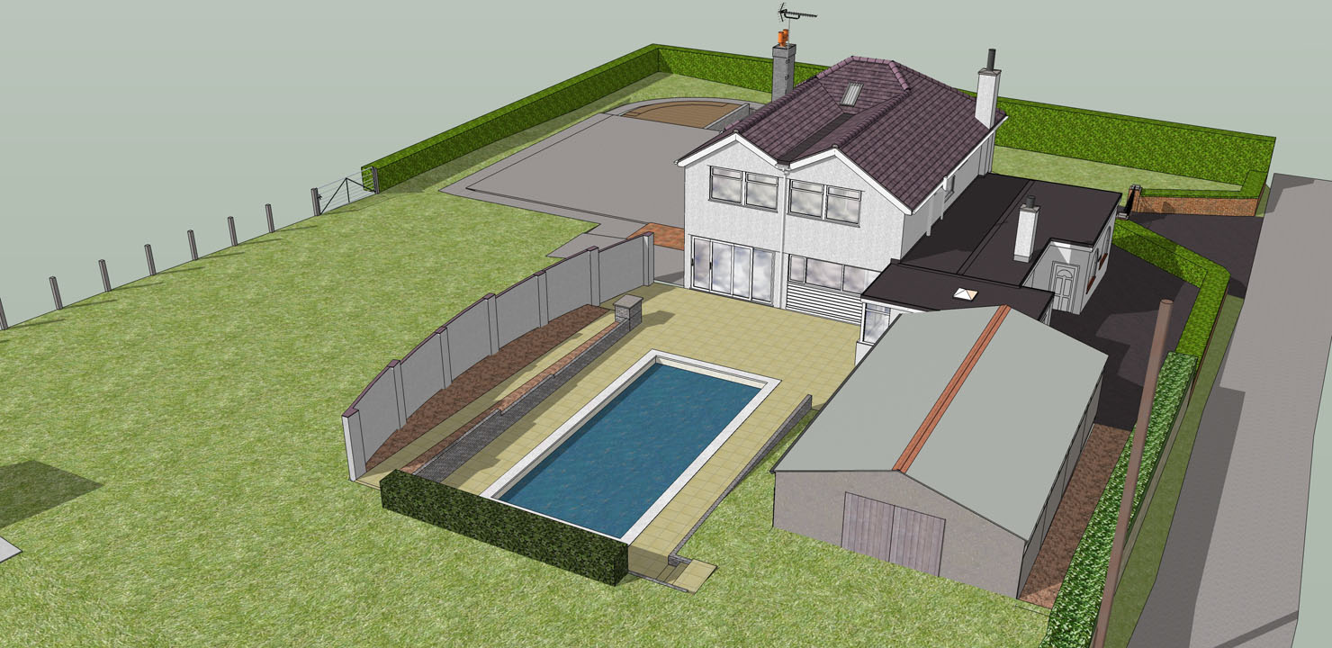
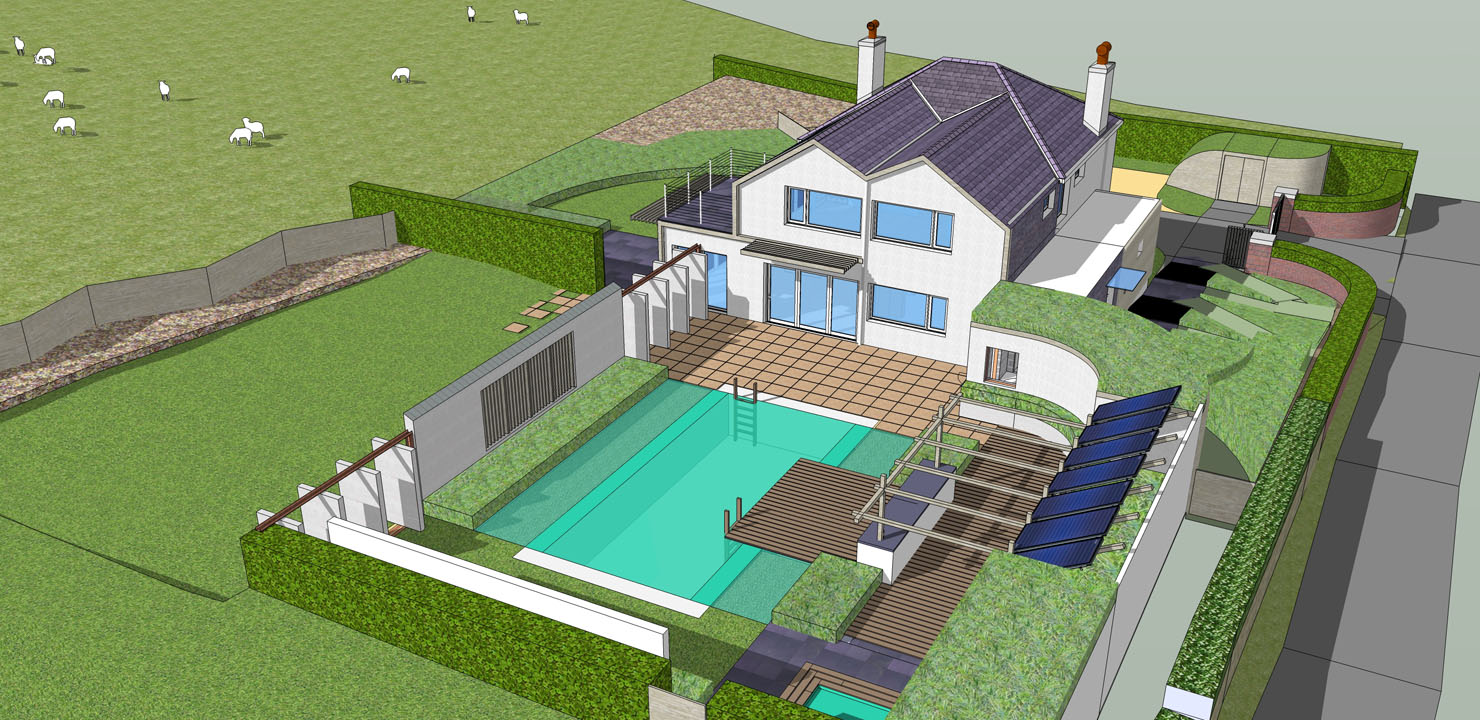
Thank you for the reply, Daniel. You make many good points - I shall try and justify each with a response below.
@daniel said:
Dear LE, a few impressions:
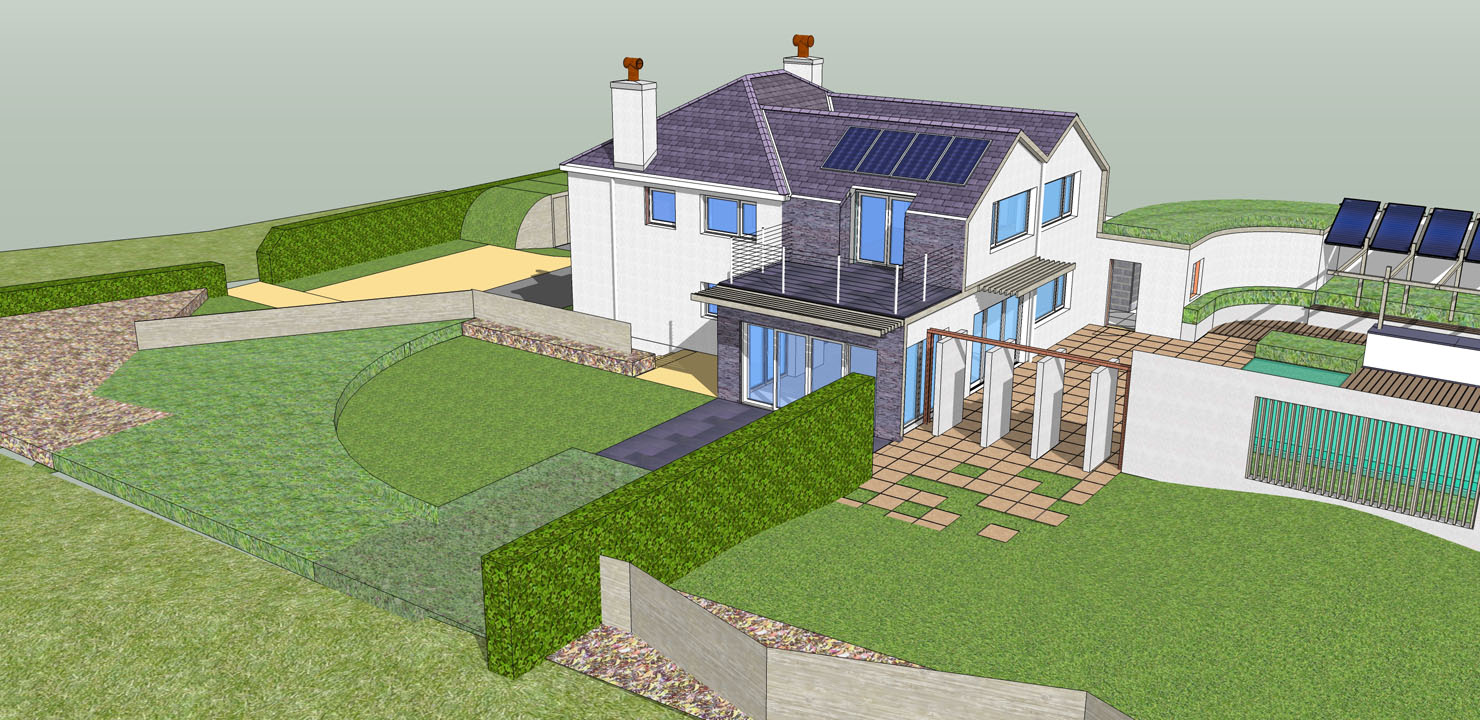
I would lose the blue glass in the refurb model - it looks cartoonish. Try a gray colored glass. For added effect, put drapes/blinds behind them to make it look more real. Swap out your green pool water with blue water (algae makes water look green; blue water will look clean and inviting)
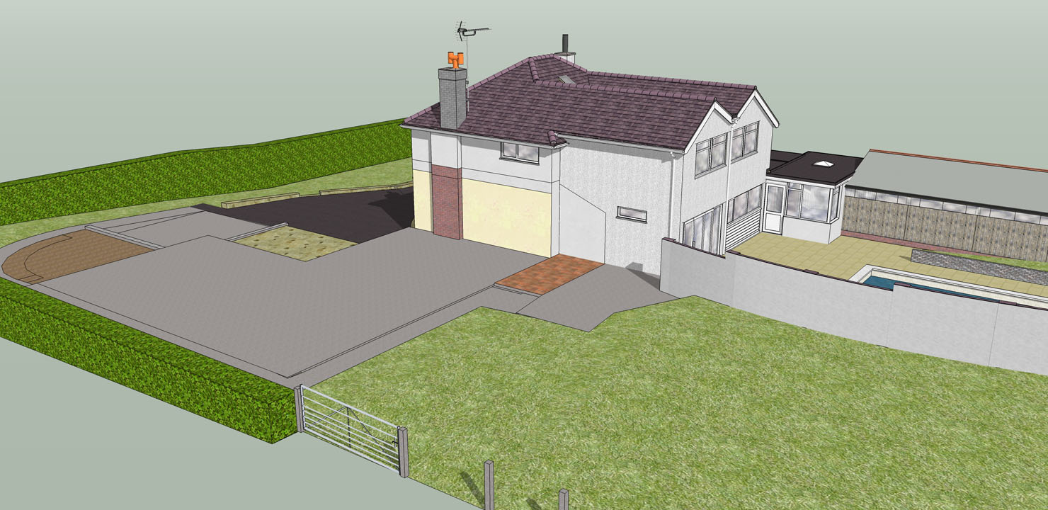
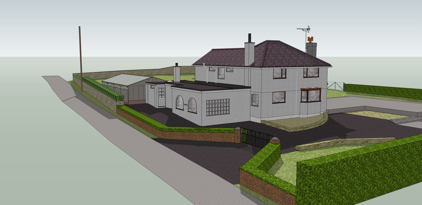
The outputs I've posted are very rough and ready and I agree, there are quite a few improvements I can make in the presentation - including the glass, as you suggest.
No*!* the intention of the green water is to look clean and inviting  ! ...What's not clear is the pool is to be converted and operated as a natural pool. Something along the lines of this sort of aesthetic:


I hope I've convinced you that a green pool can still be inviting:)!
@daniel said:
The area enclosing the pool seems chaotic to me. There is a lot going on. I don't see any unifying design element or materials. Part of it could be the textures you are using, too.
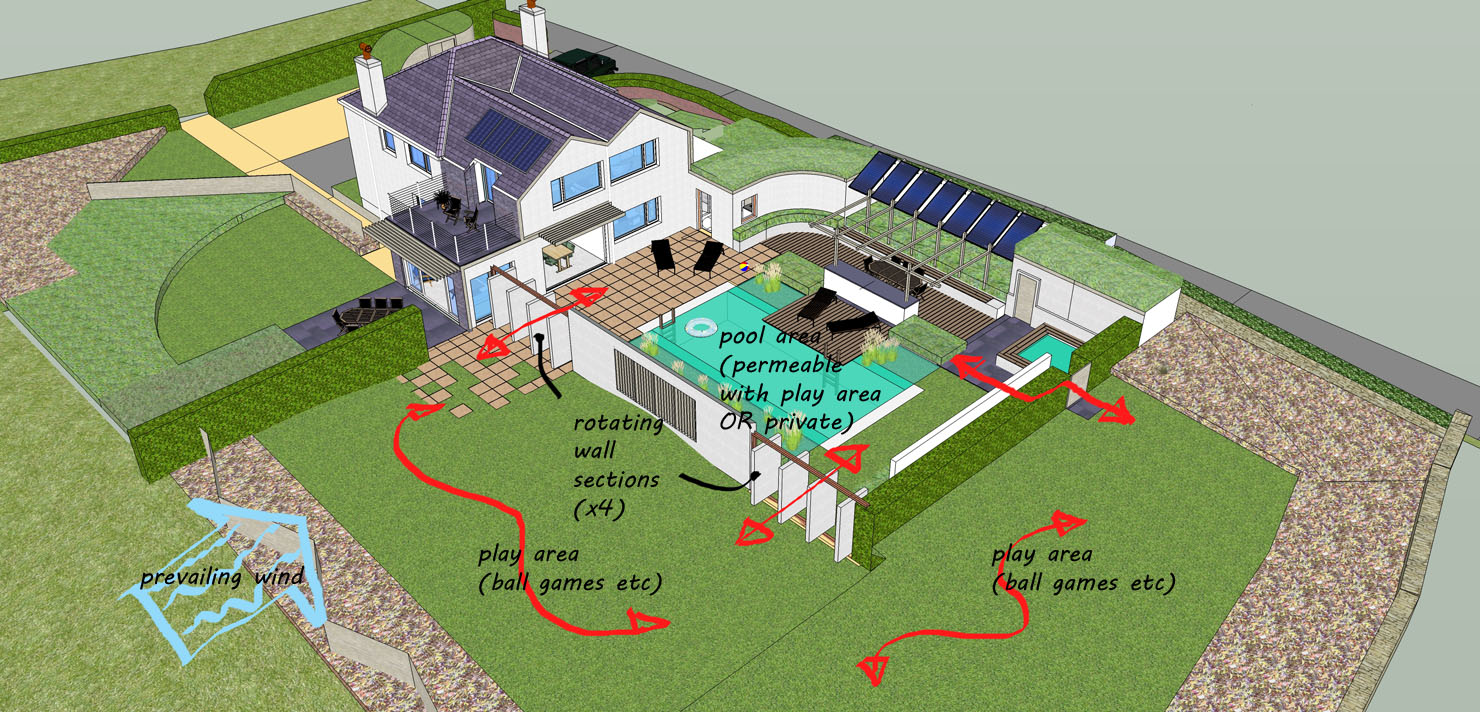
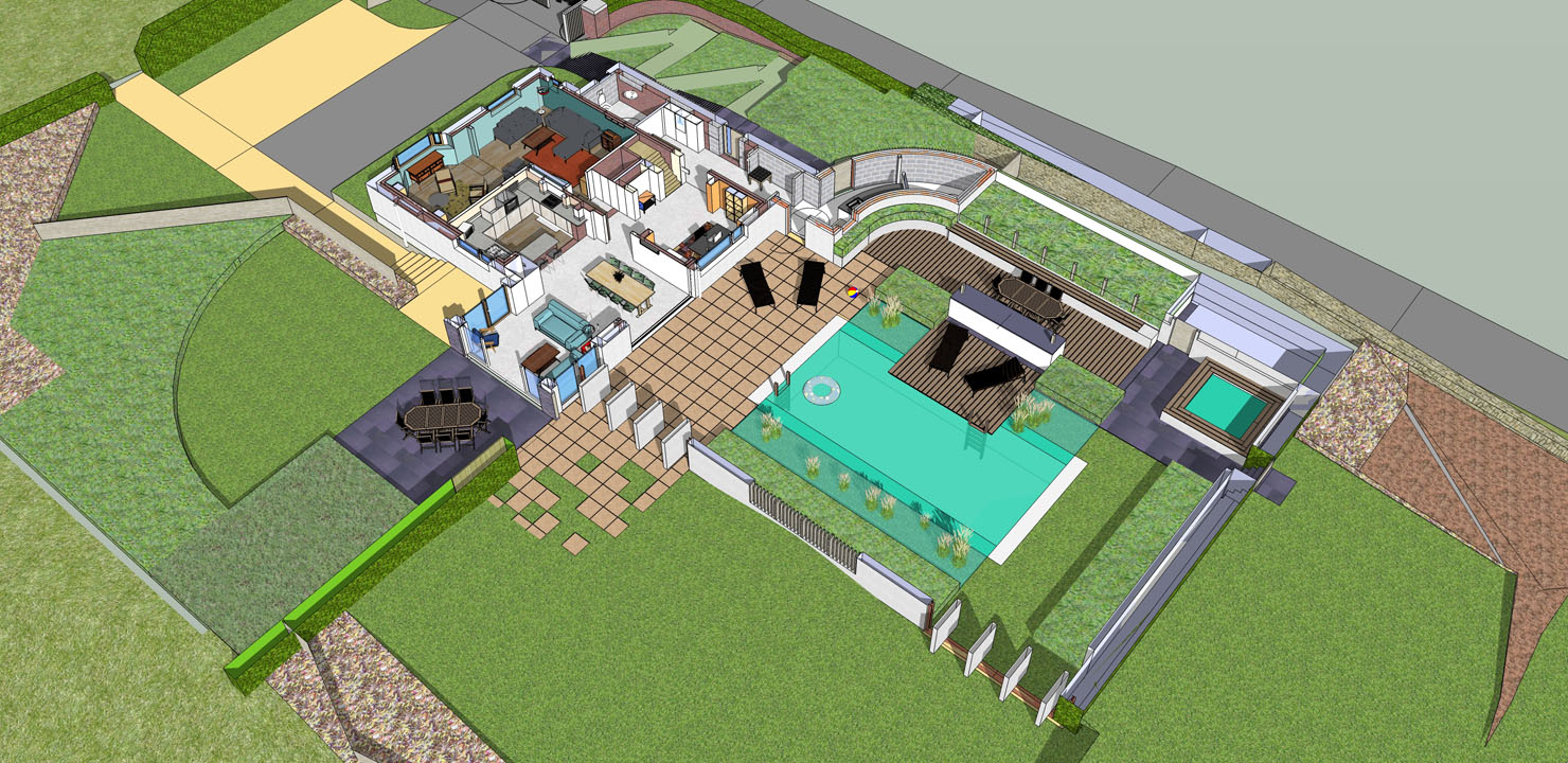
You might have a point here - especially with the introduction of loose planting associated with the natural pool. Perhaps if I annotate the layout it could help with your perception of the space - my original presentation is not entirely clear.
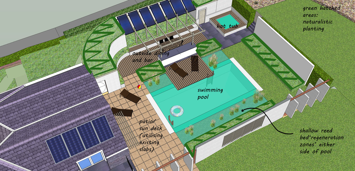
A few major unifying elements and materials that I can list:
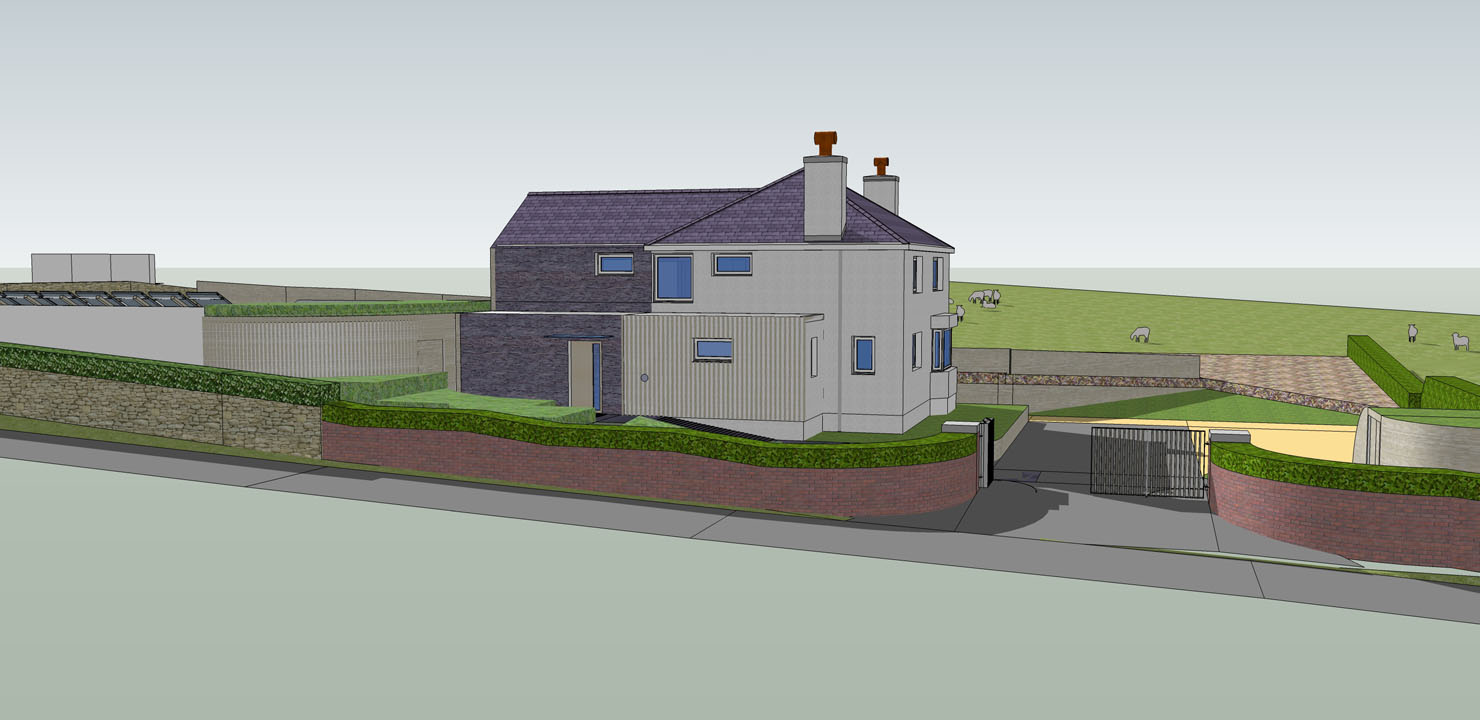
Slender vertical or horizontal timber members (wall caldding on entrance, pool wall slats, brise, solar collector frame).
White stucco render
Slate
Naturalistic planting
Solar collector panels
@daniel said:
I don't think the idea of the slate ribbon is "too bold" - perhaps that can be the unifying element, with the slate paving flowing into the pool court and elsewhere? (just a thought)
I'm buoyed by your dismissal of the ribbon being overly bold. There are slate elements elsewhere, however I fear having more slate poolside would be overpowering/dominating - but I could be wrong.
@daniel said:
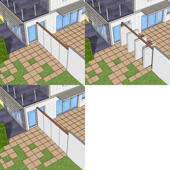
You have a large glass window on your addition, and just outside that window is... a wall? What's up with that? Who wants to look out a window and see a wall?
[attachment=4:dwdenp0r]<!-- ia4 -->1.jpg<!-- ia4 -->[/attachment:dwdenp0r]
The doors are rotating and can be open/closed individually or as a group, depending on the pool setup required.
[attachment=1:dwdenp0r]<!-- ia1 -->2.gif<!-- ia1 -->[/attachment:dwdenp0r]
@daniel said:
That large lawn area to the left of the pool court appears as left over space, and isn't engaged with the house or the other two site areas (pool and area off the addition).
This is a troublesome area. There are a few elements of the design that cannot be read without further explanation which aim to mitigate the 'left over' feeling and bring a cohesiveness to the two spaces which I can better explain on the annotation below.
[attachment=3:dwdenp0r]<!-- ia3 -->rearareaover.jpg<!-- ia3 -->[/attachment:dwdenp0r]
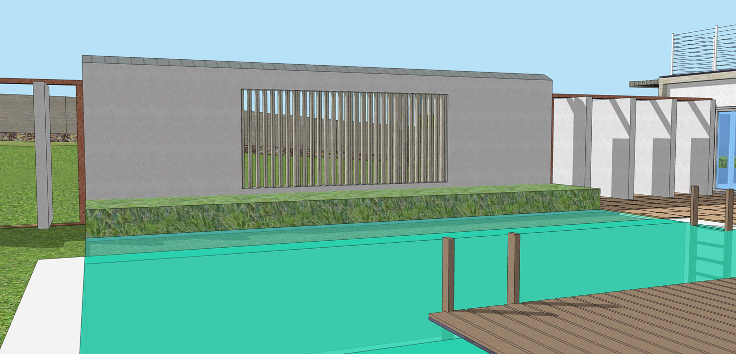
The problem is I intend the pool area to operate in two modes: 1. enclosed from the lawn/play area so as that to give privacy and/or a safe enclosure. 2. opened up to the play area, via the rotating doors. The addition of a slatted void in the main pool wall also aims to strengthen the relationship between the two spaces, as shown below.
[attachment=0:dwdenp0r]<!-- ia0 -->poolwall.jpg<!-- ia0 -->[/attachment:dwdenp0r]
Thanks,
R
