@utiler said:
WHat's your render program, japc? looks nice and clean...
Hi utiler.
I used Indigo Render and some post-production in PS.
@utiler said:
WHat's your render program, japc? looks nice and clean...
Hi utiler.
I used Indigo Render and some post-production in PS.
@krisidious said:
For me the sky lends to the artistic individuality...
Hi Krisidious. Thanks for the nice words. I'm glad that we share the same vision about these images.

Nice image. In addition to the comments, I just suggest some pronounced shadows to give a little more drama to the image.
Hi Carloh!
The proportion of sky was deliberated for presentation questions. And you are absolutely right because it is a volumetric study and not a photorealistic presentation. In this case i gave more importance to the reading of the volumetry and shadows than the materials and photorealism.
Hi guys!
I'm posting some wireframe of my new project. Soon I'll post some renders.
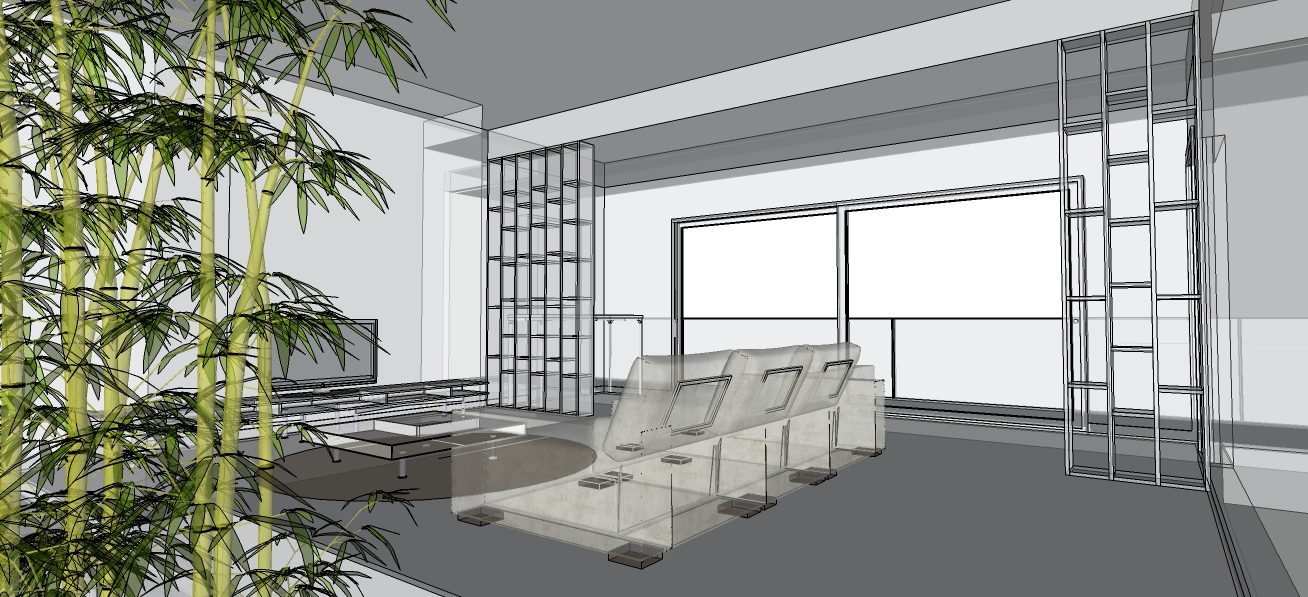
Hi Stefan!
Apreciate your comments. The chair is the Hans J.Wegner Ox Chair. I love particulary the design of that chair.
The material applied is a black leather and i agree with you, I must work a little more the texture.
I got the chair model from 3dfurniture.net.
Thanks Michael!
I agree with you. The grass should be a little less saturated.
I´m not a vray expert but i think you should add a bump map to simulate some material texture on the walls, like stucco per example. The same concept should be applied on floor.
Hi Pawel!
I like the overall concept of the kitchen.
In my opinion you should try to control a little better the reflection of the ground and add some grain to the walls to simulate some light absortion.
There's something strange about the scale of the teapot!
I'm sharing this render of a living room. I made this Sketchup model to test a few things in IndigoRender.
CC are welcome.
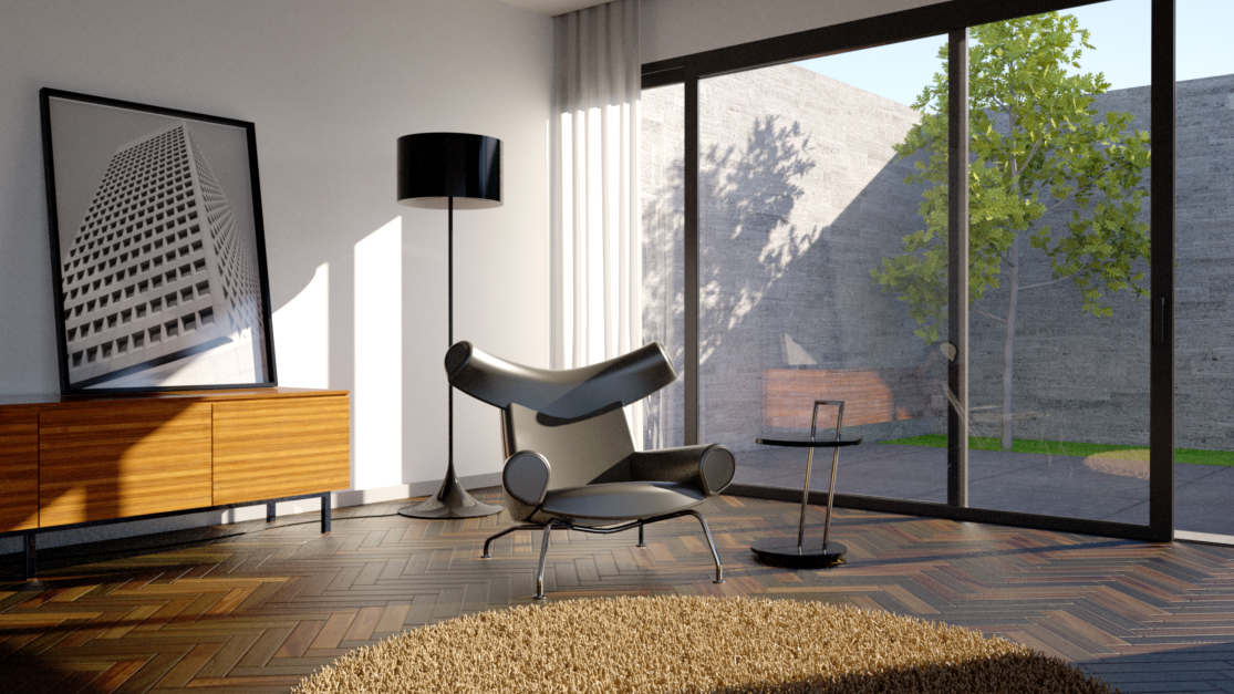
Hi Antonio, nice images!
I have only three comments for the last two pictures:
-the carpet seems quite flat. It looks like a sheet of paper to me;
-the exterior lighting of room doesnt quite correspond to the lighting of the background;
-You should look for the overall composition of the room. The journal on the floor seems a bit out of context to me, considering the disposal of the room.
Hi Minh. The project is being developed and we don´t have the a closed solution yet. Soon I'll post more information about this project. Meanwhile i leave this images of another project.
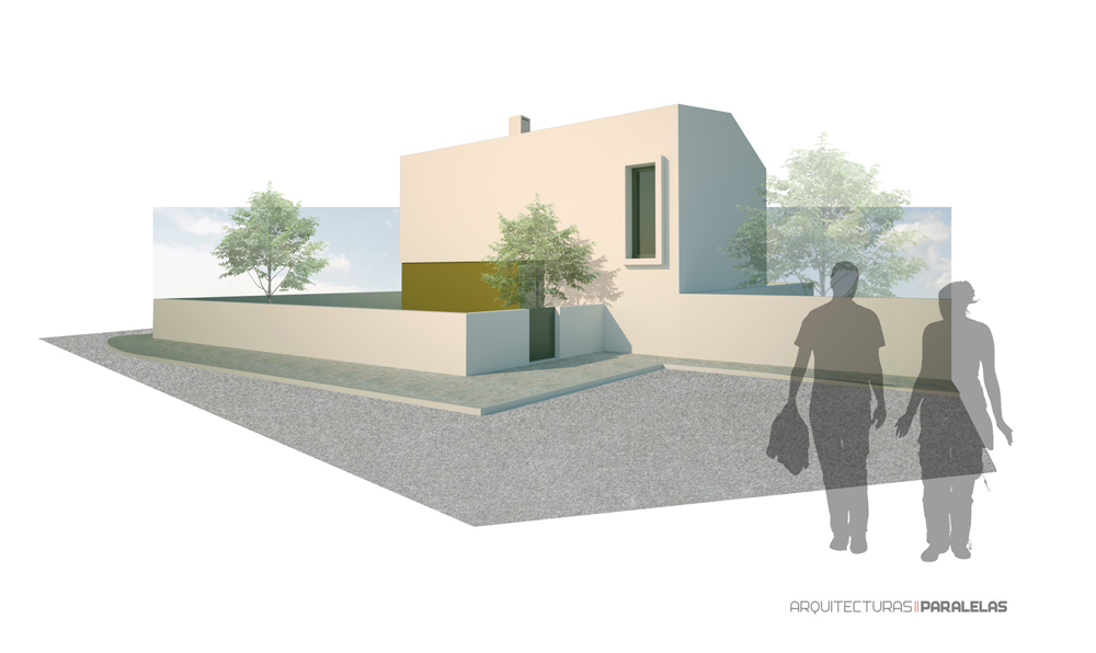
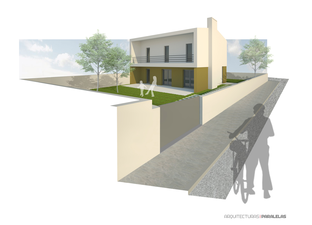
Thanks for your tips, Landie. I´ll try to improve my camera positions.
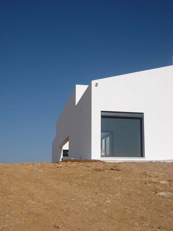
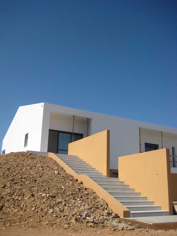
The building is a nursing home located in Chancelaria-Portugal, and is a refurbishment of an old building.
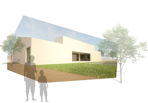
This is a old sketchup work that is coming to reality...
I will post more pictures soon.
Hi nomeradona.
I´m a big fan of simple and abstract renders. I like the render that you've posted.
I Just think a litle bit strange that you have colored the water and not the other transparent surfaces like the glass.
I think that the image would be more harmonious if you find a logic for the materials.