JAPC WORKS
-
Hi!
Here is some of my works.
CC are welcome.


-
 And another one
 -
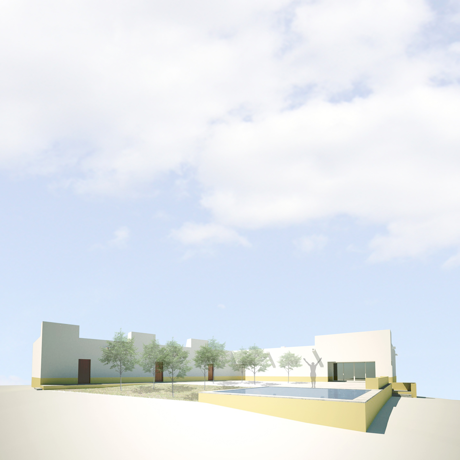
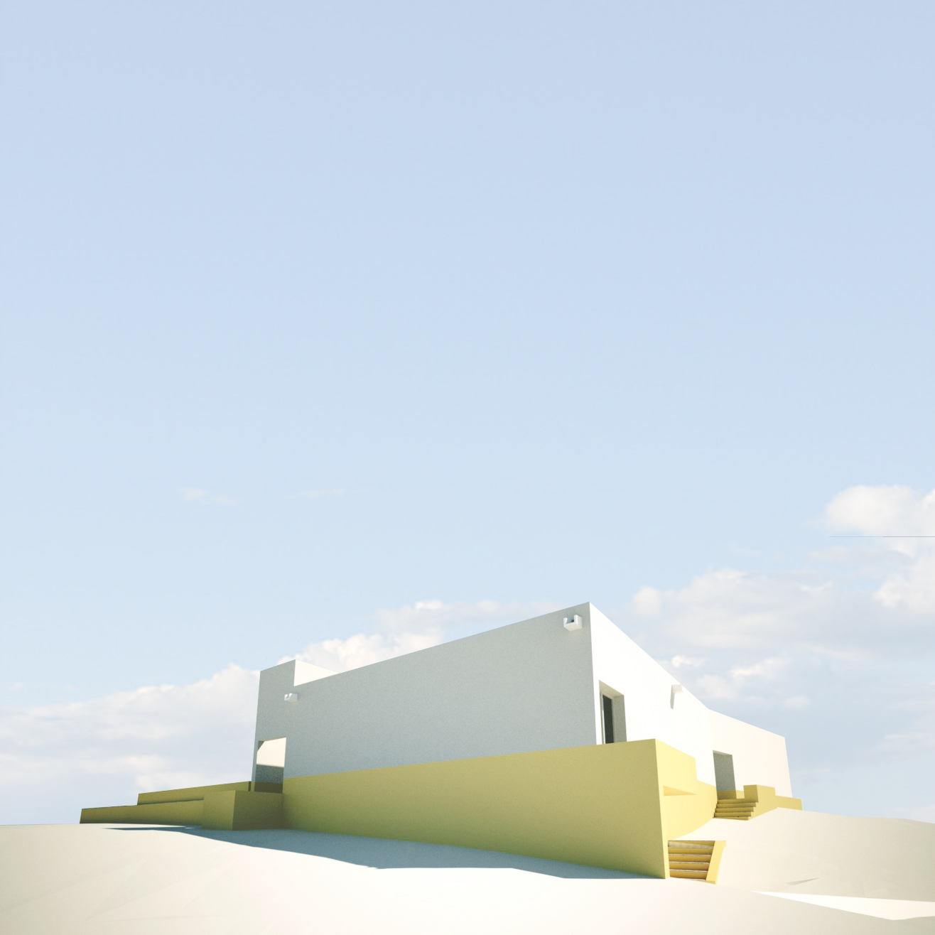
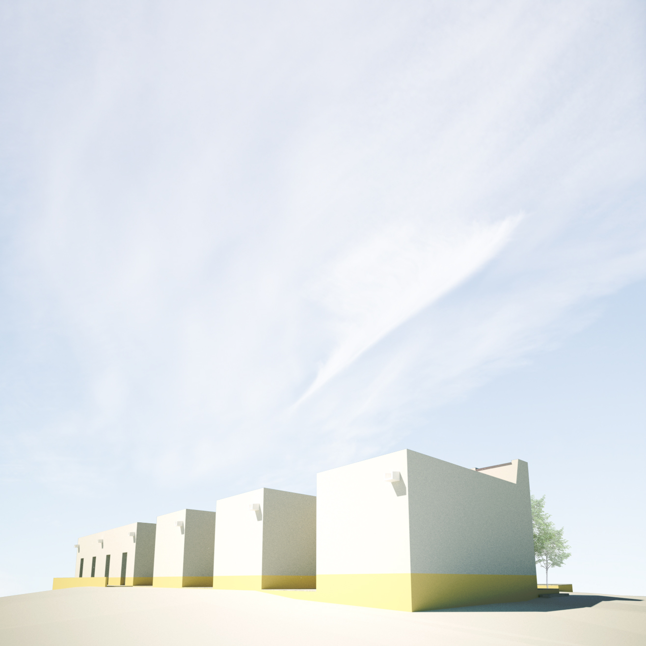
for me there's too much sky on the images. the model almost gets lost. for me the renders are too minimalistic, some textures would be nice, but i guess that's a question of taste.
-
Hi Carloh!
The proportion of sky was deliberated for presentation questions. And you are absolutely right because it is a volumetric study and not a photorealistic presentation. In this case i gave more importance to the reading of the volumetry and shadows than the materials and photorealism. -
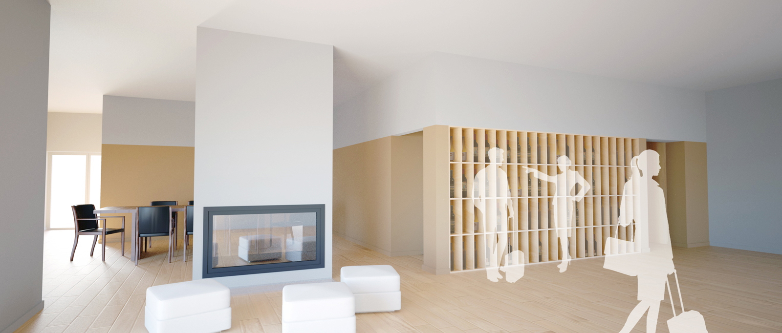
And one simple render of the interior.

-
For me the sky lends to the artistic individuality... It gives the feel of wide, expansive space even when viewing what are obviously smaller buildings. Also I think the wide, tall shots accents the color scheme; earthly, natural colors low and lighter colors high. I think they're beautiful renderings.
-
@krisidious said:
For me the sky lends to the artistic individuality...
Hi Krisidious. Thanks for the nice words. I'm glad that we share the same vision about these images.

-
WHat's your render program, japc? looks nice and clean...

-
@utiler said:
WHat's your render program, japc? looks nice and clean...

Hi utiler.
I used Indigo Render and some post-production in PS.
Hello! It looks like you're interested in this conversation, but you don't have an account yet.
Getting fed up of having to scroll through the same posts each visit? When you register for an account, you'll always come back to exactly where you were before, and choose to be notified of new replies (either via email, or push notification). You'll also be able to save bookmarks and upvote posts to show your appreciation to other community members.
With your input, this post could be even better 💗
Register LoginAdvertisement


