Hey Bryan, thanks for the reply.
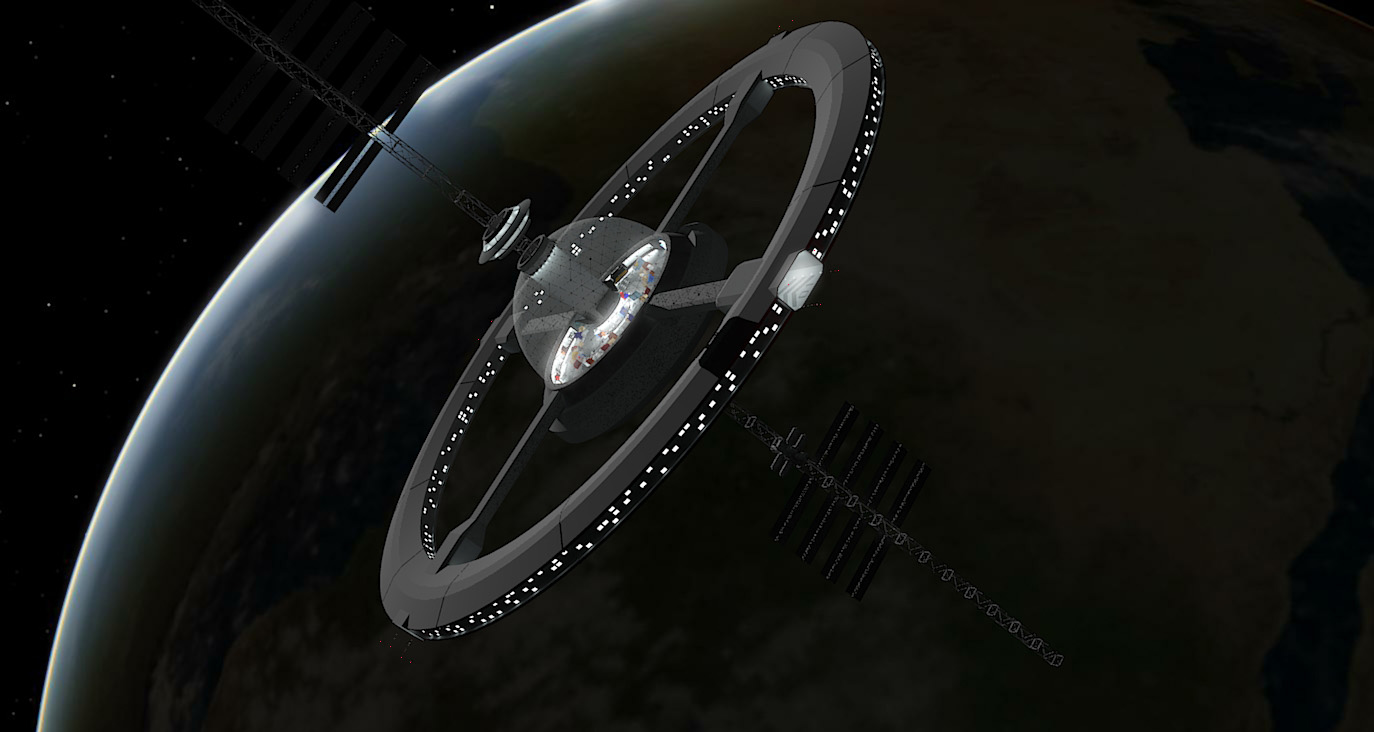
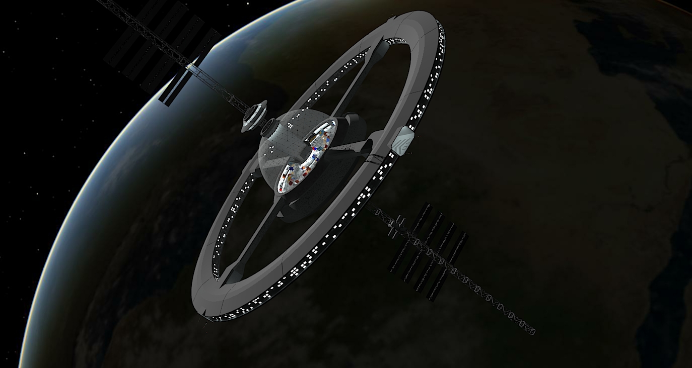
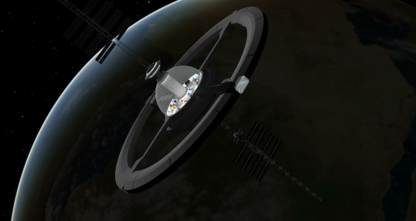
I did put some windows on the ring, just as you said, but they seemed too large and obnoxiously bright and uniform in color, as though they didn't belong with the rest of the station. I saved over that render, so I can't show you. It occurred to me that light from other openings in the station was all reflected (walls, floors, etc. with an unseen light source above) and that this is what gives each a more realistic appearance. It's also possible that just making the windows smaller will help. Until I can figure out a not-too-complex solution (textures, for example) I'm concentrating on the central dome area, but you're certainly not wrong about it.
As for "painting the cube," all of the light sources in and around the station right now are self-illuminated materials applied in SketchUp. The overhead lighting in the landing bay, the can lights and perimeter lighting under the dome, and the overhead lighting in the flight control tower are all just surfaces "painted" with a material I have designated "fluorescent lighting." You can see some small white dots inside the landing bay that show up rather well and whose self-illumination is rather evident when I turn off the overhead lighting. I called that material "white navigation lights." They received the same treatment as the red ones on the end of the trusses, just with a different material and a different color. Come to think of it, I wonder if just the color mutes it too much against the background? If I just cranked up the illumination and unchecked the "emitter" box, would it be more visible? I'd like it to emit a little light, but visibility is more important to me.
More feedback is appreciated!
-Glen


