Space Station Convention Teaser
-
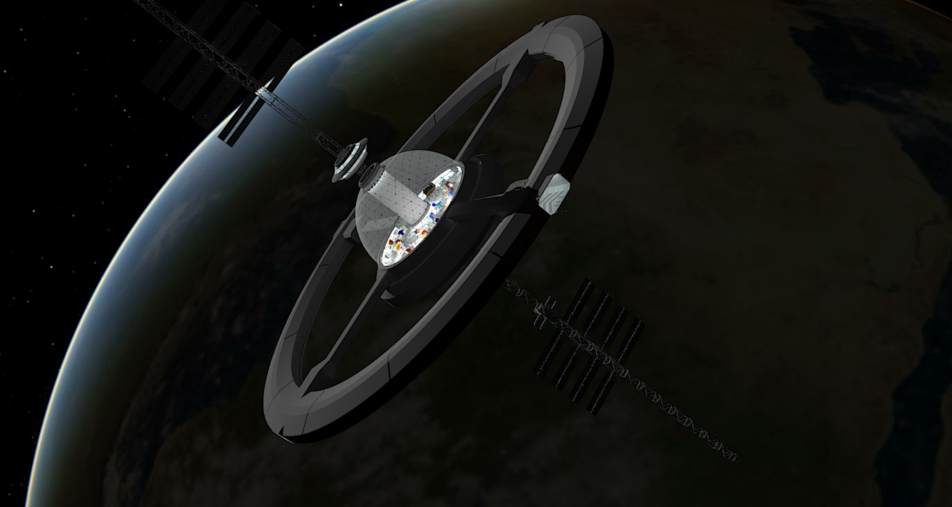
This is a work in progress I wanted to show off with the hope of attracting some pointers from Kerkythea users. I have a group of friends that run a convention every year, and I had an idea or two to help advertise. I decided to suspend my more realistic design tendencies and created this space station convention center because the environment just seems more epic to me, and epic perceptions help to sell more tickets.

I'm still working out the lighting scheme. So far I really like the light/shadow contrast, but I'm concerned that certain elements on the shadow side of the station could actually use a little bit better lighting, and I'm not sure how to illuminate shadowy areas better aside from increasing the exposure setting post-render. That, of course, brightens the entire picture, which isn't something I want for the background. I want every model in the picture to have better overall lighting to see more detail, but want the background to remain the same. Does anyone know what settings I need to tweak?
I am also trying to increase the visibility of some red navigation lights I have placed on the ends of some trusses at the landing bay entrances; four at each. At first, I tried placing a point light on the end of the truss component in sketchup, but that served to create more individual lights in Kerkythea than I wanted to deal with, so instead I created a new material in SU that I could make self-illuminated in Kerkythea, which has served me well for the rest of the lighting. I painted a cube I placed on the end of the truss in this material, but production renders don't show the light even a little. Setting self-illumination power too high results in red illumination on nearby surfaces, but little if any detectable light shown directly at the source. Any ideas on what I could do differently?
-Glen
-
That's odd that the self illumination object does not show, but the reflections do.
Don't know what is going on. I've not had any trouble with self illumination.
Also, I would suggest some more self-illuminating "windows" on the ring. This will help define and "bring forward" the space station itself. They don't have to be anything more than a square (or circle) on the face that you then tell Kerky to make self illuminating. Be sure to pick a color not used anywhere on the model.
More lights means more render time. There is no way around that.
Could you explain more about "painting a cube"? It seems this may the problem with the object not showing.
-
Hey Bryan, thanks for the reply.
I did put some windows on the ring, just as you said, but they seemed too large and obnoxiously bright and uniform in color, as though they didn't belong with the rest of the station. I saved over that render, so I can't show you. It occurred to me that light from other openings in the station was all reflected (walls, floors, etc. with an unseen light source above) and that this is what gives each a more realistic appearance. It's also possible that just making the windows smaller will help. Until I can figure out a not-too-complex solution (textures, for example) I'm concentrating on the central dome area, but you're certainly not wrong about it.
As for "painting the cube," all of the light sources in and around the station right now are self-illuminated materials applied in SketchUp. The overhead lighting in the landing bay, the can lights and perimeter lighting under the dome, and the overhead lighting in the flight control tower are all just surfaces "painted" with a material I have designated "fluorescent lighting." You can see some small white dots inside the landing bay that show up rather well and whose self-illumination is rather evident when I turn off the overhead lighting. I called that material "white navigation lights." They received the same treatment as the red ones on the end of the trusses, just with a different material and a different color. Come to think of it, I wonder if just the color mutes it too much against the background? If I just cranked up the illumination and unchecked the "emitter" box, would it be more visible? I'd like it to emit a little light, but visibility is more important to me.
More feedback is appreciated!
-Glen
-
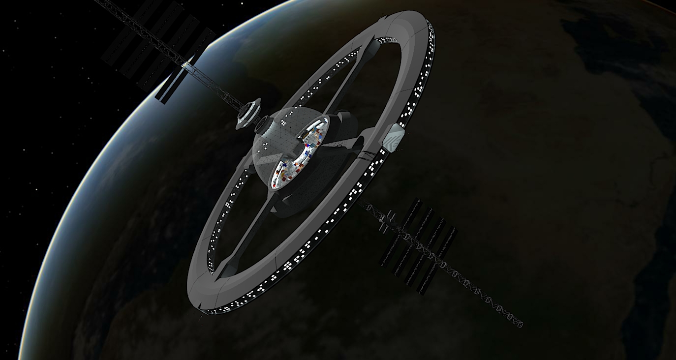
Okay, here it is again with the habitat ring lights:

I narrowed the windows by two feet in both dimensions, though they still look gaudy and out of place. Perhaps I have too many lit. The inside of the far quadrant caught my eye as being more visually attractive, so perhaps I'll halve the number of lit windows on the outside of the ring and/or diminish their brightness somehow in Photoshop. I do like the way the window light reflects off of nearby surfaces, but the bottom line is that, to me, they distract the eye from the dome and overall visual appeal of the station. It looks like a Christmas tree.
I added four extra-large flat screen monitors around the central column under the dome, the content of which can be decided later but will, I think, make it seem more convention-like when lit up.
I cranked the illumination power up to 500 on the red navigation lights and un-checked the caustics emitter box to eliminate the red glow on the side of the station without success. I still can't see any glowing red dots near the landing bay. I'll have to experiment on a separate test render.
-
Hmmm. I think the windows look fine.
You may need to delete the red landing lights and redo them. I've had that happen as well as Kerky sometime just failing. Rarely, but it has happened.
-
I just showed it to my friend who is the artistic lead on the convention on my larger flat-screen TV, and it looked strikingly better on that screen than on my office computer monitor, so I guess I see what you're saying. I suppose a render with a finer resolution and maybe some photoshopping will give us just what we want. He loved it, and it's slated to be the advertisement poster for the 2014 convention.
Our conference also produced a few more ideas, and the poster will eventually include bumper-to-bumper traffic lined up to enter the landing bay, as well as a clever surface texture for the planet that will be in keeping with the theme of the convention. I'll keep posting as things progress.
-
Good news! Excellent!
-
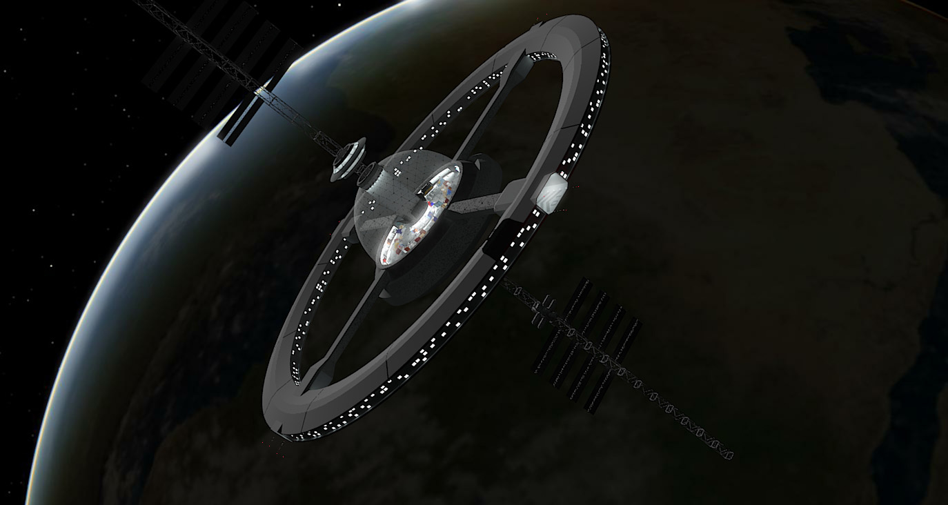
Well, I know I haven't posted in a while, but I wanted to provide a little bit of closure. The final convention poster is still quite a long way off from completion, but I wanted to show how I resolved the red navigation light issue in Photoshop.
[attachment=1:35vg27m9]<!-- ia1 -->Bellevue%20Station%204-3.jpg<!-- ia1 -->[/attachment:35vg27m9]
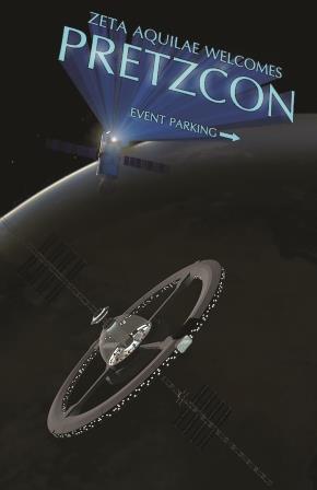
And a rough draft of what the whole poster will look like:
[attachment=0:35vg27m9]<!-- ia0 -->Pretzcon-2014-mockup-300dpi%20-%20Copy.jpg<!-- ia0 -->[/attachment:35vg27m9]
I think it's a great success! Thanks for all the input!


Hello! It looks like you're interested in this conversation, but you don't have an account yet.
Getting fed up of having to scroll through the same posts each visit? When you register for an account, you'll always come back to exactly where you were before, and choose to be notified of new replies (either via email, or push notification). You'll also be able to save bookmarks and upvote posts to show your appreciation to other community members.
With your input, this post could be even better 💗
Register LoginAdvertisement


