A Very happy birthday man
Posts
-
RE: My .SKP Works
You've done great. Altough the design of the car itself isn't really my kind of style. Great job on the model and keep on going
-
RE: Rogue's W.I.P's!
Looks great Ben!
And my zippie has already been stolen and copied 100 times by this other Spanish Speaking b-biatch
-
RE: Car renders,WIPs&videos
Nice job with the 3th place!
It was a really great model you made over there. I've seen the number 1 too and I have to say that I think, that he only won because of his futuristic presentation. Caus it aint that spectaculair as it might seem at first sight.I'm doing really fine. And I think that you are doing also!
BTW. The car from blueprint, you mean the Renault Clio lookalike I made? The ''old'' 90's car?
Lol, that's just made from a picture from the side. The rest is improvisation!
-
RE: ForzaMotor's W.I.P
@forzamotors said:
I've got back into modeling higher end models, so I decided to have my own W.I.P topic. Some place where you could view and download my models, Other then 3D Stinkhouse. To start the topic, there's a new picture of my Forza Hemisphere.
''F'' You Dennis!

Do you know how many times Im trying new stuff out on cars, and that you came up with the same idea?
The taillights of that car are seriously rude! I was thinking about making a model with taillights that just look like the same.
I don't know if you ever seen this car beneeth, it's a danish supersportscar with more than 1100 bhp. Also, this car is limited to a mindblowing 375km/h with his 7.0 L supercharged V8.
-
RE: Fiorano's W.I.P.
Almost done.
Next up: Frontbumper,Hood,Frontwindow,Details underneeth the car,Uploading it to the warehouse
Update*
Done by Tomorrow!


-
RE: Fiorano's W.I.P.
Big Update
I've made a major update on this car. The old rear was okay, but seriously. It's kinda buggy and bumpy. I've totally performed some major updates on this car.


Oh and I really need some help with the images
-
RE: Fiorano's W.I.P.

What do you think of it? This is my first ''old'' car. I'm a bit sick of all those design's I made so far. The problem with them is that they don't look clean. After seeing Ben and Ely with their clean model I really needed to start my own.
I'm also thinking about sharing them again on the warehouse. But only the basic cars like this one. Also there's a new brand for my upcoming cars:
Zippie
-
RE: Car renders,WIPs&videos
Oh my god Ely!
I've been really impressed about the fact that your skills are growing each time your modelling. If you look at your latest car with those beautifull renders, it's really a big deal since I went stuck on the quality you can find in MY W.I.P. forumpage.
You should check it out, you might like that car since ur into concept car thingy's.

-
RE: Fiorano's W.I.P.
Yeah mostly because of the small wheelbase. It makes the car look smaller and more racy. Unlike cars like the Murcielago wich i think, isn't the most beautifull sportscar in the world with it's big rear end.
-
RE: Fiorano's W.I.P.
@xymox said:
looks nice..
but i would go nuts with all these polys(faces).
half of them should be enough.The problem with sketchup is that your working with triangles as polygones.
Getting smooth faces needs more polygones than let's say 3ds max.Altough you might think it needs a lot of time. It actually is quite fun and fast thing to do. Since ur copying lines, connect them while your copied line is still ''yellow'' and than you should edit it towards the surface you want it to go.
-
Fiorano's W.I.P.
Since I'm modelling cars again, it would be funny to have my own W.I.P. page on the SketchUcation Community Forums.
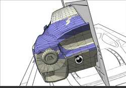
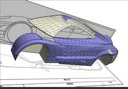
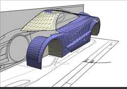
About my latest model wich I had given you guys a preview picture on the warehouse, here's a Work in progress so far:
-
RE: Rogue's W.I.P's!
@javixp said:
...

Is that an egg? I may present to you:
the Forza EGG. A revolutionary egg coming from the Forza Chicken.No just joking my friend. I'm really wondering what you'll come up with next.
-
RE: Collab WIP's
- The curve at the wheelarce is a little bit odd at the front.
- The line at the hood is too high. Make it lower. It's too agressive
Apart from that it's a sweet looking model.


