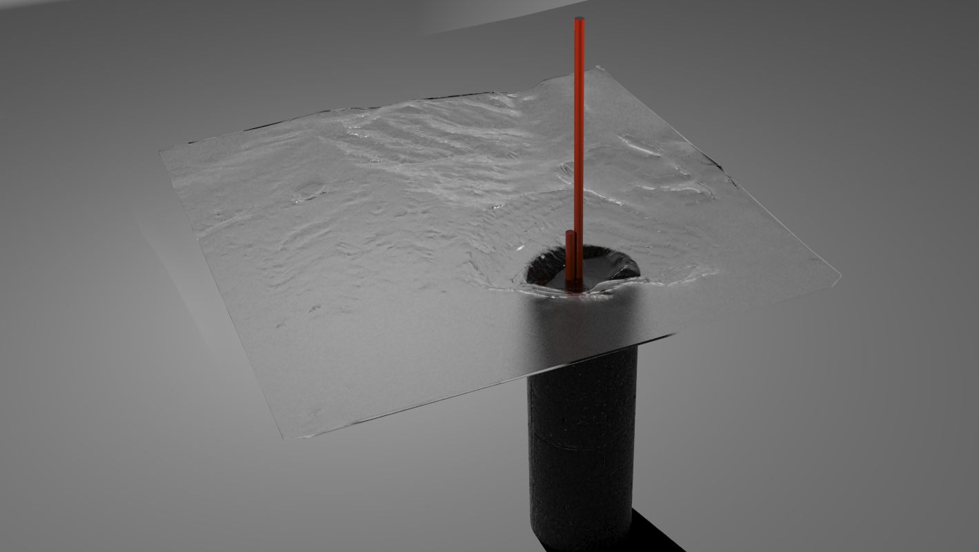
just a quick mock-up of one the 3D diagrams I will be building for an architectural exhibition I am currently researching/designing. Please feel free to comment. I'm not going to go into details about the purpose of this piece or the exhibition as a whole, as it's still being heavily edited. Thanks
Latest posts made by dpimpc
-
Exhibition wip
-
RE: Bush Lodge - Vray - updated
@arail1 said:
Question - what are the metal structures filled with rocks?
I believe they are Gabion Walls, ala the Dominus Winery by Herzog and DeMeuron. They really have some fantastic light qualities, and I would image around such a large fire pit create quite the cozy, warm atmosphere.
-
RE: Glass Challenge (all render engines)
@unknownuser said:
Here's another Maxwell rendering. Nothing special going on, this is simply the default glass material and water (default, meaning made through the Wizard via studio).
Others may be flashier, but I don't think any come close to the realism of this. Its simple and pure, very convincing. Easily the best imo.
-
RE: Modern waiting room
@wolfy said:
Your plant choice looks good, it just needs to be scaled down a bit.
As for the exterior, it looks over exposed so maybe turn down the environmental light or multiplier.
If the interior becomes a little darker, a small light behind the camera always helps.Now say hello to some freshly brewed Heinecken for me!
I disagree, with all due respect of course, I love the look of the exterior! The yellow tint that's so sun washed gives the image an artsy quality that really fits the space IMO! I really wouldn't change anything other than it's a little noisy, but I wouldn't eliminate all the noise...it gives it a sort of depth.
-
RE: Indigo for dummies
@kwistenbiebel said:
I am currently looking into Rhino as well.
It is a complete modeling suite , plugin based as well(Bongo for animation, Grasshopper for parametrics etc...) and it has all the major render engines.
When things would go bad for Sketchup in the future, Rhino is a good backup.
It has a built-in 'Layout' and its suited for printing 2D drawings.
Not a bad option...Rhino is an amazing program. It has a very very small learning curve to be able to do the basics quite well. McNeel really does a bang up job making the program user friendly for how advanced and accurate it is. RhinoScript also does parametrics with a bit more intricacy/accuracy than Grasshopper, given it is much more difficult to use. McNeel is also working on a new renderer called Toucan to replace Flamingo (which is getting quite dated), and it looks extremely promising. SketchUp to Podium will always be my go to just because its so dang fast and easy, but Rhino is a pretty incredible tool, imho.
-
RE: Pool house (First post in a long time)
@trialskid said:
hehe forgive me, im only 15 but i have no idea what mullions are... thanks for the comment!
That's perfectly alright. Its simply a fancy word for the black bars of material (metal?) separating your window panes. Structurally speaking you could make that entire wall a single pane of glass, with no need for those dividers. In any case they could be thinner. Their thickness as it stands now overly segments the facade, at least I feel that way. Overall I do like the work however, its just me being nitpicky. Do you plan on pursuing architecture? This is strong work for 15 with no formal training,
-
RE: Pool house (First post in a long time)
I think the images are actually well done, I like the semi-washed out appearance. But that's just me. One small architecture critique, your mullions have no reason to be that large on such a small structure. You could easily have none at that span. If you like them aesthetically of course then never-mind, but their size I believe distracts more than it enhances. Nice work.
-
RE: Living Pod - Cushendun N.Ireland
I believe you're renders are very expressive of the exterior shell as a sculptural form. There appears, at least to me, to be a disconnect in the way the structure meets the sky and the way it meets the earth. This may have been intentional on your part, or may not have. I do very much like the simple elegance the form portrays to me, although additional interior views might serve you better in explaining the building as a living pod. Your last image is a tad dark, but I actually find the hue suited to the design. Good work.
-
RE: ::Cabin Design::
I am really fond of both designs. The second very much falls in line with my tastes and design ideologies. It also very much reminds me of the original design sketch presented by the Eames' for their now famous house of the same name in Los Angeles. This again appeals to me because I believe that original sketch presented a stronger design that what was eventually implemented, although many would disagree with my assessment I am sure. It is interesting that you discuss the concepts of pre-fab construction, because this again was an instrumental philosophy guiding the Eames House. Overall I feel you have successfully crafted a fine, original design, that artfully interprets a serious pedigree, whether intentional or not. Excellent work.
I am also very found of the artistic approach taken to your images. While photo-realism is always impressive, I feel a slightly more artistic tone, as your images imply to me, often better showcases the nuances of a design idea. What program were these created in? (EDIT: I missed where you said Maxwell, my apologies) I particularly like the abstract ground, which wholly allows one to focus one the design.