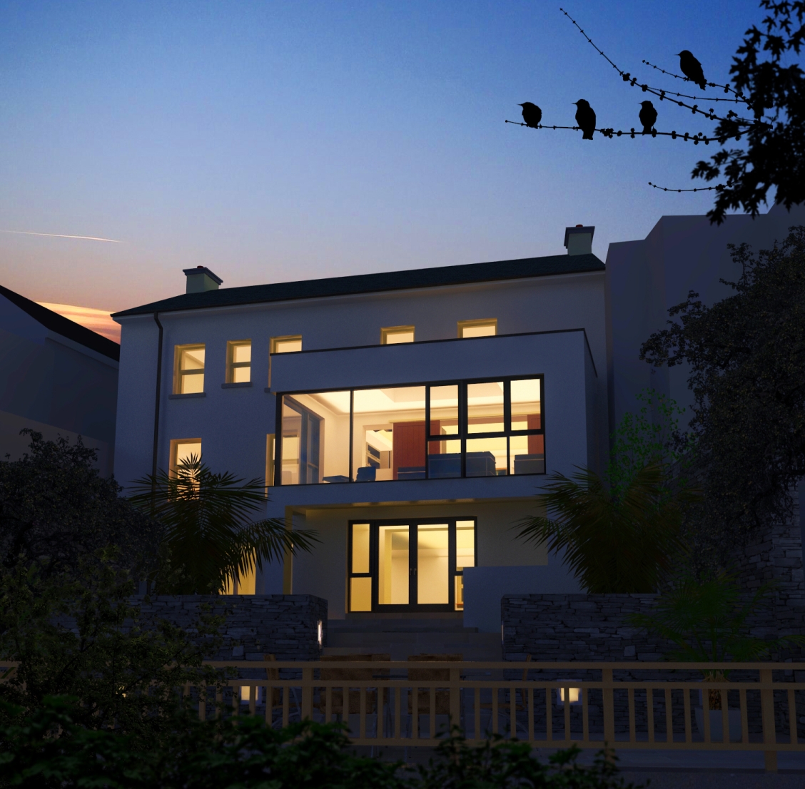
sorry,i also meant to add that some of the vegetation is from the "Billboards" that accompany the xfrog downloads on this forum
http://forums.sketchucation.com/viewtopic.php?f=40&t=34516
Posts
-
RE: Wild garden
-
RE: Wild garden
Thanks James & Dylan for your comments.
Below is a website that has some amazing hints in how to create a landscape.This site is about painting but the same Rules follow through.(I'm sure I've broken 1 or 2)
http://www.wetcanvas.com/Articles2/135/120/
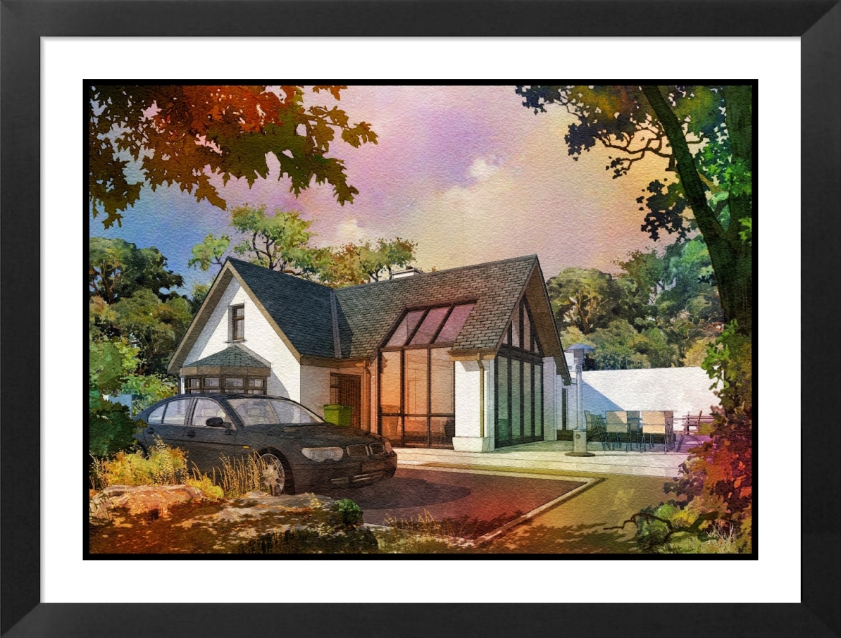
From my own perspective,I want the building to be grounded in some manner.Most of my images are created from a point of view as if you have just suddenly happened on a building,almost as if the building is secondary.I do create more conventional images i.e no foreground etc but I think that this style can help to create a certain mood and definetly helps in early design stages. -
Wild garden
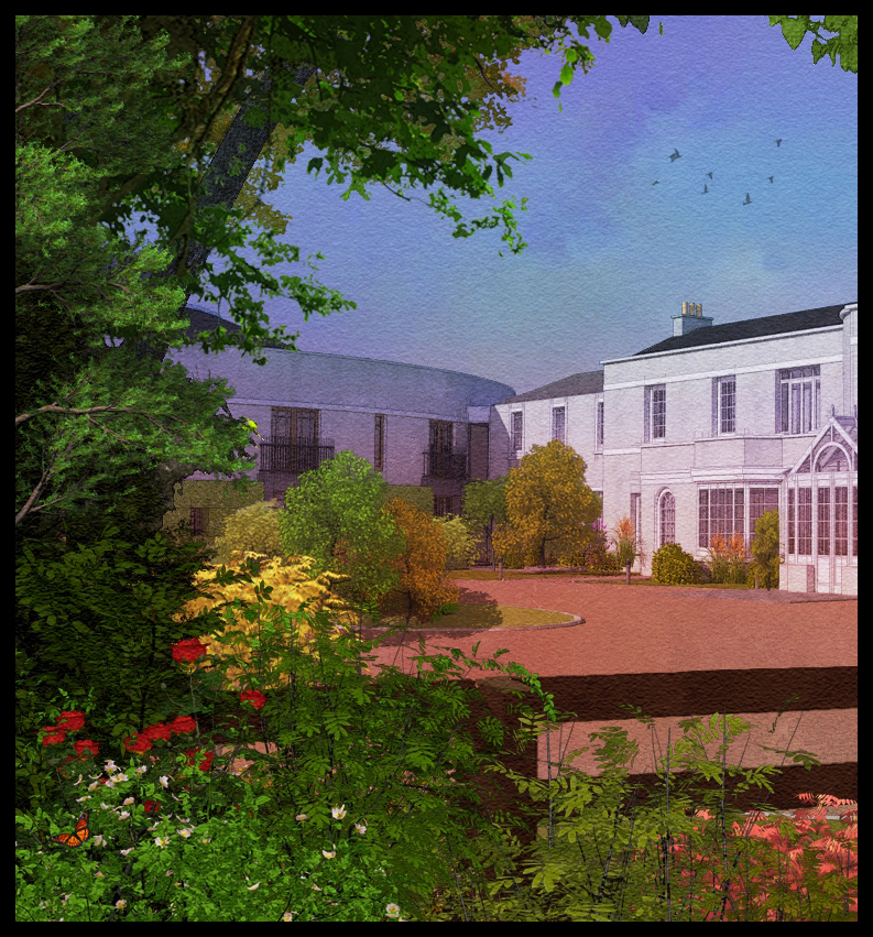
Attached is an image where i am trying to convey a wild garden idea along side a very formal building,also I'm trying to make it as colourful as possible.Originally it was rendered in twilight but unlike other images I have done in this style,it wasn't taken through fotosketcher,just loads of photoshop(42 layers and counting!)
-
RE: Streetscape
When I am trying to locate the HDRI into position,what I normally do is load the HDRI and then hide all parts of the model,then render at about 640x420.because no geometry is being rendered,it takes very little time to render,normally 10 -20 seconds, and you can see straight away if you have to rotate it.Regarding shadows,you will only get strong shadows if you have a bright spot in the HDRI.As I said before,in order to get a good quality light from an HDRI,you need to use quite a large size image.You can use a smaller size and increase the multiplier but you will not get the same quality.
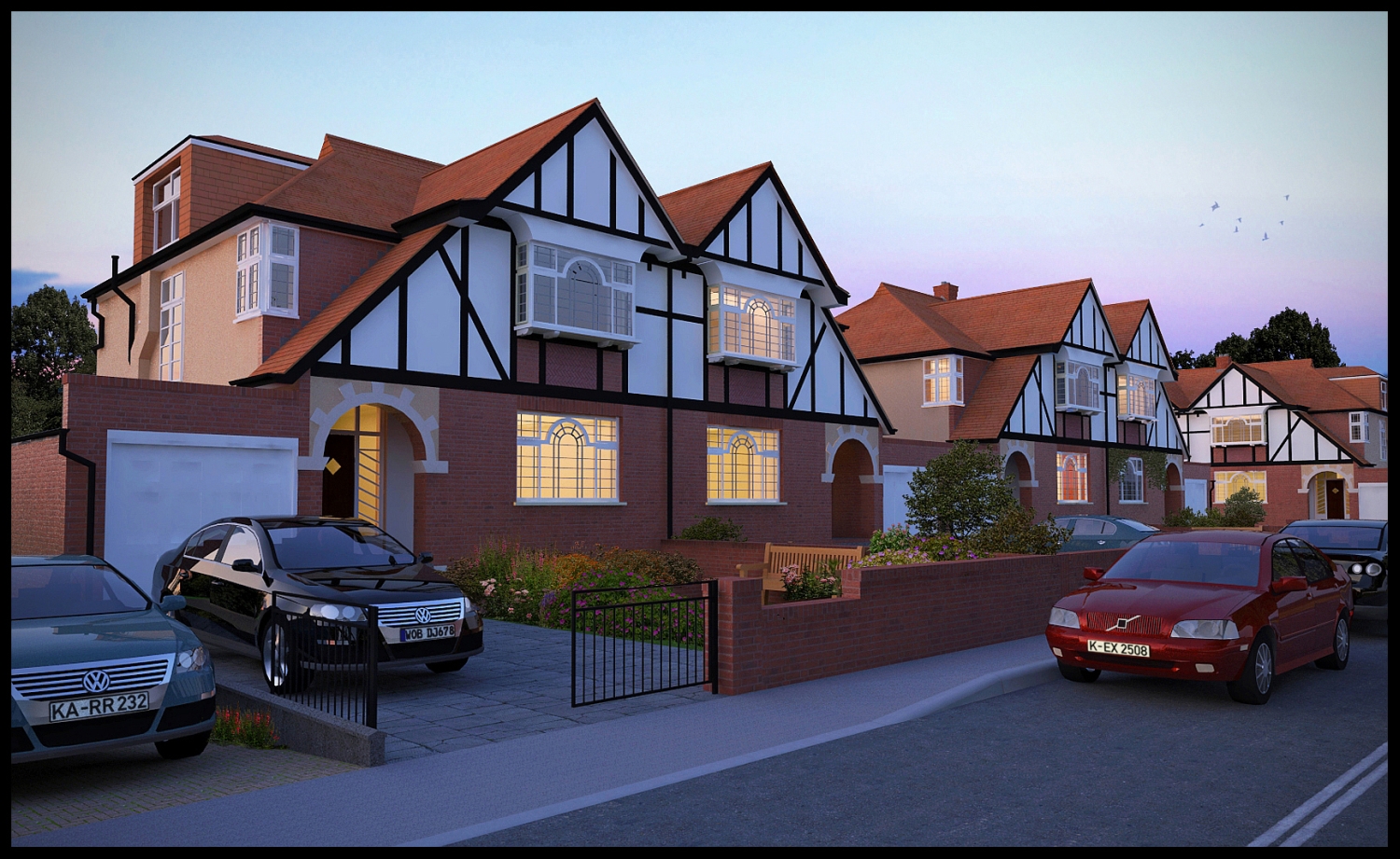
I normally use a HDRI for lighting at dusk shots.If you are using a HDRI for a dusk/early night shot it is good to get one that has a blue tinge to it,as even when it is totally dark,the sky colour is blue,not black.
(I have uploaded the image with car plates added)
-
RE: Streetscape
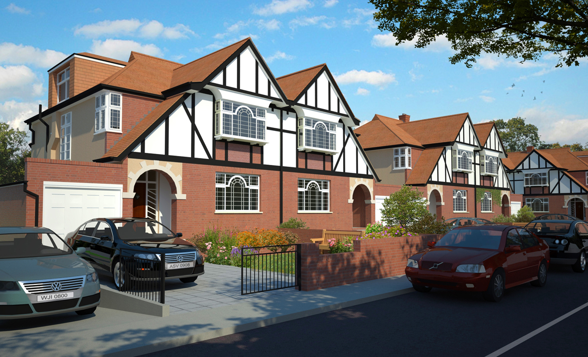
Revised images with the pavement kerb corrected and internal lighting reduced.
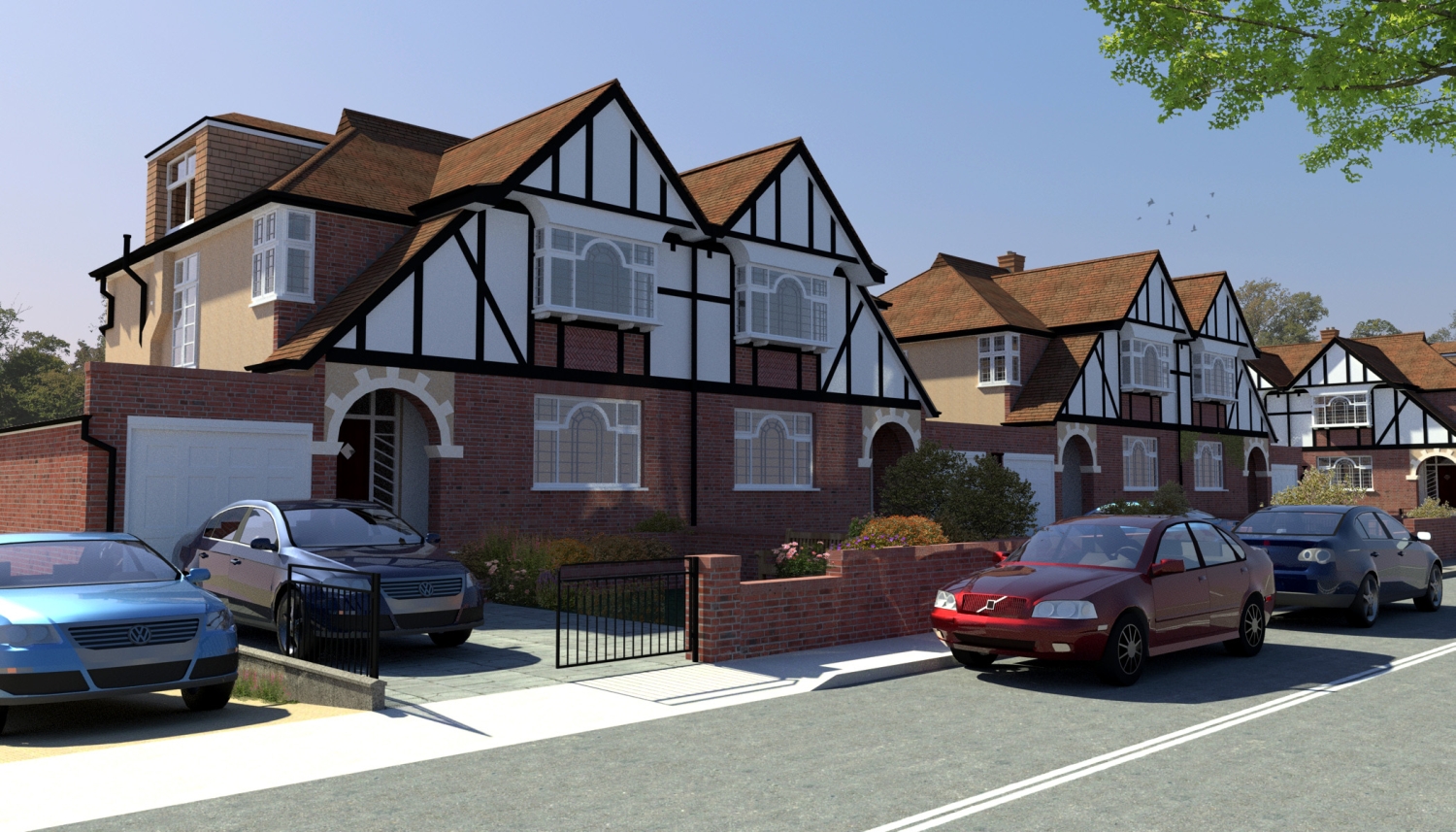
The first image is lit with an HDRI.In order to get a good quality light from an HDRI,you need to use quite a large size image.this one is 120mb.you can use a smaller size and increase the multiplier but you will not get the same quality.
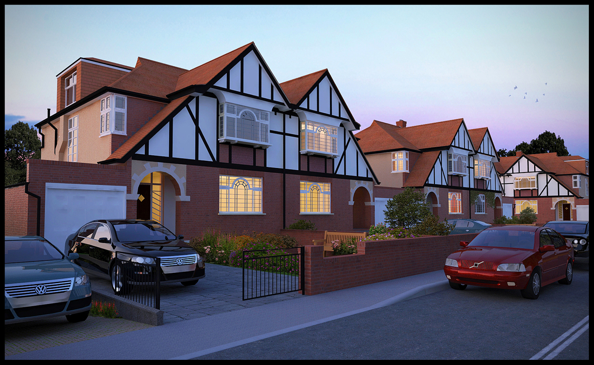
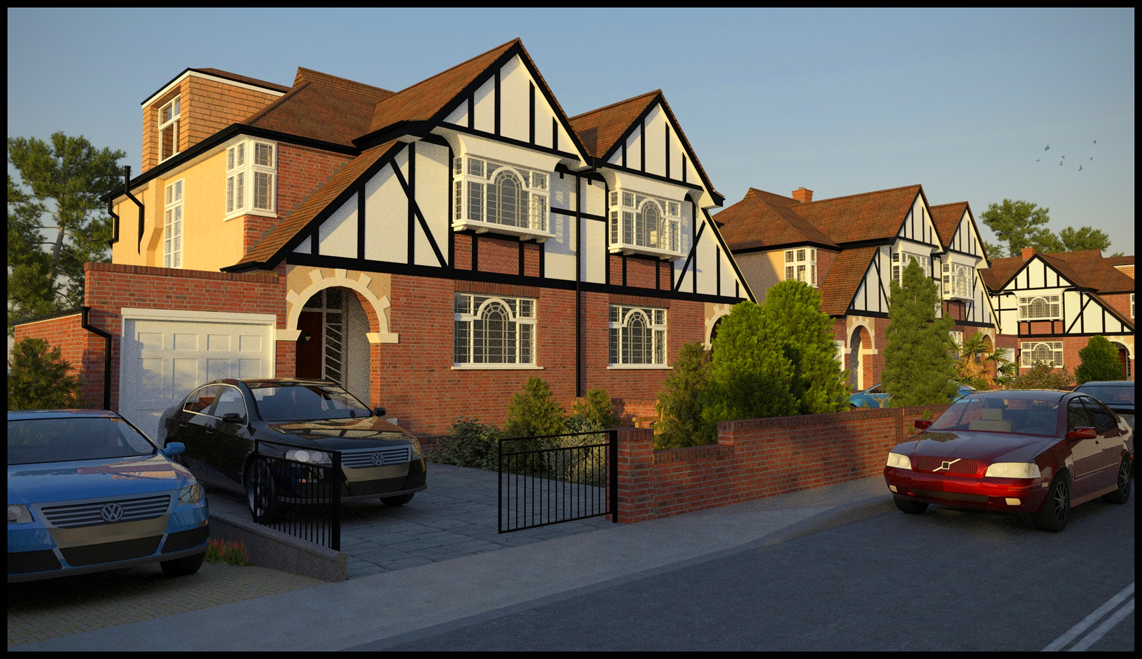
-
RE: Streetscape
2 more renders.the sunset was rendered in thea,the wet stretscape in vray.I'll have to revise the kerbing as it is too sharp and is distracting.All the views are from the same vantage point but with different lighting etc.This helps because the planting is all on one photoshop layer and can be dragged onto each image and so consequently is in the same place and all that is required is to play around with saturation etc.,depending on the main image lighting.
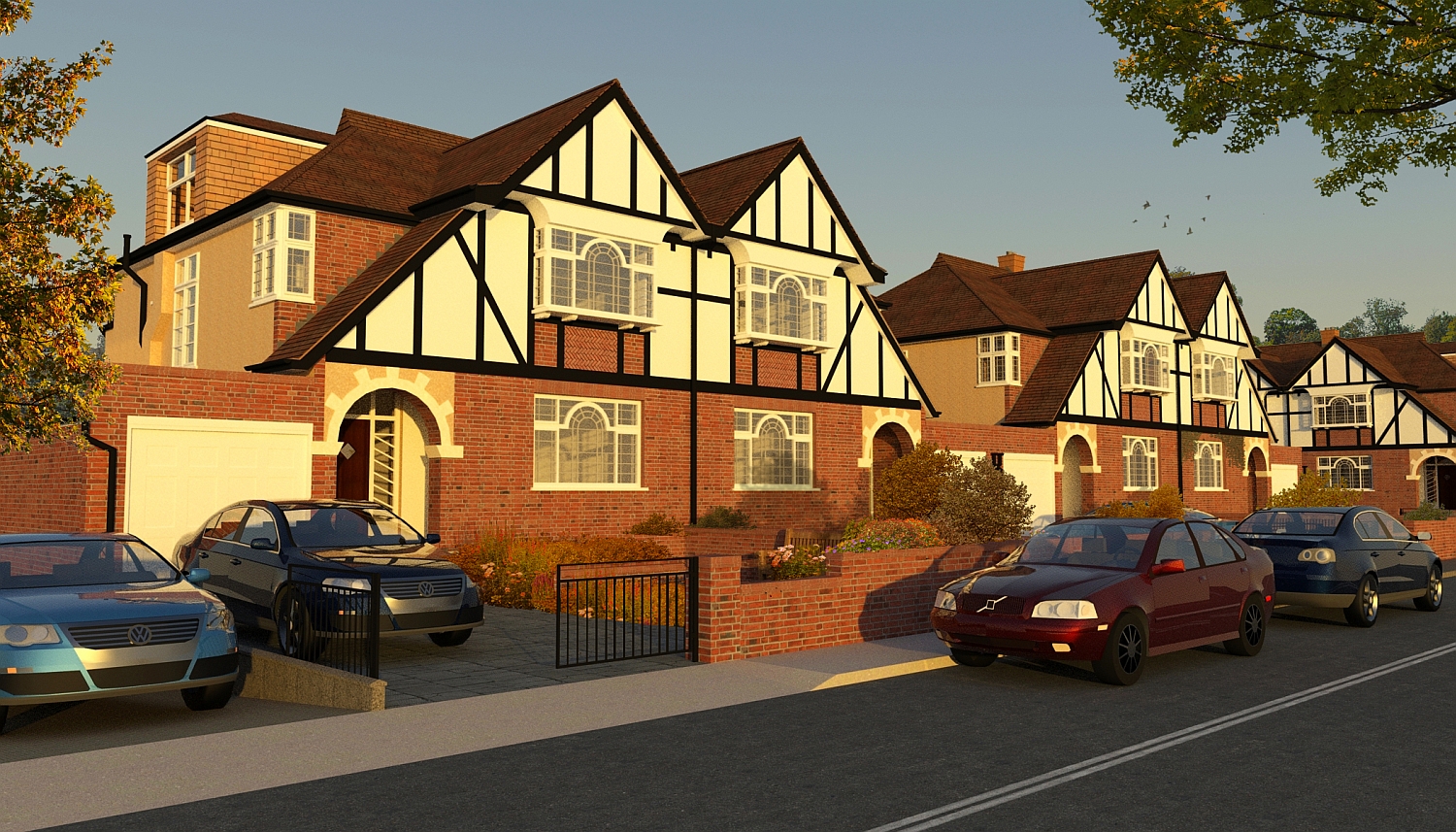
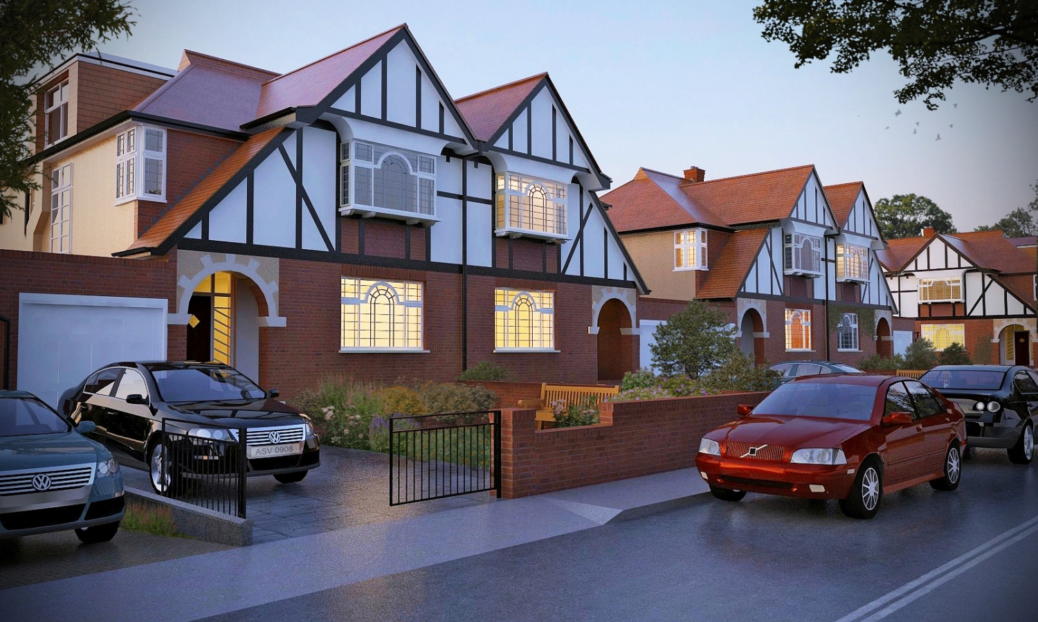
-
RE: Streetscape
Ive reattached 2 of the images with updated materials and lighting,I noticed that some of the glass on the cars was incorrect.
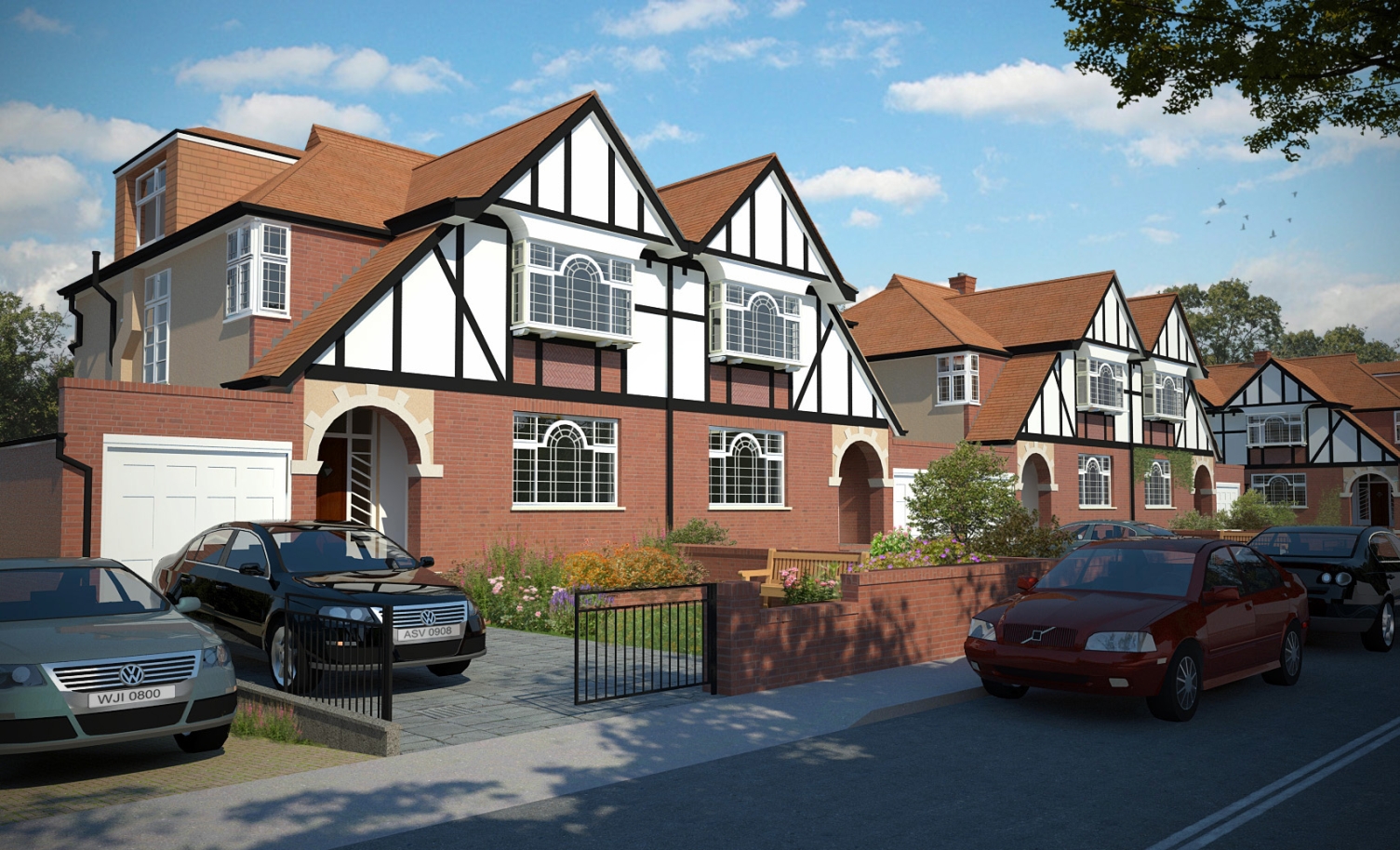
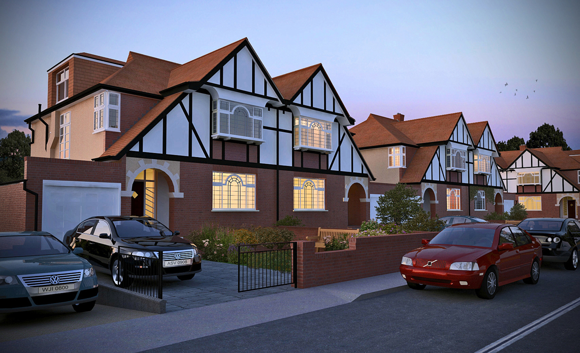
-
RE: Streetscape
ligts added and pavement corrected at gate.the render on the side of the house needs some additional specularity in order to really catch the light from the HDRI.
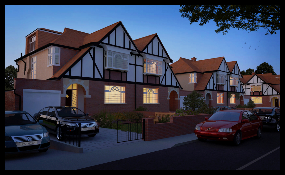
-
RE: Streetscape
The same scene but rendered with a HDRI .There is no slope from the driveway,its at the same level as the footpath.
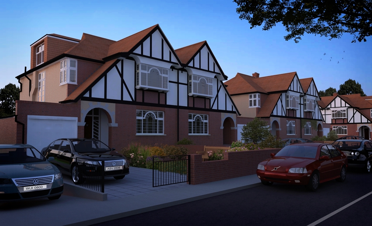
-
Streetscape
Attached is an image of a streetscape.I hope to upload a night shot later,with some additional planting.
-
BAR(cropped)
Attached is a cropped image of a bar Im working on.I have tried to get a soft look (no fotosketcher on this one just a 2 hour twilight image with photoshop enhancmeent.the reason its cropped is Im still trying to figure out how to make the rest of it come together
-
RE: Watercolour tutorial
The background and foreground planting are primarily photographs in .png format taken thru fotosketcher seperatly and consequently have the same all-over texture as the main image.As I work,I normally overlay colour(which are just blobs of colour with a strong gaussian blur filter applied and transparency reduced) over the entire image which helps to integrate the final image.One trick I often do is to take the final finished image in jpeg format thru fotosketcher a second time and overlay this fotosketcher image with the finished photoshop image (normal blend or softlight blend,with a transparency of as little as 15 %).Its all about overlaying layers and playing with the transparency.
-
RE: Dark day
http://forums.sketchucation.com/viewtopic.php?f=18&t=31369
http://forums.sketchucation.com/viewtopic.php?f=81&t=29646
above are 2 links to some of the procedures in the way I work.the main thing is to understand that with watercolour in its purest sense,colour bleeds into colour.My own favourite watercolourists are a lot more free in how they apply paint,most leave the paper to do the talking.The way I work,is I render an image and consequently have to work within the final rendered image.The key to a good image is good compostion,(see this web page http://website.lineone.net/~peter.saw/ctutor/cmpsitn1.htm )good contrast and more than that ,good lighting.(see olisheas amazing HDRI lighting of his latest model
http://forums.sketchucation.com/viewtopic.php?f=81&t=31532)
True watercolour can be beautiful and there are some wonderful artists out there,but like most people on this forum ,we work digitally and consequently accept the shortcomings of our medium- so lets push the boundaries. -
RE: Dark day
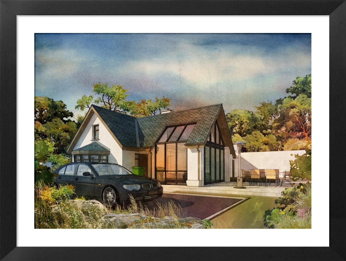
This is definetly the final one!I didnt quite like the sky in the previous upload but once you change one thing,it begins to take on a life of its own and before you know it everything has changed!
-
RE: Dark day
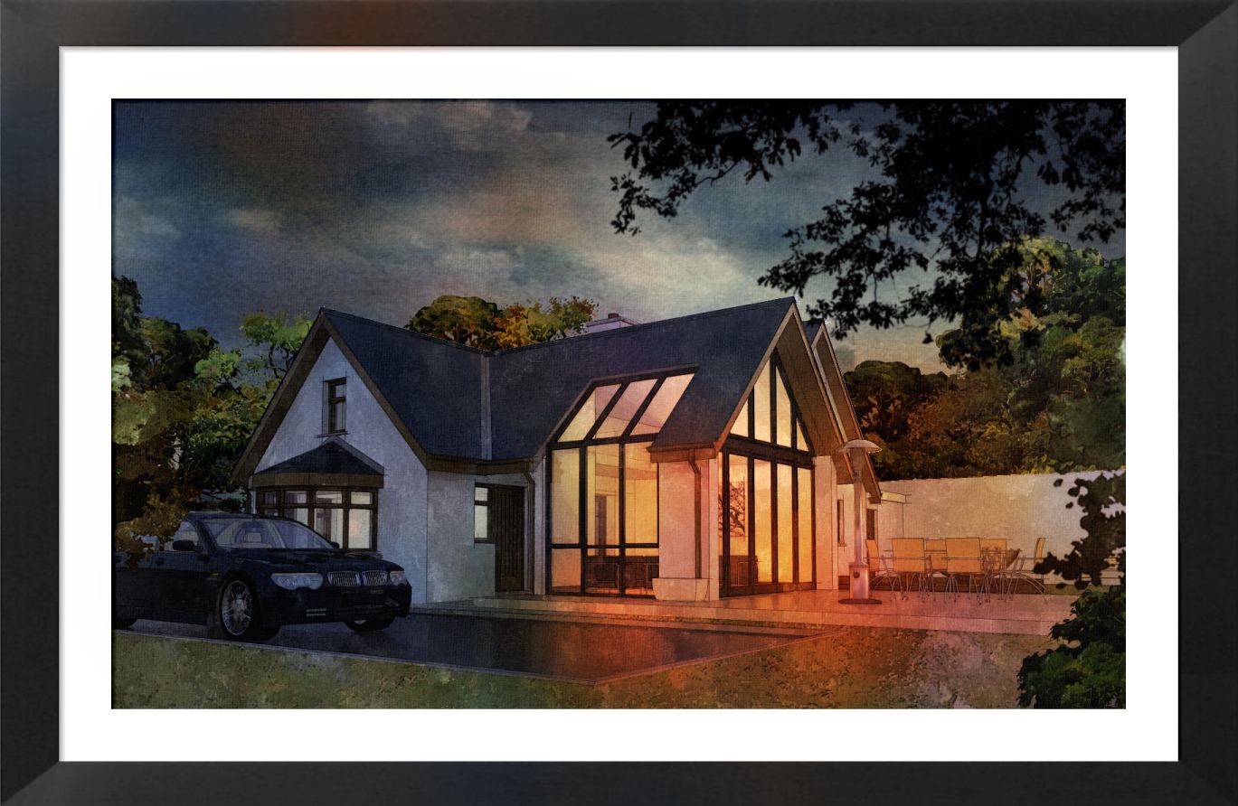
Thanks so much for the comments guys,its always great to get positive feedback.I have attached 2 more images,I think this will be the last for this project.Im sure everyone is the same in that you learn a better/faster way to do something with each successive job and that was the case with this one for me,particularly with the skies and vegetation.
The main thing I discovered with the watercolour effect is that reflections can really bring an image to life.this is the main reason I have the car in the image because subtle reflections of the sky and surrounding area are picked up on it,and helps to bring another level to the overall image.
-
Dark day
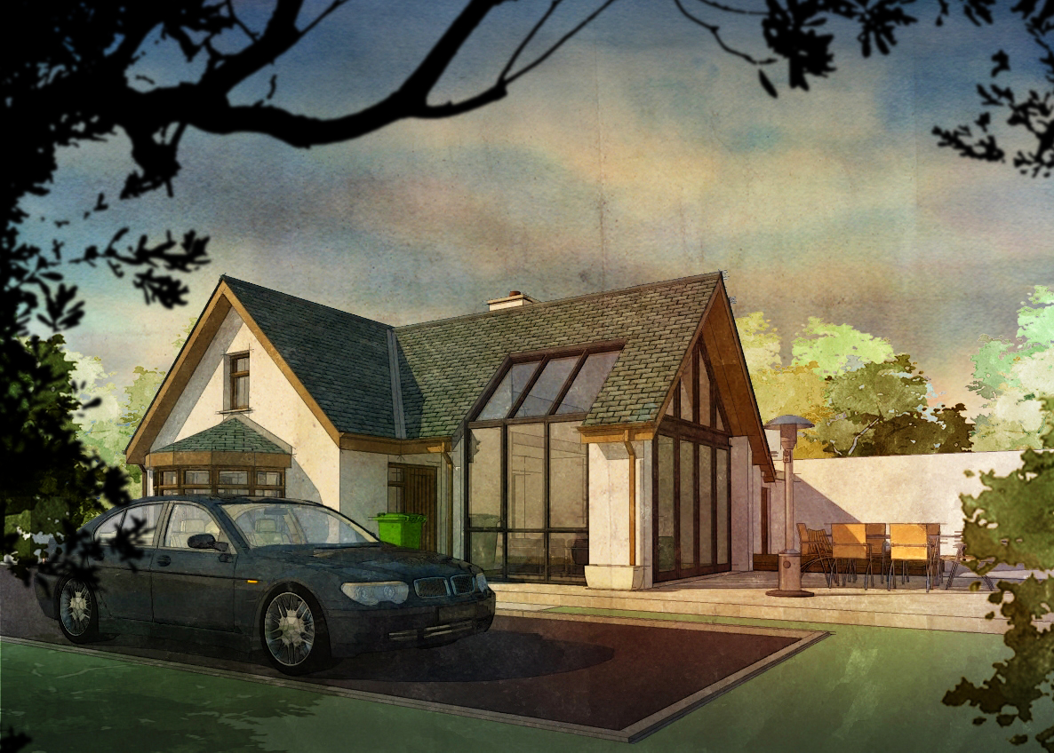
Im trying to get a dark "just before the storm" mood.This image was originally a vray render(the same one used in the snow garden previously uploaded) and tinkered with in fotosketcher and photoshop.I think the sky needs to be darkened a bit and maybe a little more contrast.
-
RE: Snowscape garden
hi guys
thanks for the crits.yes the car is too forward and i will be changing that.I also need to add some snow on the roof,frost and icicles etc to the main image.
oli,good too see you are ok from your recent accident buddy
earthmover,I always try to make my images look like they are taken from "outside looking in" if thats make sense.regarding winter coming too soon,i live in ireland,i think we guys are heading for a major deep freeze,weather wise and financially speaking.
roger, concerning the blue look,its halfway thru to being ice and probably snow,i did a similar scene on a different project but cannot for the life of me find the original photoshop image(version this and change that...)
I have done a few versions of this scene(its a family job) and I would really like to upload the sketchup model and the full photoshop scene with all entourage skies etc.will keep you posted -
Snowscape garden
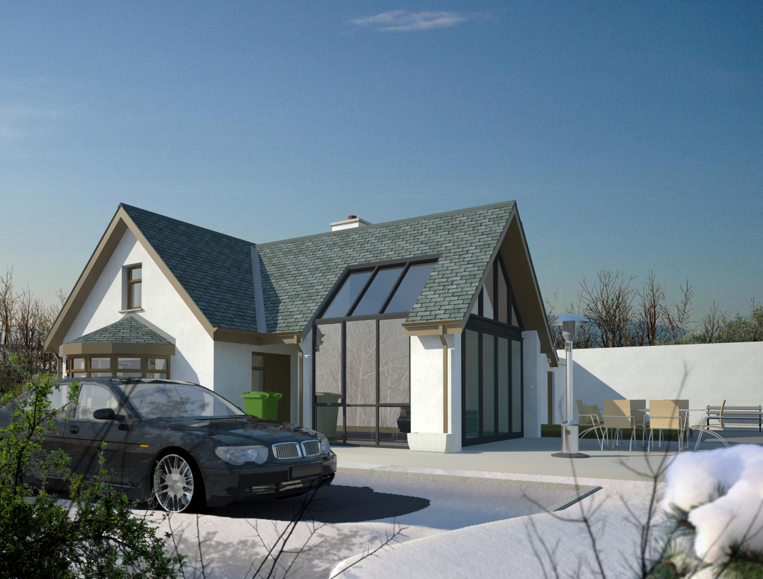
Attached is a low res winter version of an image I have previously uploaded with summer landscaping.I will be re rendering at a higher res and adjusting some elements(the green wheelie bin has to go!)as well a adding some reflection and bump to the ground/patio area(here actually missing a stone texture) and roof.I am not to sure about the green foreground plant but I think it needs some colour to contrast with the main blues.
Regarding the roof,does anybody have a good natural slate texture I could use?
-
RE: Garden
A different project this time,I will be re rendering as the original render had quite a low light cache setting which became more noticable when I increased contrast(more so around window reveals which show some burn out as does the seating at foreground)
