Hy folks,
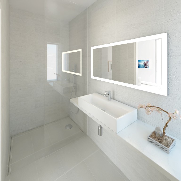
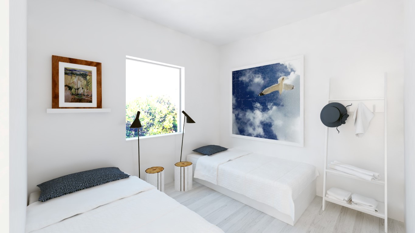
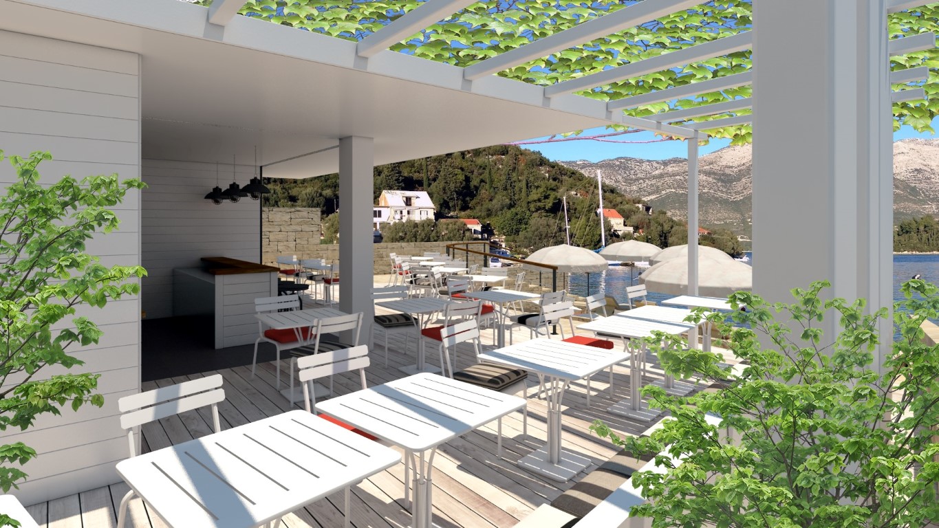
here is another finished project for a small hollyday apartments complex in Žrnovska Banja, island Korčula in Croatia.
Clients specified most of the furniture and design details so this was mostly 3D visualization project 
cheers,
a.
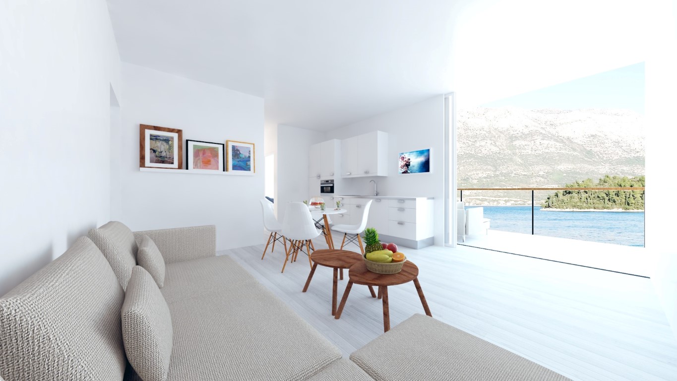
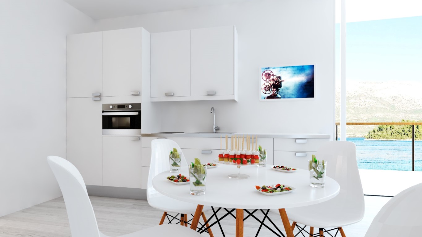
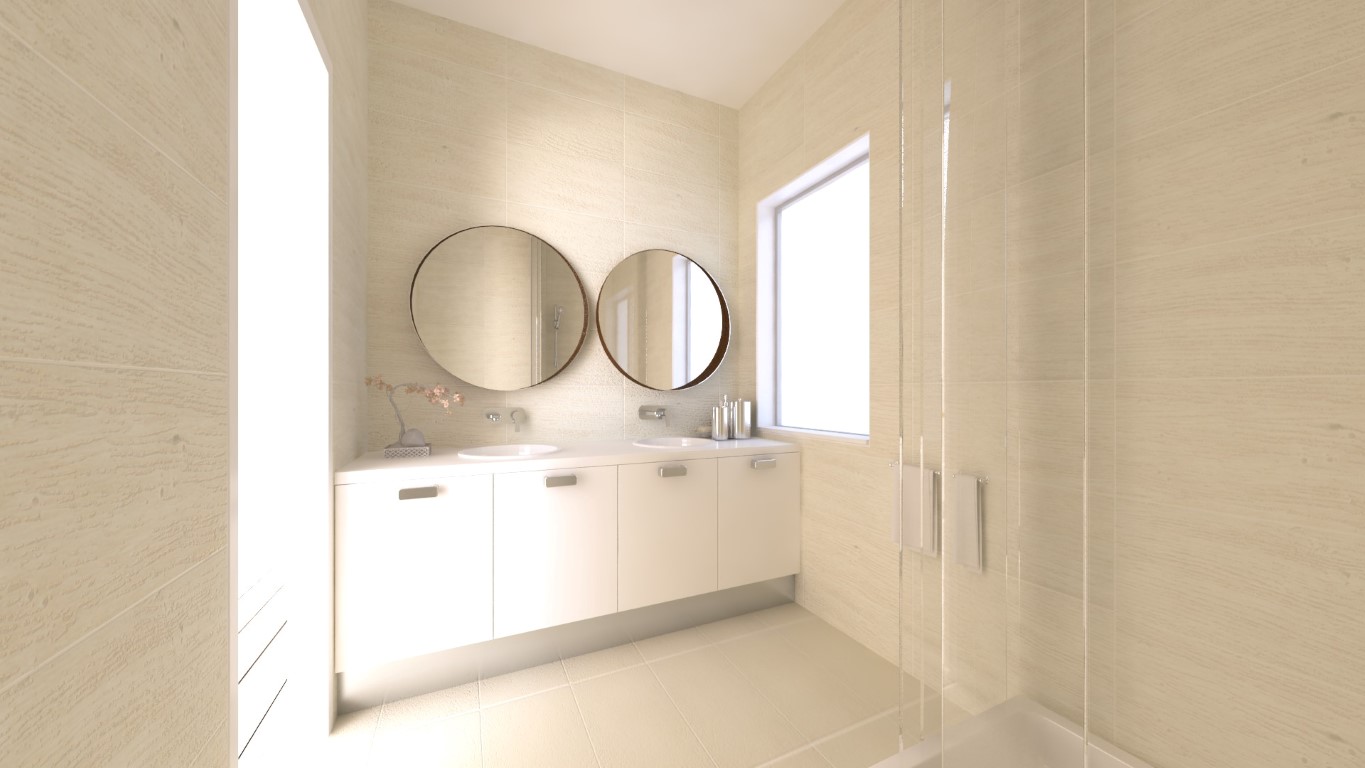
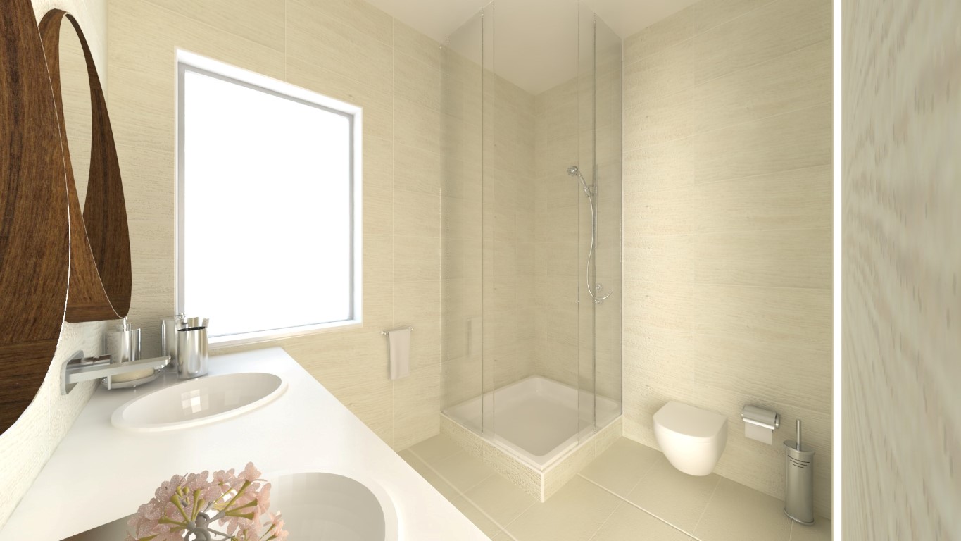
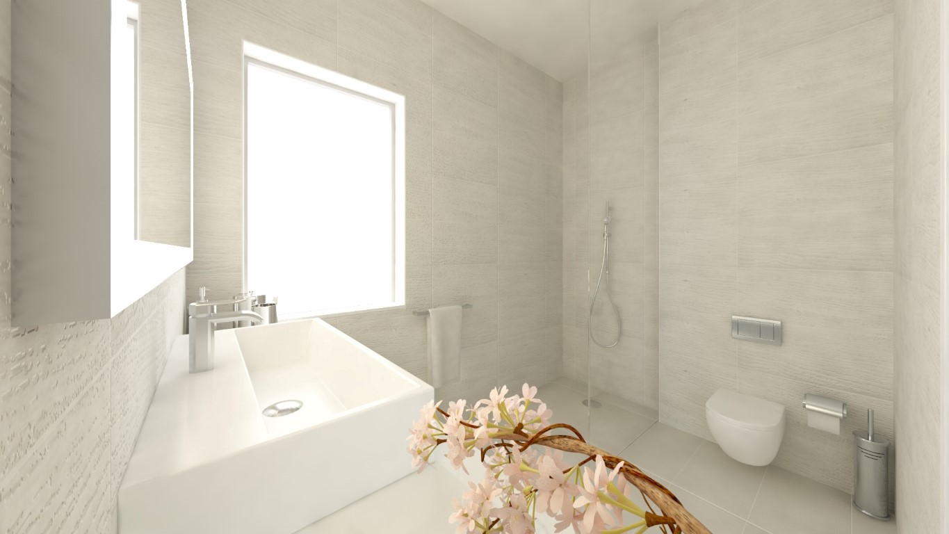
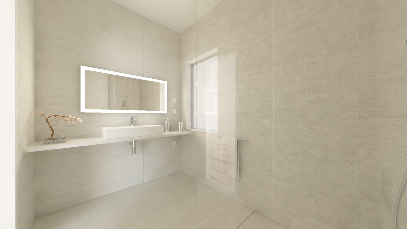
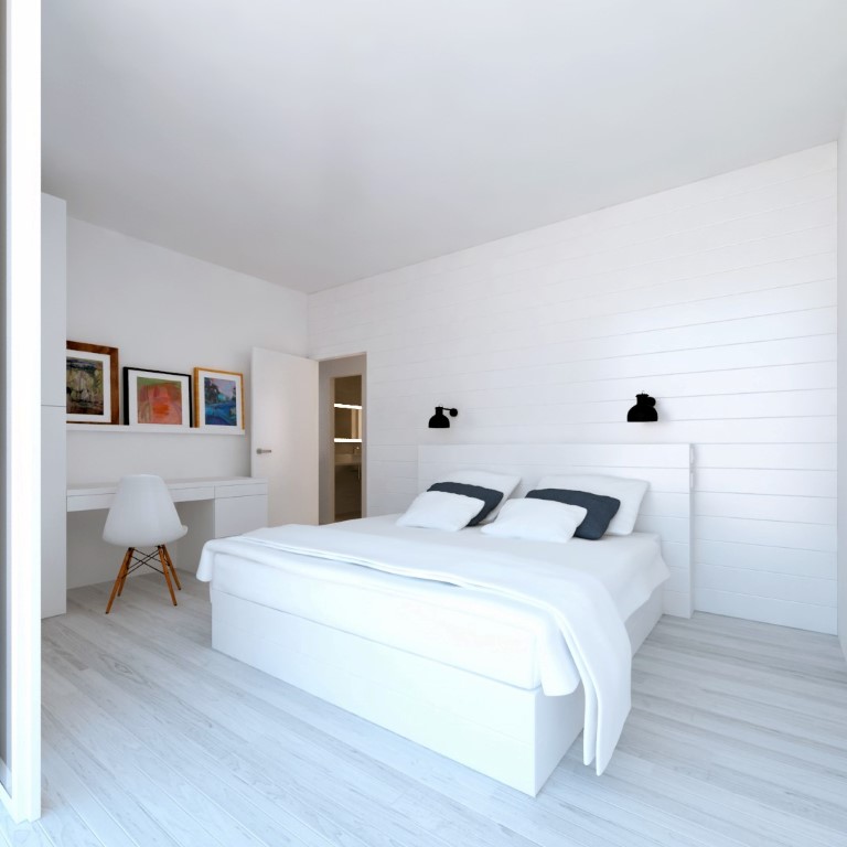
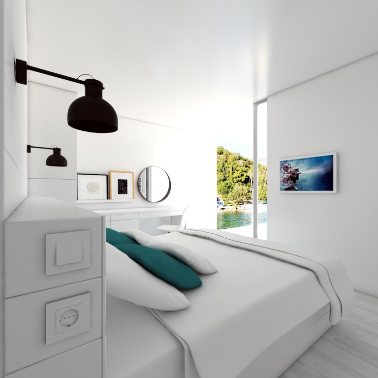
Hy folks,
here is another finished project for a small hollyday apartments complex in Žrnovska Banja, island Korčula in Croatia.
Clients specified most of the furniture and design details so this was mostly 3D visualization project 
cheers,
a.


Hy folks,
long time no see 
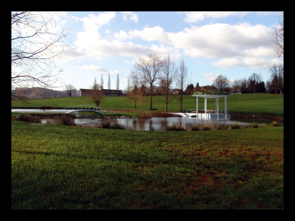
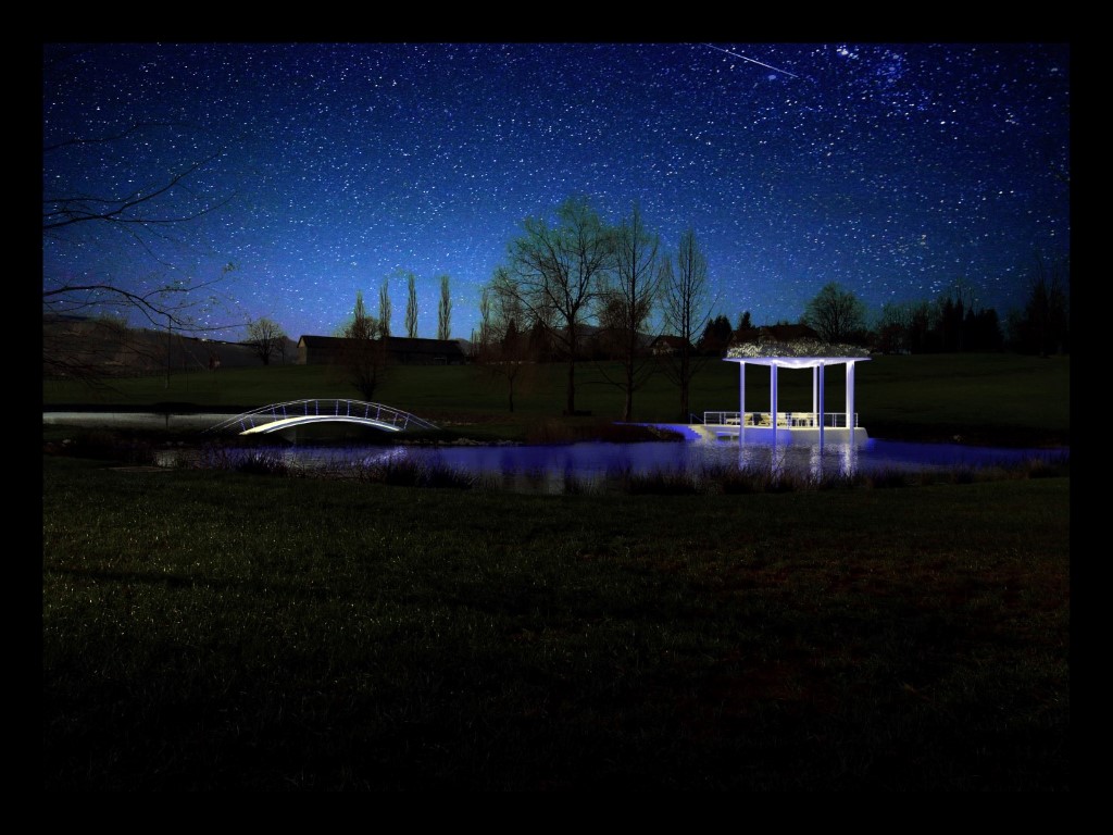
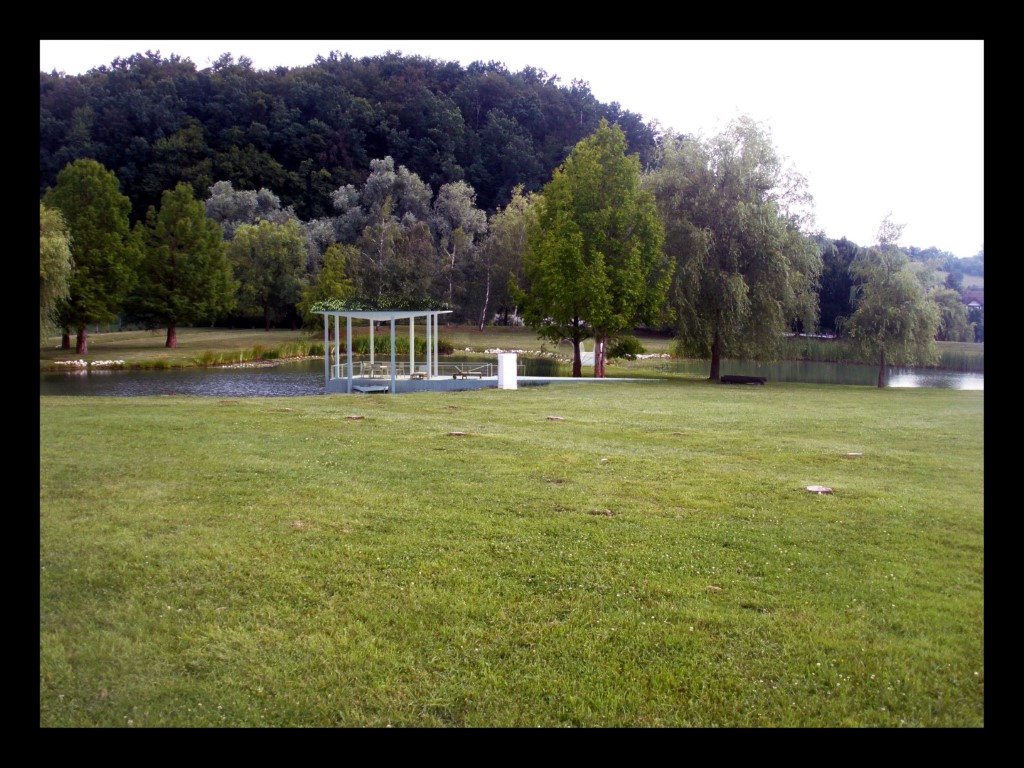
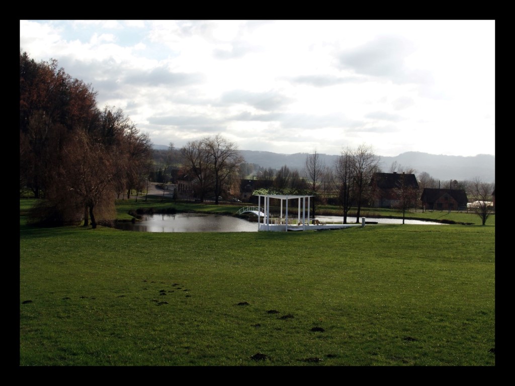
Here is a recent project I have finished for a client who is renovating an old castle in Croatia, so this is a small lake addition.
Sketchup, vray 3.0 for Max 2014 and Photoshop,
cheers,
a.
You have really cool renders, the architecture and the sceenery look great, but in a lot of your pictures, the cars and the people stand out to much, they are different style, and that spoils the overall impression for me. I suggest you use less reflection on your car materials, and try to opt for photoshop people, or 3d, not both in the same scene. Architecture is really nice to look at 
cheers 
I get you about a tilt shift camera, I use it in every architectural sceene, but I wanted to emphasise the perspective in this view, so I used normal camera, 20mm lens. There is a texture in every single material in the scene, including bump map, but it is hard to see, because I reduced the pic from its original size 4961x2791 px ( A3 format on 300 dpi), there will be some closeups, so the texture is bit more visible.
Thanks for the comments,
cheers
Here is another angle, day and night shot. I enjoy night shots, around 70 lights are in the scene 
Lots more to come, thanks for comments folks 
cheers
ha ha ha, Thanks good it is not a woord that is widespread  It is my internal gradation of my satissfaction with my work
@omikron said:
Nice concept.. it's very exotic too, imo. The renderings are also great, last one looks so real !
Yes, the architecture is quite exotic, main architect is Miliš Pecotić, really cool dude, he has made a really nice project with this, he managed to implement modern architecture with some mediteranean touches, so it is really interesting from quite a lot of angles, it's a shame there is not enough time to model and render this sucker properly, but clients said it is OK for this stage. I can live with OK 
@numbthumb said:
Great work, Andrija!
Žrnovnica?
Ha ha ha, thanks, how did you guess  Do we know eachother from somewhere, I don't recall the nickname
cheers 
@bjornkn said:
Very nice work
I'm not bothered by the flag, even though it is quite big.But I am more bothered by the water in that night shot.
It looks like it is a reflecting a daytime cloudy sky instead of the actual scene?
I have internal lightning in the pool, so that is why it is so bright, I aded some wawes for the drama in the sceene 
Here is a bit more quiet shot
@jennifert said:
I love the view from the water the best. The night time pool shot is very romantic too. Do you have any exterior lighting planned for around the pool or is it all from the indoor ambient lighting right now?
I am not planning any lightning at thi stage of the project, the night shot was a bonus for the client, I did it for my own satisfaction 
thanks for comments folks,
more to come 
Offcors, I have nothing against flags  but it is too big
Here is a speedy night shot, quite like the colorus 
Hy Solo, long time no se 
I like the design, but to me it seems like a death trap. How did you handle insulation and ventilation? And I don't see any windows, i suggest to implement at least one somewhere. I Presume that you left the recesses in between beds and bathroom for structural purposes, which is clever system, so you could guide the ventilation scoops in those voids as well. I would suggest one way vision window net on the outside, so you can provide privacy in the interior, and still keep the funky graphics on the outside 
Have you done preliminary cost assesment?
Nice project, cheers 
andrija
Yes, I don't get the flag, but the investor insisted on it, so can't really do nothing about it 
Thanks for the comment 
Here is an example o raw rendering and superfast ugly PS post processing 
cheers,
Andrija
Hy folks,
here is a current project I am working on for the last couple of days, deadline is totaly tight, so I am working around 18 hours a day, not much sleep 
It is still work in progress, there will be more to come.
P.S. Don't mind the flag, client insisted on it, I think it is a bit over the top 
Cheers,
Andrija
Hey, dude  This is amazing, i scrolled through your posts, you have some really great models and renderings, i like the surreal style that you are pursuing. I am not browsing this forums as often I used to, but maaan, this is inspiring
Cheers and keep em comming and don't forget to have fun whille modeling 
Hello folks 
This is really interesting read. As a loooong time SU user, since version 3 I believe, I feel like a senior here  and here comes my rant ;
I must admit, that I come here allmost every day, but I don't post my work here as often as I would/should, it is just over crowded in the gallery, there is a huge amount of high quality wip threads, a lot of google warehouse models modifications and most of them are not finished, but open for discussion, which is really good, and it gives a strong base for quality debates.
I agree with most of you, there should be a WIP gallery, for constructive critic. There is a cronical lack of CONSTRUCTIVE critic around here 
There should also be a gallery for finished work here, also open for critic, where the younger population could learn a lot, and olso the older ones, and proffesionals from each other, and it wouldn't be crowded with threads like ; "oh look, I made a cube in three dimensions, and I painted two of the sides in brick-like pattern, and put it all on gray background, and rendered it for 4 hours in the latest Vray4SU version plugin" ( no dissrespect to anyone, but it is not inspirational to anyone ).
I browse most of the 3d galleries searching for inspiration, and I get a good creative kick in the ass when I see high quality work, and I am affraid that it gets burried in bunch of mediocre, or unfinished posts here.
Just my 2 cents, I didn't mean to offend anyone, just some constructive criticism 
Cheers folks 
The first one rocks!!!
I realy like the architecture of the house. We don't really have a chance to do houses of this proportions in our country  ))
))
looks like a small hotel 
Fantastic work Tom!
This looks very interesting, I like the different style, I am getting tired of the lifeless "photoreal" wannabee renders. This one has a soul 
cool 