A couple of new wet ones...
-
...whatdaya think?
-
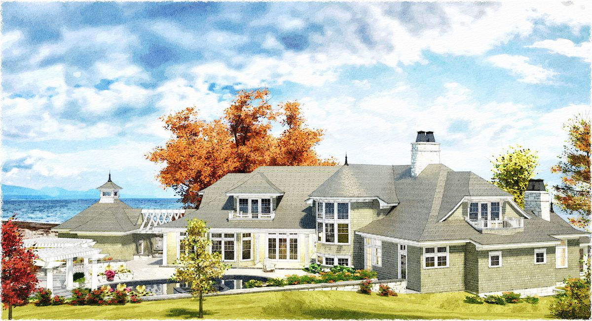
That first one is just outstanding!

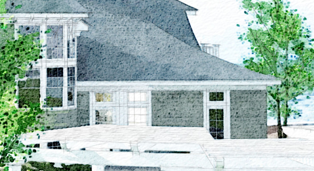
Some of your best work yet, If I had one crit - maybe just a little too bright? The first level behind the pool is just a little burned. And I would love to somehow see the stone pattern a little bit more for the white stone in some areas....but that is just being really picky Second view - not my preferred pov - too much focus on the dead trees in the front yard

great work as usual Tom!
-
Yeah Tom, those are really nice for sure! I agree about the leafless trees. Those are noce models, but feel out of place in a late spring/early summer render. Very nice work,
Chris
-
Dude, these are awesome!
Could you refresh my memory on how you make these? -
tom , you are improving your style, congrats, they are great
-
Really good images - just a little too bright.
I agree about the leafless trees - was this intentional from a tree master like yourself? -
Besides the previous comments on the trees in the second image, I'd delete the small yellow tree in the foreground of the first image, as I thnk it block too much of the pool. Also, a bit more shadow on the left, so the trellises are more defined. -
Thanks, Guys...and I know you're right on a couple of counts: both PSP and I have some trouble with warm hues...they get "hot" really quickly, and I haven't found the solution yet. (I've since done a dozen variations on the first but still none better than the one I posted.) The "dead" trees in the second are just the few of the companion set to oaks I'm about finished with. I was impatient to see how the finished ones looked rendered and decided to add the trunks as space holders for the final render...caught me. Posted the image because I really liked the lighting.
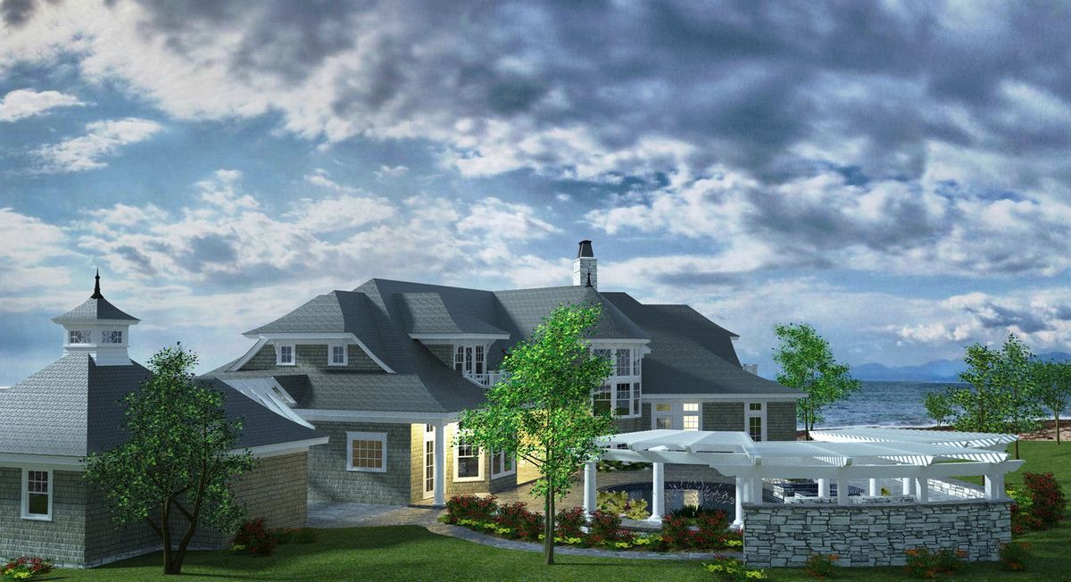
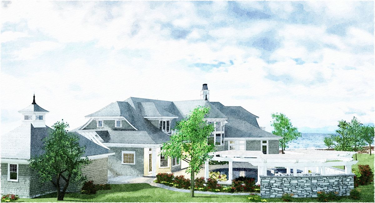
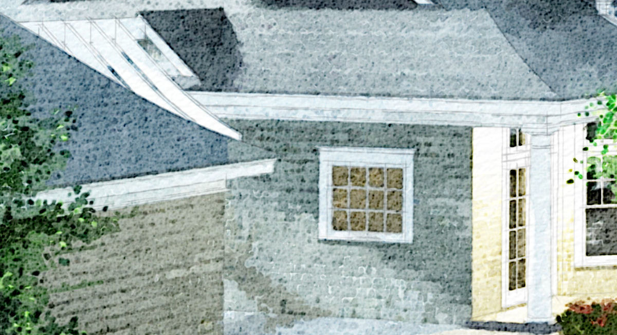
Here's another I'm pretty happy with, along with the Twilight render...haven't matched the mood in the DWC (will try again) but thought it worked anyway and I think the tech is coming along nicely (see full size details). What do you think?
-
Like the 1st one. Second one loses so much detail as it is too bright. Close ups dont have the same impact IMHO using DWC effect - loses alot of the impact for me.
-
I LOVE the last two pictures.
I can see that style used at concept stages of projects.
Could you tell more about it? I have know idea how it's done. -
The first one rocks!!!
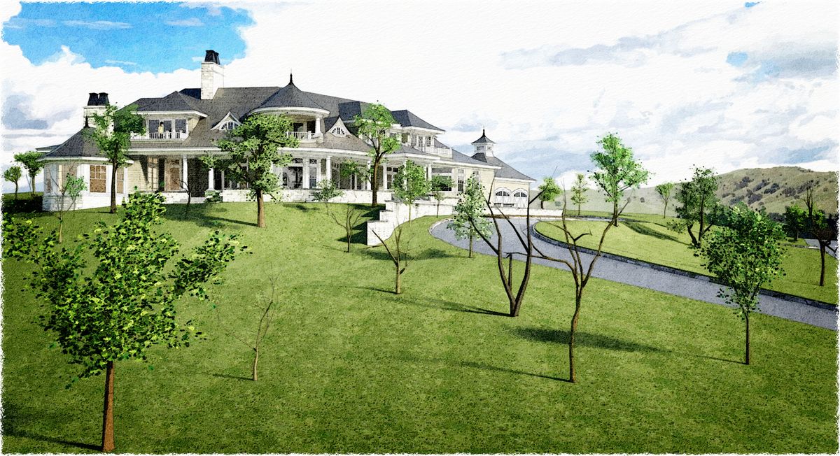
I realy like the architecture of the house. We don't really have a chance to do houses of this proportions in our country
 ))
))
looks like a small hotelFantastic work Tom!
Hello! It looks like you're interested in this conversation, but you don't have an account yet.
Getting fed up of having to scroll through the same posts each visit? When you register for an account, you'll always come back to exactly where you were before, and choose to be notified of new replies (either via email, or push notification). You'll also be able to save bookmarks and upvote posts to show your appreciation to other community members.
With your input, this post could be even better 💗
Register Login


Advertisement