Visualisation SU+Maxwell+Pshop
-
Hi all,
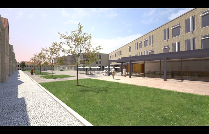
This is a visualisation I did for another architecture firm.
I didn't design the building, just modelled and rendered it following the plans they handed me over.
All SU + Maxwell + Pshop for trees and grass.
I hope you like them.Cheers,
Kwistenbiebel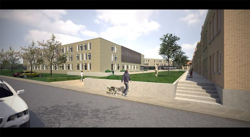
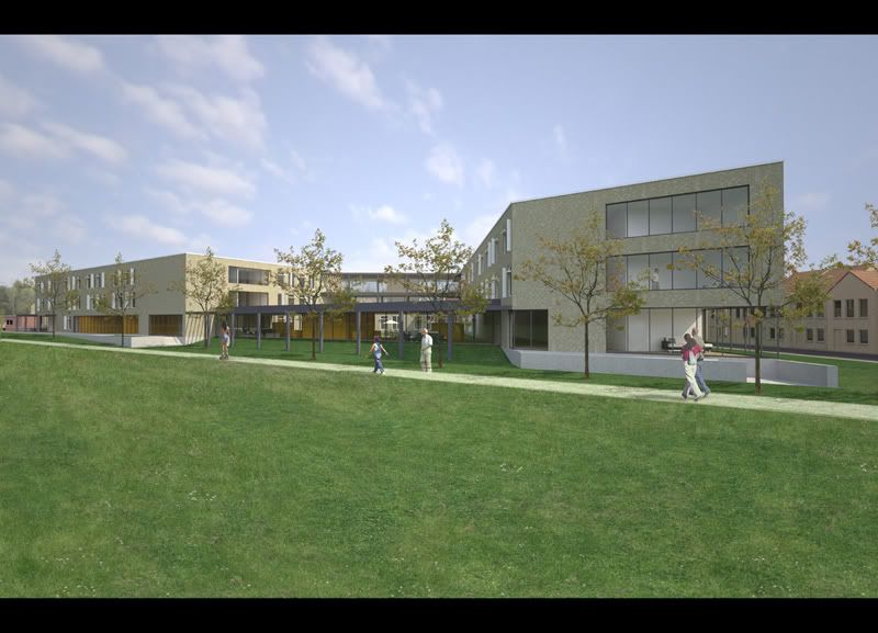
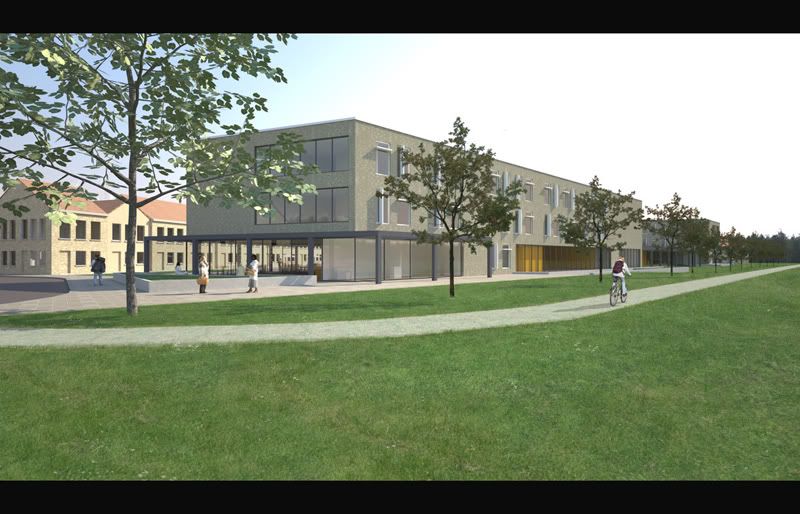
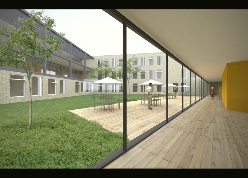
The last one is a Raw Maxwell shot without using Photoshop for extra trees.
Doing this model/render job learnt me to avoid using 3D trees and shrubs and instead adding them in Photoshop because they are much easier to alter when the client wants them differently.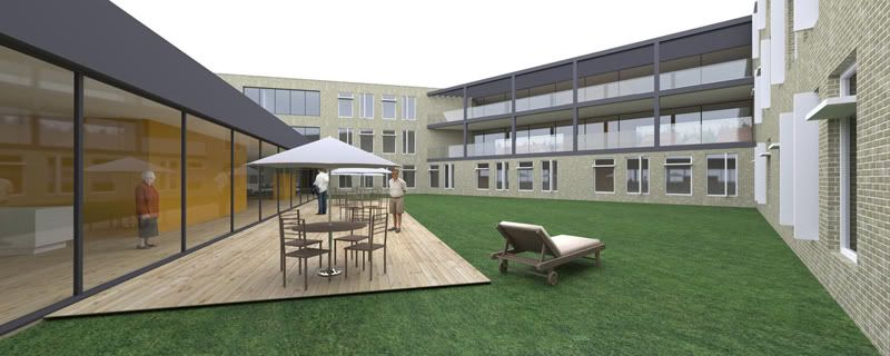
thanks
-
those are some really WIDE angle shots! i am sure u must have done it to get maximum field of view... maybe to replicate a wide angle camera?
-
Very nice. Very clean.
My first thought was that the decking outside is going to fade much faster than the inside. But then again you did not design it.
-
Very nice Kwisty. All nice compositions and POV's. You really did a great job with the grass and trees. The two cars parked in the grass look a little odd, but I really like them all.
-
Fantastic Biebel
I see you did not change those same trees in the second and third image. Otherwise great light and composition.

-
cool!
nice work!
P: CADken
-
Thanks guys for the kind remarks.
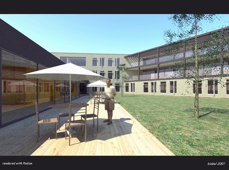
I'll take up your suggestions for the next job (the cars,etc...)I rendered the patio view also using Podium . I didn't send this one to the client but honestly I like the contrast rich light of the Podium version over the Maxwell version.
-
I liked all of these. Just my one pet peeve in some: too wide camera angles. Perfect light.
Anssi
-
You could do with a little less grain in my opinion
 .
.Also one more thing about your renders, they are excelent though a little bland if you ask me, what you could do is open them up in photoshop and edit them a little to enhance the colours:
Before:

After:

What I did was dublicate the original twice so that you got the same layer three times, then put the top two on soft light to enhance the colours. After that sharpen one of the soft light layers and merge.
-
Thanks Rob. That is looking better indeed.
I appreciate this kind of input very much!
I want to learn as much as possible about post 'enhancing' images as I feel this is very important towards the client.
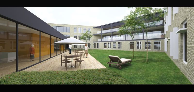
Actually, i still have to put the final images on CD-rom for the clients, so I can still try to 'enhance' them before handing them over.Your method is used in the next image (same patio view as before but with photoshop content added).
Is this better than the previous one? ...the scrubs in front seem to be quite dominant...BEFORE

AFTER
-
Beautiful stuff! I'm really glad SketchUp worked for you on this extremely large file. Yes, 3D people, cars and trees can significantly impact SketchUp's performance. Adding them later using Photoshop, as you have, looks every bit as good, allows you to make later changes easier, and also helps keep the SketchUp performance load under control.
Very nice work indeed!!
- CraigD (Google SketchUp Team)
-
Thanks Graig.
Wow, input straight from the Sketchup team, I feel honoured.
Sketchup works well for me and you are right: some things (people, trees) are better done in Photoshop.
Except for placing cars. Because of the specific viewpoints, I prefer 3d cars over Photoshop drop ins.
I will keep on using Sketchup (despite some difficulties I experienced in terms of editing speed) as much as I can.
Hopefully some workflow improvement can be done in SU6 towards 'heavy duty' modeling? For instance the ability to assign layer sets (configuration of visible layers) so you can e.g choose quickly layer set 1 that shows layer x, y and z, While layer set 2 shows layer u,w,w en z.... These kind of things would make Sketchup even more suitable for rendering jobs. And of course multicore support would be great to have too
I just mention these things because I have to take the opportunity now that a Sketchup team member is watching.
-
@unknownuser said:
Thanks Rob. That is looking better indeed.
I appreciate this kind of input very much!
I want to learn as much as possible about post 'enhancing' images as I feel this is very important towards the client.
Actually, i still have to put the final images on CD-rom for the clients, so I can still try to 'enhance' them before handing them over.Your method is used in the next image (same patio view as before but with photoshop content added).
Is this better than the previous one? ...the scrubs in front seem to be quite dominant...You could work with a layer mask, basically that means that you delete the soft light layer in the spots where you don't want the items to pop outs as much.
-
Amazing work! Sir you have outdone yourself once again!
How in the world did you manage such wonderful grass?!
We'd love to know
thanks -
Sorry one last question
Where did you find such wonderful trees and 3d people. Did you buy them? If so where? Are they free and available to all of us?
Sorry for all the questions....really nice work!
-
@robmoors said:
...put the top two on soft light to enhance the colours.
Robmoors,
This might seem a dumb question, but would you mind explaining to someone who uses Pshop for only very basic image editing? Is it one of those layer blending options?
 A few steps will do.
Thanks,
Guite -
Yeah I am currently Planning on writing a tutorial which covers basic and advanced finishing of renders in Photoshop.
-
Kwistenbiebel,
Great work, and I have to say although there is
still some grain on those images the windows look great. How long did it render?
Robmoors,
Ill be looking forward for those tutorials,
keep us posted. -
Rob that would be great. I look forward

ypnos1 try these trees
MODERATOR'S EDIT: The images at this link are commercial and almost certainly copyrighted.
-
I love that link! I wonder, are we allowed to use these commercially though?
Hello! It looks like you're interested in this conversation, but you don't have an account yet.
Getting fed up of having to scroll through the same posts each visit? When you register for an account, you'll always come back to exactly where you were before, and choose to be notified of new replies (either via email, or push notification). You'll also be able to save bookmarks and upvote posts to show your appreciation to other community members.
With your input, this post could be even better 💗
Register LoginAdvertisement


