Autocad from SU
-
thought it was about time i shared something on the new forum-
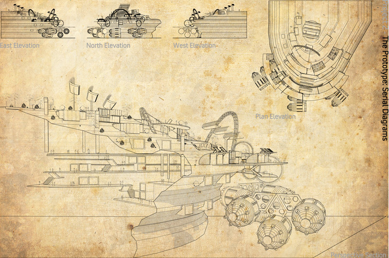
here is some DWGs of a project i am doing for uni, did a bit of fiddling about with line weights and did a bit of hatching (which u cant really see from the pic)

-
I don't think your background helps your work. I find it more distracting than anything. You should also (in my opinion) rethink the layout. Your elevations look muddy and small next to the very large section. You have clearly spent a lot of time on the model - looks complex.
-
I just love it
It makes me think about an old plan for a design made by an ancient civilization, that you just found in a rusty pirate chest ...

-
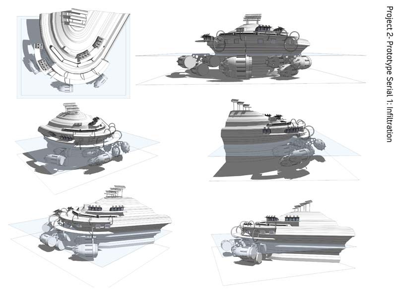
Can you post some more clear renders so we can understand the design better?
-
Hi apologies about the late reply i have been bogged down with work-
Here are some more clear renders of the model
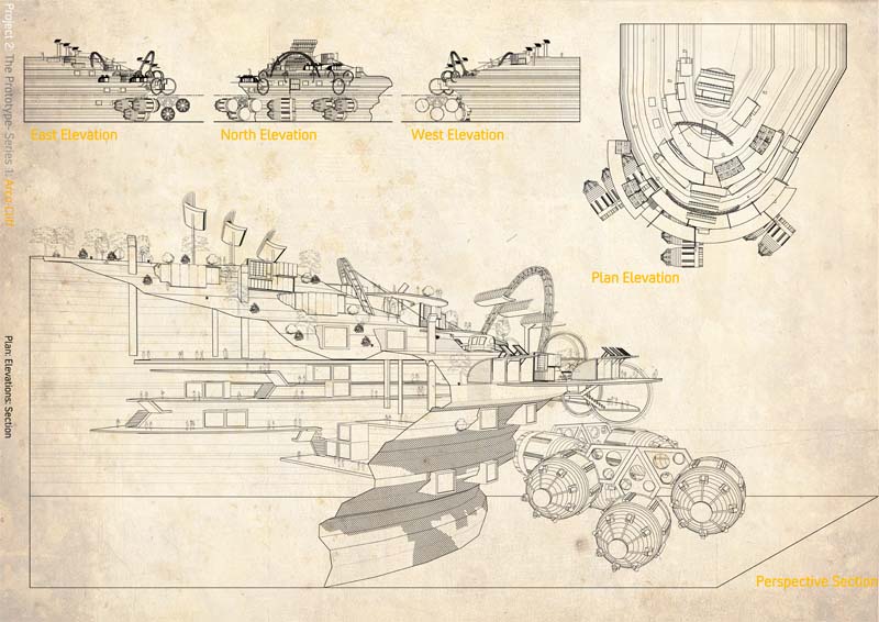
The elevations although they seem small- come out quite well on an A1 sheet but i did dull down the butchered paper effect and heres the result


-
Nice pics! Looks complex, but mind me for asking, but what is it exactly? a spaceship? a stadium? a concerthall?

-
humm, is that a rock formation? with some kind of machinery attached? part of them are under water right? if that is water is very hard to see it. But the rest looks good.
-
Nice work and great presentation but I also think that
the sephia tone ,although it is great but in this case
it puts the presentation in the background. -
'Plan Elevation'?!! is that a common thing to say where you are?
I like the 'archive' look! -
haha yeah i wasnt too sure what to call it... technically its not a plan- its an elevation taken from a plan view, so my logic was plan elevationi hate saying 'top-down view' sounds lame
yeah i think im gonna dull down the town even more although the test print off looked quite clear.
Is supposed to be a cliff and how a city can infiltrate it to form a community- i admit its not great but it does the job -
How about roof plan?
Hello! It looks like you're interested in this conversation, but you don't have an account yet.
Getting fed up of having to scroll through the same posts each visit? When you register for an account, you'll always come back to exactly where you were before, and choose to be notified of new replies (either via email, or push notification). You'll also be able to save bookmarks and upvote posts to show your appreciation to other community members.
With your input, this post could be even better 💗
Register LoginAdvertisement


