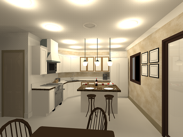
First Podium Test
-
Thank you for pointing out the tutorials! I was making it a lot harder then it was. I missed a couple of spots for reflections and lights and the cans are way too bright, but continued anyway just to see what it would look like.
This took a really long time to render. I think almost 3hrs. Where did my materials go? flooring, cabinets, walls, appliances. Is it possible to get the "light" to direct down?

-
tinnane,
What version are you using?
Version 1.5 final should be released in days, and many bugs have been attended to including disapearing textures.
If you would like feel free to email the .skp to me and i can take a look at the issues including render times. -
-
Wow, Pete, that is awesome! I have gotten your emails, but running out the door for Soccer playoffs. GO TEAM!! If they win tonight, they go to the championships!!!! WOOHOO
I'll look at the stuff later, thank you, again, so much!
Bruce, sure no prob. I'll do it when I get back.
-
Notes from Pete....
@unknownuser said:
when you render try to keep geometry to a minimum, so what's happening is the render engine is rendering the entire house, if you could put kitchen on a layer or select geometry you require and create a new .skp with just what you want in render you can reduce render time by 80%.
@unknownuser said:
I never used bumps (which would really make it 'pop') that's something that you need to adjust your workflow to when you upgrade to newer version.
I don't even know what "bumps" are. I know, it's very sad

@unknownuser said:
I checked again and figured out that with the 1.4.1 version 2 point perspectives were not completely compatible, the stove top plates will not render as lines without weight do not render with any render engine, you need to make circular shapes and add a color or texture.
I played around with it a little more, skippy attached, and it still took forever. http://www.sketchucation.com/forums/scf/sas/Gallery/kitchen.skp
 There are still missing materials? Not sure what I did wrong or different. I kept the settings the same as what you sent, I think?
@unknownuser said:
You will notice a big geodesic omni ball in view, that's my way of soft lighting in foreground (most folk hate it as it blocks view, i use it as it controls burn spots by occupying area of falloff.
Could you explain this {the 3rd grade version} a little further.
curious about the materials... you changed some materials, what was the reason for this? Also, regarding shadows... on, off, sun shading.... which is best for interior renderings?
Versions... When will 2.0 be available? and will it be compatible with 2pt perspectives?
-
@unknownuser said:
I don't even know what "bumps" are. I know, it's very sad Embarassed
Bumps are images that will make your surfaces (well, practically) "3D". Instead of me (an also newbie in the rendering "industry") going into the details, see these textures here and where there are the "diffuse", "Bump map" and "specular map", you will see little question marks. Go there and see what it say about.
http://www.arroway.de/textures/04/en/index.html -
Well that explains it!
 Thanks Gaieus.
 -
Tinane, I've encountered the same problem with disappearing textures. Its usually in grouped items (especially nested groups). Don't feel so bad about your render time. My first real rendering took over three days - but everyone said it looked great! LOL
You should post your rendering in the gallery forum, when finished.
-
V2 is still some time away. Really not at liberty to discuss the details but I can tell you that quality and speed will be way better than it is now.
The V1.5b3 should be available sometimes this week. It is much faster than 1.4.1 depending on preset used. It also makes possible to do interiors with sun only. For more details join the crowd at the forum. -
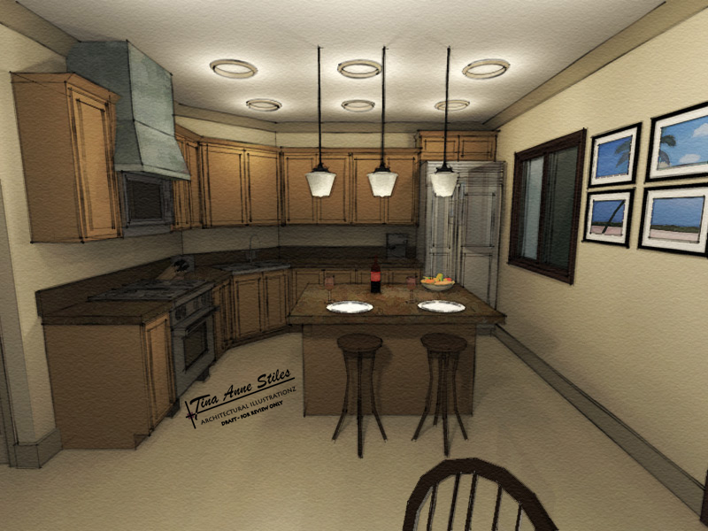
I took another stab at it with some post-processing in PS. Using V1.5b2

-
That looks awesome and with the post processing it defines the lines and creates a unique style, your style.
Congratulations, and great image.
-
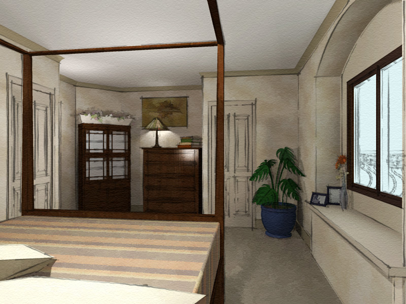
and yet another test....

-
Exellent. And with the black and white outside it feels like it is snowing. Love it!
-
Nice work, Tina. The last kitchen render is great - the added depth and realism of the shadows in combination with your style are stunning. Keep posting your progress.

Hello! It looks like you're interested in this conversation, but you don't have an account yet.
Getting fed up of having to scroll through the same posts each visit? When you register for an account, you'll always come back to exactly where you were before, and choose to be notified of new replies (either via email, or push notification). You'll also be able to save bookmarks and upvote posts to show your appreciation to other community members.
With your input, this post could be even better 💗
Register LoginAdvertisement


