Alphabet to sketch(up)
-
Krita is a gaz engine!

i can't advice about 2D Drawing prog (i use only a 23 years prog (PhotoImpact 6)
A miracle that it works always!
Very very sufficient for anything! It can even make website!
All other 2D progs for the fun of research : Free Verve, Vervette online, Project Dogwaffle Particle (for its particles), Sketchbook for classic drawing, Sisley a Fotosketcher light for modify an image, ...
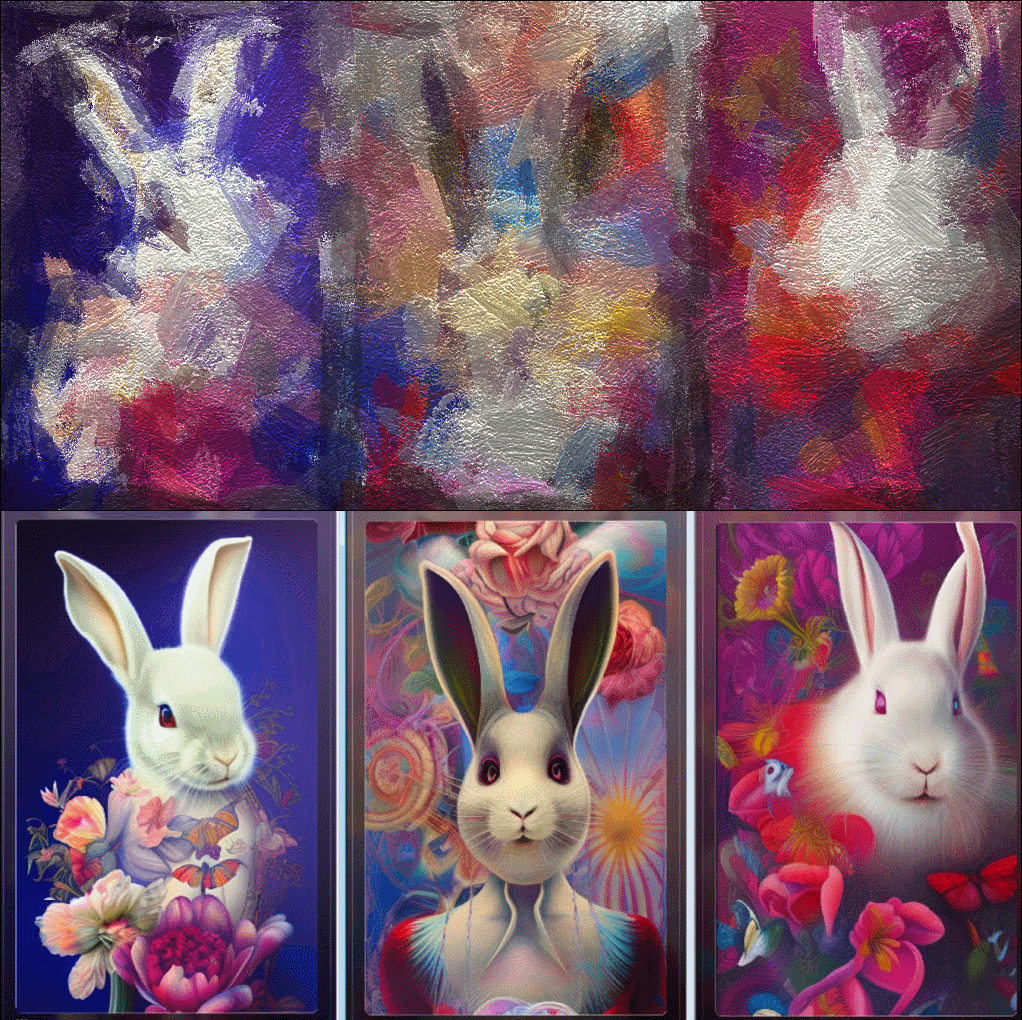
3 Rabbit are free Wombo
Abstract: Sysley of course all that is infinite!
-
It seems that Pilou has a bunch of mazing offers...! Thanks for sharing.
I am wondering what will happen in near future by implementing AI? -
Yep and they have just one year existing!

The speedy progress is terrifying!
-
Ten years ago...

-
Majid, Pilou
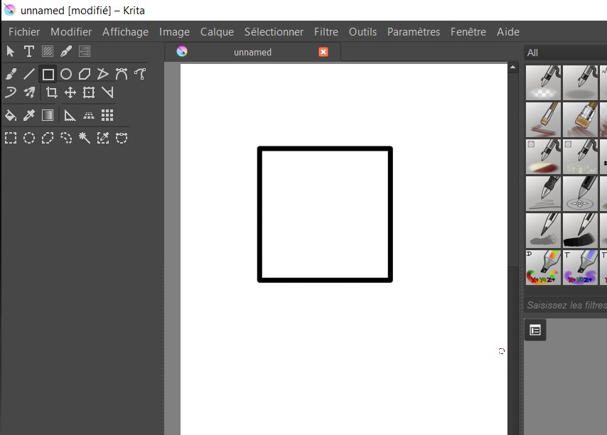
I need some help. I am tyring to learn Krita but somehow I have really messed things up. When I try to draw an object, say a rectangle or elipse, when I click to end drawing the object, nothing is showing up. I have tried to change the color and no matter what I do, it does not show up. I cannot figure out what is messed up.
Also, what dockers to you have set up in the app? How do you set up the default options for using the application?
-
I relunch krita first time from 2015

I believe you must make first Menu File / new
Select a format and go!
-
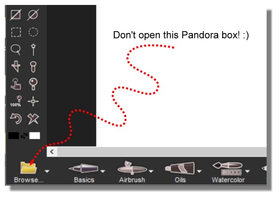
Open the Particle Dogwaffle 9


Always fun!

-
I figured out my mistake and it was so elementary that I am beyond embarrassed to admit what it was.


-
No problem i had this same problem during 3 seconds before to find the trick!

It's a sort of variation of the stolen letter by Edgar Poe!

-
@ntxdave said:
I figured out my mistake and it was so elementary that I am beyond embarrassed to admit what it was.


My comment was related to drawing in Krita

-
Yes I understood that!

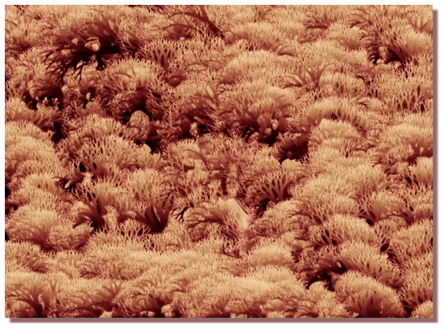
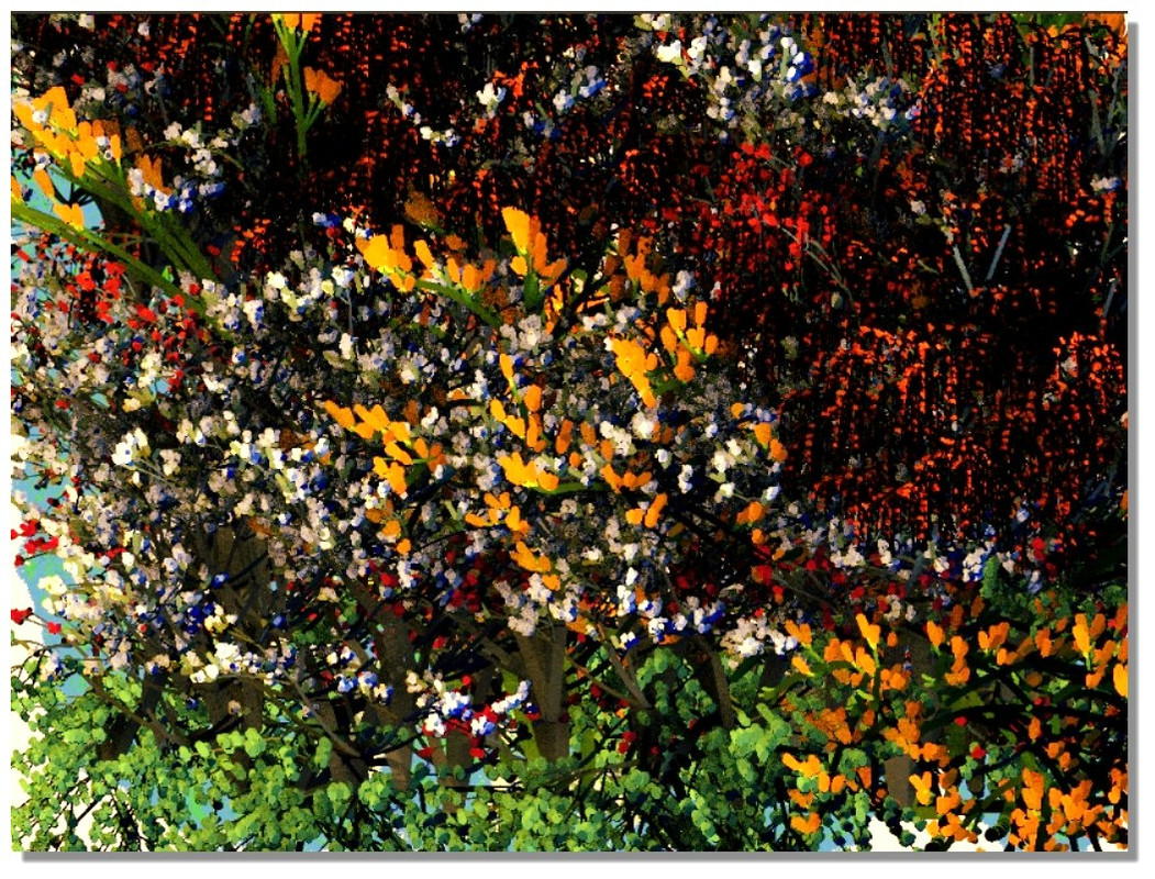
Else if by hasard you open the Particles 9

-
Else more than we can imagine in one life!
 (just scroll)
 -
Thanks, Pilou for the link, there are some amazing results. Although in some cases the relationship between the significant and signifier is so that discerning the "Alphabet" is hard.
Also, I am doing the final touches on my book and hope to be able to share it.
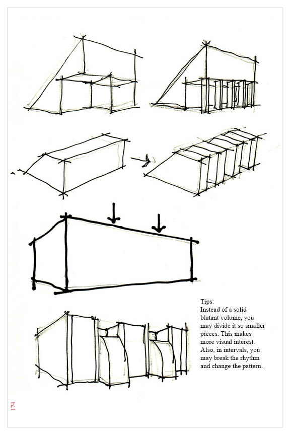
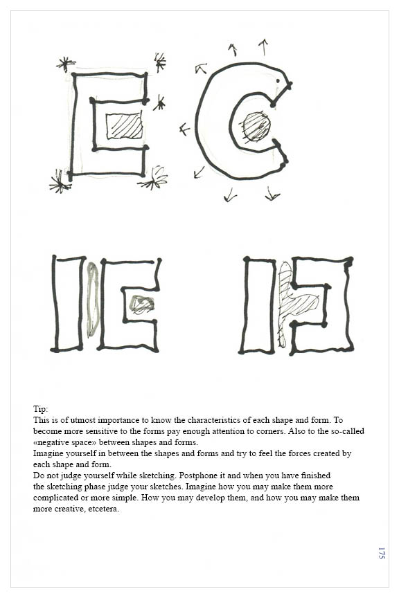
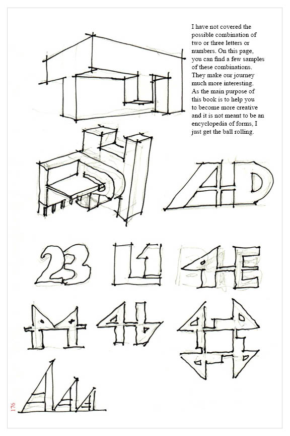
P.S. here is the link to some pages of the book. Sorry for the low quality:
https://drive.google.com/file/d/1zb1Hdr4cUDl1TL4rfUgRb39tFIaE4dpi/view?usp=sharing -
It would be much appreciated if, please give me some feedback on my book!
-
Very cool beginning if you go up to "Z" ?

Original exercice with constraint!
-
Thanks for your comments, Pilou!
Shared pages are parts of the book. The book already covers A-Z and some extra tips. It is up to 180 pages... -
-
Tips are on improving the sketches...
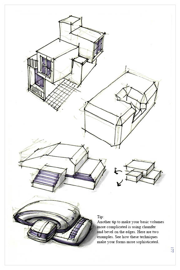
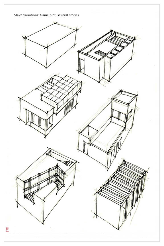
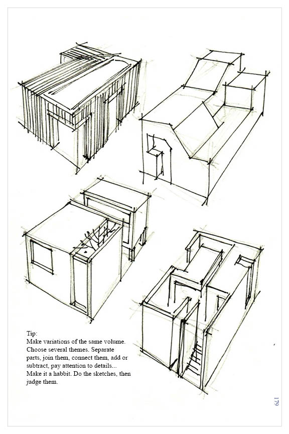
-
This is the type of thing I have been playing with/trying in Krita and have been doing a horrible job.


-
The good news is that I could spare some time to finish the job and, the Kindle version of the book is released: https://www.amazon.com/dp/B0BZJZGXWT/ref=mp_s_a_1_4?qid=1679715874&refinements=p_27%3AMajid+Yeganegi&s=books&sr=1-4&text=Majid+Yeganegi
You can read it forr free on Amazon or support me, buying it.
A higher-quality pdf version soon will be available on sketchucation shop , hopefully.
Hello! It looks like you're interested in this conversation, but you don't have an account yet.
Getting fed up of having to scroll through the same posts each visit? When you register for an account, you'll always come back to exactly where you were before, and choose to be notified of new replies (either via email, or push notification). You'll also be able to save bookmarks and upvote posts to show your appreciation to other community members.
With your input, this post could be even better 💗
Register LoginAdvertisement


