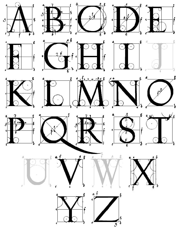
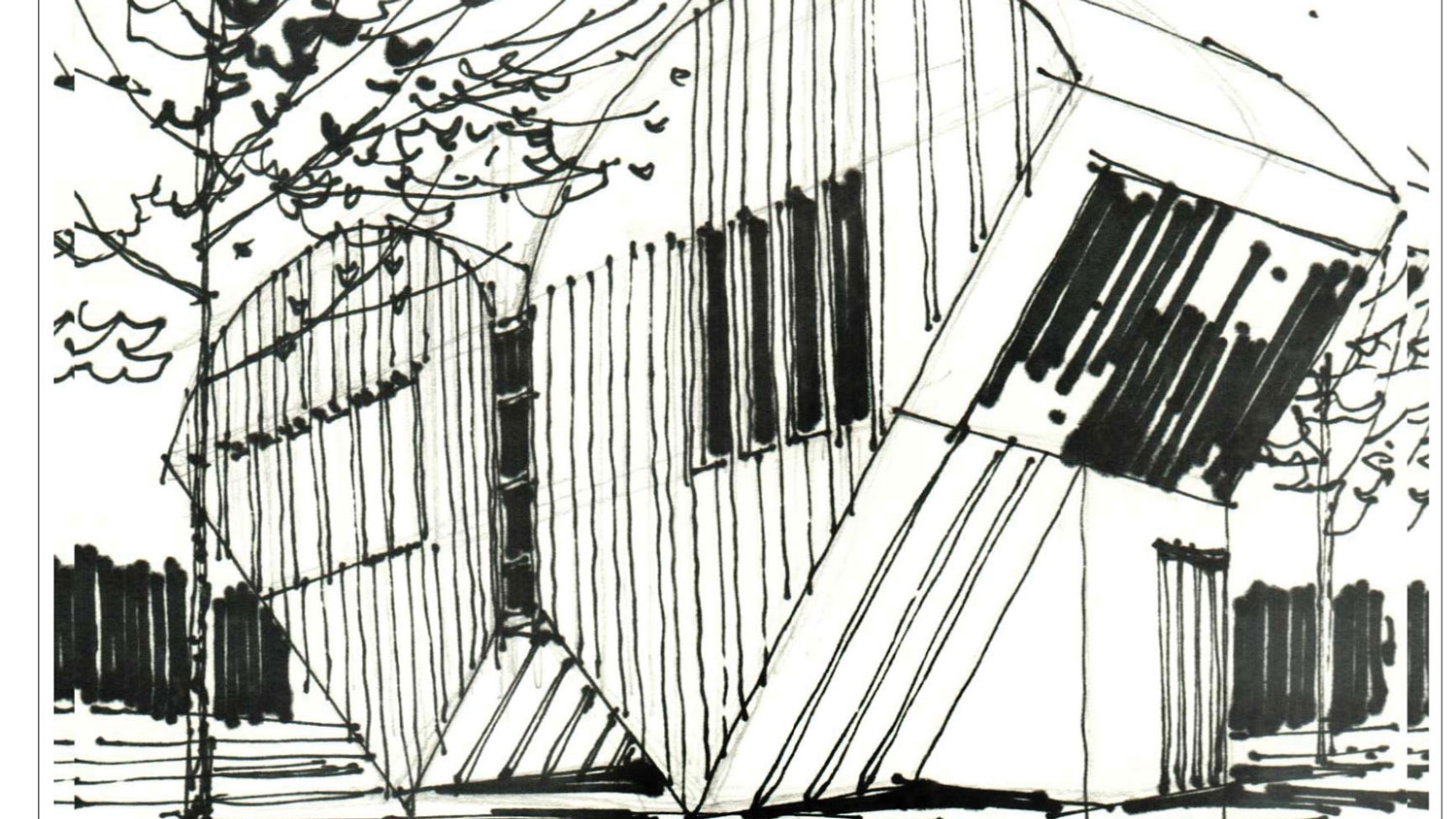
Alphabet to sketch(up)
-
Drawings on paper or digital painting ?
-
I am developing one of my paper sketches as a 3D model in Blender3D which is a challenge to me ( I do not feel comfortable with Blender yet)
-
I advise you of a new Nurbs prog Plasticity who is released the 5 april 2023!
And who is very smart! Perfect for artists, designers, architects...
Very more easy than Blender! (but not free 99$ )
Direct modeling and a pure true geometrical drawing... a circle is a circle and not a polygon!
it's a Ferrari!
You have also Moi3D who is a Rolls Royce! (export SKP) (290$)
 -
Two gems. By the way, my book is designed to be modeled using Sketchup preferably. I am doing this one using Blender to challenge myself.
-
Pilou, these products look really good for product modeling but they may not be that great for architecture from what I saw. However, thanks for sharing.
-
They are many more precise than SketchUp!

And many more easy for make some wavy forms!
And Plasticity and Moi3 are children under steroids of Rhino!
Ah sorry here its more SubD inside Nurbs but no problem with more rigid forms!

Look at all videos of this guy! -
Remember, the point of this thread is the inspiration of the alphabet and turning it into architectural design. First by sketching them into design ideas and then using SketchUp as the modeling tool ans eventually rendering the model. From that point the SubD tool is available in SketchUp and can be used as part of the modeling process.
Again, the primary purpose of the thread is the alphabet being used to “inspire” modeling designs.
-
Thanks, Dave, you are right. It is meant to be an inspirational resource for creativity and modeling (using SketchUp), although Pilous's posts are informative.
-
Yes, I agree his posts are informative but I want viewers to stay in touch with what you are trying to achieve.

-
I am the sort of person who is interested in learning unstoppably, so easily get distracted.
You are absoloutely right Dave. Ok then let's get back to the main idea of the topic. -
Father of the Alphabet Letters!

http://indexgrafik.fr/albrecht-durer-construction-des-lettres/ (English / French)

-
Playing with a sketch of "W".

-
Nice


How did you produce the reflections?
Now for the practical side, how would you walk around in side the structure? This is an issue I have with some letters of the alphabet (like say a W or Y).

-
For the water, I used a plane with pure reflection and a "noise" as bump map.
There are a few tricks to get inside the close volumes; switching between styles maybe is the easiest one. then I place the "look around " tool... -
@majid said:
There are a few tricks to get inside the close volumes; switching between styles maybe is the easiest one. then I place the "look around " tool...
I really was asking about moving around inside if was a “real” building.

-
Do you mind discribing more, please? I can not get you (I am not a native English speaker and so there are language barriars, you know.)
-
A: How do you enter the building?
B: Once a person is inside the building, how does a person walk around unless the is a floor above the v shape of the bottom of the building sections?
Again, I am looking at this like a person who builds the building or lives in it.

-
Aha, Got it. The question of solving unusable "sharp corners" needs some practice in architecture. The simplest way is to add a decent "room" to part of it. i.e. in "W" I have added a cube to part of it. Rest may be used as storage or a room for the "mechanical" part of the building.
Please also consider that in this book I was not considered to be practical. The following links also may help, the first is about the 4x4 house (2003) project by Tadao Ando:
https://en.wikiarquitectura.com/building/4x4-house/
And this is to brainstorm rules:
https://www.atlassian.com/work-management/project-collaboration/brainstorming
I may draw your attention to rule 2.
During the creativity phase, it would be way better if do not criticize the job. Later on, when "developing" the idea you may adjust it to make it works practically. That was not the purpose of my sketches.
As you might have seen in the book the original sketch includes an "entrance" room which I have changed in the render.

-
#2

I was not trying to be critical (although I understand how it comes across). Part of my problem when doing the stuff is getting caught hop n the “practical” side and not being more “imaginative”. Something I need to practice!

-
As far as I know, in all design-related jobs at least two things are inevitable: "Being practical, and not leaving undesigned parts". So you are right about being practical.
About critics: The tip is that at the early stages (of creativity) one must let it go and prevent criticizing. Then later on, during the development phase, you can make it work.
About not leaving undesigned: (In architecture) if the designer does not design everything, the builder will do! and they will do on their taste! So preferably it would be better to design everything under one hood.
My sketches are to encourage creativity and belong to the early stages of the design process (also called schematic design). Needless to say, it is a back-forth process.
i.e. please see: https://www.masterclass.com/articles/phases-of-the-architectural-design-process
Hello! It looks like you're interested in this conversation, but you don't have an account yet.
Getting fed up of having to scroll through the same posts each visit? When you register for an account, you'll always come back to exactly where you were before, and choose to be notified of new replies (either via email, or push notification). You'll also be able to save bookmarks and upvote posts to show your appreciation to other community members.
With your input, this post could be even better 💗
Register LoginAdvertisement


