5 Story
-
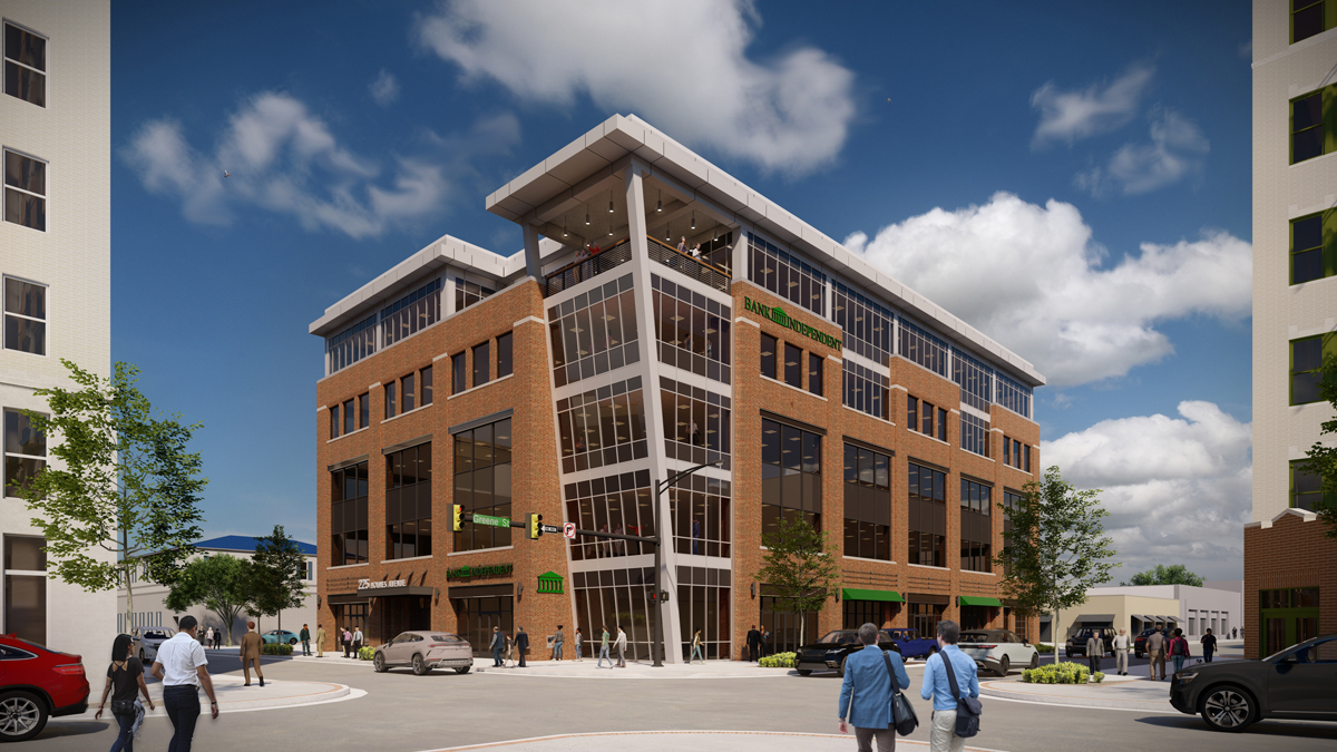
Another Lumion Rendering of a 5 story building here in Hunstville AL under construction.

-
Looking good.


-
Very nice!

-
Good work. Did u use a hdri for environment lighting? Maybe some reflections in the glass ( all the windows have a similar darkness to them )and the foreground people look a little Photoshopped which tends to catch my eye. Like the building design

-
Thanks.
I used one of the Lumion "Real Sky" options. The glass is reflecting the surrounding buildings but could look better. The darkness in the glass was chosen as this is a South facing building, I guess I could try more reflectivity on the texture.
The 4 people in the foreground are Photoshopped, the rest are Lumion peeps.
Good eye. -
I know, I am a pain in the ass
 . I find its the lighting on people always kind of gives it away and shadows too or they generally look like zombies. Good project, I do like Lumion a lot, but its too expensive for me to be honest. There are two versions, a light and a pro version I believe. I am currently using Twinmotion for exteriors and it currently suits my needs
-
Not a pain at all. I always learn from comments here so keep them coming.
-
Cracking renders.

-
Thanks.
-
Really liking that corner's design. Good job on render.
-
Here is a 30 sec timelapse of the project under construction. The rendering was done from the bottom left corner for your reference.
-
Love these progress videos of sites at work.
Thanks for sharing. -
Great time lapse. Thanks for posting.

-
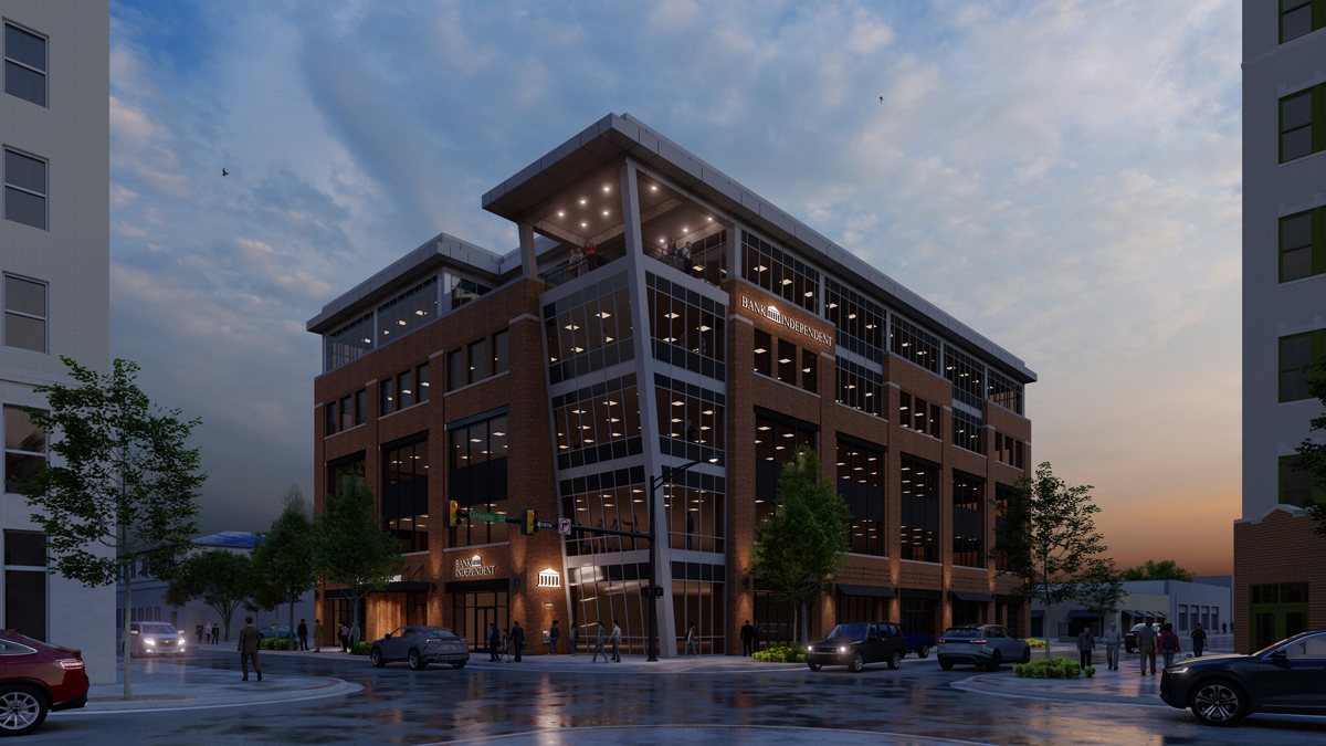
Here is an updated rendering at Dusk.

-
A great render mate.

-
-
Really like this dusk version !

-
Nice work I much prefere the dusk version, Very Archvis


-
Thanks guys.
Hello! It looks like you're interested in this conversation, but you don't have an account yet.
Getting fed up of having to scroll through the same posts each visit? When you register for an account, you'll always come back to exactly where you were before, and choose to be notified of new replies (either via email, or push notification). You'll also be able to save bookmarks and upvote posts to show your appreciation to other community members.
With your input, this post could be even better 💗
Register LoginAdvertisement


