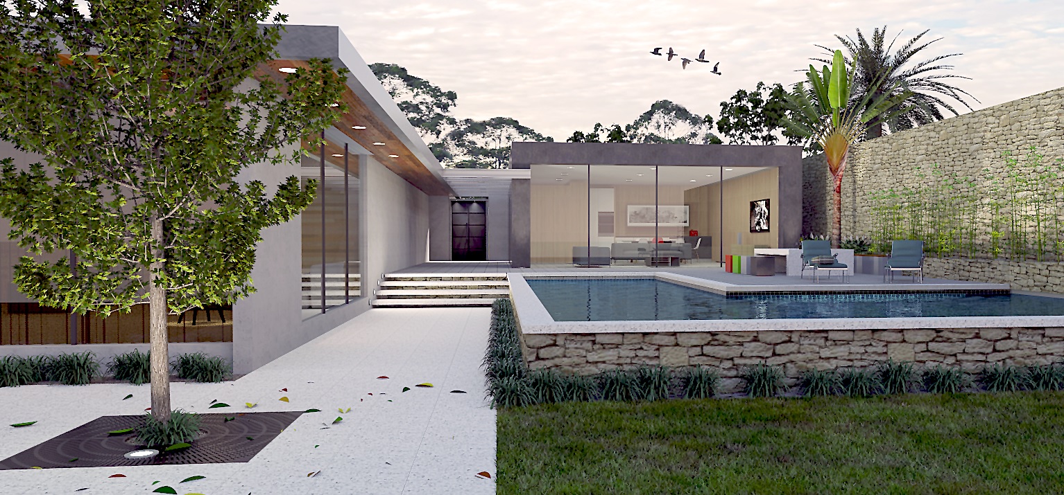
Perth 2 story house render
-
Nice clean model & render
 IMHO the lighting inside the house (during daylight) lessens the contrast in the image, although it seems to be a trend at the moment.
John
-
@tadema said:
Nice clean model & render
 IMHO the lighting inside the house (during daylight) lessens the contrast in the image, although it seems to be a trend at the moment.
John
Thanks Tadema
 I think I get what you mean about the contrast. I have no skills in photoshop so ATM I am relying purly on the renderer. I use the lighting as a device to compensate. Seems to give the image some "cred":D If you would be so kind could you post an example image of "more contrast" to assist my learning curve it would be most helpful.
(Edited) oh I think I now what you mean now. I was a landscaper/designer and have had professional photography done. The photographer shot at dusk and has about a 5 minute window in which to shoot (twilight) The image was meant (perhaps unsuccessfully) to look like twilight. The sky is a twilight sky as is evidenced by the orange/yellow cast to the sky to the far right. Room for improvement perhaps

-
@l i am said:
@tadema said:
Nice clean model & render
 IMHO the lighting inside the house (during daylight) lessens the contrast in the image, although it seems to be a trend at the moment.
John
Thanks Tadema
 I think I get what you mean about the contrast. I have no skills in photoshop so ATM I am relying purly on the renderer. I use the lighting as a device to compensate. Seems to give the image some "cred":D If you would be so kind could you post an example image of "more contrast" to assist my learning curve it would be most helpful.
(Edited) oh I think I now what you mean now. I was a landscaper/designer and have had professional photography done. The photographer shot at dusk and has about a 5 minute window in which to shoot (twilight) The image was meant (perhaps unsuccessfully) to look like twilight. The sky is a twilight sky as is evidenced by the orange/yellow cast to the sky to the far right. Room for improvement perhaps

Looking good!
I am building an automatic Photoshop script for SketchUp at the moment I will keep you posted, it's going to take a few months!
-
[/quote]I am building an automatic Photoshop script for SketchUp at the moment I will keep you posted, it's going to take a few months![/quote]
Hi Liam, thanks! That is a cool idea mate, will it be just filters etc or will it do more, are you able to say?

-
@l i am said:
I am building an automatic Photoshop script for SketchUp at the moment I will keep you posted, it's going to take a few months![/quote]
Hi Liam, thanks! That is a cool idea mate, will it be just filters etc or will it do more, are you able to say?
 [/quote]
Will do more I hope, combining the linework, emphasising any glass and reflections and altering the shadows etc.
-
@liam887 said:
@l i am said:
I am building an automatic Photoshop script for SketchUp at the moment I will keep you posted, it's going to take a few months!
Hi Liam, thanks! That is a cool idea mate, will it be just filters etc or will it do more, are you able to say?
 [/quote]
Will do more I hope, combining the linework, emphasising any glass and reflections and altering the
Hi Liam thanks for getting baxk, that sounds really exiting

 If I understand correctly in relation to the glass reflection etc it may do away with the need to some extent of HDRI environments, and my experience with environments is it is often difficult to get an apropriate one and they are reasource intensive. Cant wait mate and good luck with it. Please keep us informed
-
Hmm kind of but it will be nowhere as good haha.
I am giving a presentation at SketchUp basecamp this year and it's one of the things I am building and giving away for it. If you look at this breakdown image I made yesterday, and look specifically at the 'glass and mirror section' you will get an idea.

-
Oh BTW Liam, I voted for a thumbs up in a post above but gave a thumbs down using touch screen

-
@l i am said:
Oh BTW Liam, I voted for a thumbs up in a post above but gave a thumbs down using touch screen

Haha no worries I did not see. The plan is to create a suite of automatic actions in Photoshop that allow you to do maybe 6-7 functions for SketchUp models. Lighting, highlights, reflections etc etc. They can be used on raw models exports or with renders. Still a few bugs to iron out it's been a few years since I made and serious ones. I will send them over to you as they go you can help me test them if you want.
-
Thanks Liam, that is awsome, actually I was going to ask but thought that perhaps rude
 I have a few renders that were marginally successful and would be interested to see how your application works on them. be happy to feed back to you
-
Nice render, the interior lights do seem to reduce contrast a bit but does not reduce the overall effect imho.
-
The lighting is completely off. 6.00PM sky, afternoon 2D? trees (with altered levels).. they don't work together
-
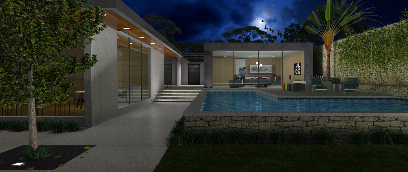
Still experimenting with lighting and producing renders out of the box with no post processing. Whilst not completely successful but perhaps an improvement, I'm not sure.

-
Nice composition in both images, mate. Like tadema said though lighting the scene with artificial lights in a daylight setting seems.... well; artificial. Obviously the interiors need a little lighting to balance out with the outside sunlight but exterior lighting in your soffits / garden lighting IMO is not needed.
Still, a nice presentation!
-
The first image was meant to be a Twilight render (not the render engine)not a daylight render. So I decided to go for a full night render. Again it was right out of the renderer with no post production at all, so it took a lot of fine tuning. Will try for a tryptic of all three times of day lighting conditions
Cheers

-
@l i am said:
Still experimenting with lighting and producing renders out of the box with no post processing. Whilst not completely successful but perhaps an improvement, I'm not sure.
[attachment=0:2on3xmwu]<!-- ia0 -->Modern tropical Sml 2.jpg<!-- ia0 -->[/attachment:2on3xmwu]
For not doing any postprocessing I think your renders are good, but for me, photoshop is a vital process to make my work presentable.
Cheers!
-
@renderiza said:
@l i am said:
Still experimenting with lighting and producing renders out of the box with no post processing. Whilst not completely successful but perhaps an improvement, I'm not sure.
[attachment=0:2xx0rfw5]<!-- ia0 -->Modern tropical Sml 2.jpg<!-- ia0 -->[/attachment:2xx0rfw5]
For not doing any postprocessing I think your renders are good, but for me, photoshop is a vital process to make my work presentable.
Cheers!
No argument from me on that. Photoshop is something I am procrastinating on learning. I have been watching vids and absorbing........oh I think that may be procrastination as well

But seriously I can see the power in Photoshop and really want to find out what I can do with it
 Quite exiting really, I will start next week
-
@renderiza said:
@l i am said:
Still experimenting with lighting and producing renders out of the box with no post processing. Whilst not completely successful but perhaps an improvement, I'm not sure.
[attachment=0:hmk1u999]<!-- ia0 -->Modern tropical Sml 2.jpg<!-- ia0 -->[/attachment:hmk1u999]
For not doing any postprocessing I think your renders are good, but for me, photoshop is a vital process to make my work presentable.
Cheers!
Sorry its been a while, would you care to share a similarish image to mine of what you mean (photo shopped? I am in need of a dangled carrot, would really appreciate it
Hello! It looks like you're interested in this conversation, but you don't have an account yet.
Getting fed up of having to scroll through the same posts each visit? When you register for an account, you'll always come back to exactly where you were before, and choose to be notified of new replies (either via email, or push notification). You'll also be able to save bookmarks and upvote posts to show your appreciation to other community members.
With your input, this post could be even better 💗
Register LoginAdvertisement


