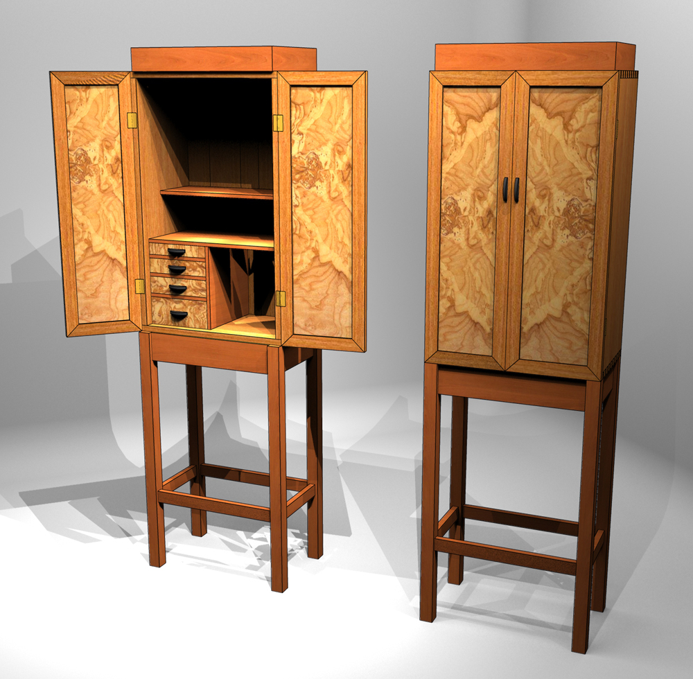
Krenov-style cabinet on stand
-
 Decided to try something original for a change. A cabinet-on-stand in the style of the late James Krenov. The proportions of the case, base, and doors are based on the gold section. The base is cherry; the case, elm; the interior shelves and dividers are also cherry. I used an olive ash burl texture for the door panels and drawer fronts. It's difficult to see in the render, but I've placed two small recessed lights in the top of the case to illuminate whatever is on the shelves. The cherry pieces at the top serve as a crown for the case and hide the light cans. For the render, I used Shaderlight, with a hidden-line accent on the edges a la Dave Richards.
Enjoy.
dh -
David, Simply wonderful ! I've been tempted myself to do a piece in Krenov's style, just haven't been able to get around to it
 . Great job
  .
. -
Thank you, sir.
The model may be as close as I ever come to making the cabinet. -
very nice. One small quibble- I don't think Krenov used the miter joint for cabinet doors much, if memory serves he used bridle joints or m&t. Just my $.02, not meant as a criticism

-
Nice work as usual, David!
-
 Tbanks, Dave.
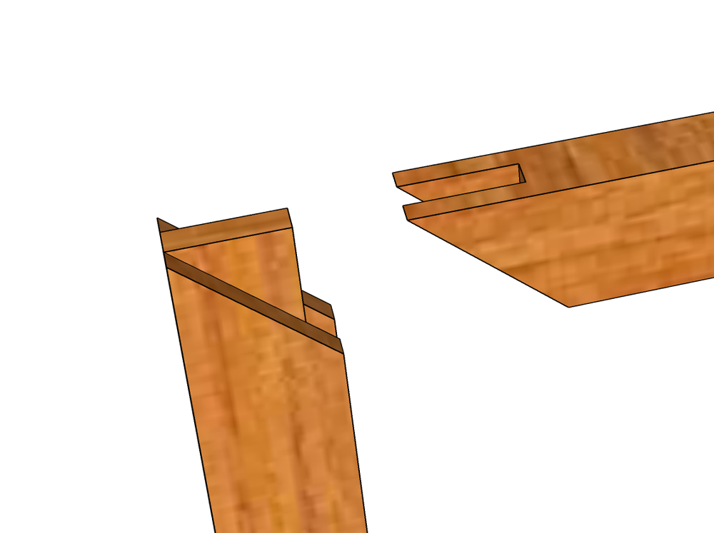
Mrossk, Thanks for raising a good question. The door frame uses a splined miter joint; a plain miter probably wouldn't be strong enough. And I wanted that diagonal seam on the frame to complement the figure in the door panel.
Best,
dh -
Thank you, L i am.
-
 about the quality of your shown furniture, everything is said here - but not about the presentation yet - just excellent
  again and again I love this combination of a render with line overlay. Your here used virtual studio seems to be an open cube with rounded edges?
 -
HornOxx, we can all thank Dave Richards for the rendering techniques. He's the one who popularized the use of a hidden line image combined with a render to define edges. Dave also uses a cube with rounded corners for his rendering "studio." Like a real photo studio where the subject poses on seamless background paper, the rounded edges in SketchUp help to diffuse the background lest it detract from the subject.
-
Beutifull work David, the proportions are highly resolved ..........perfect

Hello! It looks like you're interested in this conversation, but you don't have an account yet.
Getting fed up of having to scroll through the same posts each visit? When you register for an account, you'll always come back to exactly where you were before, and choose to be notified of new replies (either via email, or push notification). You'll also be able to save bookmarks and upvote posts to show your appreciation to other community members.
With your input, this post could be even better 💗
Register LoginAdvertisement


