Room Divider - Added 2nd Model
-
Have been messing about trying to come up with a room divider design. Hope to build one at some point for my abode. Posting a render and raw SU image of one design that I think has some potential... but not quite sure if it's where it needs to be yet.
Comments on the design more than welcome.
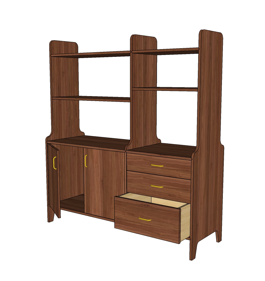
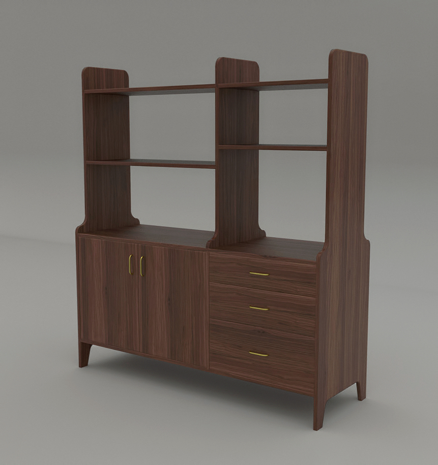
-
I am certainly no designer but if it is dividing a for, should you have some access to the storage area from both sides?
BTW: I do like the design and render.

-
ntxdave , thanks for the comments. I don't think there's a hard and fast rule on how access is handled on the lower case on these sort of pieces. In this case the piece will have a sofa up to the back side so doors and drawers on the one side is the way to go.
-
I like it although I think I'd like to see smaller radii on the corners of the verticals.
-
Dave R, thanks. Find your comment about the radius on the verticals interesting. First version of this I had smaller radius, after looking at it a bunch decided to increase them..... must be a tomato, tomatoe thing.
-
The legs on the side pieces may be a weak point. You might try making the sides solid all the way to the floor (or maybe with just a small cutout at the base). You might also consider a narrow horizontal stretcher under the bottom of the cabinets. The stretcher would help the cabinets resist sagging from the weight of whatever you put inside them.
Picky, picky, picky. Your basic design is good--attractive and functional. Nice work.
Best,
dh -
I think it's ok for one side to be non-access to drawers. It could be the sitting area--less utilitarian (if that word could be applied to such a nice piece) and may have a sofa backing up to the unit. My worry would be what to do with the top portion. you won't want to looking at the back side of books or photographs. Maybe some of the shelves is backed on one side for these items. Otherwise I guess it could be used for more freestanding display.
-
I want to second David's suggestion for the stretcher and legs. The center divider breaks up the bottom cabinets too much for my taste, I would suggest and 1/8" gap between the cabinet door and drawer front to give the bottom the look of one cabinet. Nice render!
-
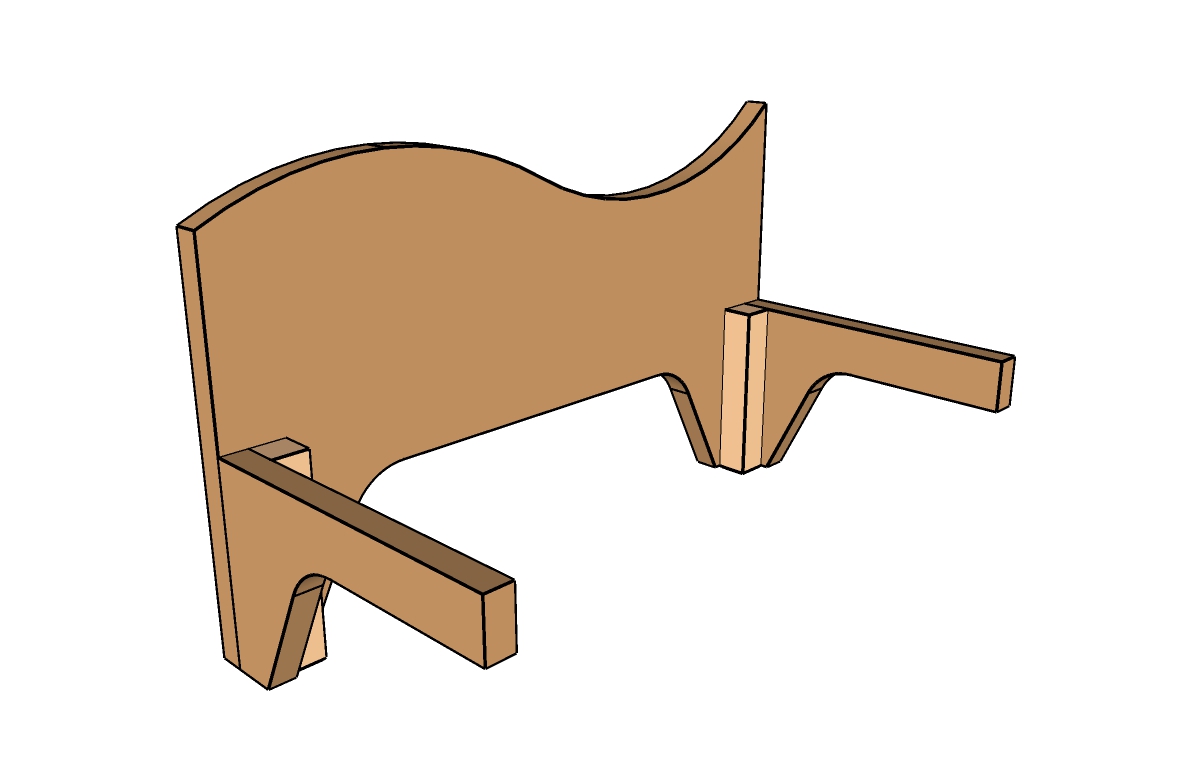
Here's a schematic sugggestion for another base treatment:
Leave the cutouts as is on the sides. Add a stretcher front and back, with cutouts to match the sides. Position a block at the corners, where the stretchers join the sides. The cabinet bottom rests atop the stretchers.
Now, here's the cool part: Make the blocks 1/16 in. longer than the end of the stretcher, and chamfer the bottom ends of the blocks. This way, the blocks, not the cutout legs, support the room divider; they also help prevent the sides from chipping if the divider has to be moved across the floor.
This is a slick trick I learned from Philip C. Lowe, a fabulous furniture maker who runs the Furniture Institute of Massachusetts.
Just a suggestion (as if you didn't already have more then you need).
dh -
David, pbacot and jtri , I appreciate all your comments and suggestions. The way the sides of the piece are shaped is a take off of the style of a lot of Sam Maloof's casework. The plan if it gets built is to use sliding dovetail joints where the case sides, top, bottom and vertical partition join. Think this would provide ample rigidity for the lower case. Totally get the point that you really don't want to see the back side of books in the upper case. The planned use of the upper shelves is for the display of vintage glassware and ceramics that I own.
Still a design in progress. Have a couple variations in the works. Might nail the final design down one of these days.... -
We're always ready to volunteer suggestions, whether you need them or not.
Best,
dh -
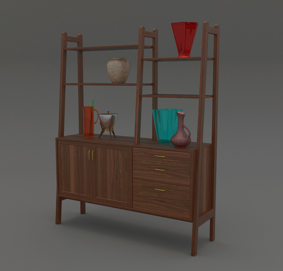
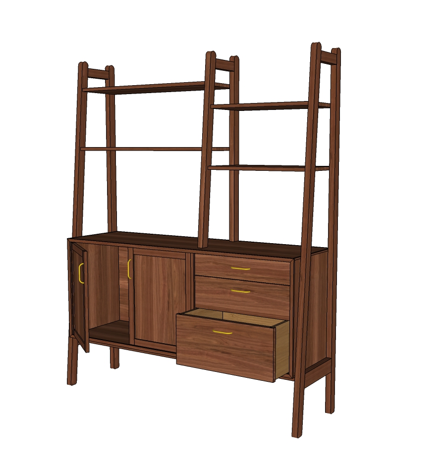
O.K. everybody, here's a different version of the room divider. I'm not 100% but I think I may prefer this one to the first model posted. Again input is always appreciated. By the way there are stretchers under the case on this one.....
-
I think I like them about equally well. Frame and panel doors don't seem right to me. Slab doors would be more in keeping with the MCM style. I'd also square off the tops of the uprights. As it is, those are the only curves in the piece and to my eye they look out of place.
Is the case sitting on stretchers between the end frames?
-
Thanks for the input Dave. Couldn't make up my mind between frame with a flat panel or solid doors, sort of flipped a "mental coin" when drawing it up. You've made a valid point about the tops of the uprights. Yes there are stretchers under the case, just set them back in some from the front edge.
-
I have a couple of thoughts but would like to see the back 1st. Is the carcass to be out of solid or sheet goods? I really like your render, I need to start to render, what do you use?
-
jtri, Thanks for the response. the render was done in Twilight. As for the case..... haven't yet really made up my mind if I'm going to go with solid wood or sheet goods. Each has it's on set of challenges as it were.... sheet goods will need solid edging applied, solid wood will need accommodations for expansion figured out. Either way the case back will most likely be veneer ply let into a rebate in the case.
-
@tuna1957 said:
Dave R, thanks. Find your comment about the radius on the verticals interesting. First version of this I had smaller radius, after looking at it a bunch decided to increase them..... must be a tomato, tomatoe thing.
Cherry tomato vs. beefsteak tomatoe

I really liked the render!
Hello! It looks like you're interested in this conversation, but you don't have an account yet.
Getting fed up of having to scroll through the same posts each visit? When you register for an account, you'll always come back to exactly where you were before, and choose to be notified of new replies (either via email, or push notification). You'll also be able to save bookmarks and upvote posts to show your appreciation to other community members.
With your input, this post could be even better 💗
Register LoginAdvertisement


